I am finding myself in a season of practice. It wasn’t planned, but here I am. And what surprises me most is that it’s not an uneasy place to be…for the most part.
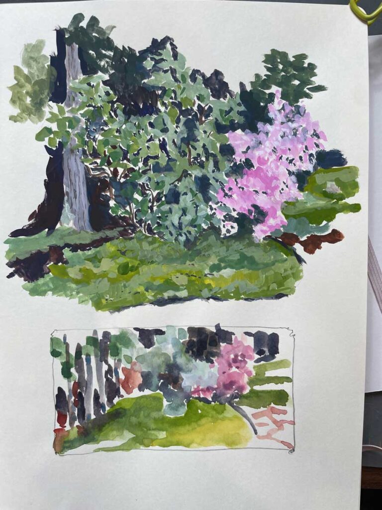
Our early blooming Korean azalea marks the beginning of each growing season in our back garden. Gouache (top) vs watercolor sketches. What I find most interesting in these experiments is that they show possibilities for pushing toward abstraction.
All I want to do these days is play with materials and allow myself the space and grace to relax into exploration for its own sake. In part, this may be a response to the past year, one filled with changes and milestones, both personal and professional. I’m more than ready to let the wind blow me around for a bit.
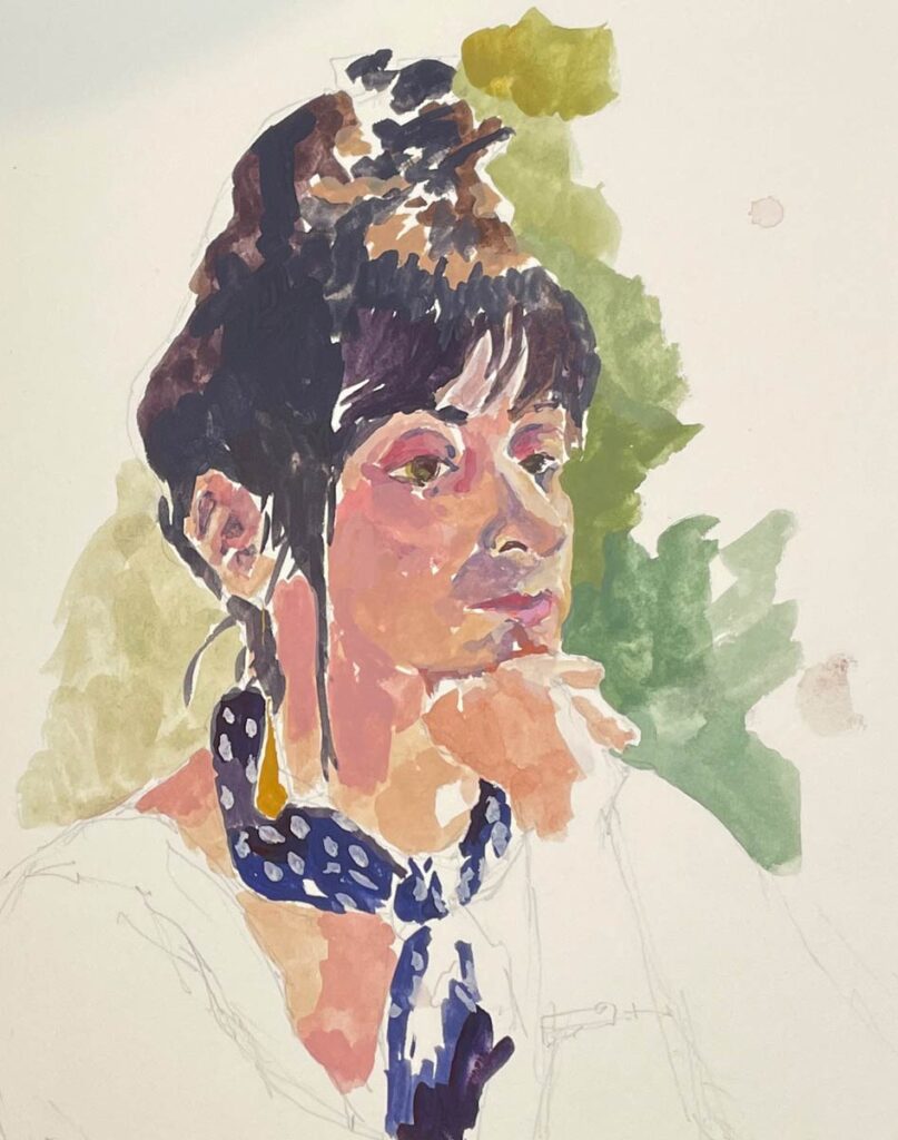
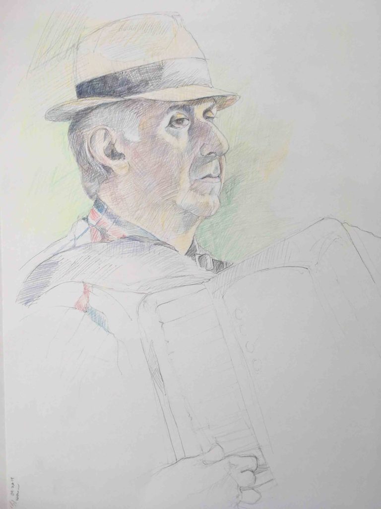
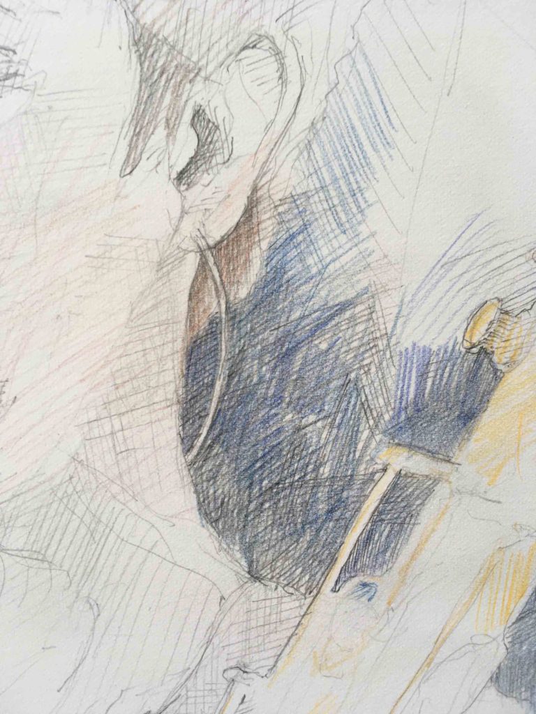
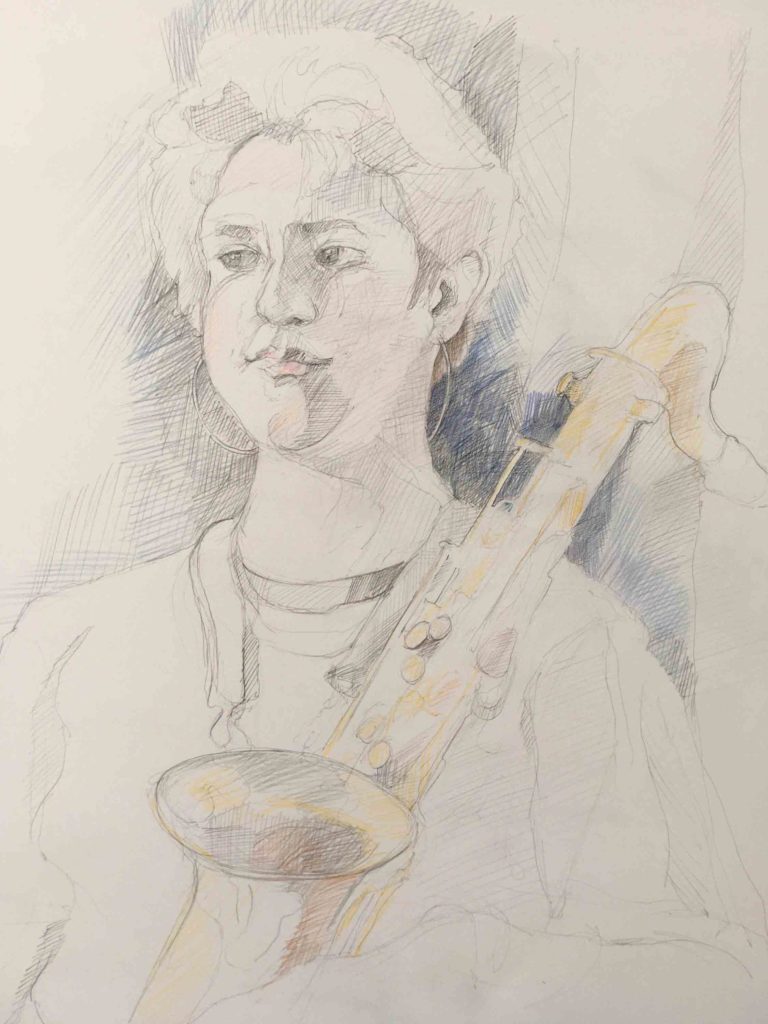
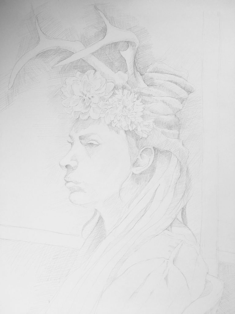
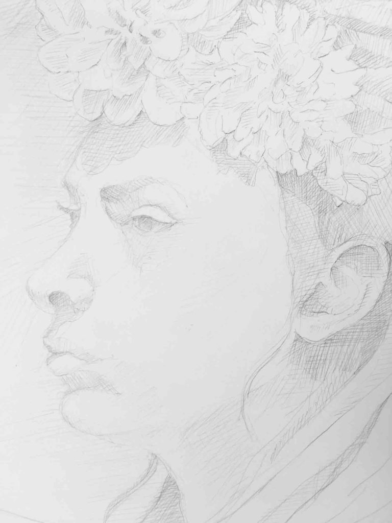
I always ask our life drawing models if it’s ok to take a photo. In the moment it allows me to see details that aren’t possible unless I’m right up in their faces. Most are happy to oblige. I don’t ever share the photos elsewhere, but I can return to them later for practice. This is done with gouache. It’s all about color here.
That said, I realize that in the long run it will serve me to set up a few guardrails in order to find a path and to stay on track. My current task is to try to figure out exactly what those parameters will be.
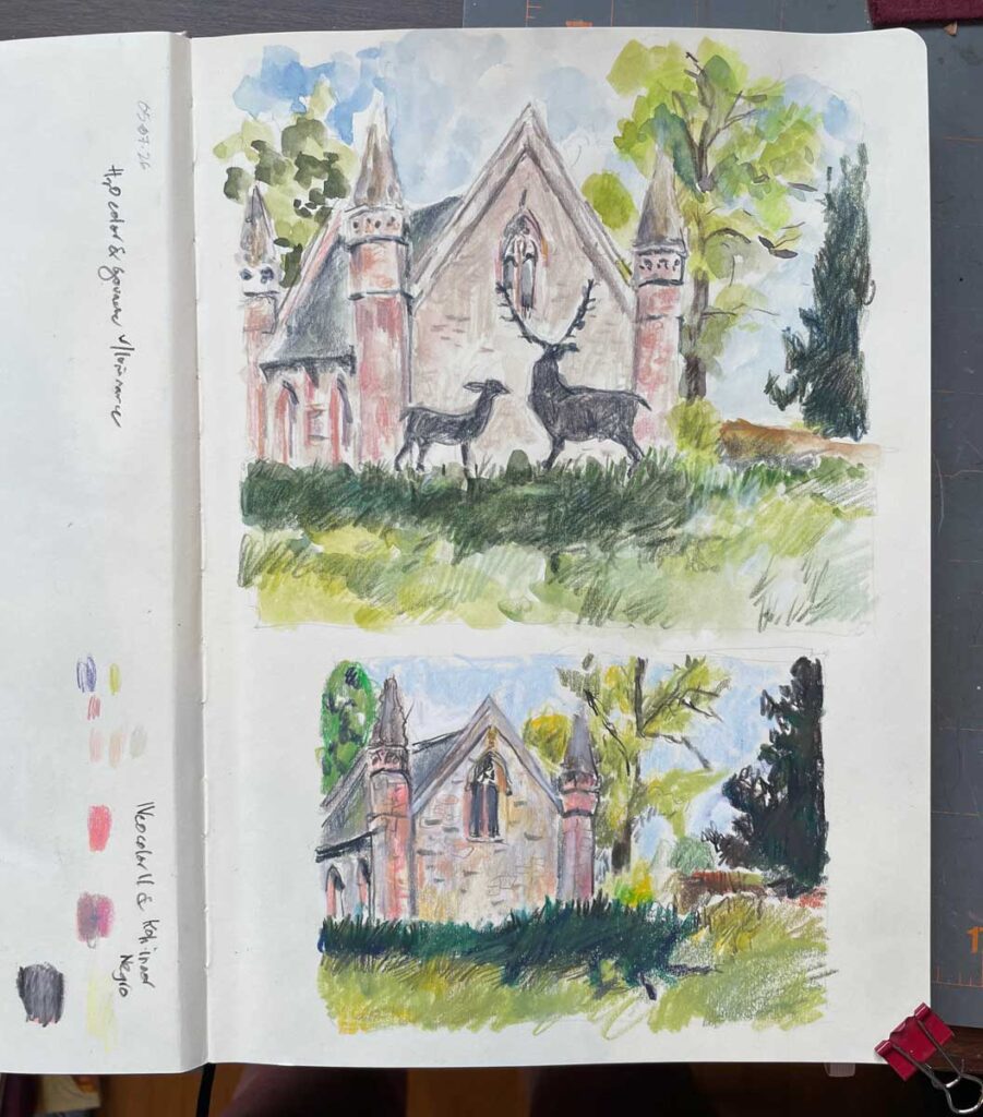
Photos from our travels offer plenty of opportunity for experimenting with different materials. These images of the chapel at Scone Palace in Scotland were made with watercolor, gouache & pencil (top) – I love the way that you can see the strokes of pencil over the paint. The bottom drawing is made with Neocolor IIs and a Koh-i-noor Negro pencil. Due to their waxy nature, not much will make a mark over the Neocolors. It was a huge discovery to find that this pencil will.
It’s somewhat slow going. Some days don’t feel particularly productive or, probably because of that, comfortable. Yet, playing around with intention can be a lot of fun, and my gut tells me that spending this time now will bear fruit later.
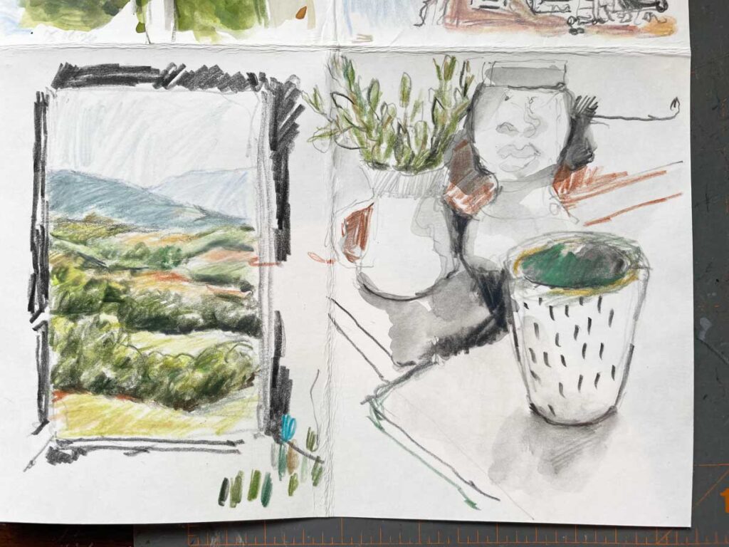
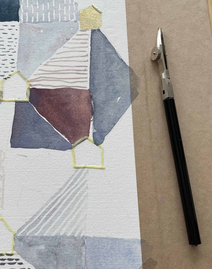
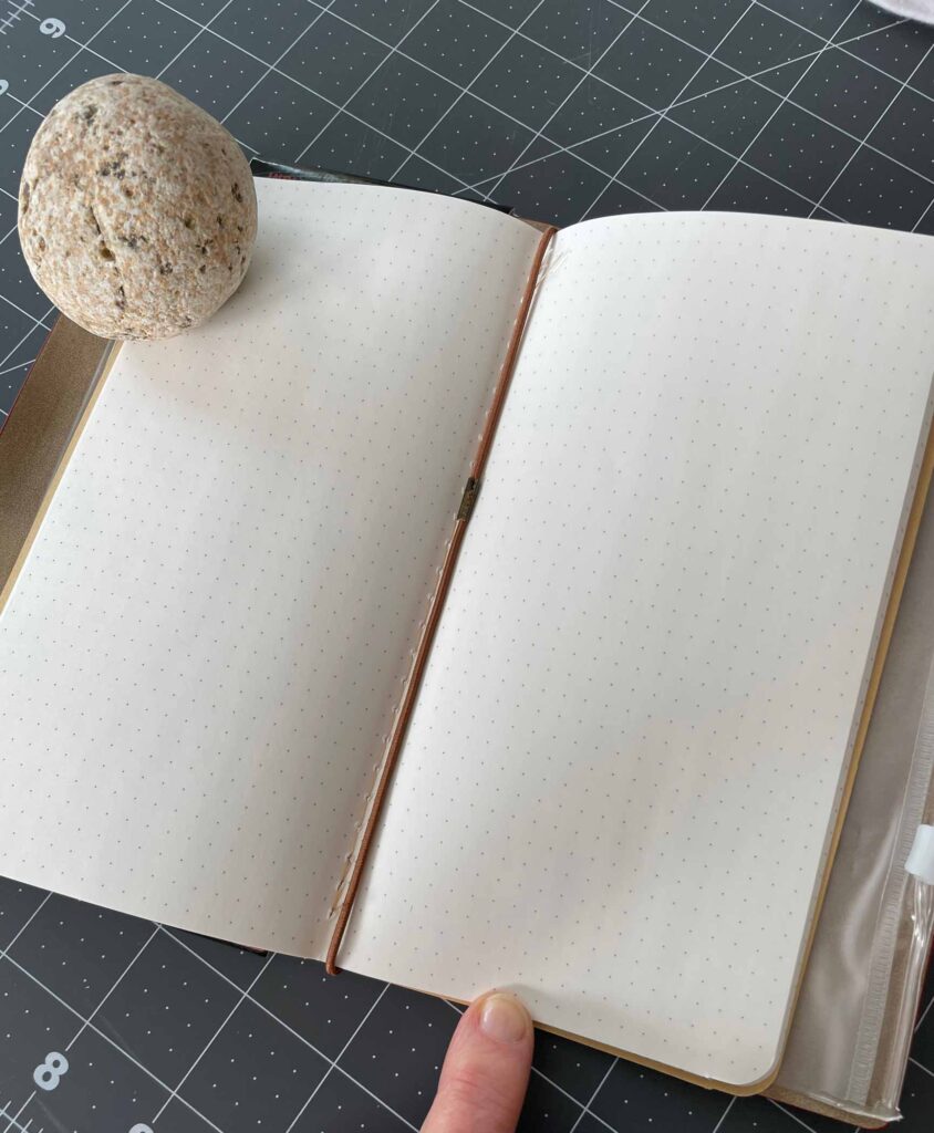
This experiment was geared more toward the paper than the drawing materials or paint. I don’t want to bother with a bulky sketchbook when we travel, so finding the right paper for making my own is key. So far Fabriano Artistico bright white wins.
Overall, I have faith that investigation minus specific goals or time constraints isn’t aimless; it’s the route to eventually cracking open a new realm of possibility. Unearthing unexpected and (hopefully) insightful discoveries between process and materials can only surface by diving down rabbit holes with a mindset of “what if?”.
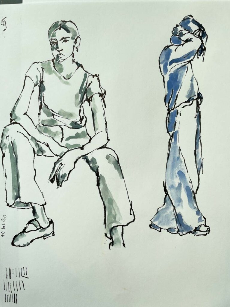
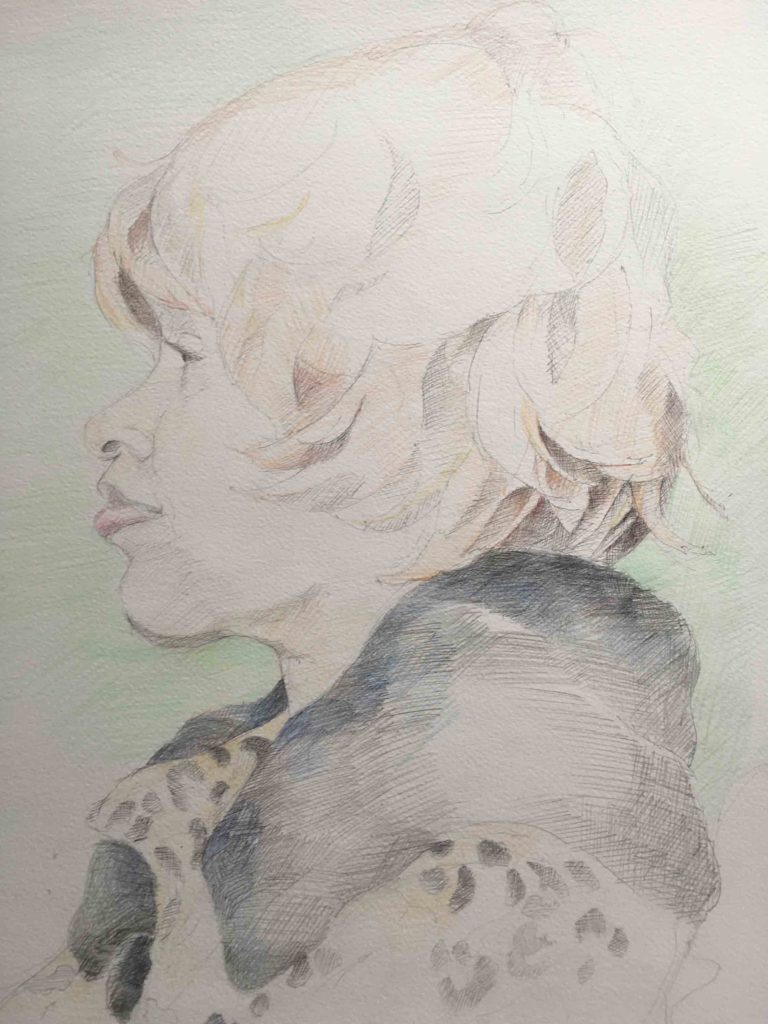
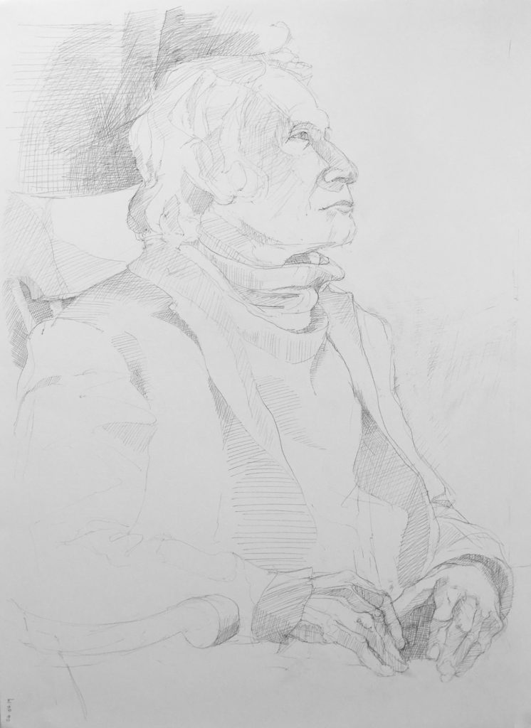
Drawing the models in the endless catalogs that come in day after day makes for an easily accessible source for figure drawing practice on the fly — not to mention helping me feel like the catalogs weren’t a total waste before throwing them in the recycling bin.
So that’s where I’m headed.
✶
Latest inspiring finds:
The Bridge – a series of letters between artists Stacey McCall and Elizabeth Barnett , asking questions about art, creative practice and life. The big things and the small.
And, I can’t wait to visit Paper & Pencil the next time we’re in Chicago. Let me know if you get there first.