Beginning to feel like I had hit a wall this spring, and hoping to make some headway (no pun intended), I signed up for an online drawing anatomy class through Sktchy in March.
@2021 Elizabeth Fram
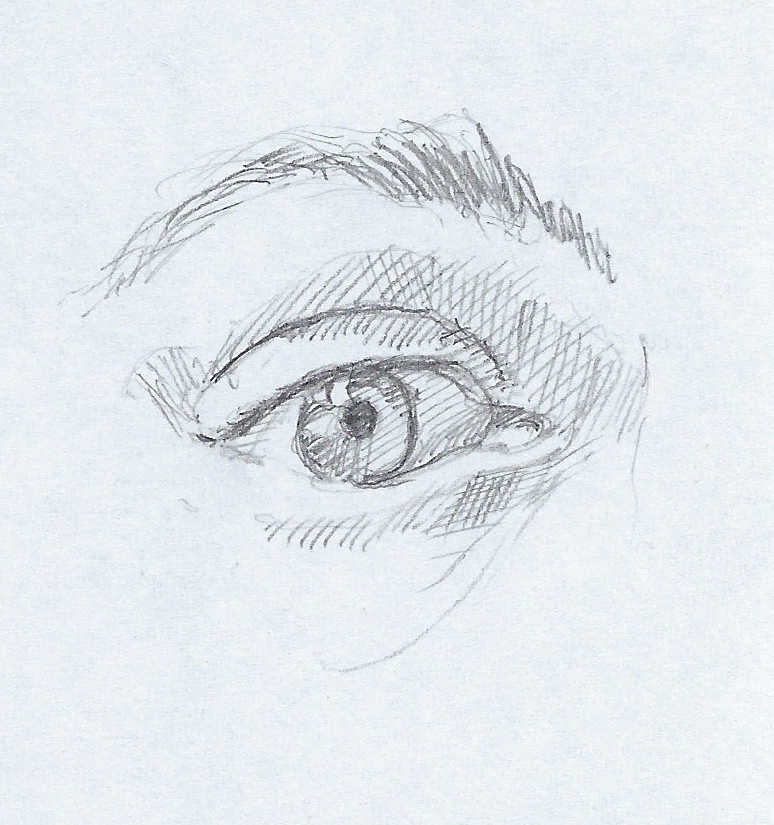
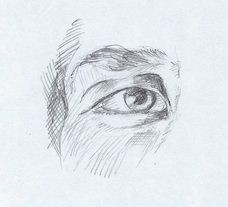
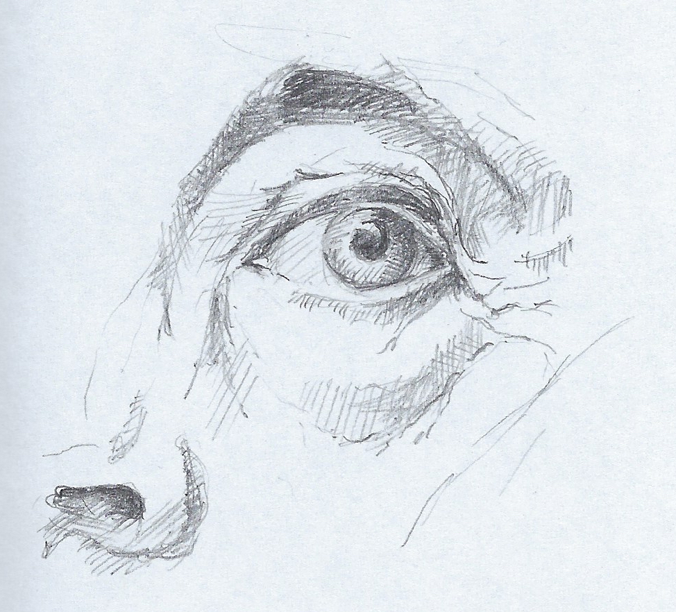
This particular course concentrates specifically on the head. It is divided into separate lessons that go over the skeletal and muscular systems of each feature (eyes, nose, mouth & ears), the skull, and surface anatomy. The teacher is a medical illustrator who covers the material in great detail, referencing her own layered and labeled drawings using Procreate. She draws simultaneously as she explains each feature.
@2021 Elizabeth Fram
Every lesson is followed by a real-time portrait study/demonstration reiterating what we just learned. I’ve found it helpful to draw along with her, listening as I work. I seem to absorb the info much better that way.
@2021 Elizabeth Fram
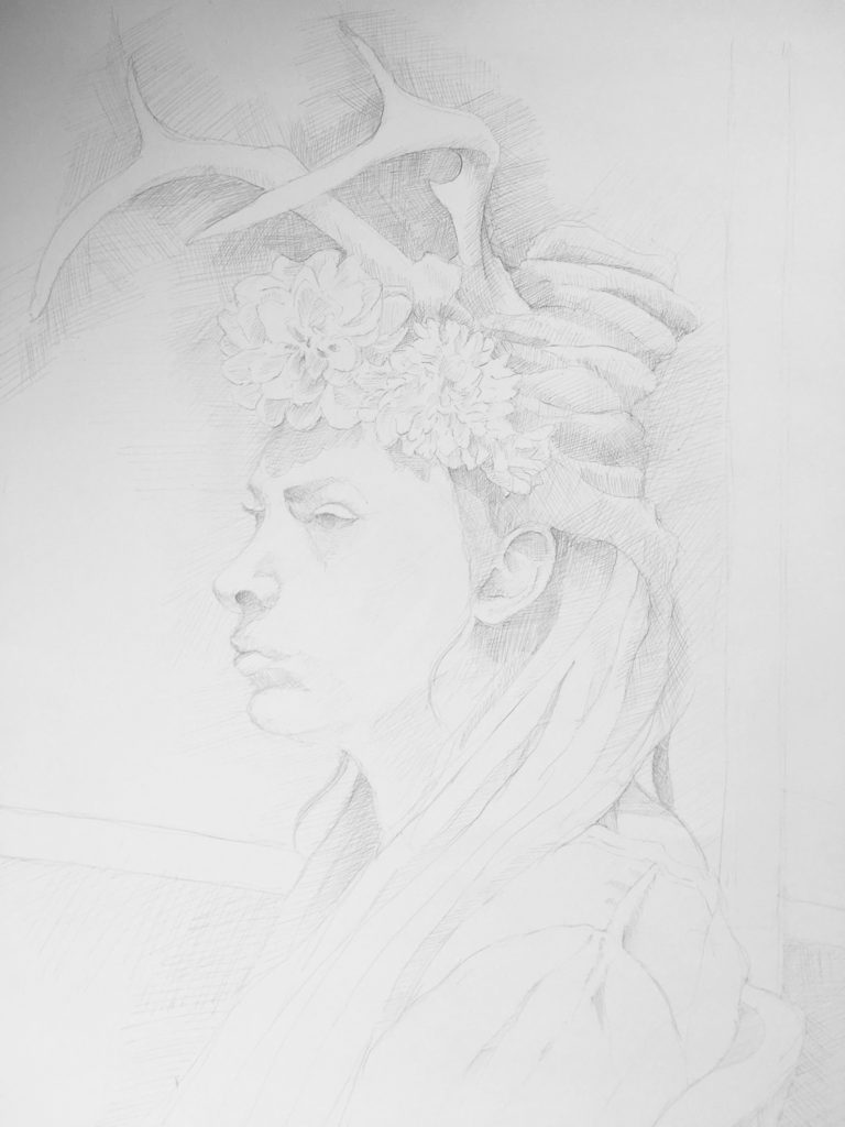
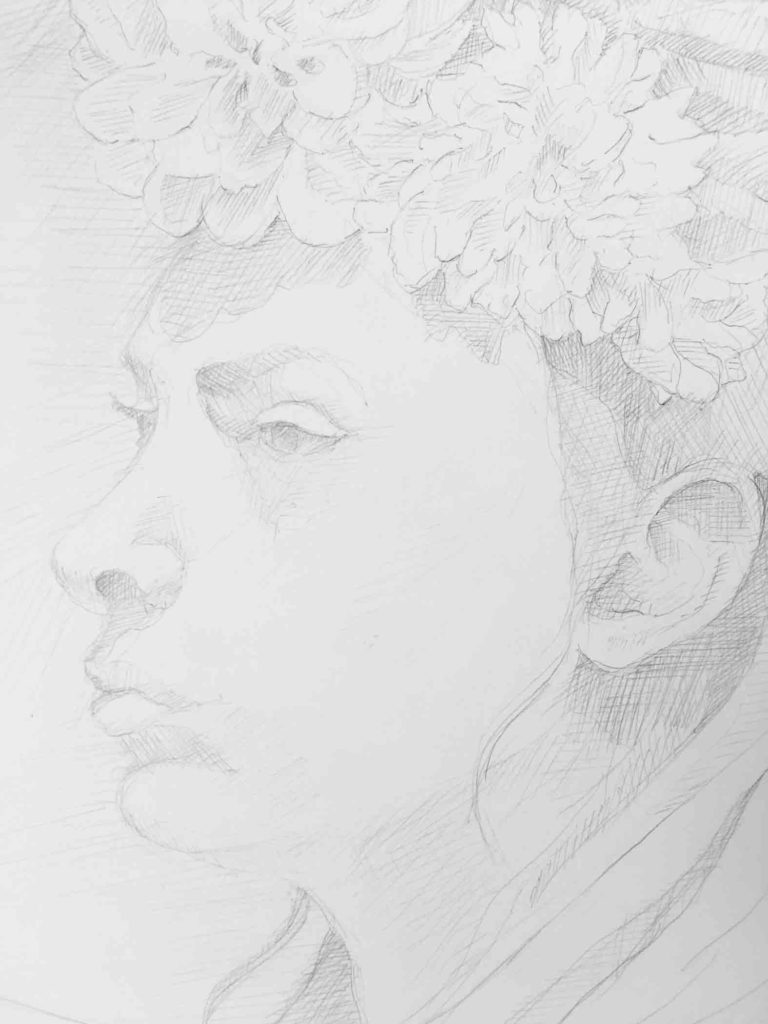
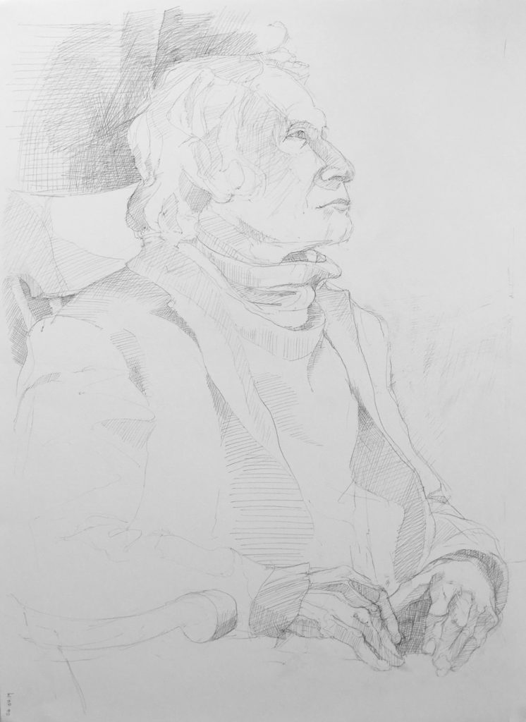
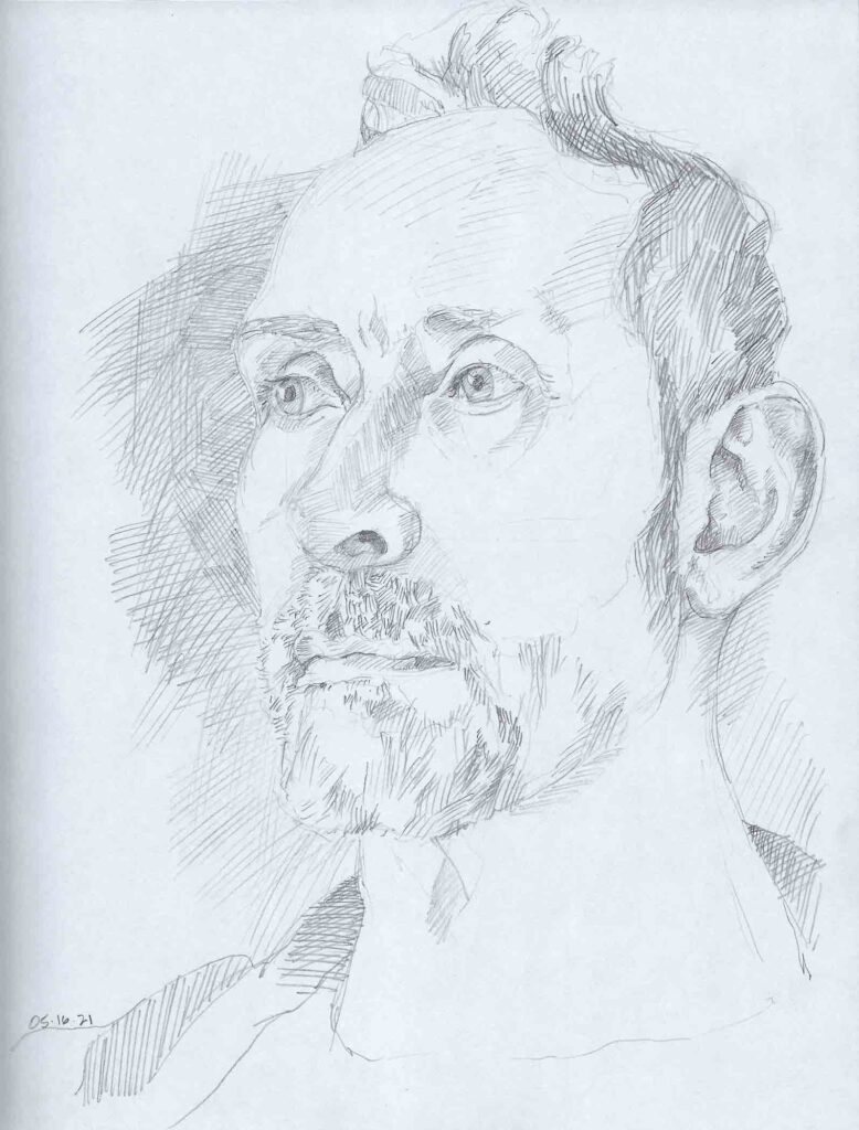
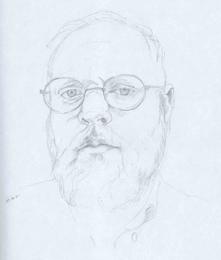
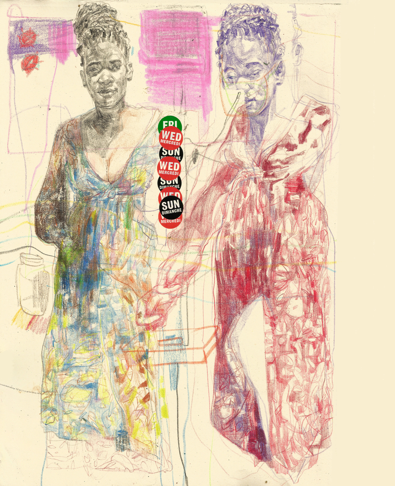
How often do we really look at the faces of those we know and love? The human face is such a rich landscape of information. With other subjects my focus often shifts back and forth between recognizably portraying the object(s) and sliding into an abstraction of shapes and placement. But every time I draw a face I can’t help but get lost in the details. Empathy is always looking over my shoulder, reminding me of the potential depths lying beneath the surface and the ever-present similarities in our differences.
© 2021 Elizabeth Fram
If you’re interested, the class is “Drawing Anatomy with Tiffany S. DaVanzo: Learn How to Draw the Human Face from the Inside Out”. Most of the lessons are between 30-45 minutes long.
As an aside, she really knows her way around the Procreate program, which was fascinating to watch in and of itself. Yikes – another rabbit hole one could very easily drop into and become lost within! I know some of you must have experience with Procreate. I’d love to hear your thoughts – pro or con – and how you rate the size of the learning curve.
©2021 Elizabeth Fram
✷
As you might imagine, I have quite a variety of sketchbooks, each with its own advantages and disadvantages. For the drawings shown here, I’ve been using an 8.5″ x 11″ Crescent RendR. I like the size — big enough to not feel constrained, but not so large as to be unwieldy. It has a soft cover, so is relatively lightweight, and the paper is very smooth, similar to hot press. It is advertised as “no show thru”, meaning that ink of any sort won’t bleed through to the back side of a page. My Tombow pens have proven that to be true. Since I’ve been using graphite with these drawings, I’m much more interested in the smooth surface, the heft of each page and the fact that a kneadable eraser removes lines cleanly and without any surface abrasion. The one caveat is the paper has a slight grey cast, which I think is due to whatever it is that makes it “no show thru”. Because of this, photos of drawings made with a hard lead can appear under-exposed. That doesn’t seem to be an issue with scanning — although you can definitely see the cool slant of the paper in the images above. All in all, the advantages win out over that one downside, so I’m happily filling up the pages of my book.
✷
© Graceina Samosir
My Instagram share this week also falls in the portrait drawing arena.
I’m always captivated by the gestural and complicated work of Graceina Samosir who packs a lot of punch and information into every drawing. @graceinasamosir