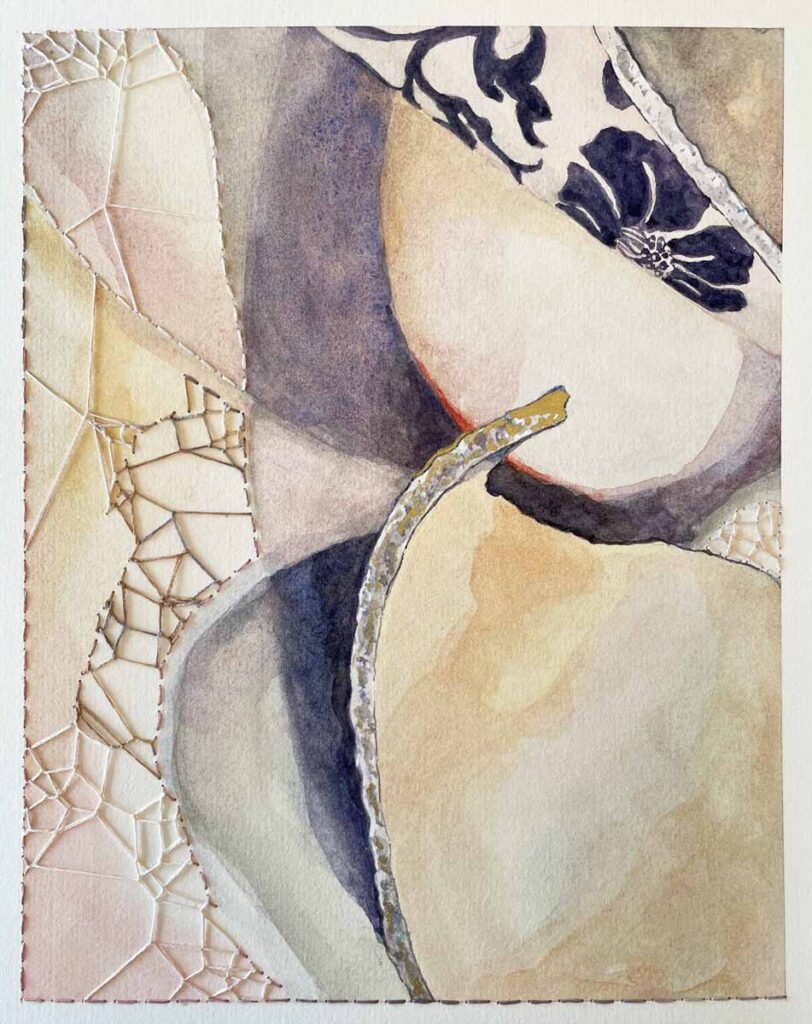
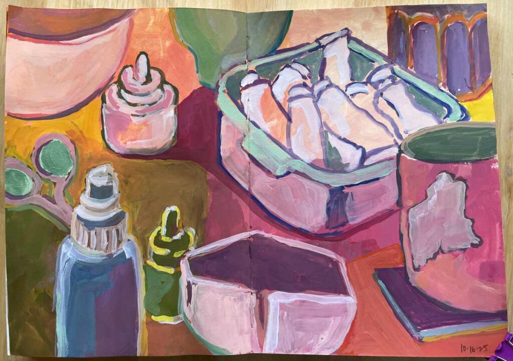
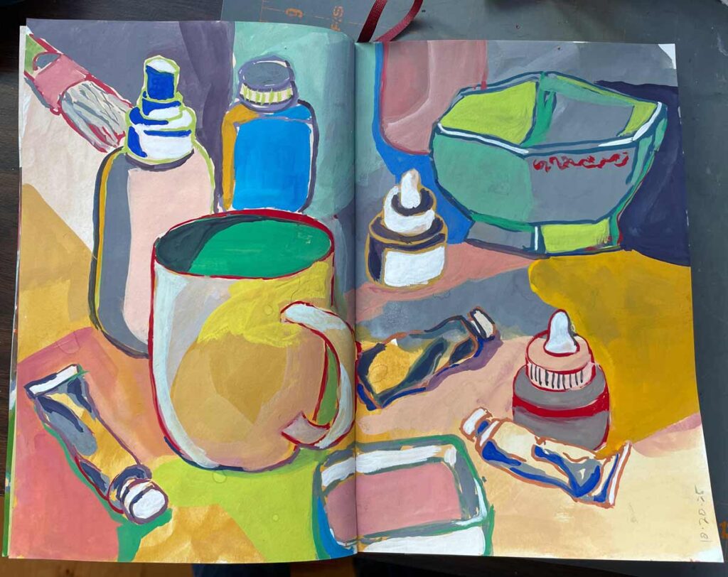
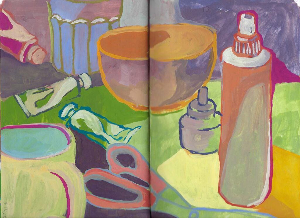
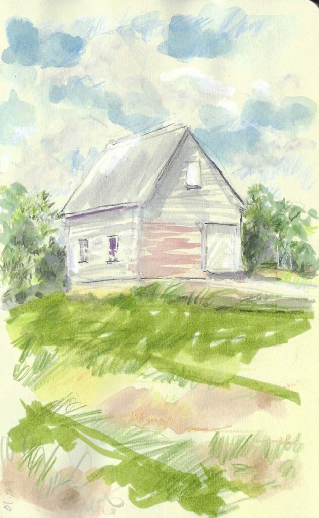
I don’t have too much to offer you this week. My head has been buried in website-related nuts and bolts and piecing together the first stabs of a barely-begun project that’s nowhere near ready for prime time. Oh – and I’ve been happily making messes in my sketchbooks while just as excitedly cleaning up in preparation for a much-anticipated houseful of family.
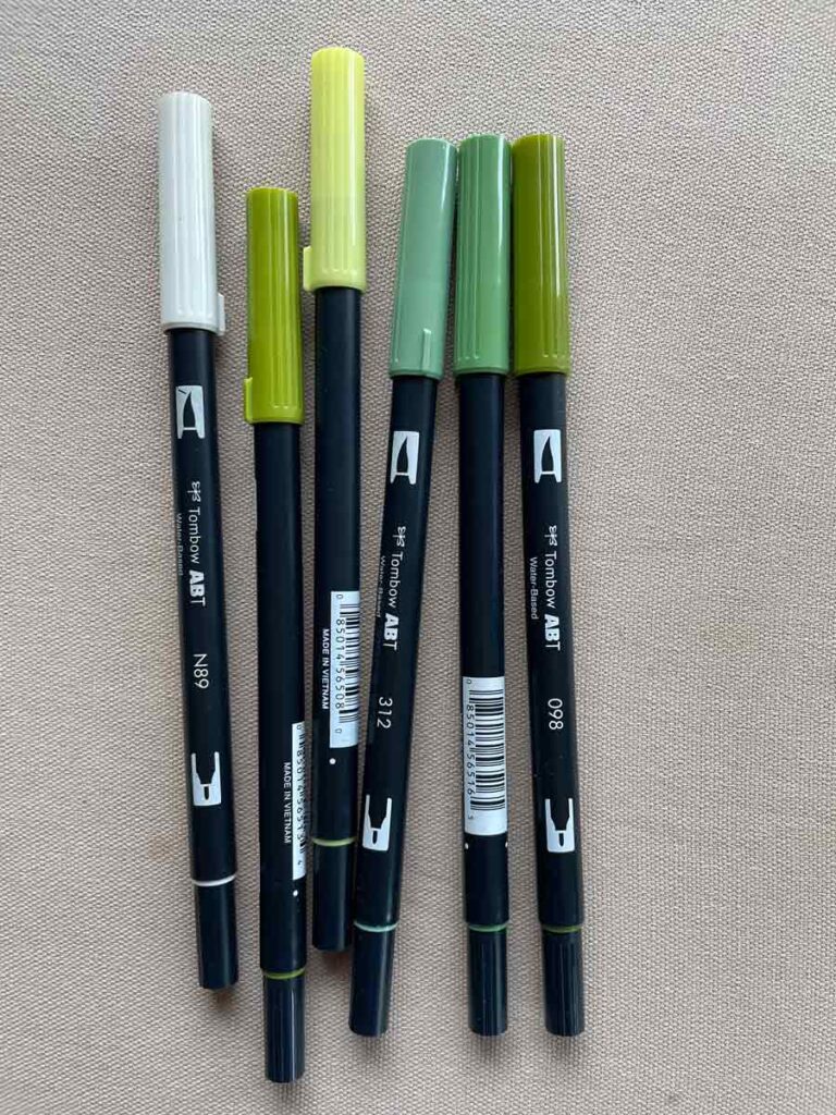
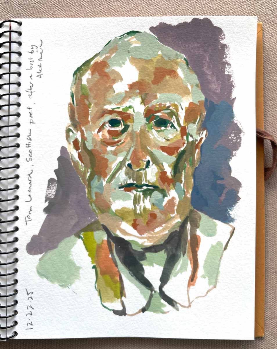
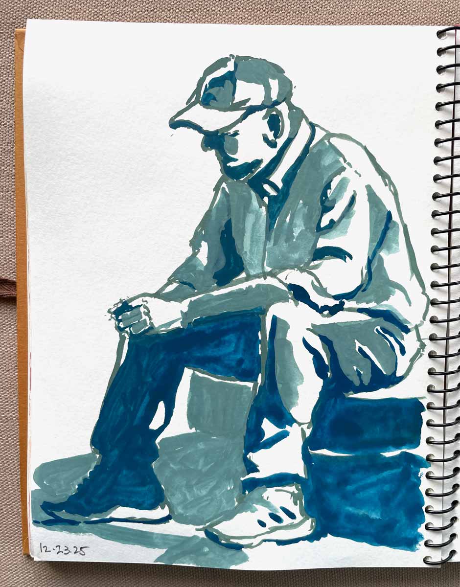
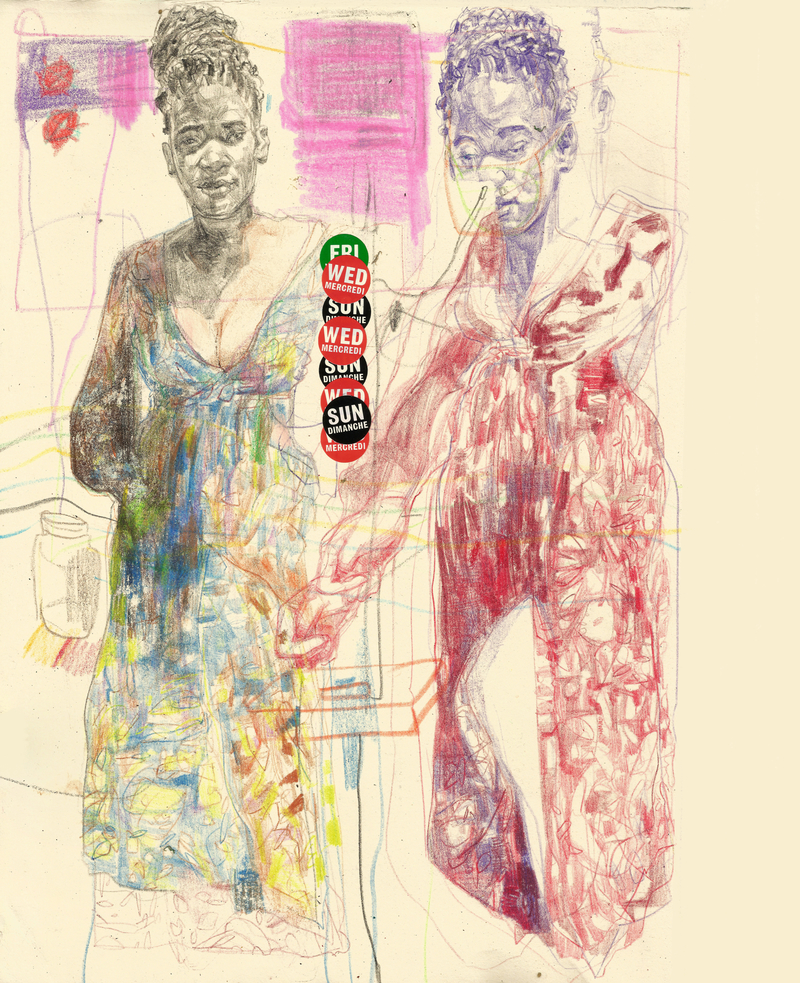
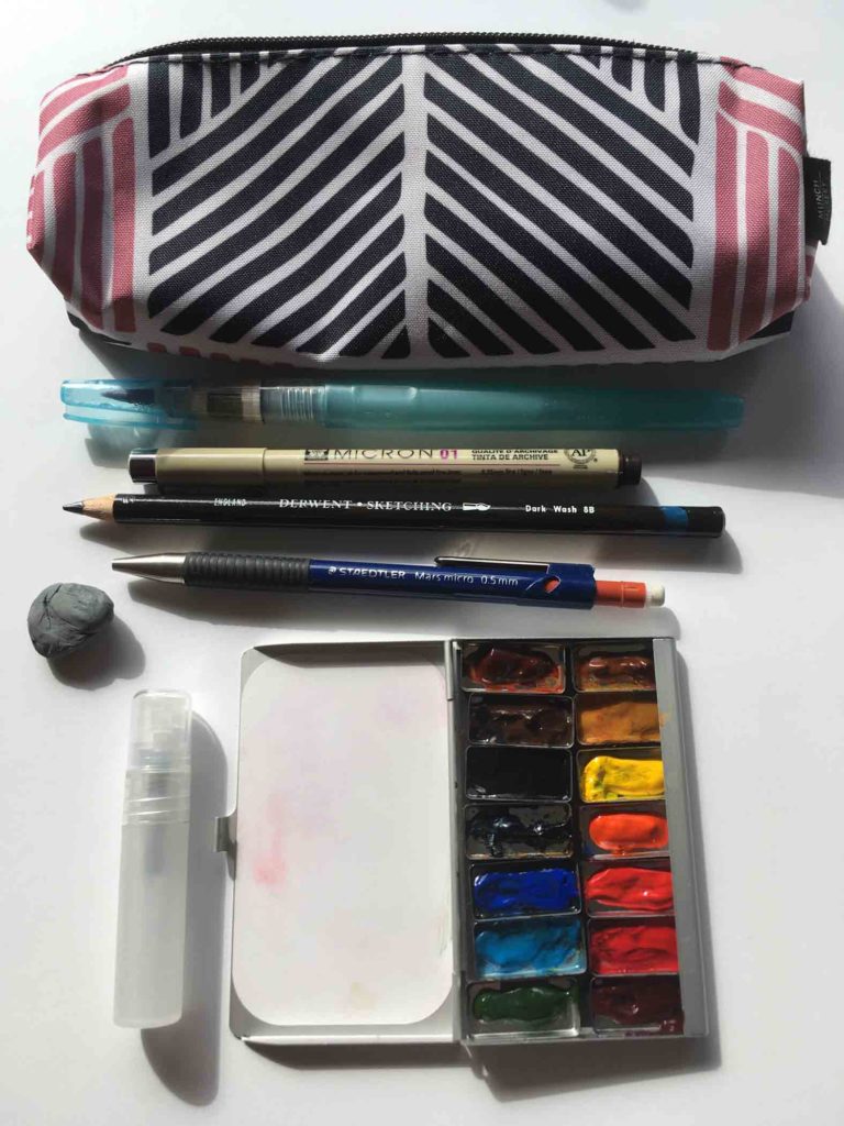
Tombow dual brush pens have been my go-to supply lately. Easy to transport and pull out in the moment, they have a flexible brush tip and a fine liner at either end. Plus, they’re water-based, so no smell and their color can be pushed around and muted with a wet brush (something I rarely do, but it’s an option). They’re acid-free but aren’t archival or light-fast, so best for sketchbook work which rarely sees the light of day.
That said, I don’t want to leave you without something to think about.
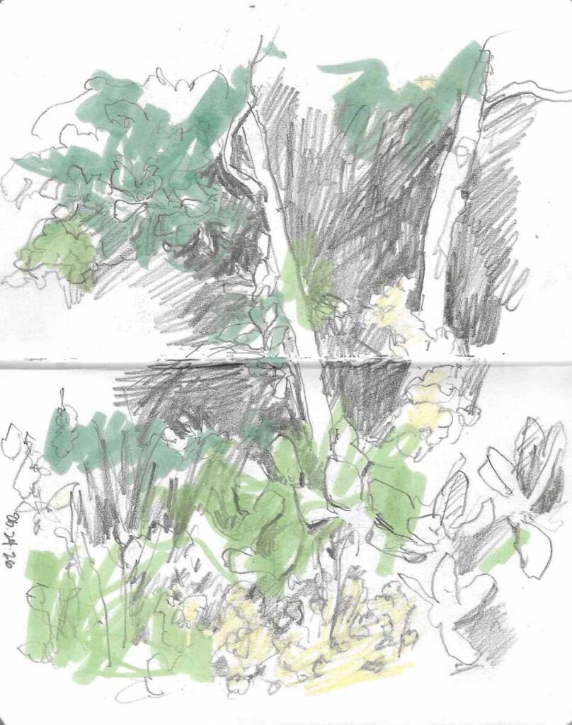
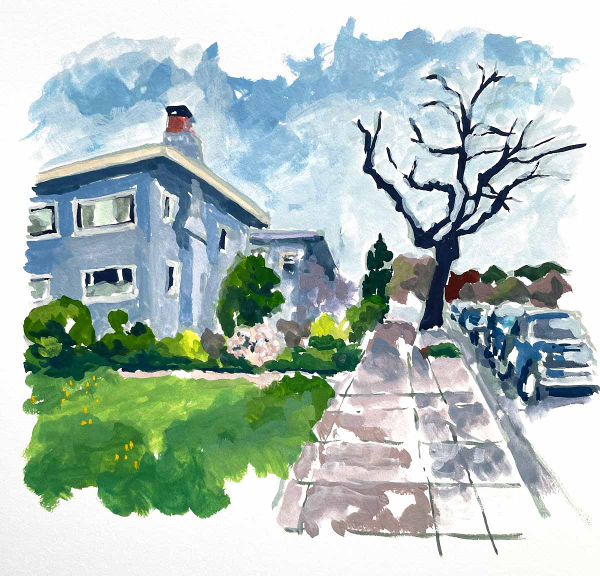
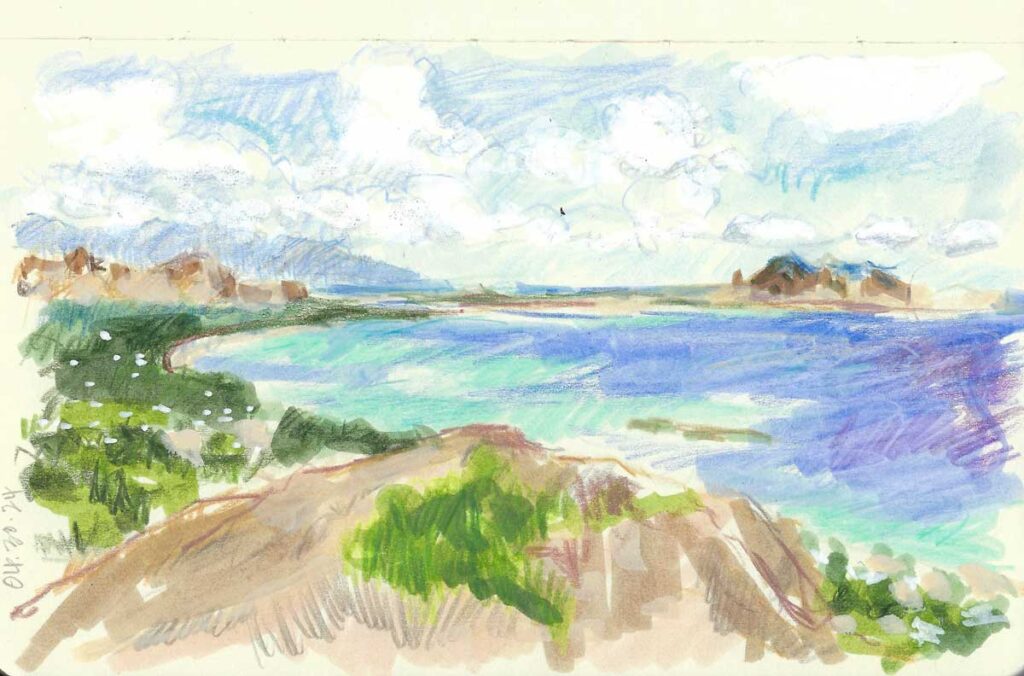
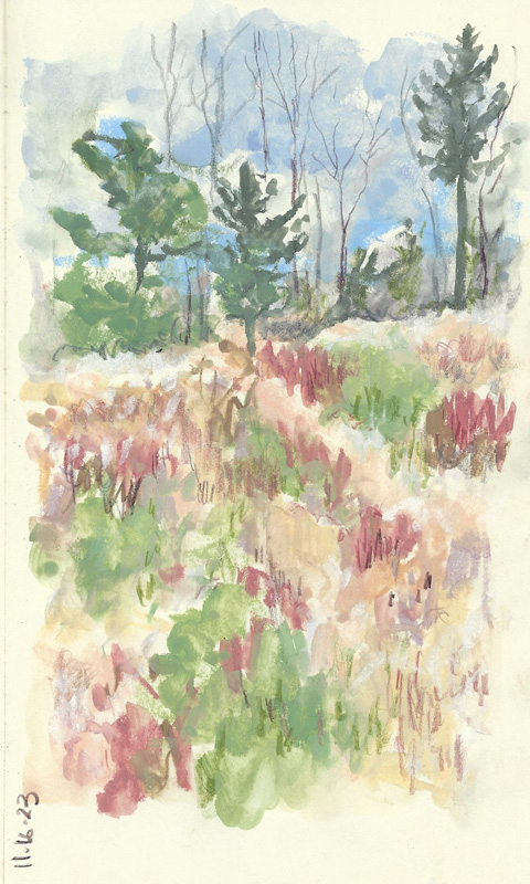
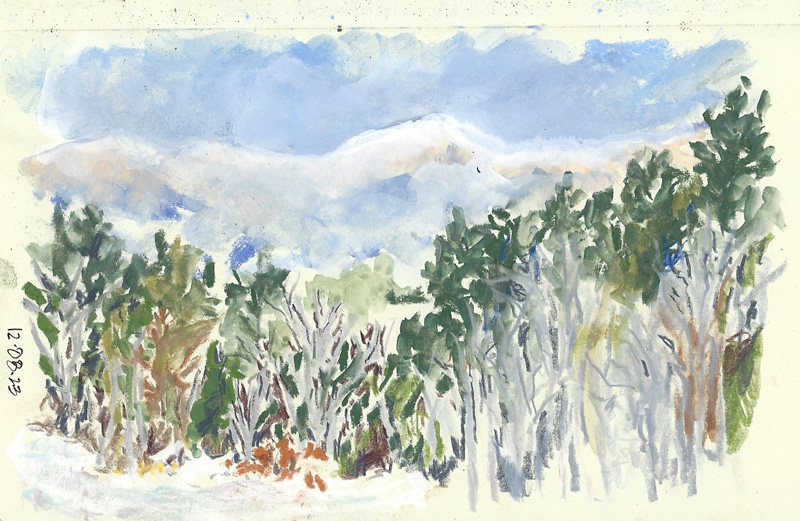
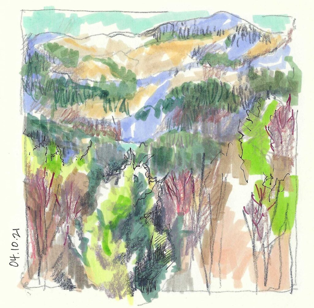
Back Garden Sketch I have been trying to train myself to work more quickly, which means narrowing down my supplies. The Tombows allow me to lay down color quickly and to then fine-tune with a pencil or pen.
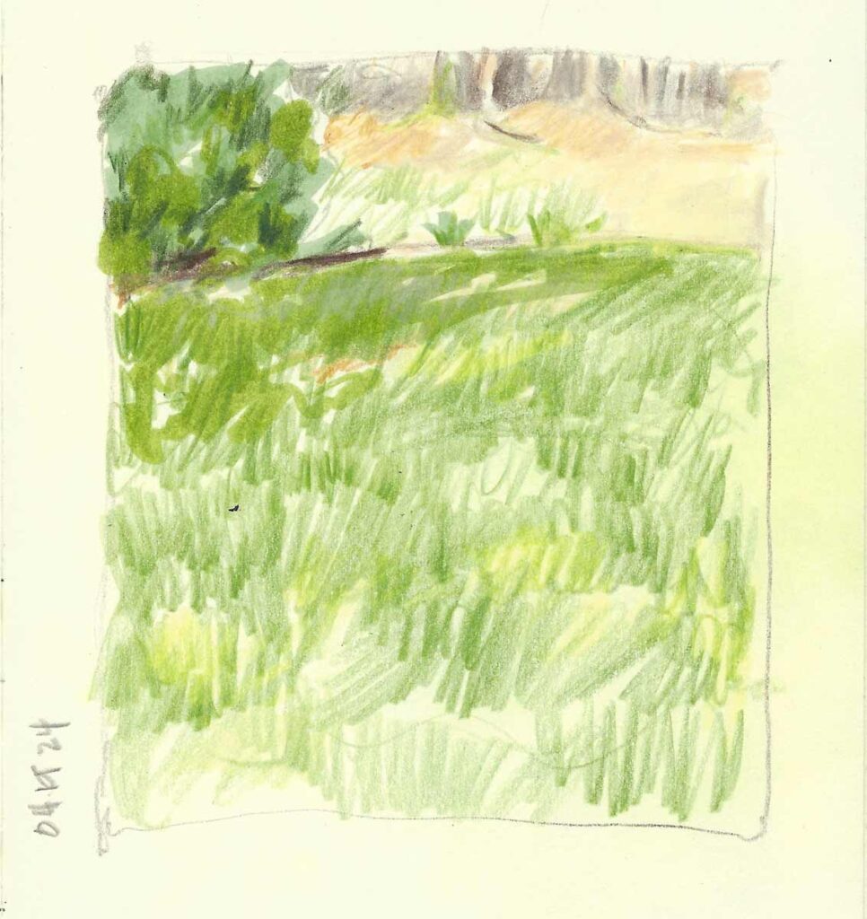
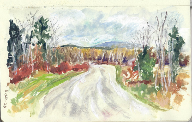
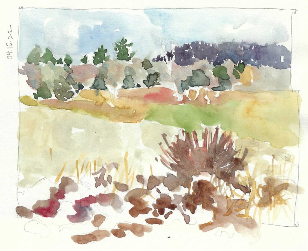
We had a very rainy and cool Spring here in the Green Mountain state this year. However trying it was in the moment, it is paying off in spades now. Gardens everywhere, both natural and cultivated, are lush and bountiful — so color is king.
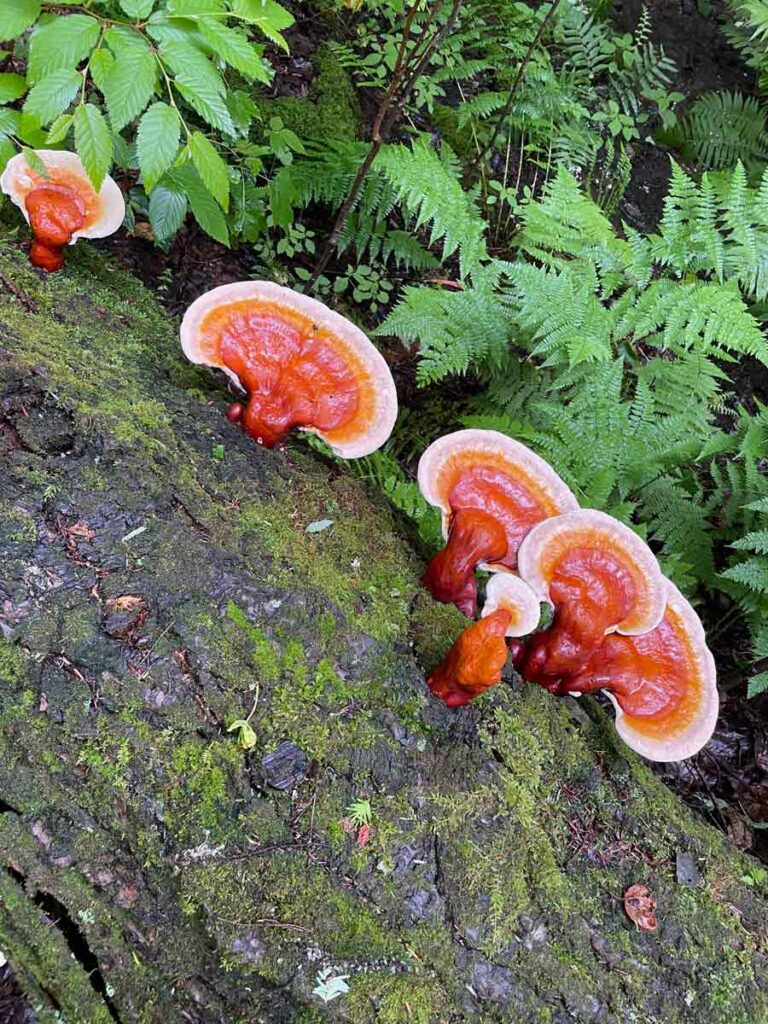
The eye popping orange of these Ganodermas, surrounded by all the green of our woods, is just as stunning as the peonies that are in full bloom in our house garden.
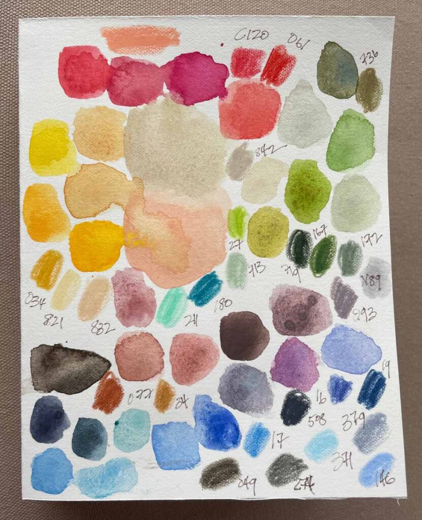
With that in mind, Lorene Edwards Forkner wrote a couple of months ago on her Substack about the joy of “collecting” colors. I love her idea – especially for those of us who live where summers are particularly brief. Who wouldn’t be grateful for a visual boost when the dead of winter rolls around again?
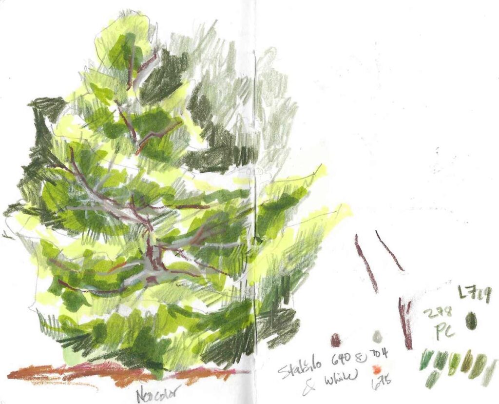
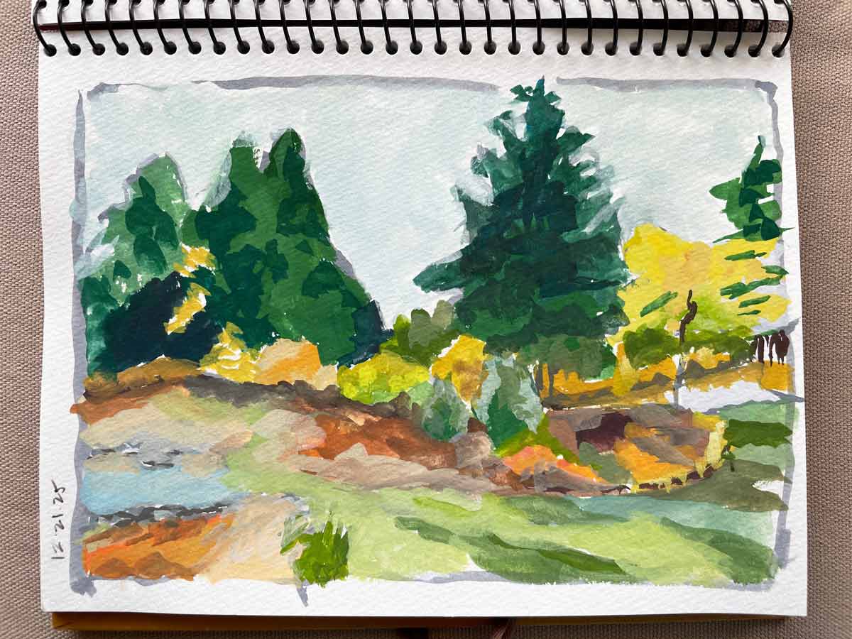
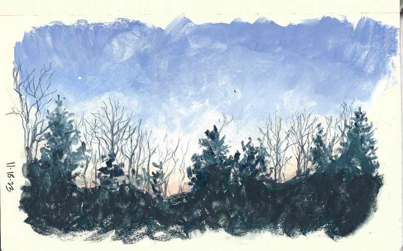
We have a Korean fir with a lovely shape. I first laid down its structure with Tombows, and then used colored and pastel pencils to fine-tune with textural marks that give the drawing life & energy.
It’s easy enough to snap some quick photos as you move through your day. The upside is that thinking about color in this way is an easy opportunity to connect with your practice, whenever or wherever — whether in the most boring of moments (like waiting in the grocery line) or when life is too busy to carve out time to get into the studio. It’s a total win-win.
And I’m sure, with a bit of thought, there are ways to organize your own color collection that will make it unique and useful for your specific practice.
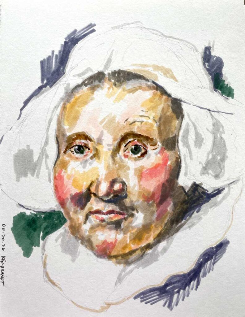
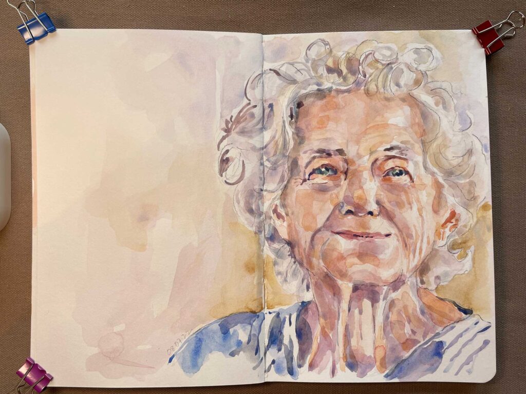
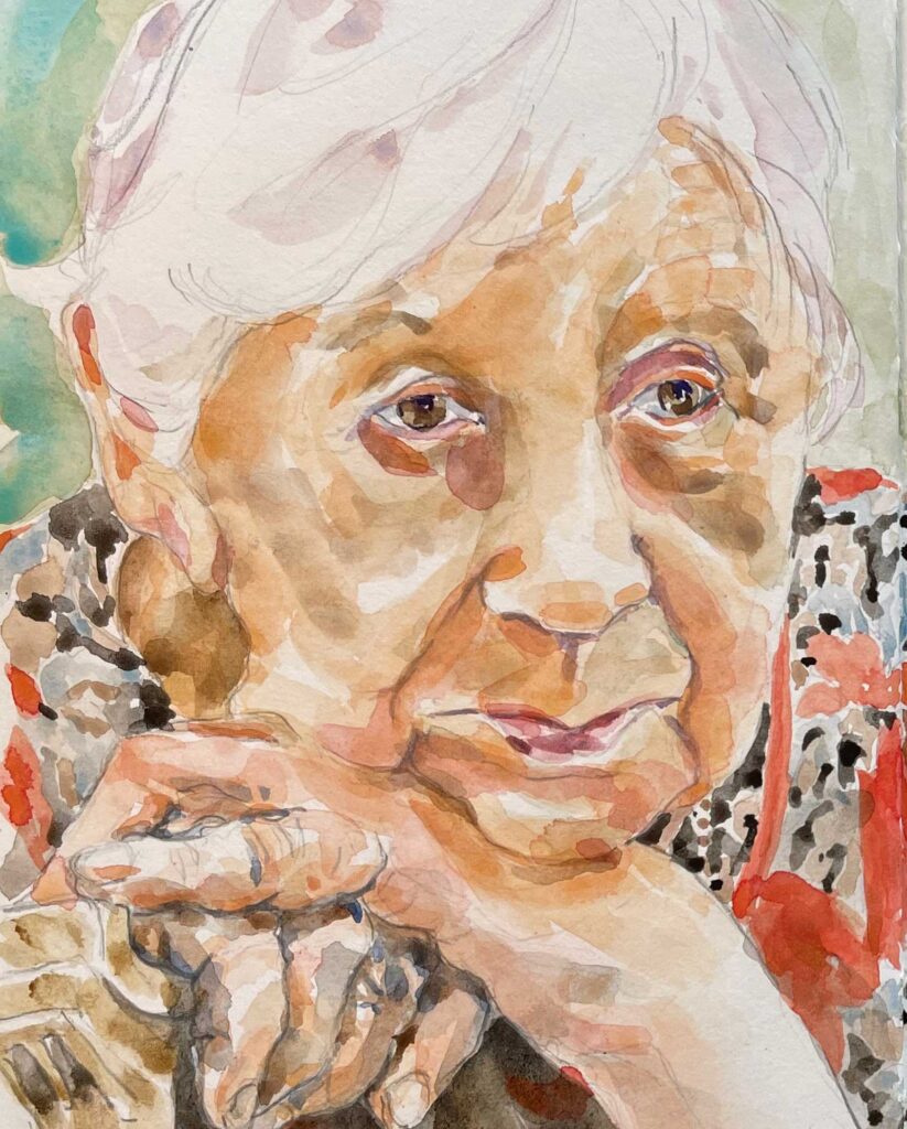
My copy of Rembrandt’s “Portrait of Aeltje Uylenburgh” (1632) illustrates Tombows layered over each other. With watercolors or gouache, one can just mix whatever color is needed. But because Tombow pens have a comparably limited color range, using them is a great exercise for practicing getting the right color and tone by combining the colors at hand.