Tag Archives: Stillman & Birn

My #1 Investment

First, my thanks to those of you who commented on my last post with your own reading recommendations. If you didn’t see those contributions, be sure to check them out. I have one more quick addendum of my own: the Strong Sense of Place podcast #65 centers on museums and includes an intriguing line-up of museum-related reading to dive into.

Kind Eyes

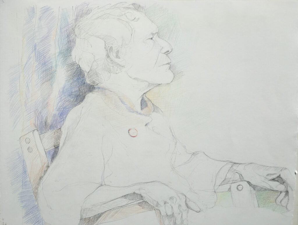
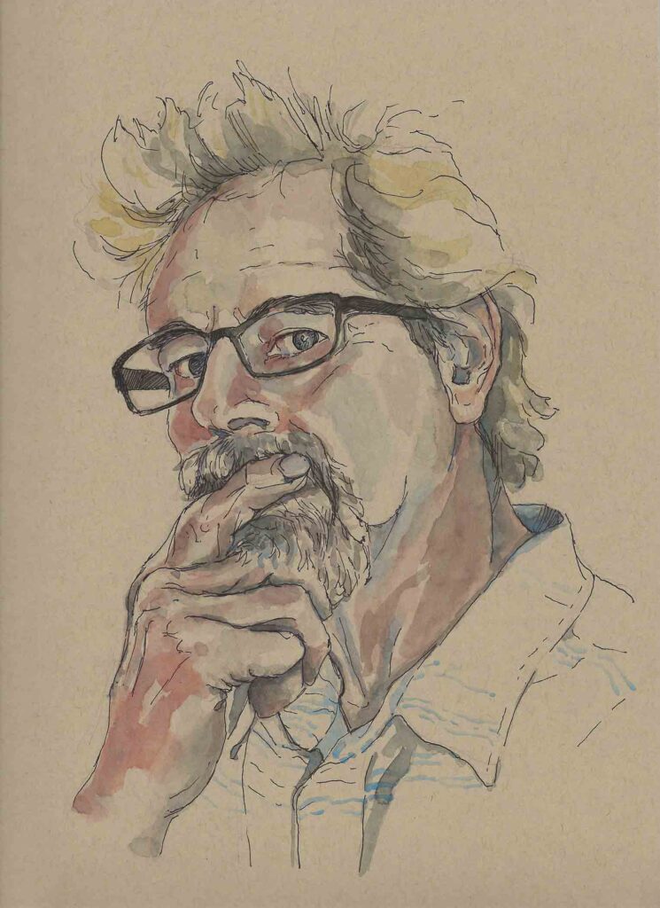
Kind Eyes    ©2022 Elizabeth Fram, Watercolor and graphite on paper, 8.5″H x 11″W

Meanwhile, I’m feeling pretty good about having taken care of a necessary chore by weeding through and reconfiguring the portfolio section of my website. Doing so is one of those time-consuming admin duties that accompanies uploading a chunk of new work. One change inevitably leads to another, so making these edits is always a bigger job than I anticipate – which is why I tend to drag my feet getting started. Spending days in a row at the computer feels like such a waste in the moment, but I have to admit the results are very satisfying once the job is done.

Daily Rhythms

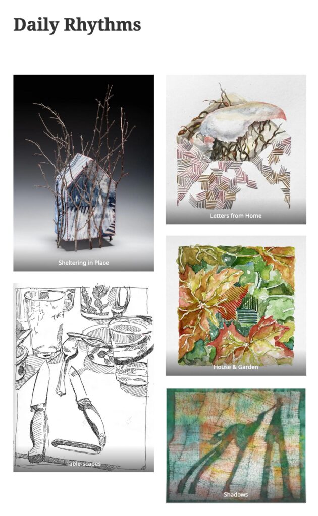
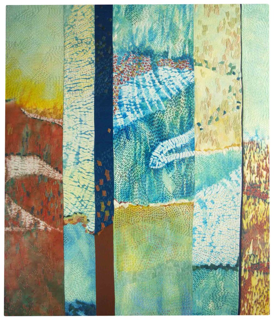
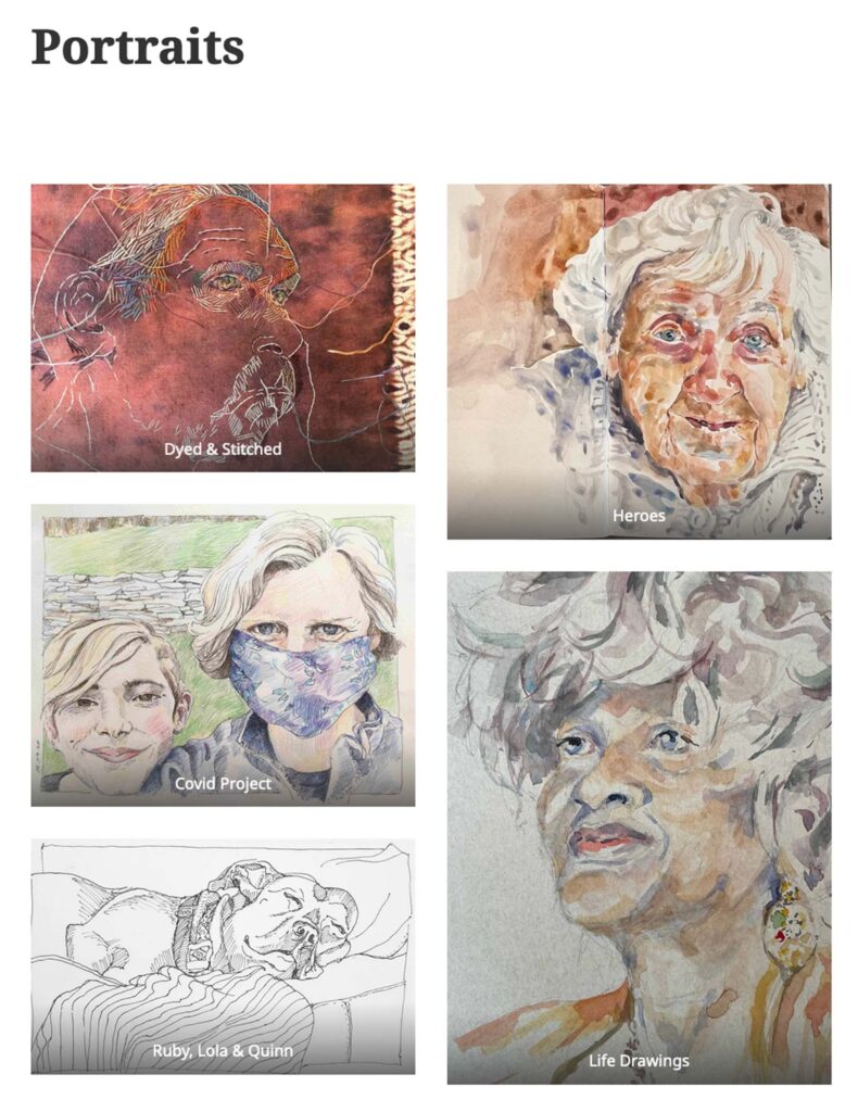
As I began, I took a step back to try to see the big picture and it occurred to me that pretty much everything I make falls into one of two categories: “Daily Rhythms” or “Portraits”. So this time, rather than organizing my work chronologically, I’ve grouped all series under those two umbrellas. Ostensibly it may seem like just a menu change, but there’s a lot more behind the switch. The results feel crisp and concise. I invite you to explore the new drop-down menus to see what you think.

Portraits

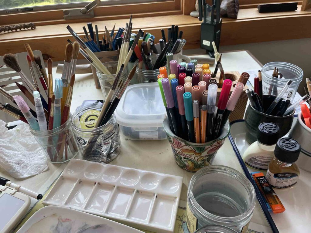
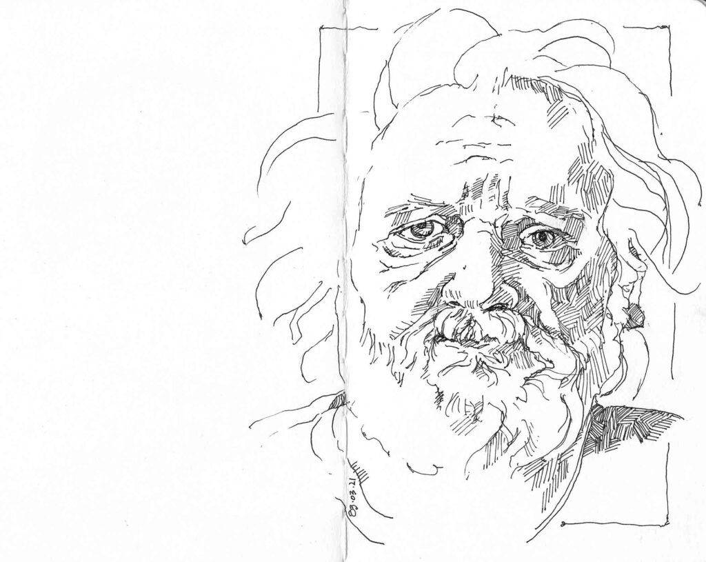
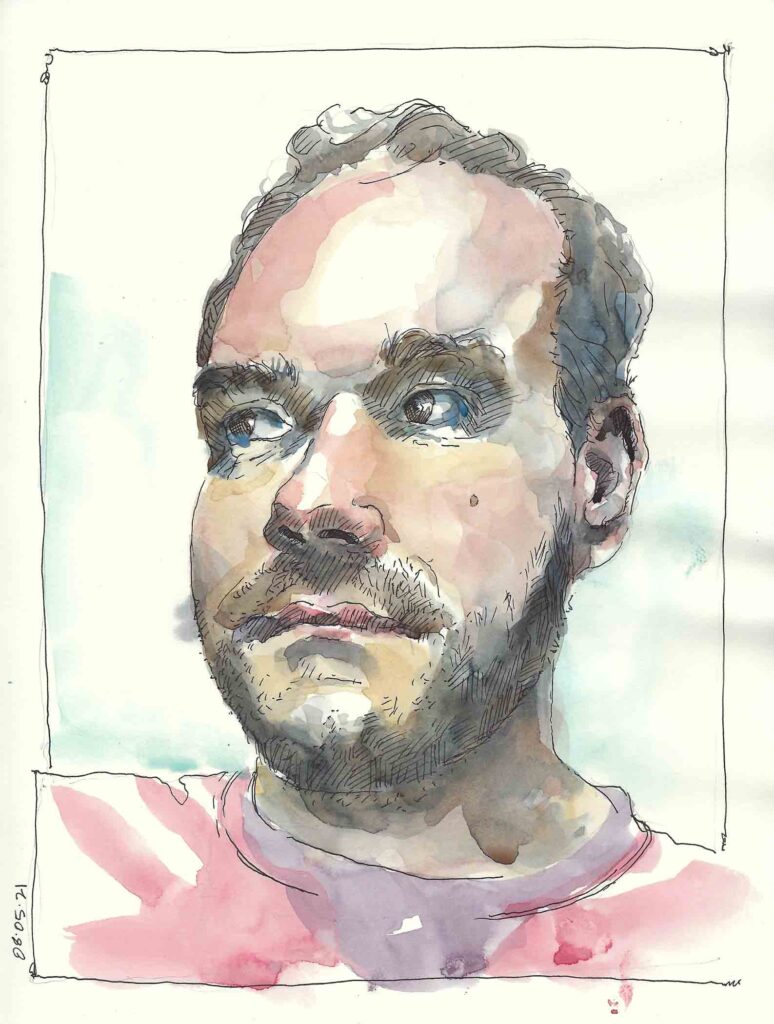
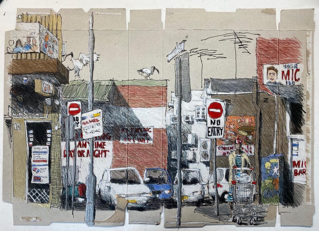
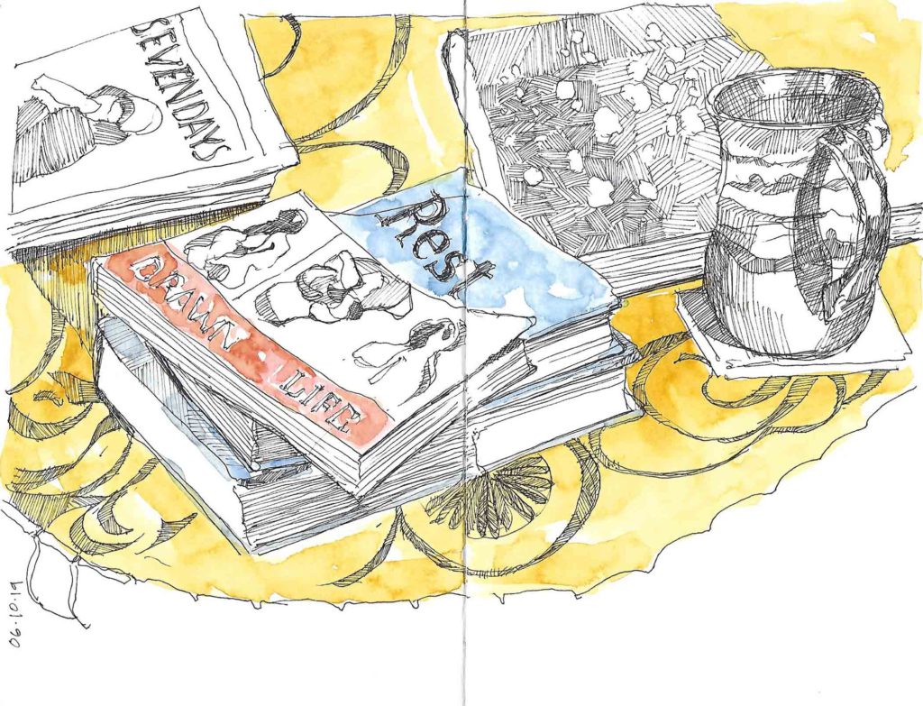
Lastly, I’m doggedly plowing my way through the Stillman & Birn Beta sketchbook that I’ve devoted to portrait sketches this summer. With each new addition I learn a little more and feel more confident in the results. Practice makes for progress, and as I work ideas are beginning to hatch in anticipation of completing the last page and moving forward toward stand-alone pieces that incorporate stitch.

Confident Smile

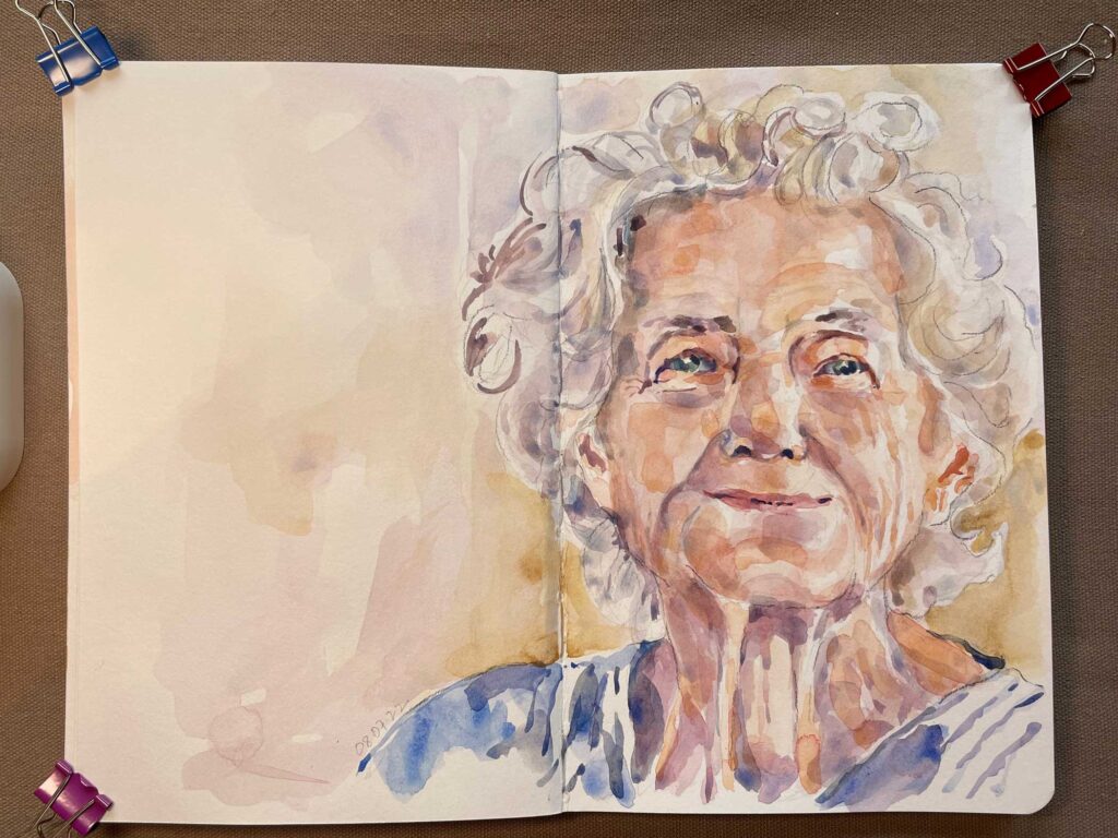
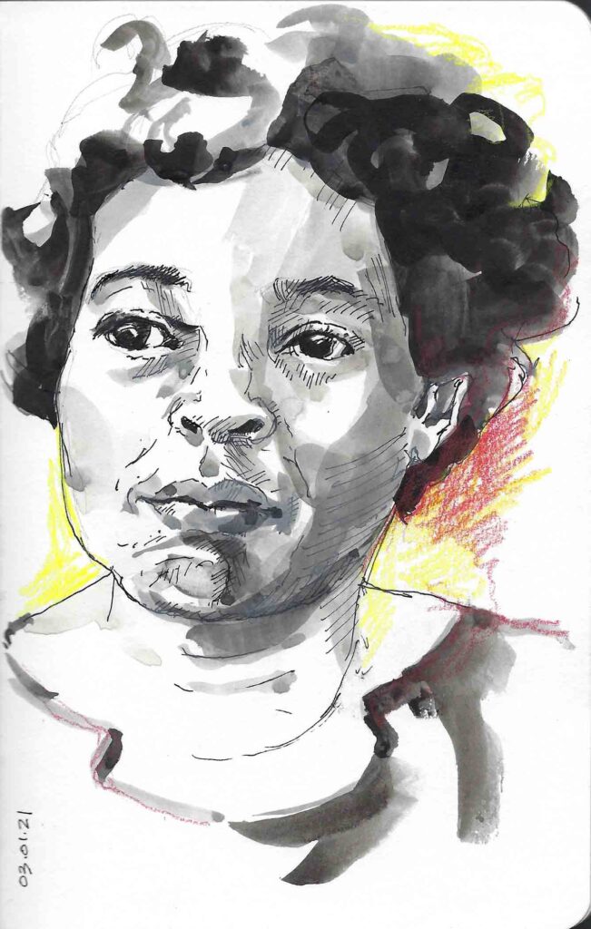
Confident Smile    ©2022 Elizabeth Fram, Watercolor and graphite on paper, 8.5″H x 11″W

I’ve been concentrating on these two projects since mid-June and working on them has reminded me that the most important investment I can make in the studio is simply time. Time to practice, time to think things through and reevaluate, time to make mistakes and definitely time to experiment.
Overall, I think it’s starting to pay off.

Pensive Detail

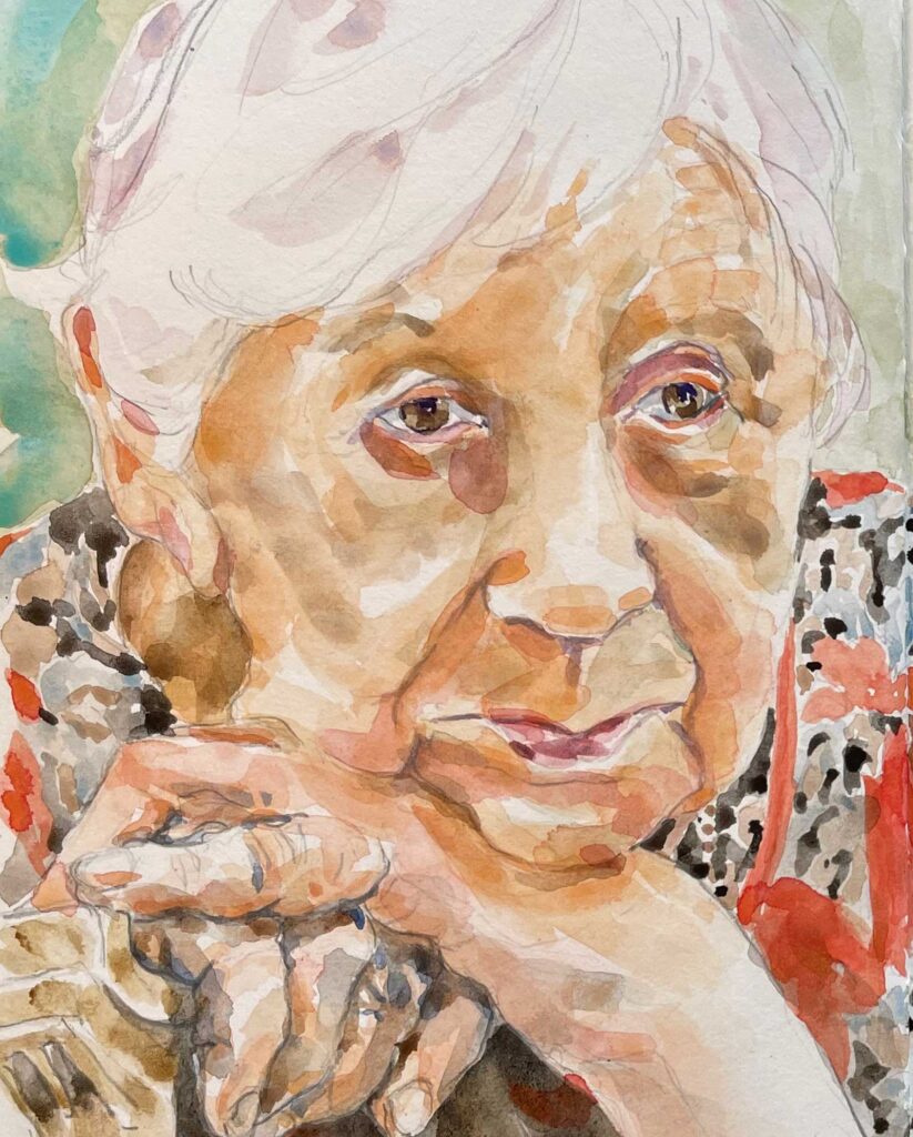
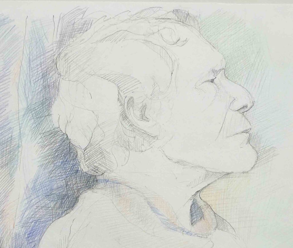
Pensive, detail   ©2022 Elizabeth Fram, Watercolor and pencil on paper, full size 8.5″H x 11″W


Gearing Up

After a hiatus of a year and a half, it looks as though our Life Drawing sessions will start up again in early September. Here’s hoping the rising variant numbers don’t interfere with that.

Supplies

In the meantime, I’ve been gearing up by getting back into practice mode and collecting supplies along the way. I’ve had plenty of time to experiment with new materials over the past 18 months, so my kit will be a little different from what it was when we last got together in March of 2020.

Scott

Scott ©2019 Elizabeth Fram, Graphite and colored pencil on paper, 18 x 24 inches.  Canson Edition paper

The biggest change will be paper. Be forewarned – this is a deep dive into options, probably best suited to those of you who draw.

Before the pandemic I had been using Canson Edition paper exclusively. It’s 100% cotton and acid-free with two deckle edges and two distinct sides, one smooth and the other slightly textured. It’s a good workhorse that accepts a variety of media. For my purposes, its greatest asset was in capturing the marks of my ultra fine (.03) graphite. The downside is it doesn’t show off colored pencil as richly as I might have hoped.

Scott Detail

Scott, detail

This past year, working smaller & mostly in sketchbooks, I discovered several new options as I began working more with watercolor in addition to ink and graphite.

Daisy Bates

Daisy Bates © 2021 Elizabeth Fram, Ink and colored pencil on paper, 8.5 x 5.5 inches.  Stillman & Birn Beta Series sketchbook

Old Man

Weathered ©2021 Elizabeth Fram, Ink on paper, 8.5 x 11 inches.   Stillman & Birn Beta Series Sketchbook – note that the page opens flat, making drawing across the gutter a snap.

Stillman & Birn makes sketchbooks with eight different types of paper. The Beta Series is my favorite. It has a lot of great qualities: acid-free, bright white paper that handles ink and watercolor beautifully and, despite being cold press, has a surface that my pen seems to glide across effortlessly. Each page has some real heft (180 lb) so there is no rippling and it stands up to erasing without damage. Plus, it’s a good weight for stitching if, as with my garden paintings, I choose to go that route. Happily, it’s also available in 22 x 30″ sheets, giving me lot of flexibility with size.

Thinking

Hmmm ©2021 Elizabeth Fram, Graphite, ink and watercolor on paper, 12 x 9 inches. Strathmore 400 Series Toned Mixed-media paper

I’ve also been experimenting with toned paper.
Strathmore 400 Series Toned Mixed-media paper (acid-free, 184lb, 9×12″ sheets) takes ink and other wet media well, while its smooth surface amplifies the marks of colored and pastel pencils the way I like.

Quinn and Stillman & Birn

Stillman & Birn Beige toned sketchbook, 8 x 10 inches

I also just bought, but haven’t yet tried, a Stillman & Birn Nova Series beige-toned mixed-media sketchbook. The 90lb paper will take ink and light washes, so I expect it will be good for general practice, as is my Global Hand Book sketchbook.

Global handbook

Bryan ©2021 Elizabeth Fram, Graphite, ink and watercolor on paper, 11 x 8.25 inches. Global Art Hand Book Artists Journal. This paper is also able to take a light wash, but note the rippling on the right, captured when I scanned the image.

Experimentation is half the fun, and it’s great to have a few new options. Whether or not we actually make it back to meeting in person – and I really hope we do – it’s exciting to think about as I get prepared.

If you aren’t one of my newsletter subscribers (you can sign up here), you will have missed my notice that next week I will be participating in a panel discussion with 3 other artists who also have work in the ongoing exhibition Hidden Messages: Old and New, on Wednesday, August 18th @ 7pm. I hope you will join us – the details and link to registration are below.

Artists Talk

Signify: A Conversation about Meaning and Technique

will be moderated by Leslie Roth, with a panel of
Jennifer Davey, Marya Lowe, and yours truly.
The presentation is free and open to the public; register here.

Instagram of the week:

©Peter Rush

© Peter Rush

It doesn’t have to be all about fancy, store-bought paper. Check out the work of @peter_rush_drawings. He often draws on the inside of cardboard packaging – a novel take on toned paper!

Refuge

Last weekend I attended a symposium named “Art Meets History” at The Rokeby Museum. Overall, I enjoyed the discussions that evolved as the day progressed, but I left feeling a bit lukewarm about how well the presenters met the mark in aiding us to draw connections between our individual art practices and history.

Clementines

Clementines    ©2019 Elizabeth Fram, 8.5 x 11 inches, Ink and watercolor on paper                      In an effort to add color to my sketchbooks I am experimenting with adding it in a limited way. I have been trying out a new sketchbook that I’m quite pleased with: 5.5 x 8.5 Stillman & Birn Beta Series, soft cover mixed media sketchbook with extra heavyweight, archival, white, cold press paper. I got it from my local art supply store, but Dick Blick also carries them.

But that isn’t the subject I’ve been mulling over this week. It’s not unusual to go to an event expecting one thing and to come away having gleaned something completely different. And that in itself can be worthwhile.

For me, the most important moment of the day was when another of the participants shared an experience of personal affront and crisis that was so overwhelming she couldn’t keep it to herself. It is not my story to share, but it led to a discussion and exploration of ways that art, as a form of expression and protest, can be a conduit for bringing awareness, catharsis, and perhaps even change.

These aren’t easy times and there are any number of worthy issues to dominate our consciousness, all meriting attention and consideration. Art provides one of the most salient platforms for bringing awareness and for expressing the myriad feelings and ideas that accompany thorny topics.

Olive Oil and Pears

Olive Oil    ©2019 Elizabeth Fram, 8.5 x 11 inches, Ink and watercolor on paper

Vermonters are not shy about expressing their opinions and concerns; there is excellent work being made here that carries an underlying message — whether about the environment, our current political climate, or any other of a host of important issues. I often find myself feeling a bit out of step as I don’t approach my work with a cause to champion; my considerations are more home-centric and lean toward academic formalities.

My pieces celebrate day-to-day, run-of-the-mill household observations that often go unnoticed in the bustle of cellphones and busy schedules. Yet it is just such repetitive everyday sights which bring me (and I hope my viewers) pleasure and even comfort, offering a sense of constancy amid the tumult and distress that accompanies the unrelenting barrage of news.

Protest is important yet there should also be room in our consciousness for quiet statements that give us hope, reminding us of the good that surrounds us each day. We need to honor the moments that bring joy via their simplicity and their universality. We need refuge.

Seven Days

Seven Days    ©2019 Elizabeth Fram, 8.5 x 11 inches, Ink and watercolor on paper

So, in a world of causes and points to be made, perhaps my simple tablescapes and dog shadows have more to contribute than I thought.

This weekend marks the opening of the 2019 Rijswijk Textile Biennial which runs from June 18 to October 6th.

RTB Poster

I am so excited that four of my pieces (shown below) were selected to be part of the exhibit alongside the work of 21 other artists from across the world.

Artist list

While scheduling prevents my making it to the opening, I’m looking forward to getting to the exhibit this fall. Should you be traveling to The Netherlands before October 6th, please do consider a trip to the Rijswijk Museum, only 3.5 miles from The Hague.

Alone Together

Alone Together    ©2017 Elizabeth Fram, 11 x 14 inches, Stitched-resist dye and embroidery on silk

Poseidon's Garden

Poseidon’s Garden    ©2016 Elizabeth Fram, 26 x 22 inches, Hand-dye, stitched-resist dye, discharge, and embroidery on silk

Respite

Respite    ©2017 Elizabeth Fram, 11 x 14 inches, Stitched-resist dyed embroidery on silk

Espresso & Peanut Butter

Espresso & Peanut Butter    ©2018 Elizabeth Fram, 14 x 11 inches, Stitched-resist dye and embroidery on silk