Tag Archives: Rembrandt

Win-win

I don’t have too much to offer you this week. My head has been buried in website-related nuts and bolts and piecing together the first stabs of a barely-begun project that’s nowhere near ready for prime time. Oh – and I’ve been happily making messes in my sketchbooks while just as excitedly cleaning up in preparation for a much-anticipated houseful of family.
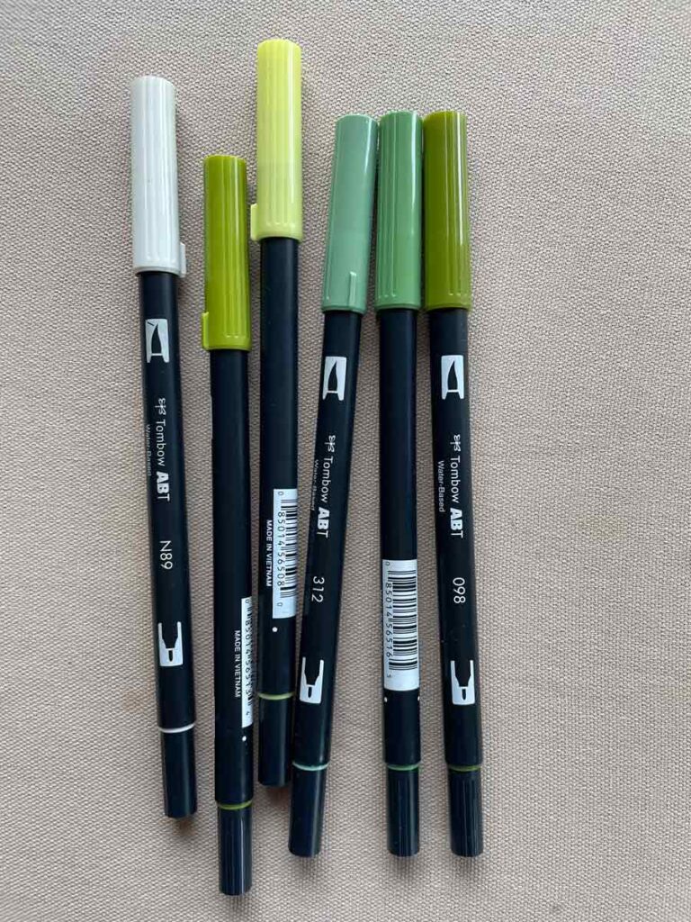
Tombow Pens

Tombow dual brush pens have been my go-to supply lately. Easy to transport and pull out in the moment, they have a flexible brush tip and a fine liner at either end. Plus, they’re water-based, so no smell and their color can be pushed around and muted with a wet brush (something I rarely do, but it’s an option). They’re acid-free but aren’t archival or light-fast, so best for sketchbook work which rarely sees the light of day.

That said, I don’t want to leave you without something to think about.
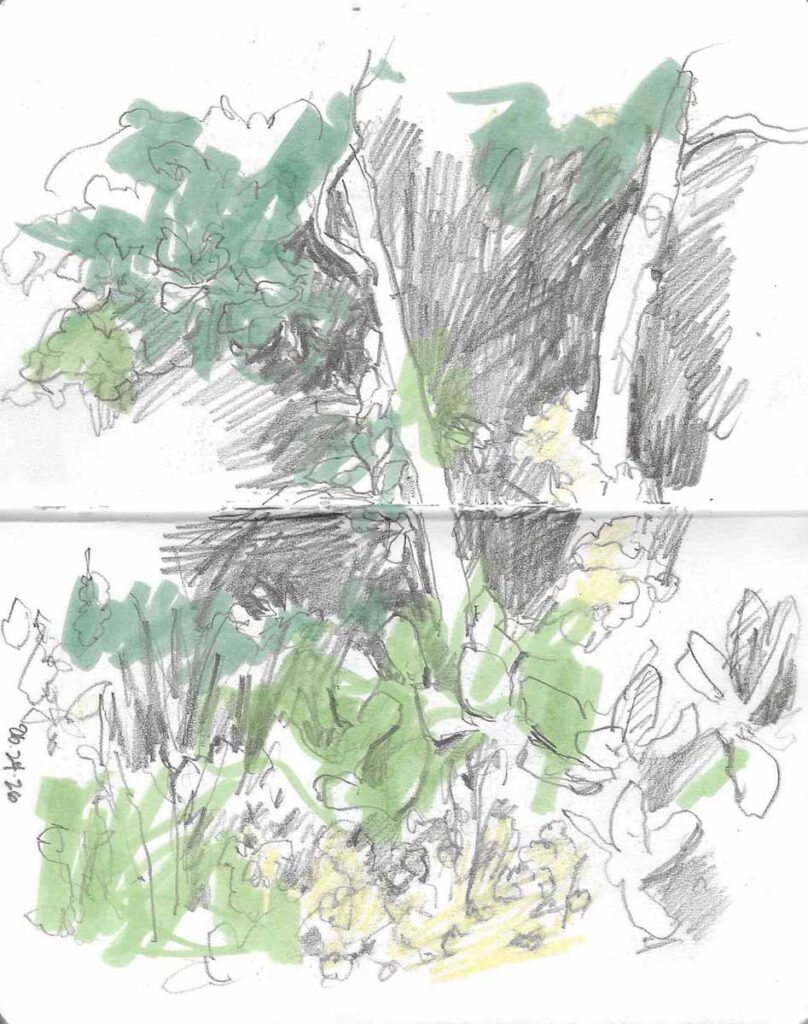
Backyard

Back Garden Sketch  I have been trying to train myself to work more quickly, which means narrowing down my supplies. The Tombows allow me to lay down color quickly and to then fine-tune with a pencil or pen.

We had a very rainy and cool Spring here in the Green Mountain state this year. However trying it was in the moment, it is paying off in spades now. Gardens everywhere, both natural and cultivated, are lush and bountiful — so color is king.
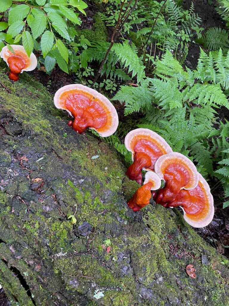
Ganoderma mushrooms

The eye popping orange of these Ganodermas, surrounded by all the green of our woods, is just as stunning as the peonies that are in full bloom in our house garden.

With that in mind, Lorene Edwards Forkner wrote a couple of months ago on her Substack about the joy of “collecting” colors. I love her idea – especially for those of us who live where summers are particularly brief. Who wouldn’t be grateful for a visual boost when the dead of winter rolls around again?
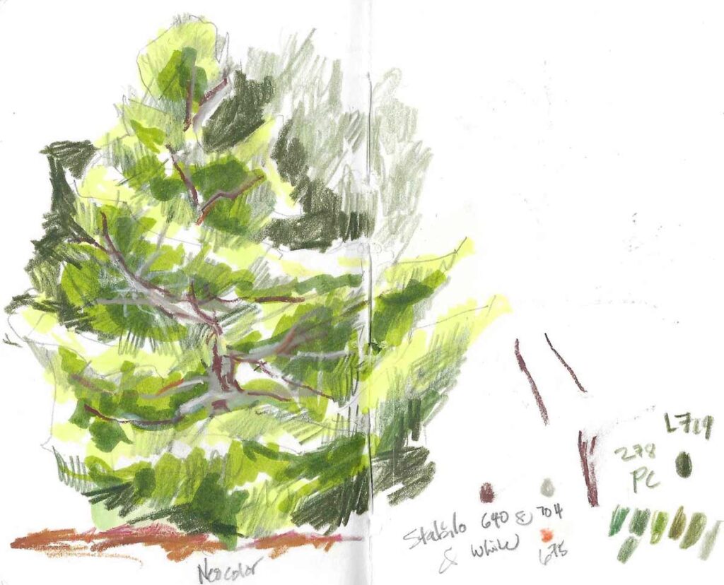
Korean Fir

We have a Korean fir with a lovely shape. I first laid down its structure with Tombows, and then used colored and pastel pencils to fine-tune with textural marks that give the drawing life & energy.

It’s easy enough to snap some quick photos as you move through your day. The upside is that thinking about color in this way is an easy opportunity to connect with your practice, whenever or wherever — whether in the most boring of moments (like waiting in the grocery line) or when life is too busy to carve out time to get into the studio. It’s a total win-win.

And I’m sure, with a bit of thought, there are ways to organize your own color collection that will make it unique and useful for your specific practice.
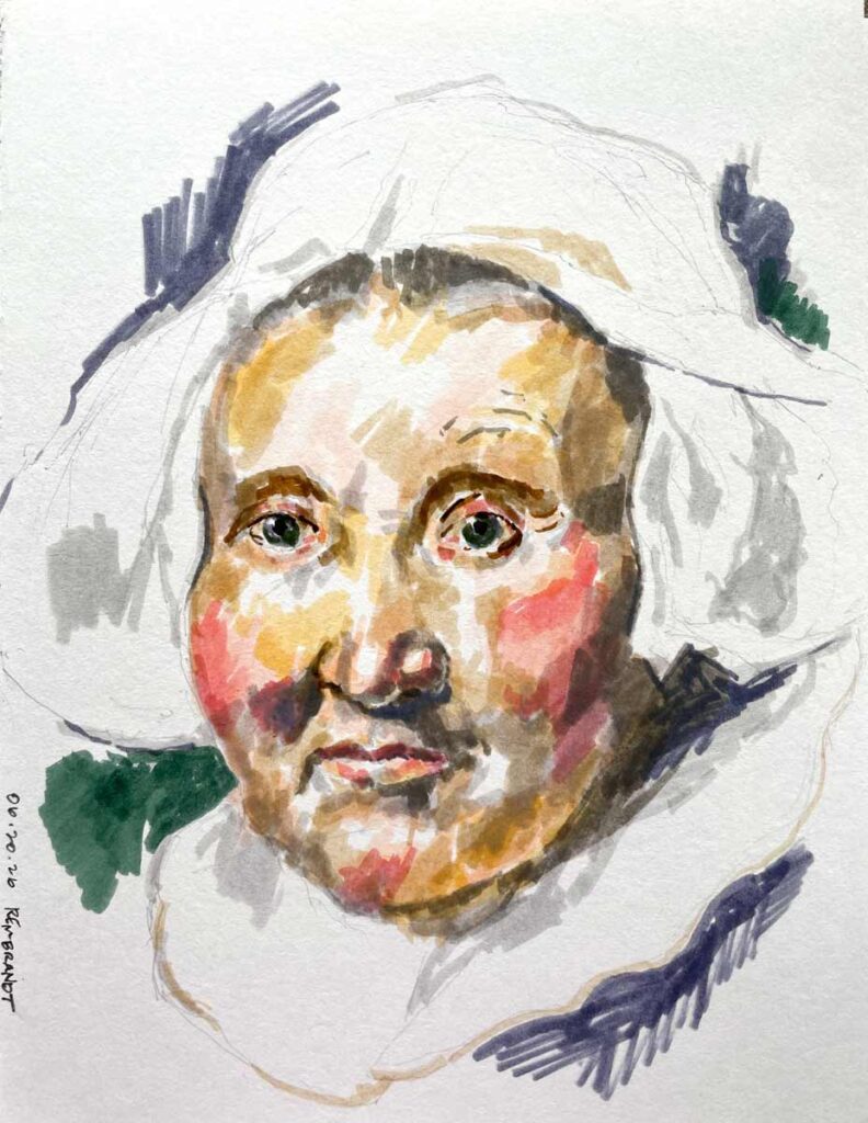
Rembrandt

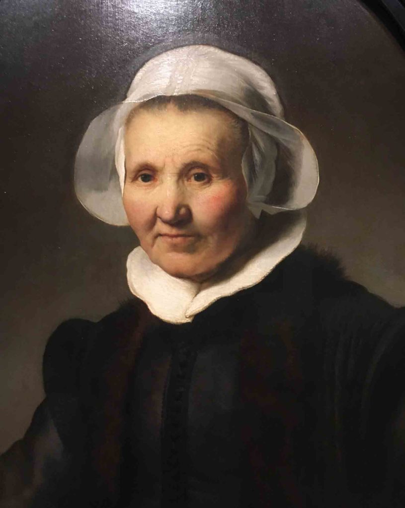
My copy of Rembrandt’s “Portrait of Aeltje Uylenburgh” (1632) illustrates Tombows layered over each other. With watercolors or gouache, one can just mix whatever color is needed. But because Tombow pens have a comparably limited color range, using them is a great exercise for practicing getting the right color and tone by combining the colors at hand.
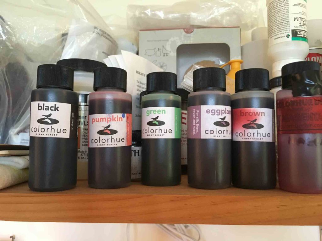
 

Colorhue

One of the questions I get asked most often is what kind of dye I use.
I first learned about Colorhue dyes from Glennis Dolce when I took her online shibori course in 2011. I was instantly smitten.

Colorhue

Even though they seem small, these 2oz. -size bottles last me a long time. I’ve learned to stock up during the warmer months so I don’t have to worry about freezing during shipment… a small price to pay for the privilege of living where winter is winter.

I have stayed with Colorhue exclusively since then, and like them for the following reasons:

-They are environmentally friendly
-I get immediate results without a lot of bulky, extraneous equipment
-I can achieve deep, rich colors

Intensely concentrated, Colorhue is an instant-set dye that requires only tap water (no chemical additives, pre-soaks, or heat-setting required). Very little water is used throughout the process. For most projects I probably use a pint to a half-gallon of water total, and since the vast majority of the dye is absorbed directly into the fibers of the silk, there is very little dye remaining to drain into my septic system (unlike the gallons of color-laden water necessary to rinse out excess Procion dye).

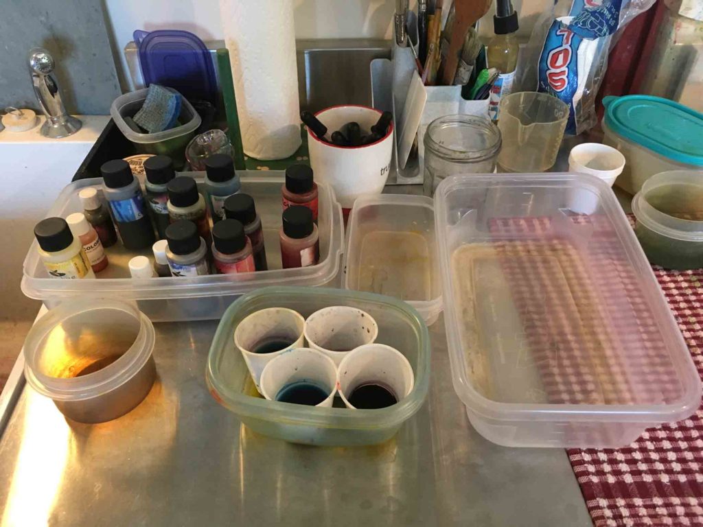
Set up

This 18″ square area is the heart of my dye set-up, even for large pieces. Yes, it’s really that small. The white mug in the upper middle of this photo contains the eyedroppers I use to apply the dye. I couldn’t ask for a simpler operation, which is exactly the way I want it.

The fact that Colorhue has only 11 colors may be seen as a downside for some. Rather than reaching for a ready-made color, I have to rely on the transparency of those basic eleven, mixing the colors I am looking for from scratch. The benefit is it opens the door to some lovely and unexpected results. This is somewhat reminiscent of the limited palettes many Urban Sketchers prefer in their ongoing quest to trim down the supplies they pack in their traveling sketch kits. (For a fuller idea of the power of limited palettes, read here and here.) And frankly, it’s a task that encourages getting to know one’s colors better; arriving at what you want becomes much easier with experience as you learn how each color interacts with the others.

If you’re selling hand-dyed yardage and need to be able to reliably repeat a color time after time, these are not the dyes for you. And initially they may seem expensive. But because they are so highly concentrated, they stretch a long way – so I wonder if in the end they really do cost much more than other options.

Sink

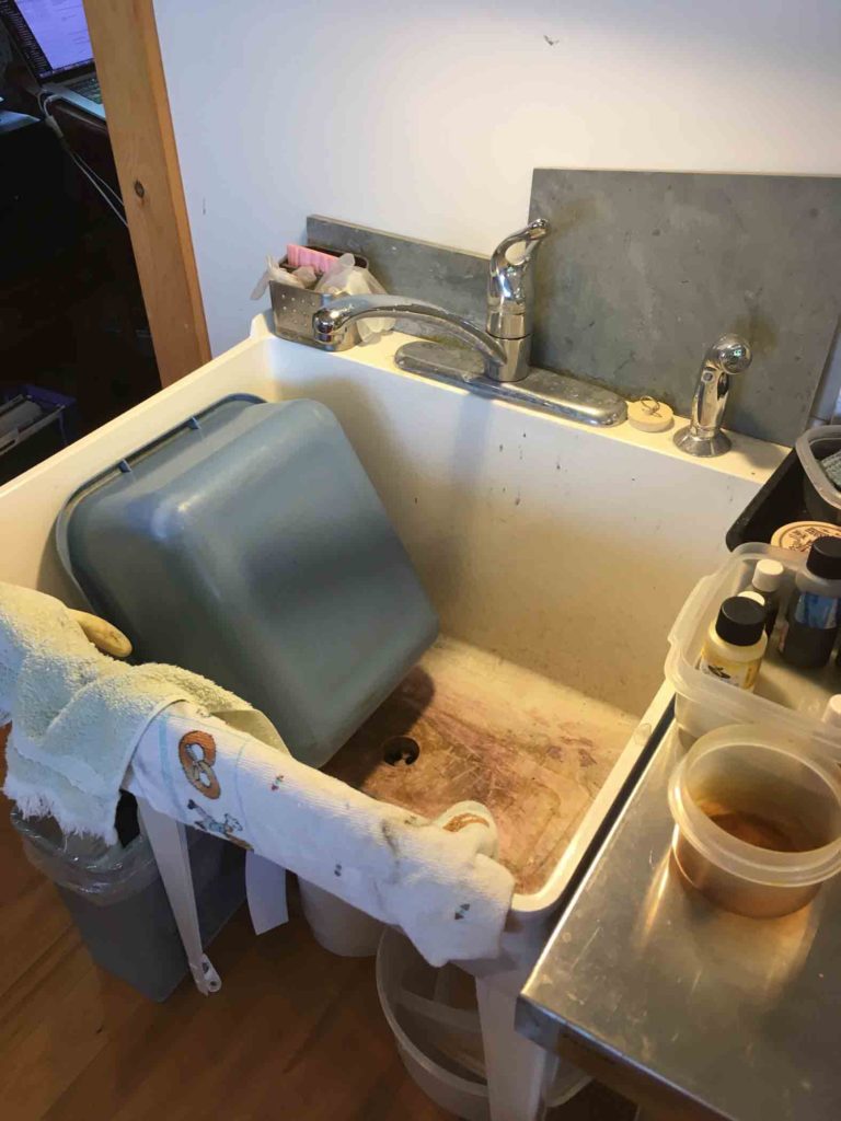
It’s not very glamorous, but having a sink in my studio made me feel like I’d really arrived.

I buy my dyes from Dharma Trading who notes:

“…great when you need fast results and are not too concerned with depth of color. Black is the most difficult color and comes out more of a maroony eggplant. Good silk dyes for beginners, classes, and quick projects.”

While I can see the angle they are aiming for, I think that’s a bit of a bum rap for a great product. As with any medium, time and experimentation are necessary for greater understanding of how far it can be pushed. In fact, I have had no issues with achieving depth of color, or in using black. I think Dharma does these dyes a disservice to imply they are student or beginner grade.

Iris

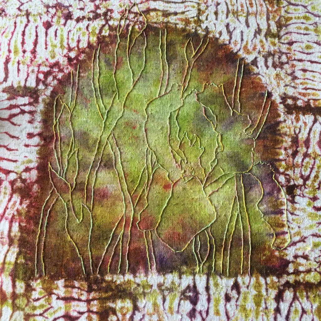
In process.     Once the stitching begins I can see the nuances of Colorhue dye up close. The luminescence of the central area in this piece, paired with the arched shape, have put me in mind of stained glass windows. Please note the variation of colors as they mix together, especially around the edges of the arch. It’s rich passages like these which cause me to take issue with the suggestion that these dyes are limited in their depth.

One has to keep in mind they will only work on protein fibers. While they seem perfectly matched for silk, I had very disappointing results trying them on some wool challis. Also, I have only used them for work that is framed and hangs on the wall, never for clothing. With that in mind, I feel like I should supply the disclaimer that the above information is just a window into my personal experience. I make no definitive claims and would encourage you to do your own research to see if they meet your specific needs.

Operation Night Watch – Live
Did you hear this? The Rijks Museum in Amsterdam has embarked on a huge research/restoration project of Rembrandt’s The Night Watch. Rather than conducting this process behind closed doors, they have built a glass box around the painting in the gallery, allowing visitors to watch all work taking place. Check out their website for extensive videos, information about the painting itself, and this huge undertaking. Fascinating!


Drawing Connections

I know it’s a crazy time of year to suggest it, but if there’s any way you can get to the MFA in Boston before December 10th, do it!

Rembrandt

Rembrandt van Rijn, Portrait of Aeltje Uylenburgh, 1632, oil on panel              It’s hard to connect with many centuries-old portraits because they give such a stern and removed impression, making it hard to imagine the subject expressing any emotion beyond stiff disapproval. Yet Rembrandt’s painting of Aeltje Uylenburgh, despite its dark and limited palette, presents an image so approachable that one can feel the warmth of her humanity. I find the blush in her cheeks and the kindliness in her eyes quite endearing.

My main reason for visiting was that I was anxious to see the newly acquired collection of Dutch and Flemish paintings, a grouping that will serve to further distinguish this museum from other major art institutions in the country. Including an assortment of Golden Age still lifes, landscapes, marine paintings, portraits, genre scenes, historical and architectural paintings, the MFA is rightfully proud of this exceptional gift that offers something for virtually every taste.

Fashionable Firefly Hunting

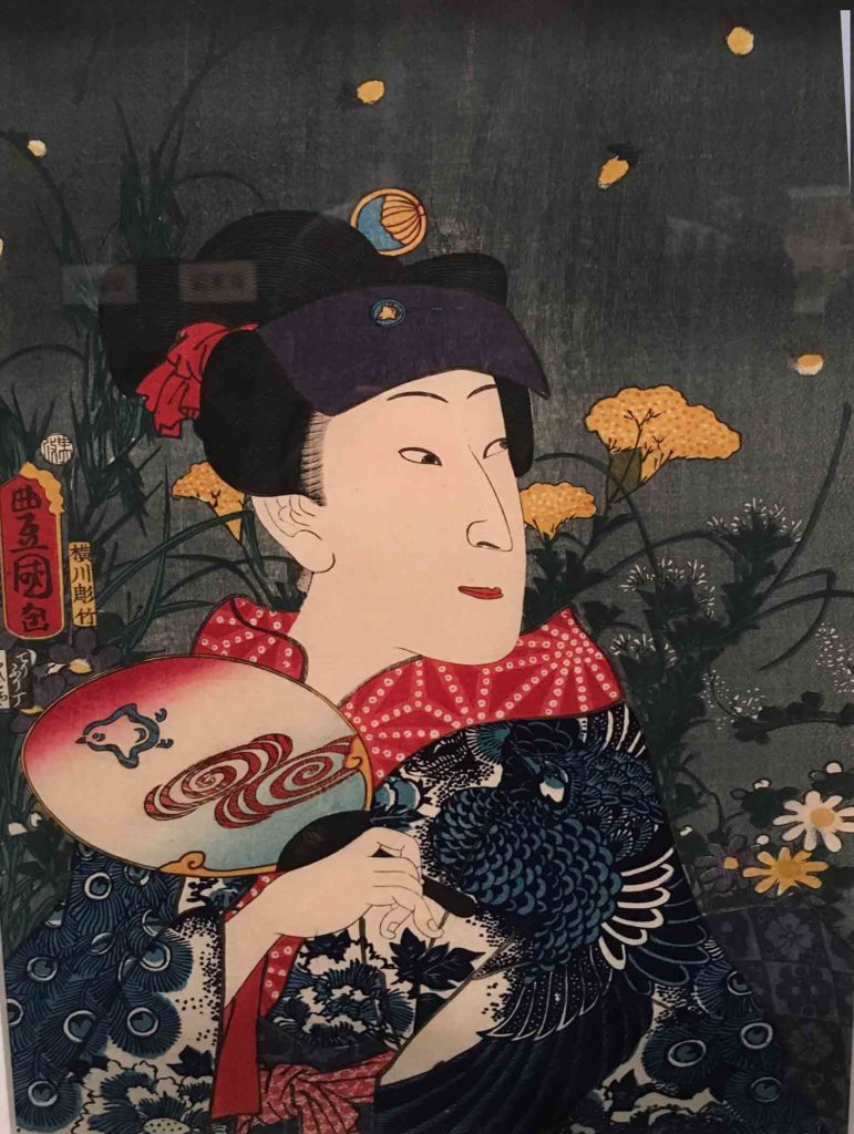
Yokokawa Takejiro, Fashionable Firefly Hunting, 1860                             Kunisada and Kuniyoshi’s woodcuts are spectacular images of detail, pattern, and color. There is so much to be seen in each image that making my way through the 100 prints was almost overwhelming.   I am struck by a few basic similarities between this portrait (of a male actor in character for a female role), and Rembrandt’s portrait of Aeltje Uylenburgh above. Both images are relatively dark, yet despite their obvious differences, they share an accessibility that is expressed in both their faces and their clothes (the crisp white cap and collar, and the fur around the neck soften the austerity of Uylenburgh’s environment, while the patterns and colors of the kimono bring life to the stark and minimally defined face in the portrait of the actor Sawaura Tanosuke III).

It was just blind luck that there are several other equally exciting exhibitions simultaneously on view – among them a remarkable collection of one hundred Japanese woodblock prints by rival masters Utagawa Kuniyoshi and Utagawa Kunisada, a series of Rothko paintings, a selection of Inuit art prints, and an eclectic pairing of contemporary painter Takashi Murakami’s bold, cartoon-like works alongside classics of Japanese mastery, handpicked by Murakami and Japanese art historian Professor Nobuo Tsuji from the museum’s permanent collection.

Claesz

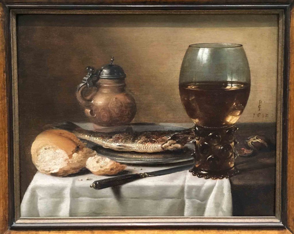
Pieter Claesz, Still Life with Stoneware Jug, Wine Glass, Herring, and Bread, 1642, Oil on panel                                                                                                                                                     Pieter Claesz was celebrated for his “breakfast pieces” that present the viewer with an almost literal taste of foods, both local and exotic, during the 17th century. His artfully arranged still lifes have surfaces and textures so articulately described that one can almost smell the display and feel the smooth, cool surface of the glass. Whenever we’re on the road, the one time I can usually count on squeezing in a quick sketch is during breakfast. While the only safe comparison I can make between my sketches and Claesz’ masterpieces is our shared penchant for making images of the first meal of the day, seeing his paintings gives me an enjoyable sense of camaraderie.

As diverse as these exhibitions are, connections between them can’t seem to help but bubble to the surface in hindsight as I’ve let the experience simmer this past week. Perhaps it’s just human nature to try to make sense of what we see by attempting to braid together assorted impressions into a whole, but the sub-conscious must definitely play its own part as well.

Kuniyoshi

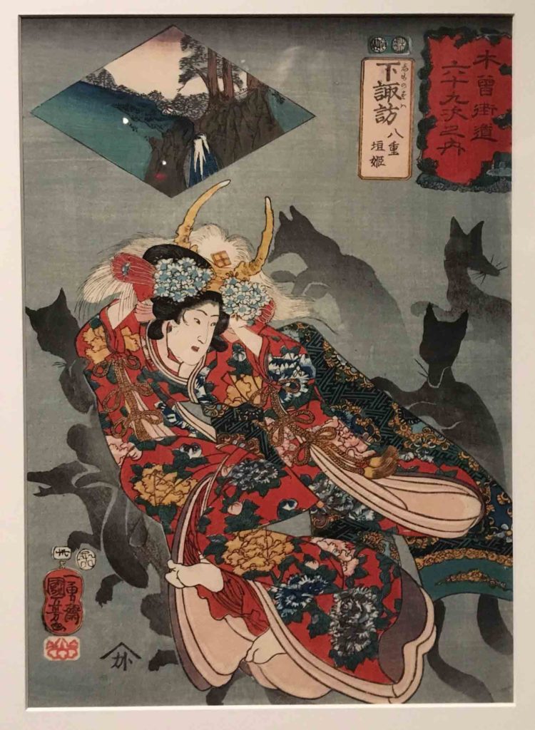
Utagawa Kuniyoshi, Shimosuwa: Yaegaki-hime, No. 30 from the series Sixty-nine Stations of the Kisokaido Road, 1852                               Images of animals are very hard for me to resist. These sacred foxes act as protectors for this mythic princess, running ahead of her over the ice to show where she can safely walk.

Tiger

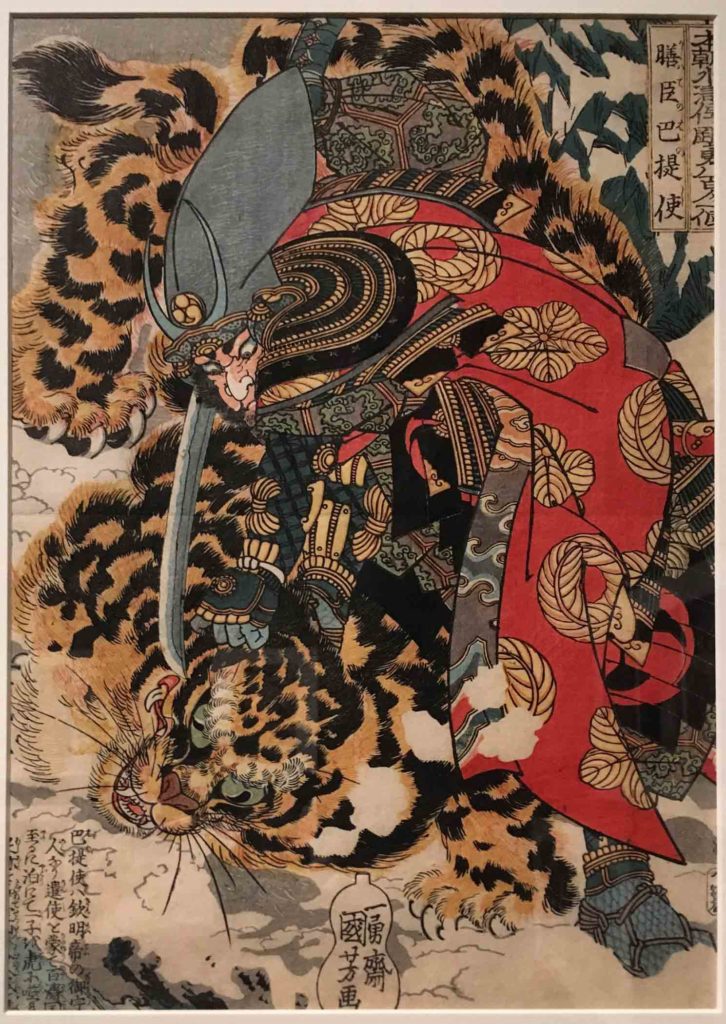
Kuniyoshi, Hayakawa Ayunosuke from the series Eight Hundred Heroes of the Japanese Shuihuzhuan, about 1830                             Although the subject of this piece is the legendary warrior Hayakawa Ayunosuke, it’s the tiger that caught my eye.

Proud Hunter

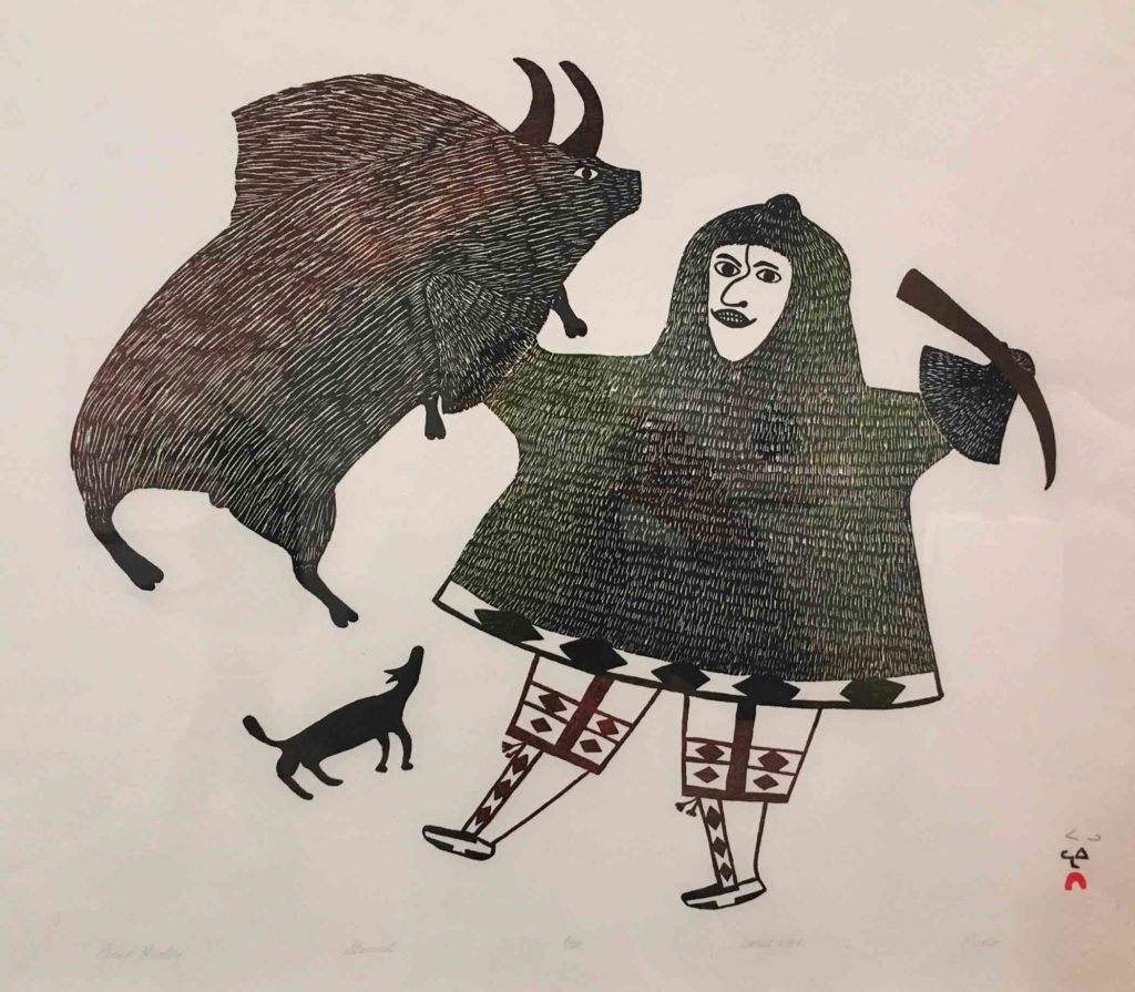
Pudlo Pudlat, Proud Hunter, 1987, Stonecut                                                                                             I am always fascinated by pattern. The graphic quality of the marks in this piece create a sense of pattern that is just as striking as the intricate depictions of printed cloth within the Japanese prints.

For years, when traveling I used to try to go to locally owned fabric shops to refresh my “palette”. It became amusingly uncanny that, more often than not, despite choosing fabrics at random with only an eye to diversifying my stash as much as possible, once I had a chance to go over my spoils later, the fabrics seemed to work together in perhaps a deeper and more meaningful way than if I had purposely intended it.

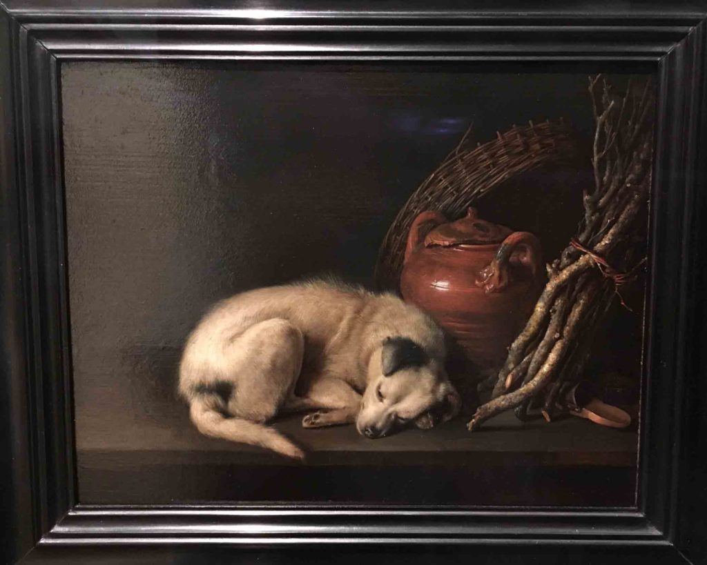
Dog at Rest

Gerrit Dou, Dog at Rest, 1650, Oil on panel                                                                                            I love this little painting for obvious reasons. But I was also struck by the differing means of convincingly portraying fur in this piece, as well as on Kuniyoshi’s tiger and in the sealskin coat and wild prey in Pudlat’s print, both above.

Much of the fun of experiencing something new is the fact that it is just that: a novel occurrence. But the unexpected connections that arise later enrich and personalize the experience, making it all the more enjoyable while lending an undeniable staying power to any lasting impressions. I don’t doubt that you can think of examples when this has been true for you as well.

Eventually everything connects – people, ideas, objects. The quality of the connections is the key to quality per se.       ~ Charles Eames