Tag Archives: Daniel Smith watercolors

Tools of the Trade

It’s been a while since I last posted about art supplies.
As I delve further into stitched paintings, new supplies are rotating into my regular line-up. I’m also reintroducing a couple of items that I haven’t used in decades, but happily never got rid of…chalk one up for pack-rat genes! Maybe something below will nudge you into thinking about trying something new – or old – in your own practice.

Daniel Smith Gold pigment

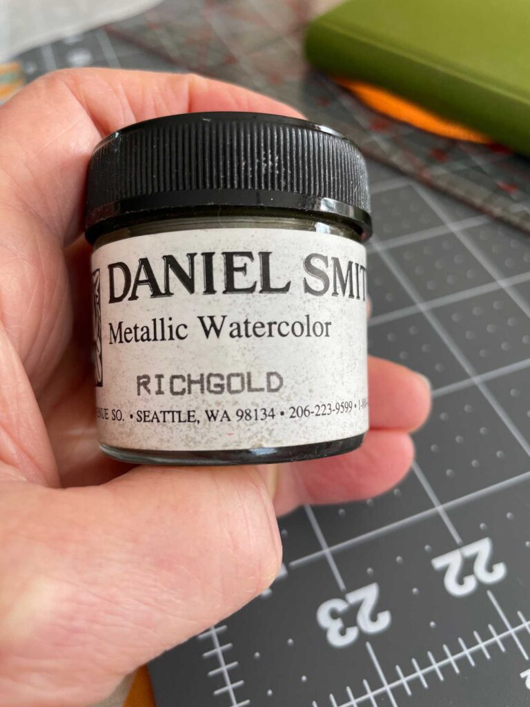
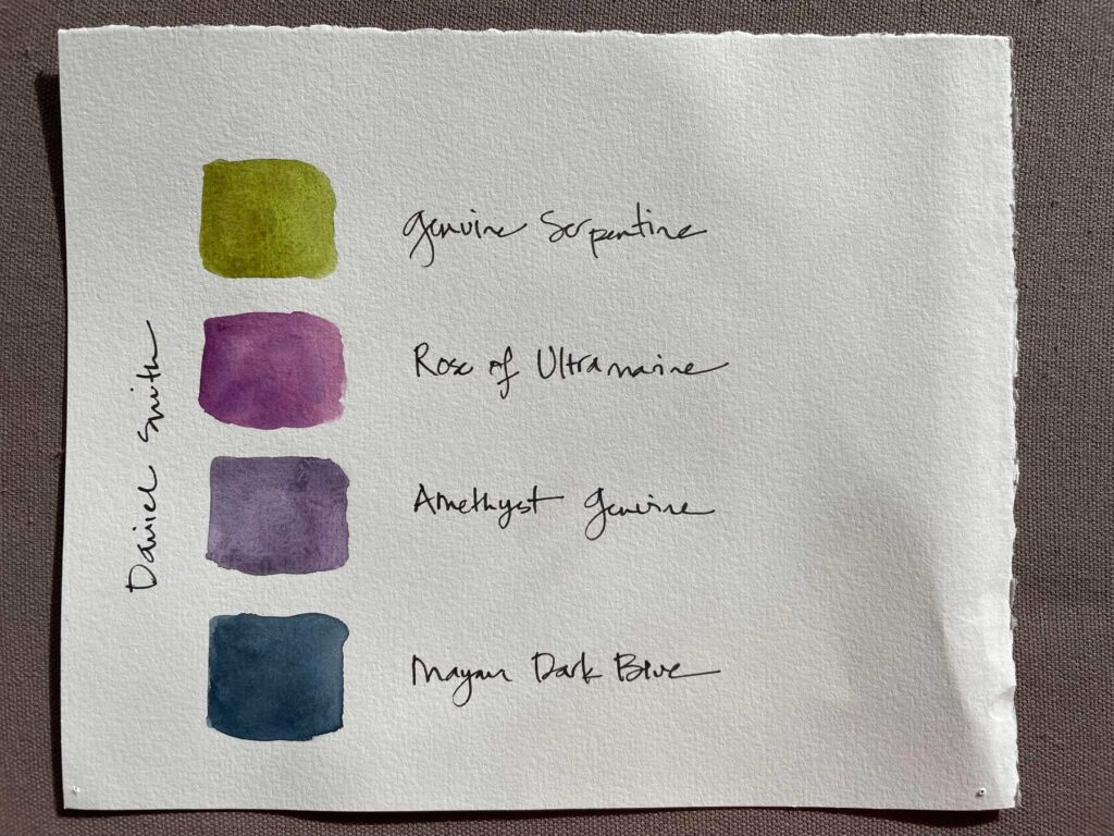
I’ve recently been considering the possibility of incorporating small areas of gold into my paintings. However, before dropping into a gold leaf rabbit hole, I realized I already had some ground gold watercolor pigment from Daniel Smith that I must have bought at their flagship store when we lived near Seattle almost 30 (gulp) years ago. It’s so old I don’t think you can even get it like this anymore, but what I have hasn’t suffered any with age. Once reconstituted with water, it’s just the touch of Midas I was looking for, without the learning curve.

Ruling Pen

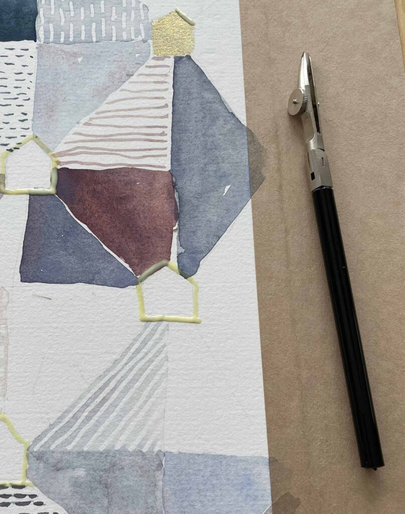
When I worked in graphic design (and we actually drew with real ink rather than on computers), I had a ruling pen for making rules/lines. It’s a great tool that I’d completely forgotten about. Listening to a podcast recently, I heard someone mention using a ruling pen as a way to get a really fine and even line with masking fluid for her watercolors. Eureka! Works like a charm — as you can see both above & below.

Gold paint and masked lines

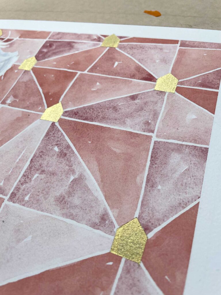
Gold paint and masked lines in action on my current piece

Watercolor boards

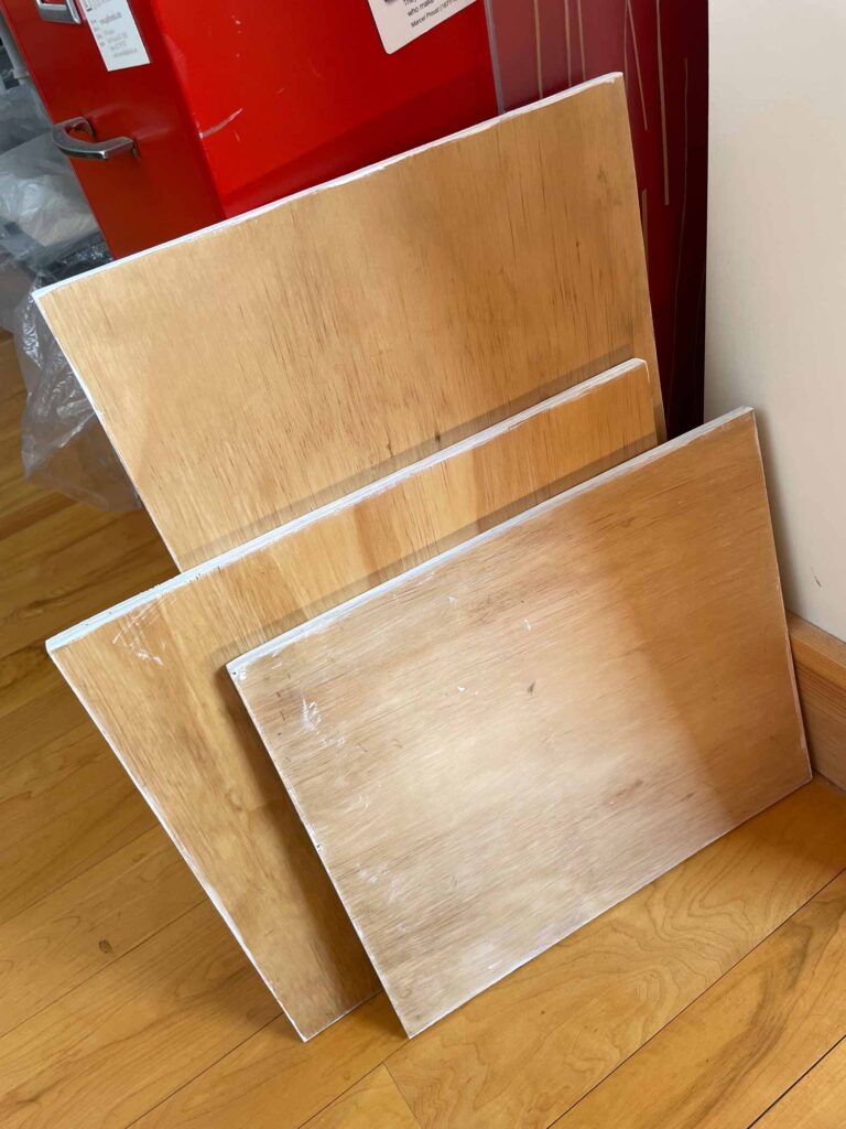
It hasn’t taken long to realize that if I’m going to continue with watercolor painting, I need to stretch my paper. I wanted a couple of boards that could accommodate smaller cuts of paper and would fit on my desk with all the other supplies. But I didn’t want to have to buy a full 4′ x 8′ sheet of plywood which was way more than needed. I’m so grateful that a friend had a smaller, cast-off piece in his barn that he was willing to throw my way. My husband cut it down into 4 pieces of varying sizes and sanded them to a velvet finish for me. A quick coat of sealant on the flat sides and gesso along to edges to keep out the water and I am now in business with several sizes to choose from. If you’re interested in making your own boards, “Watercolorish” has a solid video that discusses his boards and his method for stretching paper.

The algorithm on Instagram definitely has me pegged, so the ads I see are pretty much all art-related. In two cases I learned about items that have become my new workhorses.

JazperStardust paint

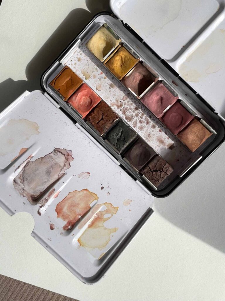
Jazper Stardust paint is 100% handmade in micro batches of pure earth pigments. I bought a set of 12 half pans of what he calls “Skin Tones” and I absolutely love them. They mix and granulate beautifully. If you’re curious, he has loads of intriguing individual colors and sets – a lot of which are geared toward landscape artists with specific locales and weather in mind.

Polina Bright brushes

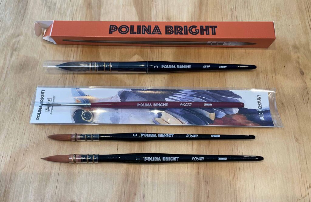
Last fall I bought two round Polina Bright brushes. Their performance is so outstanding that I bought a rigger and mop brush last month. Made with synthetic hair, they aren’t expensive yet they hold water and a point better than any of my other “fancier” brushes. Heads-up: she’s in Australia so your order will take a bit of time in transit.

And of course it pays to keep your eyes open because you never know where and when you’ll find your next treasure.

Voyager Notebook

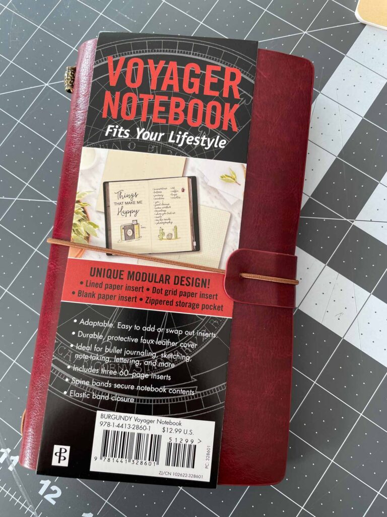
I grabbed this gem last weekend at a nearby bookshop; it’s from the awesome Peter Pauper Press (love their sketchbooks too). It comes with 3 removable book-like inserts: 1 with lined paper, 1 with dotted grid pages, and 1 with blank pages, and it also includes a zippered storage pocket.

Voyager Notebook Open

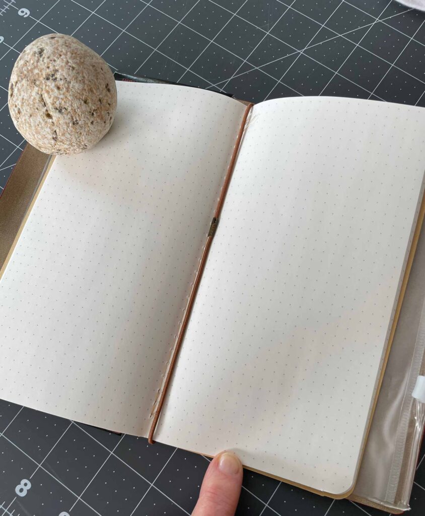
It’s wonderfully compact (7-3/4″ x 4.5″) with a faux leather cover and an elastic band closure, so I know it will be secure in my bag and can stand up to lots of use, making it perfect for both travel and around town. I’m thinking I’ll just switch out a couple of the ready-supplied inserts for a homemade sketchbook using the Fabriano or Stillman & Birn paper I have on hand.

Finally, writing this post tickled my curiosity because I know there have to be plenty of other folks who are sharing what they know about art supplies online. Here’s a list of various podcasts that do just that. I can’t vouch for any of them yet, but I’ll be listening to “Art Supply Posse this afternoon as I continue with the stitching phase of my current work in progress.

Keeper of the Keys WIP

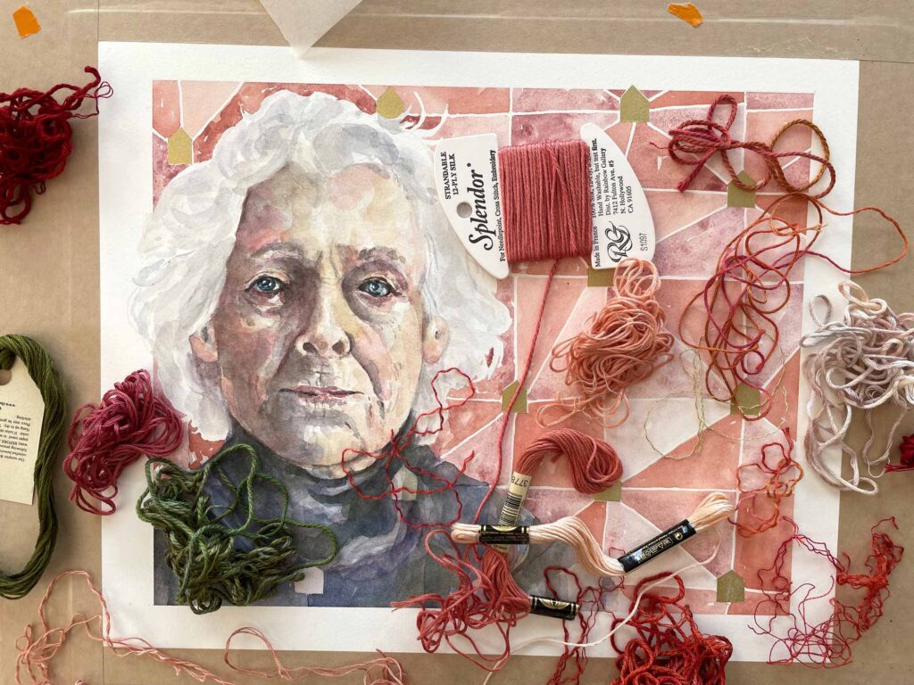
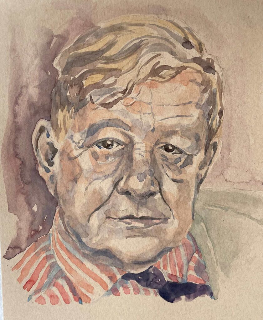
Sneak peak of “Keeper of the Keys” earlier in the week as I was choosing thread colors.


Unexpected Gifts

I’ve been thinking lately about how, despite the ups and downs that come with wending one’s way through a global pandemic, there have still been some truly unexpected bright spots over the past two years.

Considering all that is happening around the world these days, it would be foolish to take anything for granted. And perhaps the enormity of the world’s current problems explains why it’s the little moments in life that offer the greatest reprieve and joy right now.

WH Auden

WH Auden ©2022 Elizabeth Fram, Watercolor and pencil on paper, 12 x 9 inches       I made this portrait after reading Elisa Gabbert’s fabulous interactive feature “A Poem (and a Painting) About the Suffering that Hides in Plain Sight”, which appeared in the NY Times on March 6th. Her piece centers on Auden’s poem “Musée des Beaux Arts”. I found it very moving — another unexpected gift.

Two particular highlights that have come my way in the past 12 months were a total surprise. In both instances, I thought I was making a relatively small contribution to lighten someone else’s load, but truthfully, I’m the one who walked away with gifts far greater than earned or than I would have thought possible.

Thank you to my local art supplier, The Drawing Board, for coming up with the brilliant idea of a monthly watercolor subscription last year. When I signed up I wasn’t sure I needed a new half-pan of paint each month – but it seemed like an easy and fun way to support a local enterprise at a time when no one knew what was lurking around the corner for any business.

Seaglass

Seaglass © 2022 Elizabeth Fram     This is a test painting for a work I haven’t yet begun. I’m including  it here because the four Daniel Smith colors I mention below comprise its backbone.

The thing is, I got way more out of that subscription than I ever would have dreamed. Soon I couldn’t wait to see the regular envelope which included not only the promised paint, but also other supply surprises (paper samples, brushes, a sponge, drawing tools, etc.). As Covid dragged on, each arrival became something of an event that was just as exciting and as eagerly anticipated as when the Scholastic book order arrived in elementary school. Remember those days?

On top of that, I’m super glad to have added Daniel Smith’s Genuine Serpentine, Rose of Ultramarine, Amethyst Genuine and Mayan Dark Blue to my palette. I’m not sure I would have tried them otherwise, but they are remarkably versatile and now an integral part of my kit.

Palette

The other highlight I wanted to share with you comes in the form of a daily email from artist Janet Van Fleet, who is participating in the March Arts Marathon to benefit the Central Vermont Refugee Action Network. Every day this month she sends donors a brief recap with images of her art career as she ‘looks over her shoulder’ at her creative journey. It’s a tremendous commitment and amount of work on her part, but for those of us who follow, it has been a delight that marks how thoroughly engaged Janet is with the world, its joys and its woes. The whole exercise has made me realize how often artists’ creative paths are overlooked, and how important they are to understanding the development of someone’s work.

Hug Fish Van Fleet

Hug Fish ©2021 Janet Van Fleet, 56 x 18 x 5 inches

To a great degree, I think the practice of art is a form of translation. One of the qualities I most value about it and the people who create it, is the ability to conjure unexpected and enlightening connections — associations that strike both a universal and a personal chord with viewers. Visual analogies are a strong means for making ideas and emotions relatable and palpable.

The Beginning

The Beginning   © Janet Van Fleet, Oil on board with wine foils.     Included in her 2019 exhibit “Vanishment” in the Vermont Supreme Court  lobby, this and the painting below call attention to the devastating reality that we humans are killing off other species at alarming rates.

Please visit Janet’s website to see the breadth of her work. Look closely and you will see she is a master of metaphor. She tackles weighty subject matter without ever losing sight of the sheer joy of life. That’s a pretty impressive juggling act.

The End Van Fleet

The End   © Janet Van Fleet, Oil on board with wine foils

Her short film, March of the Teapots, will give you a sense of her marvelous imagination. And I trust it might be an unexpected gift for you today.


The past two years have been a long haul, but think about it — who or what has made small moments monumental for you? Whatever the answer, I’ll bet you didn’t see it coming.

I recently discovered the sprightly work of M. Louise Stanley. If you curious about someone who combines her sketchbooks with old master works, laced with a healthy sense of humor, be sure to visit her website. You can also find her on Instagram @m.louisestanley.