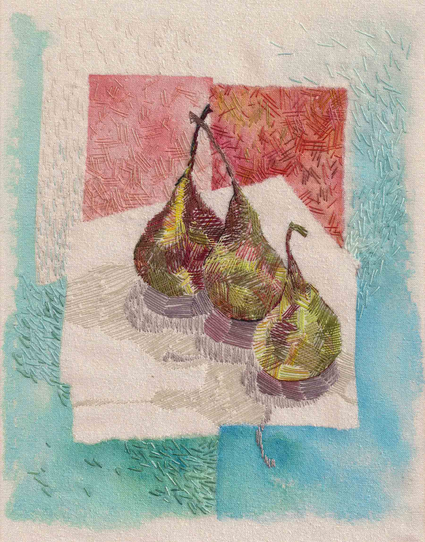
After reading Gretchen Rubin’s Life in Five Senses last year, I often find myself tuning-in to more than just one sense in a given situation.

Tomita Mikiko, Form of the Progenitor, 2019, Glazed and enameled porcelaneous stoneware with gilding
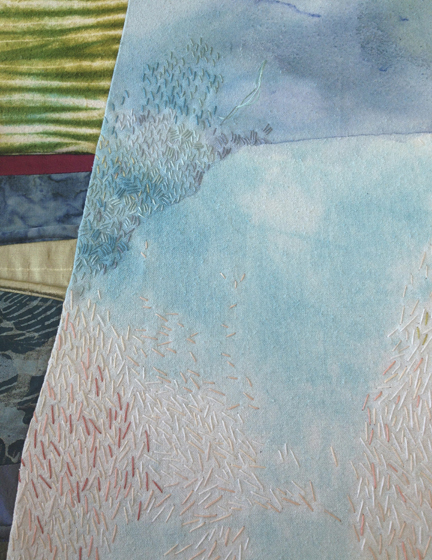
Visiting the Art Institute of Chicago a couple of weeks ago was a perfect opportunity to look beyond merely the visuals of the two exhibits we saw, considering them in terms of touch as well.
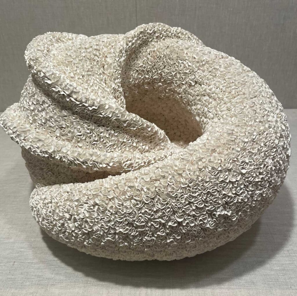
Hattori Makiko, Wandering, 2012, Porcelaneous stoneware
Radical Clay: Contemporary Women Artists from Japan is a grouping of work by 36 ceramicists — significantly, as noted, all women. The pieces are from the collection of Carol and Jeffrey Horvitz.
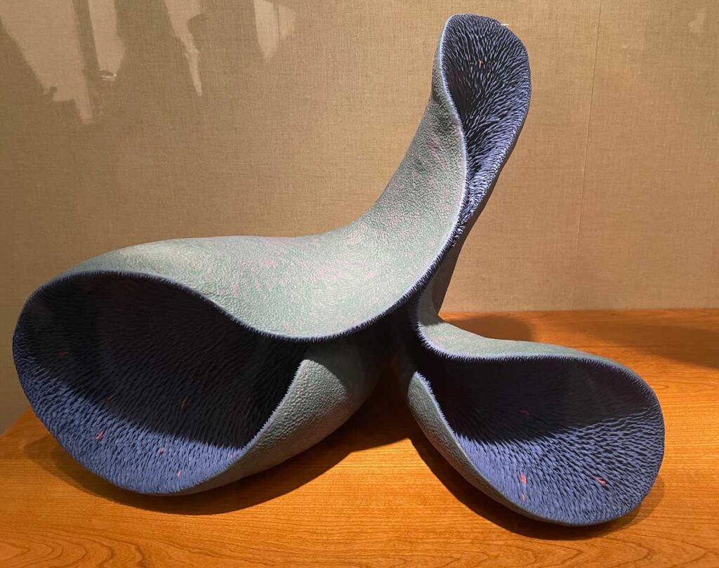
Ikake Sayuri, Breathe, 2015, Pigmented clay
Customarily under-recognized within a country that long excluded women from the creative side of clay, this show lends focus and acclaim to both leading and emerging female artists in the field.
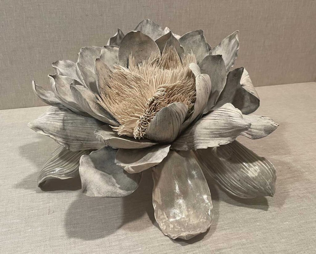
Shingū Sayaka, Erosion No. 4 (Eroding Flower), 2021, Glazed and unglazed stoneware
Their work bursts exuberantly beyond the boundaries of traditional pottery, proposing wild and unimagined possibilities within the medium.
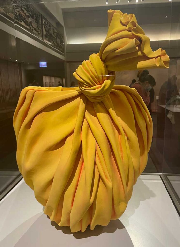
Tanaka Yū, Bag Work, 2018, Glazed Shigaraki stoneware
So much about the work is unexpected. It is curious, delightful and often somehow relatable despite the many unidentifiable and fantastical forms.
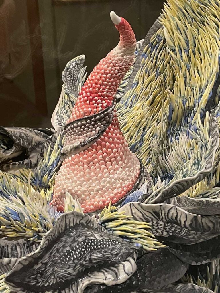
Konno Tomoko, Liberation (detail), 2022, Porcelain
Beyond that, the overall gathering point for me was texture – in all its pockmarked, frilled, spiked, gathered, ribbed, shaggy and even occasionally glassy-smooth glory.
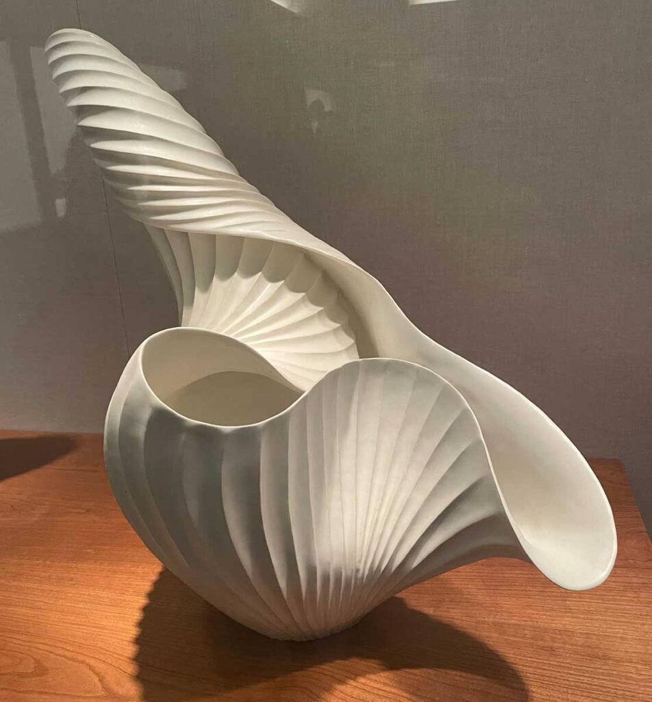
Inaba Chikako, Leaf Vessel, 2017, Glazed Stoneware
Revisiting this exhibit through my photos has led me to realize I wasn’t just seeing it – I was feeling it with my eyes.
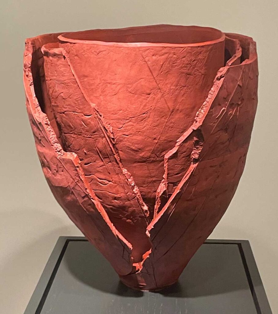
Ogawa Machiko, Red Vessel, 2021, Reduction fired stoneware
❖
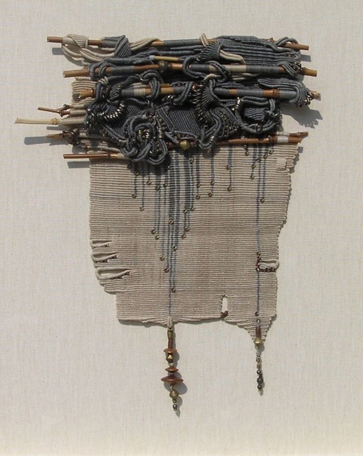
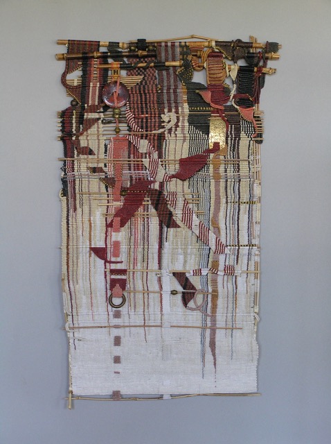
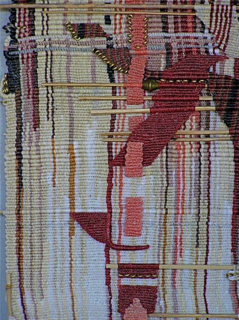
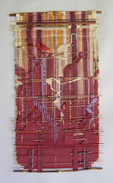
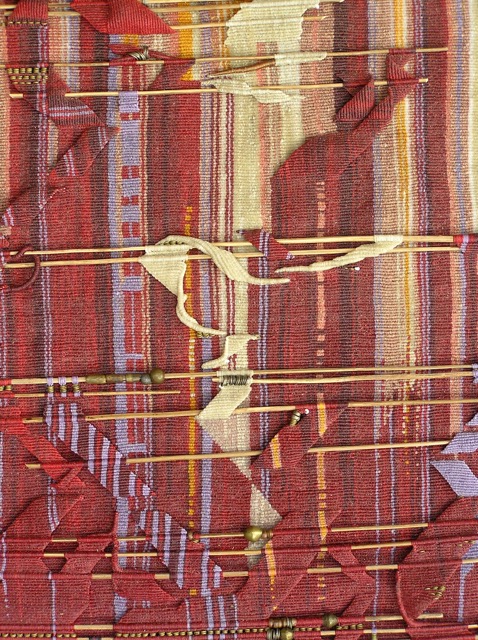
Moving from clay to textiles, next we visited Threaded Visions: Contemporary Weavings from the Collection. Relatively small in terms of the number of pieces, it is nonetheless mighty in impact, pushing one’s multi-sensory buttons. The works definitely have the expected tactile appeal associated with textiles, but it is the marriage of texture with dimension that most intrigued me. I didn’t so much want to run my hands over the work as I wanted to drop into the space each artist created.
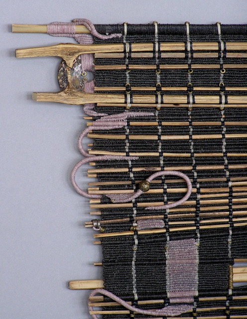
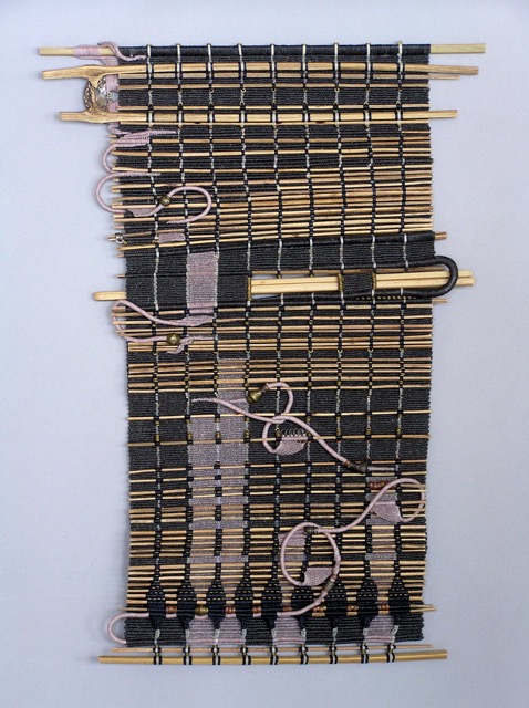
María Dávila and Eduardo Portillo, White Dwarf, 2016, Silk, moriche palm fiber, alpaca, ad metabolized synthetic film wrapped thread; multilayered plain weave
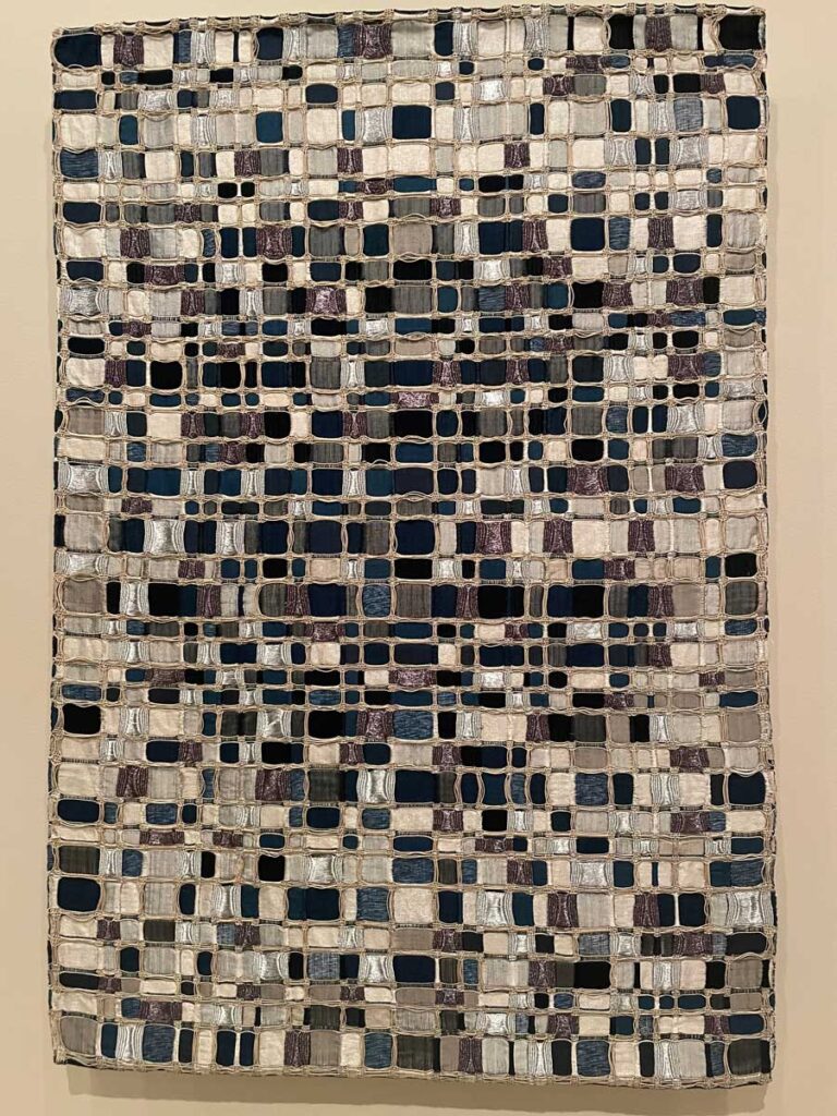
María Dávila and Eduardo Portillo’s piece White Dwarf, from their imagined cosmos series, refers to a collapsing star. It is a dimensional piece with silvery metallic coils hovering above a grid of deep tones that, to me, evoke the shimmer and movement of moonlight on dark water. Read about these artists’ process and journey in Part one and Part Two, posts on Browngrotta Arts fabulous blog, ArtTextStyle.
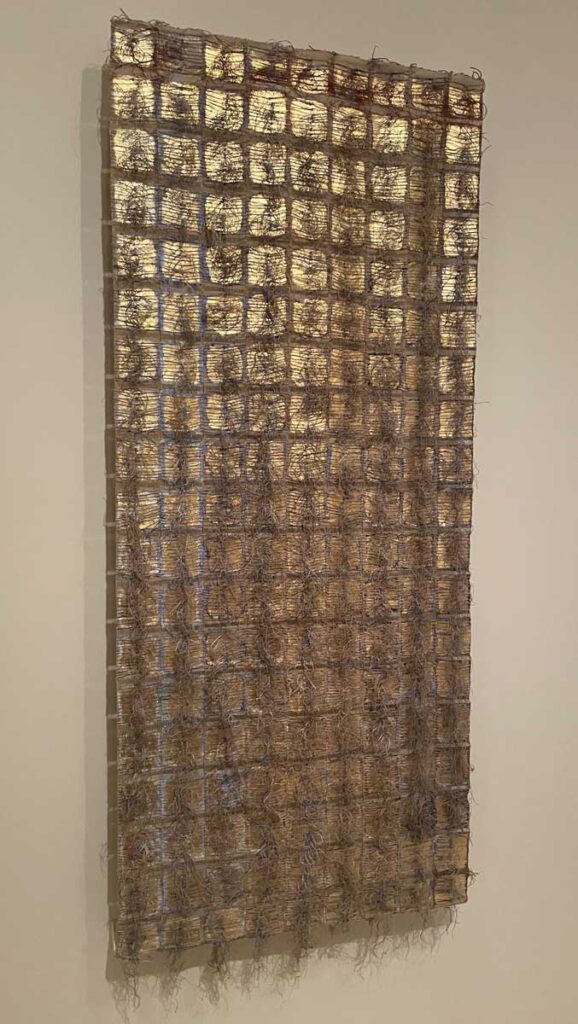
Olga de Amaral, Alquimia III (Alchemy III), 1983, Linen, cotton, gesso, gold leaf and pigment; plain weave joined by knotted weft fringe
This glittering piece by Olga de Amaral is part of a series on the subject of alchemy. The masses of loose-end threads emerging from a background of gold leaf suggest a balance between order and chaos.
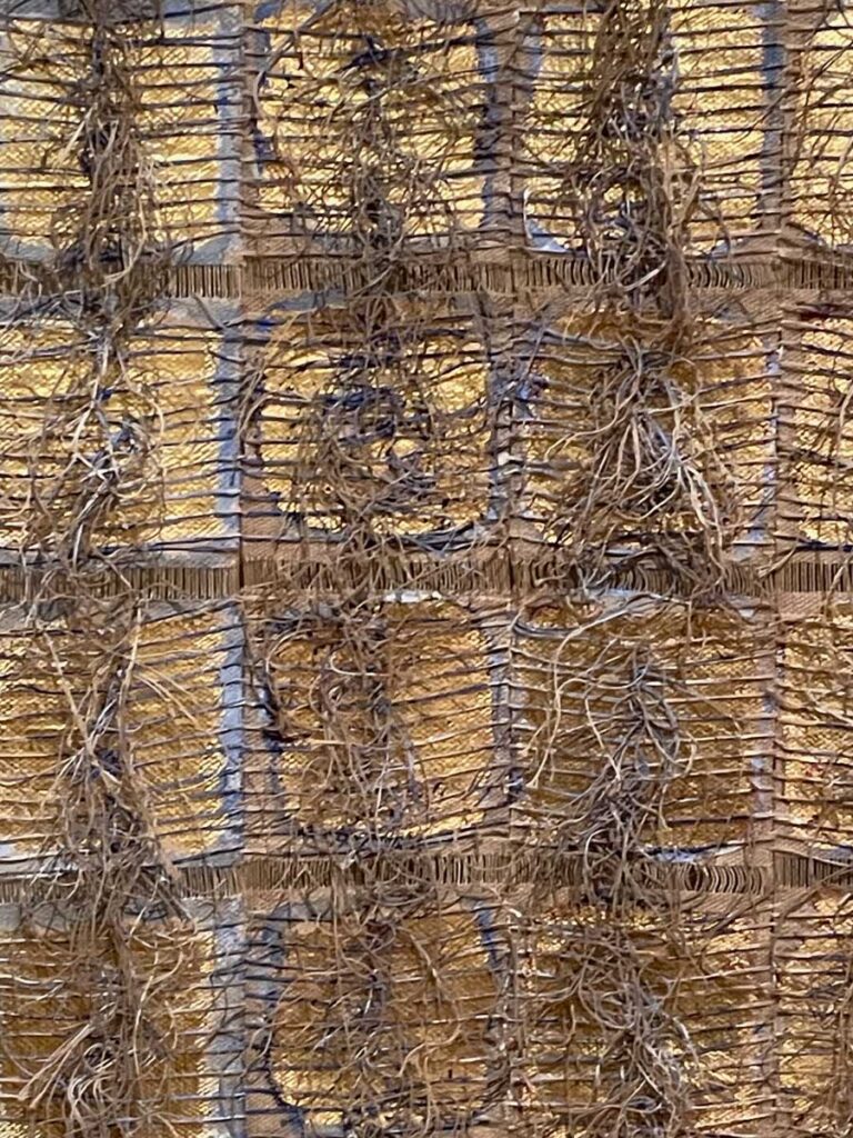
Olga de Amaral, Alchemy III, detail
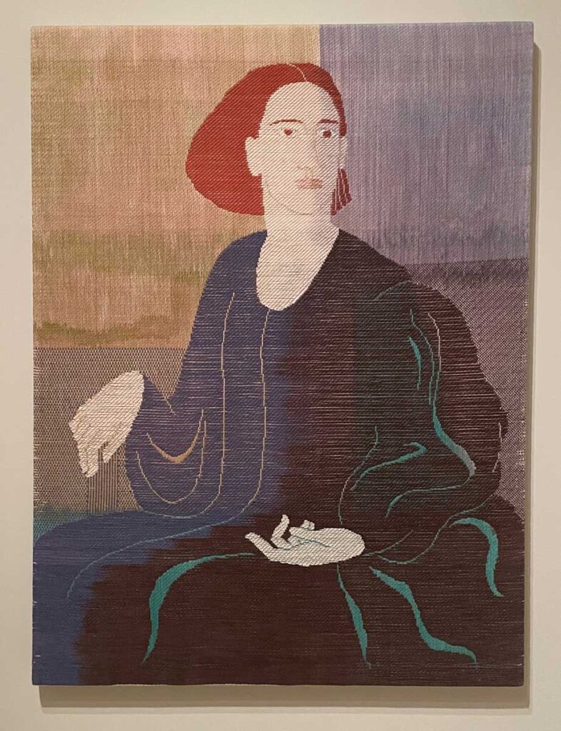
Ethel Stein, Portrait, 1999, Cotton; warp and weft resist dyed, satin and twill weaves
The varying weave patterns of Ethel Stein’s stunning Portrait lend an abstract sense of rhythm to the figure within a static background. Zoom in on the above photo to see how the complexity of one area/pattern abutting another incorporates a sense of dimension within an image that essentially presents as flat.
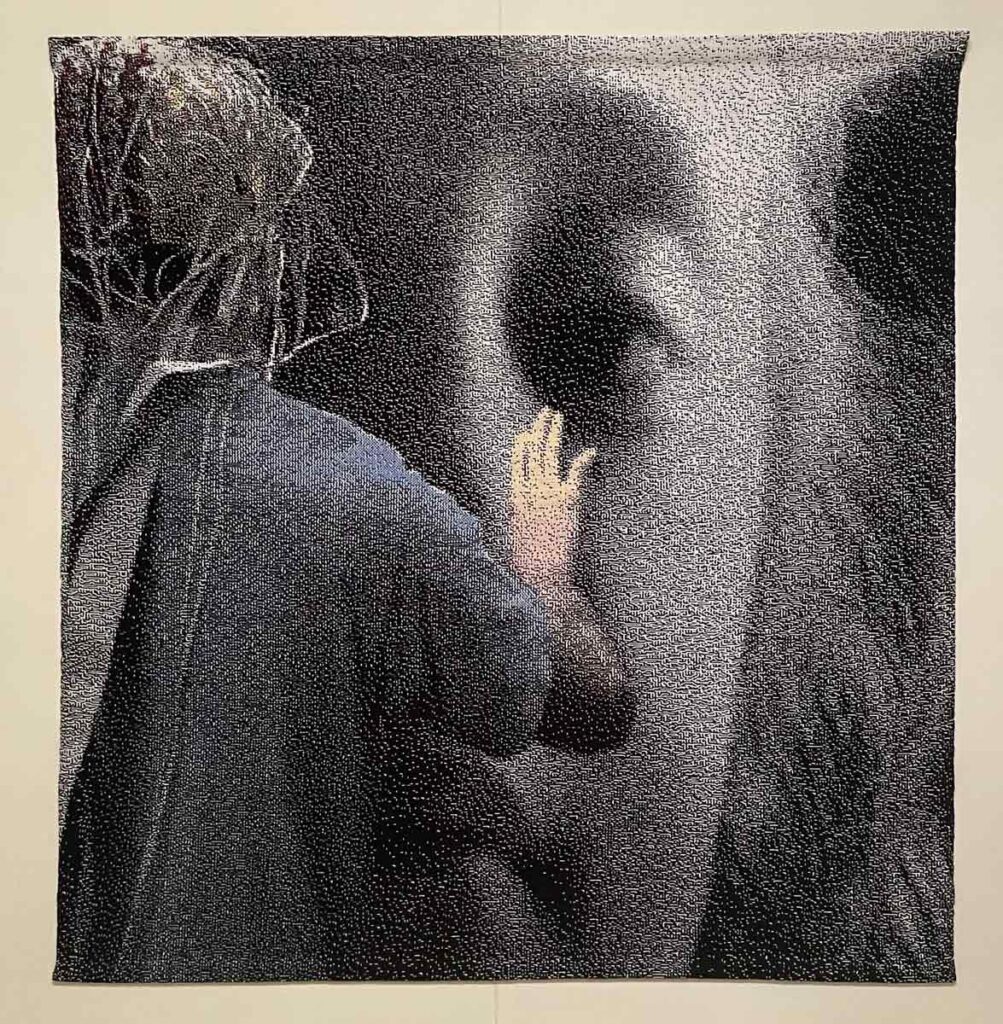
Lia Cook, Facing Touch, 2011, Cotton’ woven on a digital hand loom; rayon lining
Finally, and perhaps most interestingly, Lia Cook addresses the idea of texture directly, as noted on the information card accompanying her piece:
“Lia Cook has long been interested in how the human brain reacts to the desire for touch. In the early 2000s, she began to work with neuroscientists to compare the brain’s response to viewing a woven image of a face versus a photograph of the same face. They discovered that seeing the woven image triggered greater activity in the part of the brain most affected by touch. Facing Touch illustrates this experiment: in it, a girl wearing a cap with sensors attached reaches out to a woven portrait also by Cook, Binary Traces: Young Girl, from 2004.”
❖
If you have a moment, enjoy this quick and uplifting “Stuck in Vermont” video about Hannah Miller’s quest to read, write and knit in all of Vermont’s libraries during her year-long sabbatical. Follow Hannah’s joyful journey on Instagram: @handknitbyhannah