Tag Archives: garden

First Blush of Spring

Our landscape is finally coming back to life. Each day there is something new to see as the browns and grays of mud season recede, making room for the richer hues of spring.

Spring 1

I have been watching for a solid couple of months as people who live elsewhere in the country  — and world — post images on Instagram of their neighborhoods as they green up.

Spring 3

We in the upper Northeast may be the last to arrive at the party, yet there is sweet reward in the feeling of having truly earned the colors that are re-emerging after a long, hard winter of visual restraint.

Spring 2

For those of us who relish the cycle of seasons, we wouldn’t have it any other way.

Spring 4

For now, our days are fluctuating between cold & rainy and warm sun, so the garden is unfolding slowly, making it possible to mark changes daily. I watch those details closely and am rewarded with a world of color in each square inch.

First Blush

First Blush, detail     ©2012 Elizabeth Fram        Stitching and paint on reclaimed bulk tea packaging and hand-dyed silk

For a dose of pure chromatic eye candy, Carl Holty’s Flowering brings the garden to the canvas. Read about him and see more of his lush work in this article in Art & Antiques.

Holty, Flowering

Flowering     ©1961 Carl Holty, 37 x 32 in., oil on canvas


Pleasure and Privilege

Making art is something of a ‘Get Out Of Jail Free’ card.

Yes, the stripped down beauty of a snowy landscape has a unique subtlety that many of us who choose to live where winter is serious business appreciate and even relish. But that doesn’t mean we don’t sometimes miss the full-blown colors of our gardens and of the local countryside that currently lie dormant under a blanket of snow.

Work in Process, Full

©Elizabeth Fram    Mid-process

There is rich privilege in being immersed in color every day via drawing or stitching or dyeing. It’s an advantage I don’t take for granted. And perhaps for just this reason, I find the current phase of this piece – defining the octopus with color – the most enjoyable of all the various steps that have led up to it.

Do you remember the color theory exercises comparing two colors that seem completely different, but which are actually identical? The point being that their appearance is drastically affected by the color surrounding them. For an example of this phenomenon, check this out. That’s one of the key factors that brings so much pleasure to this current process of fleshing out the image. Each stitch is influenced by the color of its neighbors, as well as by the varying shades of the dyed silk ground it is sewn upon. That interaction creates a visual richness that at times seems almost melodic.

Work in progress, detail

©Elizabeth Fram, detail

It’s a fascinating process and somewhat addictive. I have to set a timer to remind myself to stop and get up to stretch because I get so lost in the rhythm of stitching and the desire to see how new interactions between colors will evolve. The wonderful bonus is that it’s also a great way to guard against any feelings of color deprivation that can often be mid-winter’s calling card.

How is a parterre like a patisserie?

I’ve begun watching Monty Don’s 3-part series Gardens of France. Drawing a parallel between the 17th century gardens of André Le Nôtre, creator of the gardens of Versailles, and rows of glistening pastries under glass, Don acknowledges a French cultural love of formality that lends a sense of order and harmony and balance, coupled with refinement. Admittedly, what I’m seeing in the gardens he is touring and in the display case of Carette at Place des Vosges, is a far cry from my relatively undisciplined flower beds and humble cookie creations, but the spirit of both are equally inspiring on a chilly winter day.

Back Garden in June

June in our back garden: azaleas, early phlox, and one of my favorites – American umbrellaleaf or Diphylleia cymosa, whose white flowers transform into blue/black berries on bright red stalks, and whose leaves become a beautiful mix of burgundy and gold toward the end of the summer.

Isn’t it wonderful how culture and even national sensibilities squeeze beyond the boundaries of a given discipline, surfacing in the arts and daily life?

Considering Negative Space

This past winter was crazy-busy and as we march toward summer I am hoping to manage a change of pace to recharge my batteries. I’ll bet you are too.

Old habits die hard and I can’t escape the rhythm of the academic year, at least psychologically. I am savoring the idea of summer’s less regimented schedule in the same way I know I will look forward to falling back into a set routine come September.

MayGarden1

Things in the studio seem to be moving more slowly lately, probably because of the added  distractions of the garden, the higher temps, and the beautiful weather. But despite the fact that these things compete for the limited hours in my day, they also serve to feed the creative fire.

Paint1

2015 ©Elizabeth Fram                                                                                                    In process

When I’m in the garden, kneeling low to the ground and weeding around the new growth, my viewpoint is concentrated on the two-foot square in front of me, focusing on details rather than a more comprehensive view. I start to see the leaves of young plants abstractly – flattened into the space around them. What I see is transformed into a formal arrangement of shapes in a way that won’t be as obvious once the plants fill out and begin to rub shoulders.

Iris Leaves1

As a result, I have begun consider negative space, both physically – which I am investigating in new work, and conceptually – as it relates to time & each day’s agenda.

Pos-Neg1

2015 ©Elizabeth Fram                                                                                                    In process

Visually, I am embarking on an exploration of a shifting back and forth between positive and negative shapes, using color, and eventually stitch, to orchestrate a dialogue between the two. In the same light, summer’s more relaxed schedule widens areas of “negative space” on our calendars; time that can be filled with restorative activities that soothe and rejuvenate the weary sense of ‘push’ that marks the rest of the year.

Painted Leaves1

2015 ©Elizabeth Fram                                                                                                   In process

My aspirations are always broader than what I can actually accomplish, but I hope the next months will allow me, in addition to pushing forward in the studio, to delve into watercolor, be adventurous with recipes that highlight the bounty from the garden, and have the opportunity to sit on the porch, enjoy the breeze and read a good book.

PorchChair1

That said, since I am always on the lookout for a good book recommendation, here are a half dozen that I hope might bring some pleasure to your “negative space” this summer. They are a mixture of art, gardens – and sometimes both together.

Book Stack1


The Essence of Spring

Color is returning to our landscape as the snow slowly melts and evaporates.  It’s a lift for my spirit to see the vibrant shades of green and red that quickly reappear after having been buried for such a long time. There is much to see and absorb as the season changes.

Red barked dogwood, moss & Lichen

Red-barked dogwood, moss and lichen

Contrasted with the earthy shades of stones that have just emerged from under the snow, the vivid moss that survived through months of subzero temps is a wonder in both its color and its resilient softness.

Stones and Moss

Stones and moss

With the remaining snow as a backdrop, textures become more noticeable and appreciated.

Pine

White Pine

The shadows plants cast against the smooth surface of rocks create interesting abstract patterns. I can’t help but think of arashi shibori (wrapped resist).

Shadows

Shadows on Stone

Arashi

Arashi Shibori

Wide swaths of white still cover large portions of the garden, offering a counterpoint and an opportunity to look at individual features differently than during the rest of the year. It’s easier to frame interesting compositions because everything is still pared down to essentials. Variations of tone carry new weight in their subtlety.

The areas of “empty” space created by the remaining snow, offer a compelling contrast to these characteristics, simultaneously creating both weight and breathing room. And because color is just reemerging, there is a sense of promise that is missing during late fall and winter.

Courtyard Garden

Courtyard Garden

Seeing my yard and garden in this way reminds me of the visual elements of Japanese gardens that I find so irresistible. Spring calls attention to the essence of the garden. It provides a chance to appreciate the intrinsic nature of plants through their inherent structure and their understated textural variations that aren’t as easy to see once their leaves and the grass have filled in. Irregularities that will become hidden once the beds are back in full bloom, are now their pride.

All of these elements carry strong suggestions for new work. I don’t think of myself as a landscape artist, but there’s no denying that my surroundings have a strong effect and influence on my thought process. The ice pieces I began in February are mostly finished and it’s high time to leave the winter months behind and to begin to concentrate on what’s to come.

PS:  The photos above were taken yesterday, the post written right afterward. This is what we awoke to this morning.

StoneSnow

It looks like I will have more chances to enjoy the essence of spring…proving once again the Power of Persistence.

Field Trip: David Stearns’ Studio

Visiting the space where an artist lives and works has the potential to provide wonderful insight into the art created there, offering an opportunity to draw connections between both the artwork and the environment from which it springs.

StormCloud.20x18

Storm Cloud     20″ x 18″     ©David Stearns

Last summer I had the privilege of visiting David Stearns at his home studio in Bridgewater, VT. I feel quite fortunate to have been the recipient of this warm and generous man’s time, and to have been allowed a glimpse into the beauty of his creativity – both inside and outside his studio.

Wide

©David Stearns

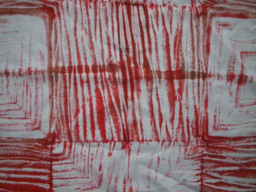
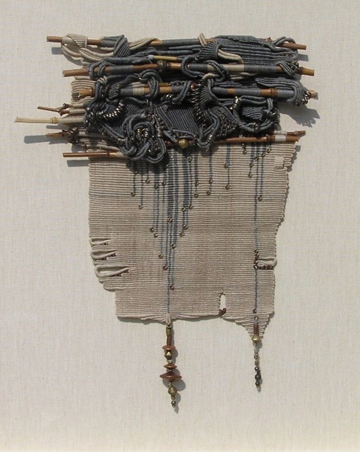
David’s knotted tapestries are engagingly lyrical; smart pieces that are sophisticated in color and intriguing in their complexity.

P1010005

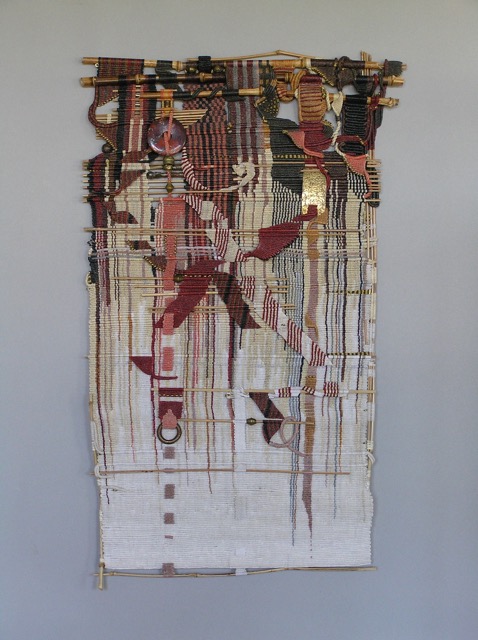
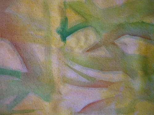
Fade to White     25″ x 15″    ©David Stearns

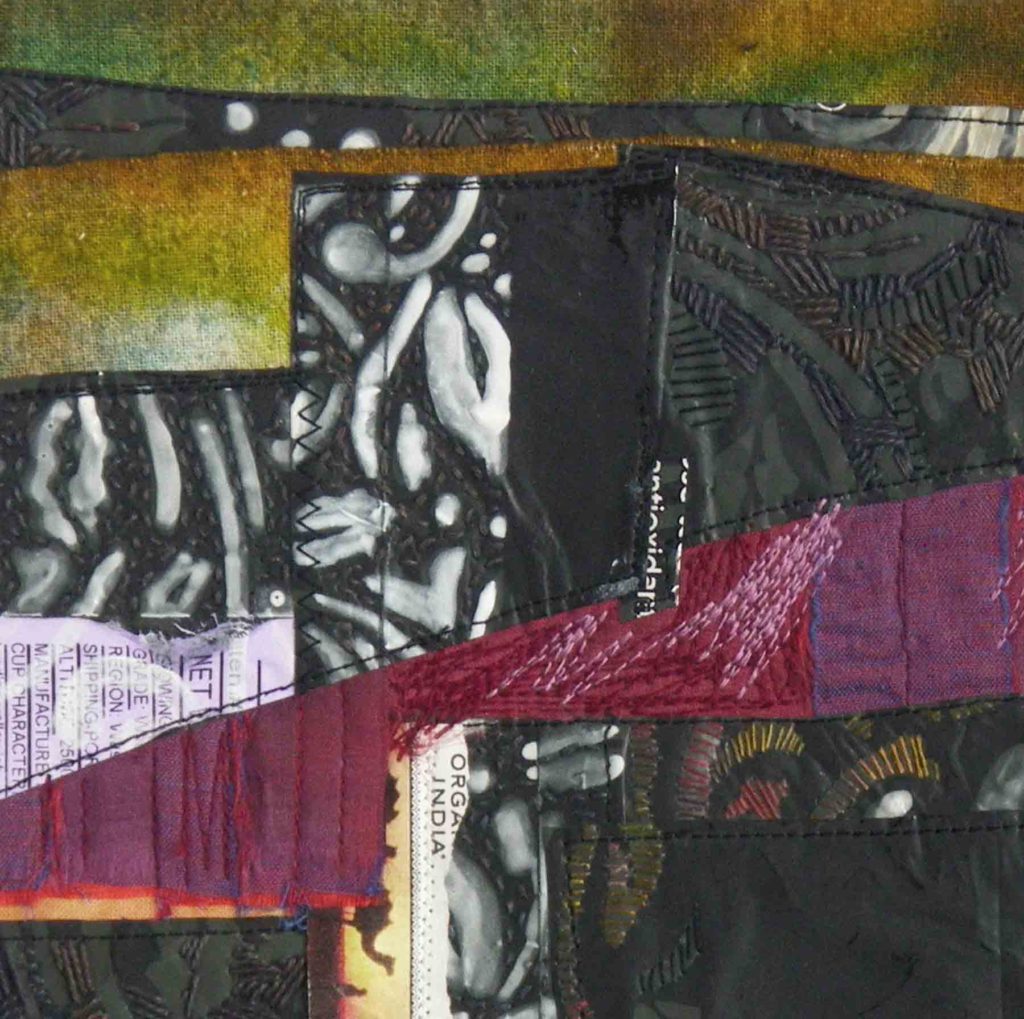
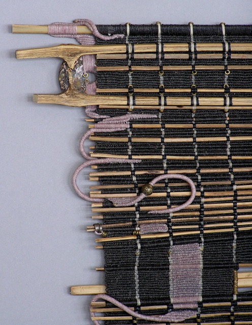
They possess a depth and intelligence that are more fully revealed upon close study, impressing the viewer with his scrupulous attention to the subtleties of detail.

P1010003

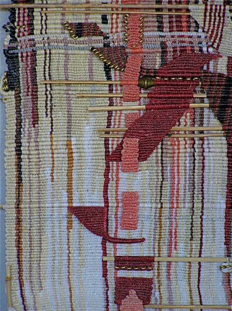
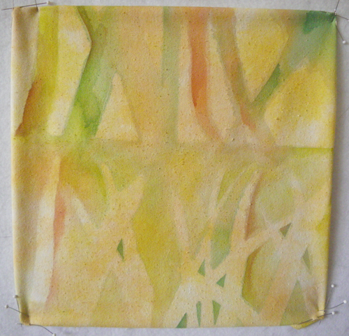
Fade to White, detail    ©David Stearns

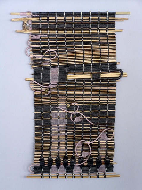
Within each work, there are elements that seem to develop an independent personality, breaking away from the main fabric of the piece, twisting and relocating to another section of the whole.

P8310006_1

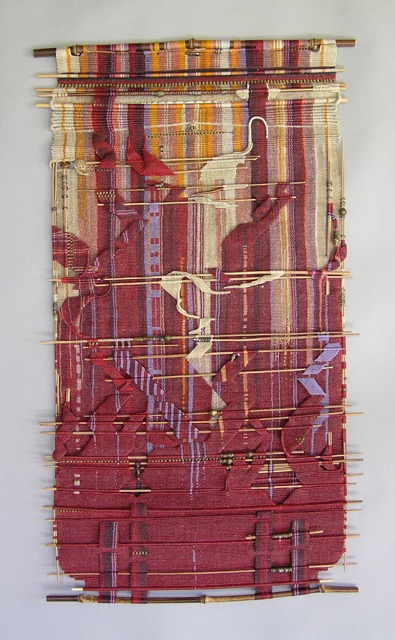
Capricho    28″ x 14″    ©David Stearns

Disparate and unexpected items such as bamboo sticks and metal beads are also incorporated, contrasting with the knotted, waxed linen, accentuating the rhythm of thousands of half-hitches while simultaneously conjuring an air of unpredictability. As a result, the pieces are quite musical.

P8310004_1

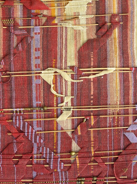
Capricho, detail ©David Stearns

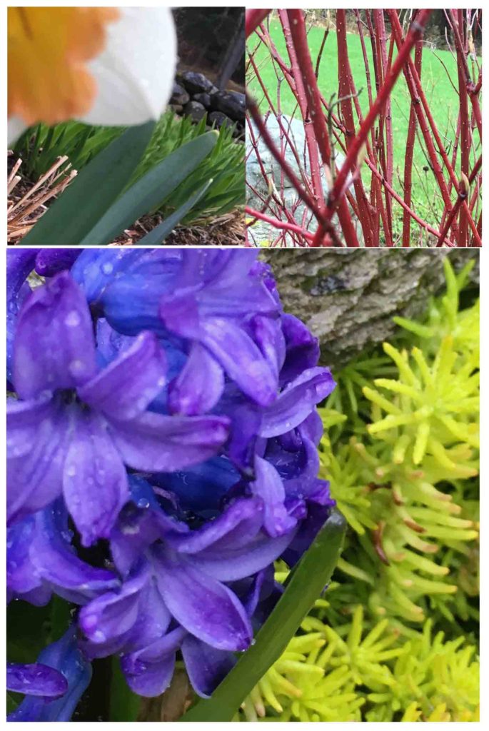
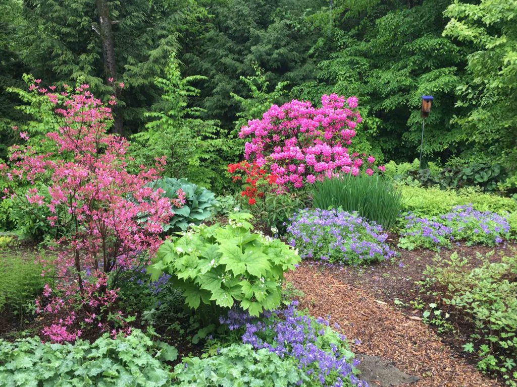
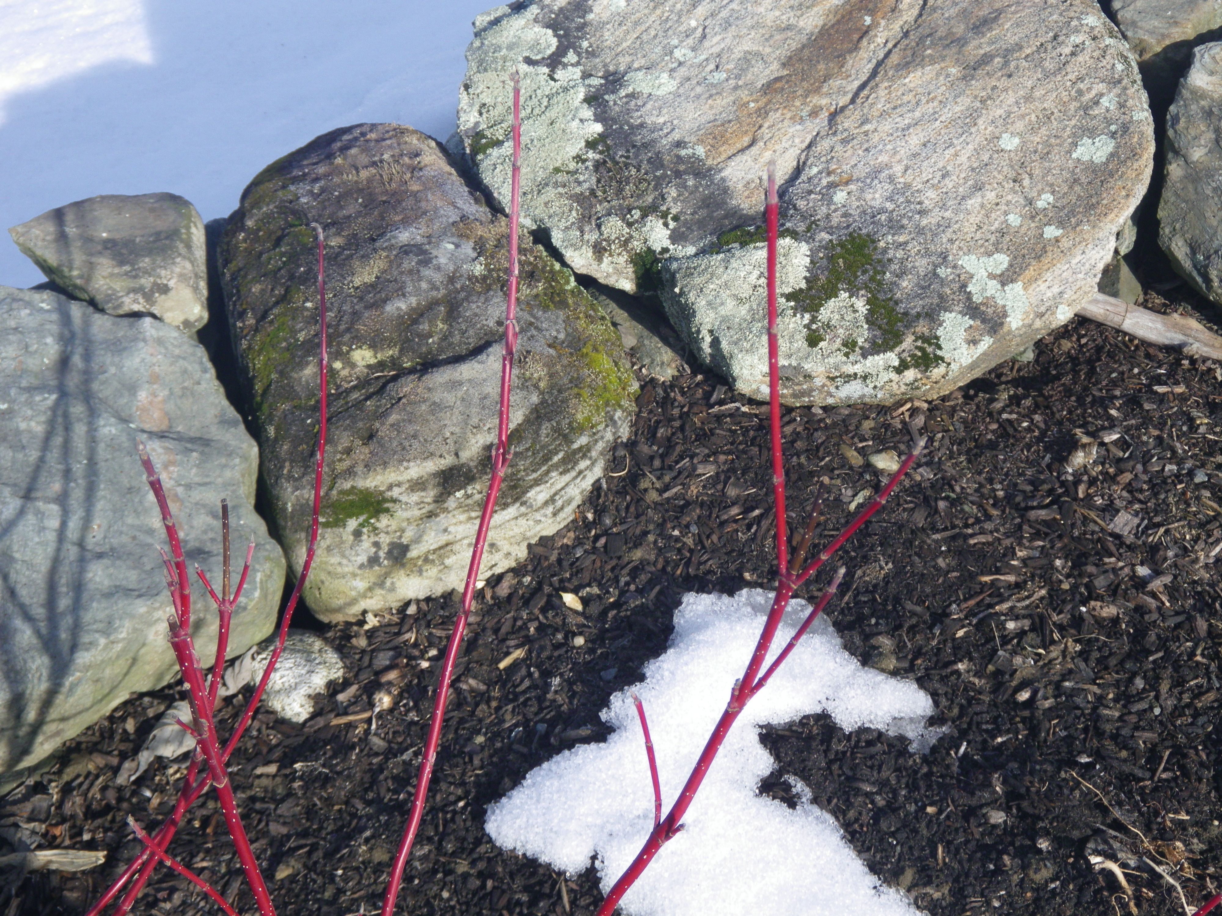
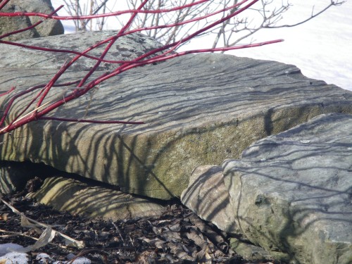
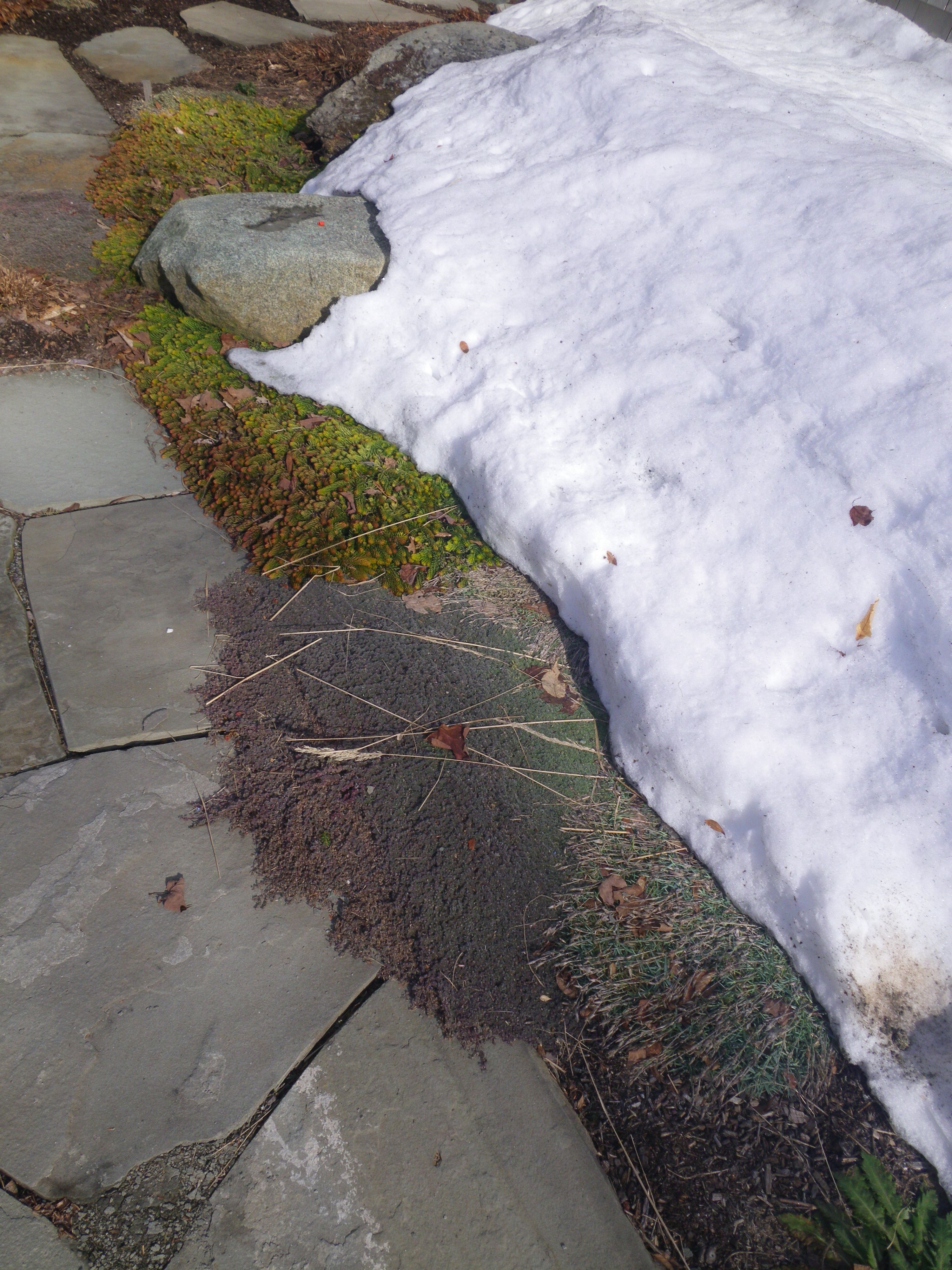
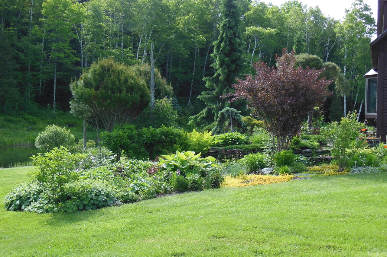
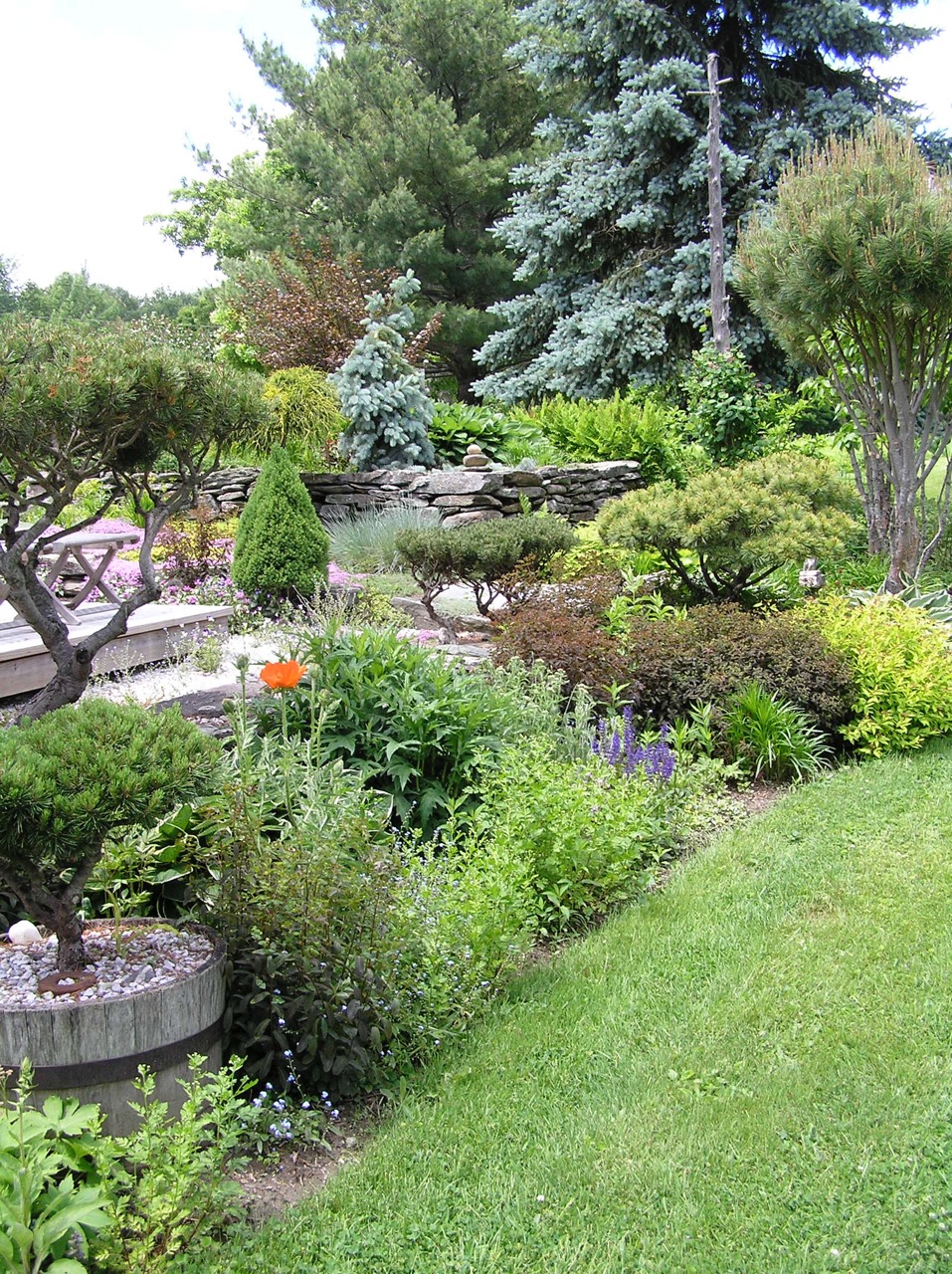
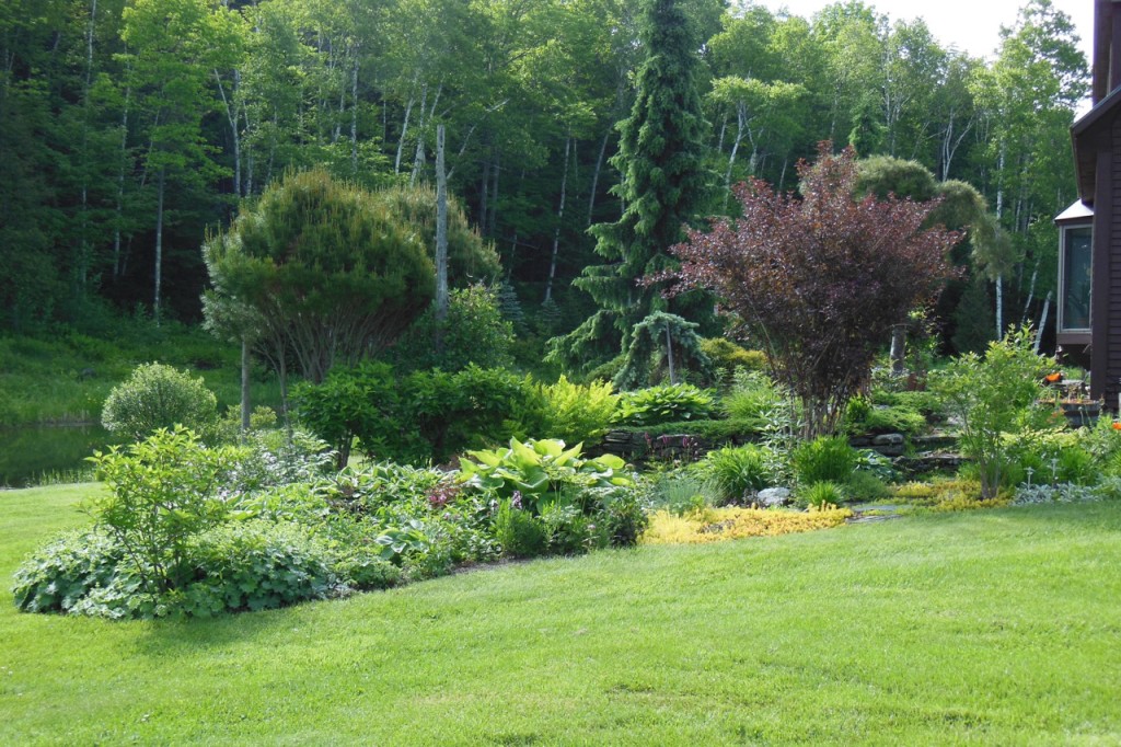
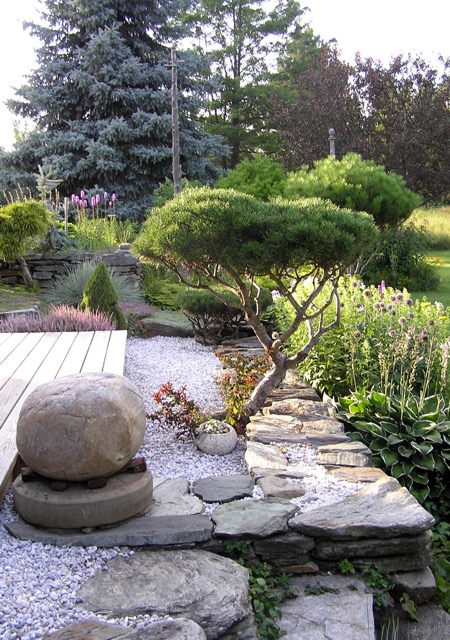
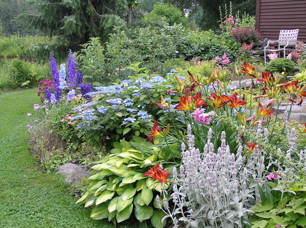
The weather on the day of my visit was lovely and it was impossible to ignore the setting surrounding David’s studio. I was swept away by the beauty of his garden — a masterwork of color and texture that manifests the depth that comes with years of care and evolution. One can’t help but notice the thoughtful placement of plants, such that they appear to be in concert with each other, first one carrying the melody, then another picking up the tune in its own voice.

Greens

©David Stearns

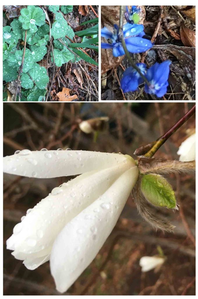
Layers of light, dark and texture are revealed through the prism of a neighboring plant, bringing to mind the offshoots that spring from the fabric of his tapestries, twisting and turning against the backdrop of the “mother”.

P1010001_1

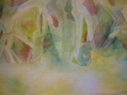
Meandering, detail ©David Stearns

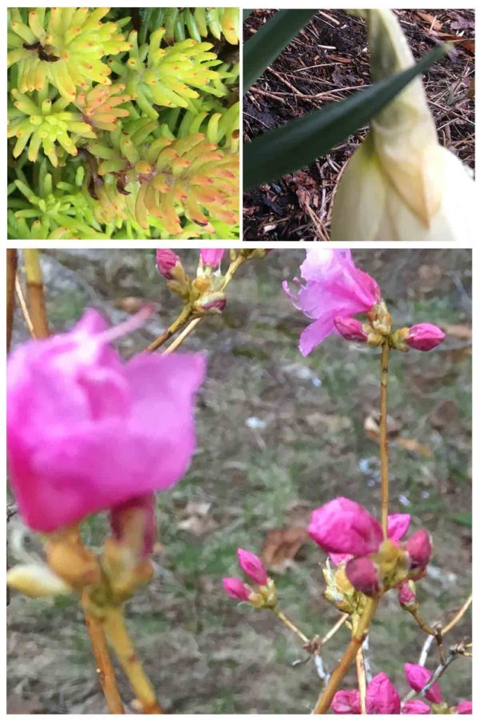
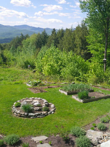
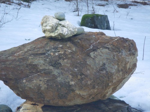
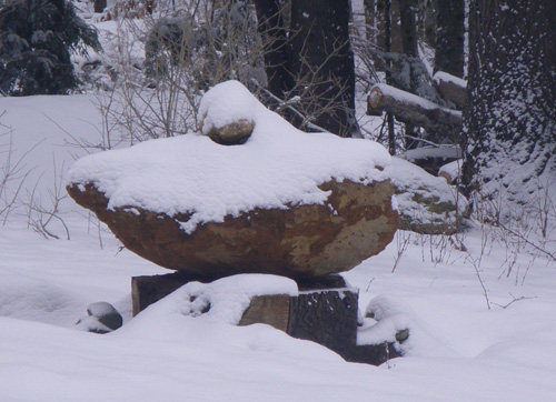
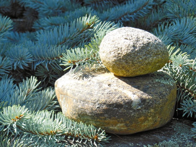
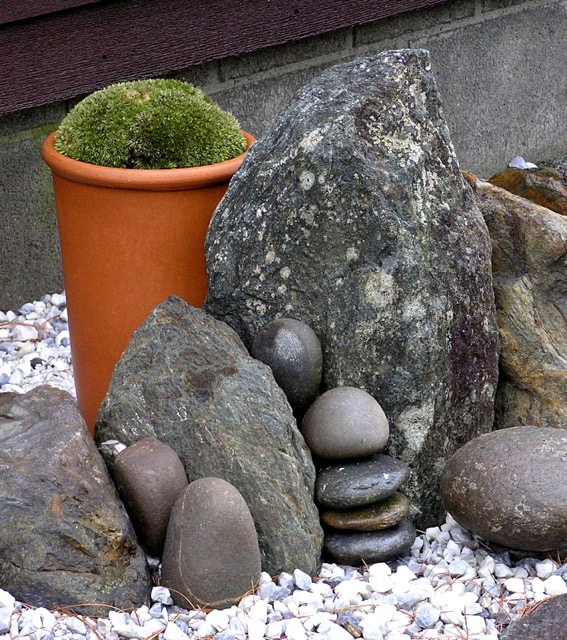
Water-worn stones of interesting shape and color punctuate the vegetation with the presence of sculpture, and when considered with trees that have been pruned to reveal their intertwining trunks beneath the wig of their leaves, create a counterpoint of structure within and beside the flowing garden beds.

Stones and bonsai

©David Stearns

Although the realms of knotted linen and a cultivated plot of land operate on different planes, it is apparent that David has discovered a way to bring together these seemingly separate labors of love so that each informs his work with the other. As a viewer, greater understanding of each comes via the experiencing of both. The mark of the same deft hand remains in both his tapestries and his garden beds, and one begins to realize that each is a different vehicle for answering the same questions.
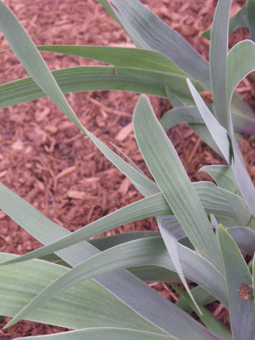
Stones and Moss

©David Stearns

P1010010

Meandering    21″ x 15″    ©David Stearns

Upon reflection, it drills home the strength and reward that is gleaned from finding a way to marry two separate disciplines so that they work together symbiotically, such that each raises the execution of the other to a higher level.

Flowers

©David Stearns

If you would like to see more of David’s work and environment, and to hear him describing his his art, please watch this lovely short video created by his nephew, Jay Stearns of Handcrafted Video. You won’t be sorry, I promise.

2Stones

©David Stearns