From its inception, I have consciously kept this blog centered on my practice rather than delving any more than superficially into my personal life. This has been partly in an effort to respect my family’s privacy, but also to keep attention focused on the elements I am most interested in sharing within this space: the ideas, art and processes that grab my attention, inform my work, and which I hope will hold some interest for you as well. However, it’s delightful serendipity when occasionally the two legitimately overlap.
This post will be short and sweet as we have just returned from California where we celebrated one of life’s most joyous milestones – our son’s wedding. And quite frankly, I’m too spent, in the happiest of ways, to write very much.
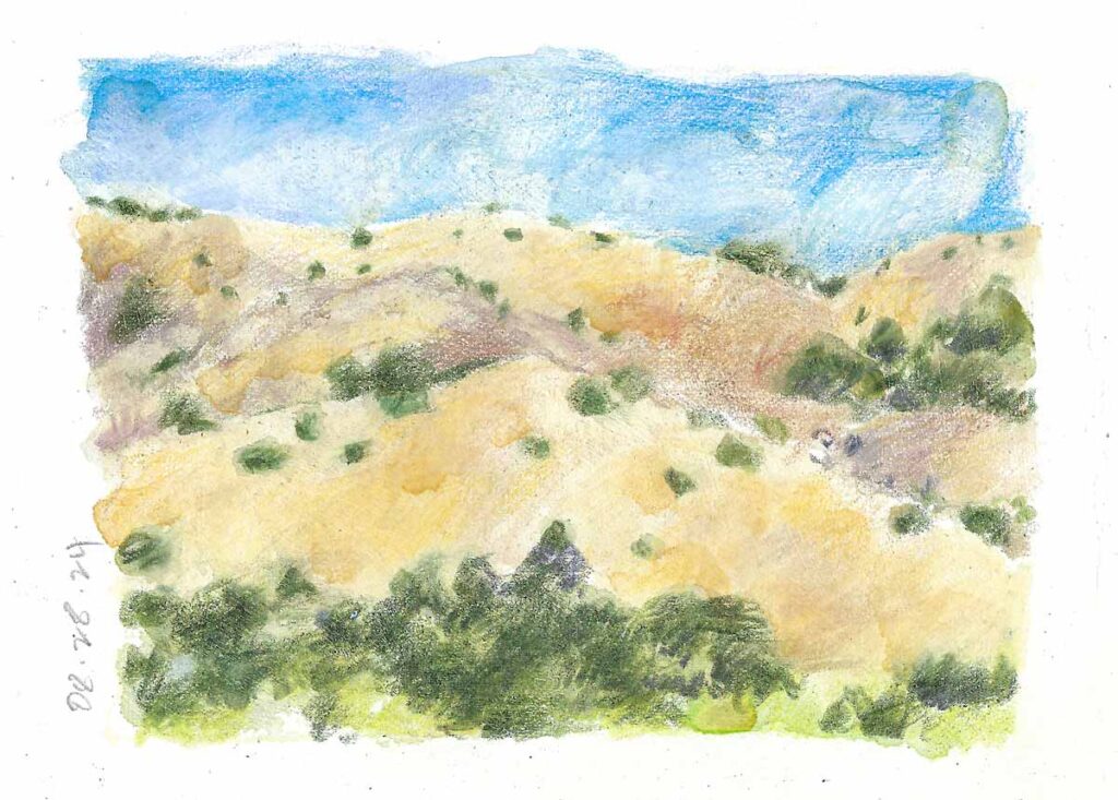
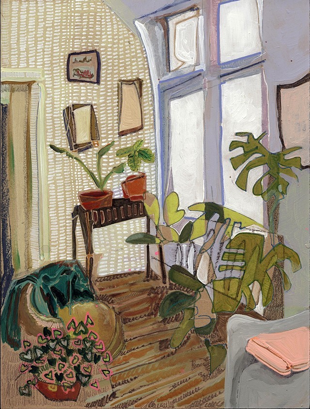
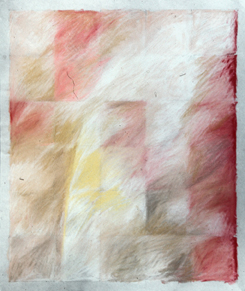
©2024 Elizabeth Fram, Watercolor, Colored pencil & White acrylic on paper, 3.5 x 5 inches. While I did bring my supplies, I only had time for one fleeting little sketch last week. The golden hills that are so ubiquitous along the roads and highways of Marin County are so striking – rich as they are with hints of Mars Violet and Burnt Ochre and dotted with the green of both isolated and clumped groups of trees.
But I’d like to take the time to share that it was my son who, when I was mulling over the idea of whether or not to begin a blog in 2014, most heartily encouraged me to dive in, dispelling any lingering fears that were causing me to hesitate. In the almost 10 years since, he has consistently been available – to consult about technical issues, to share authors and podcasts, and to support my nerdy enjoyment of productivity hacks so I could learn to juggle the many artistic and personal balls I want to keep up in the air.
In early June, he sent me the following article from The Convivial Society, which I just loved and knew would be perfect to highlight here sometime. Please read it – it’s a healthy helping of food-for-thought which resonates strongly, not only with ideas I, and maybe you, have been feeling instinctually in my gut (most closely expressing in this post from 2016,) but it is well-worth a read for anyone who works creatively and is wondering where the world of AI will lead us. At its core, it is an affirmation that we can hold onto the things that will always give us the advantage over technology. If nothing else, L. M. Sacasas’ theory would be a great jumping-off spot for future discussions.
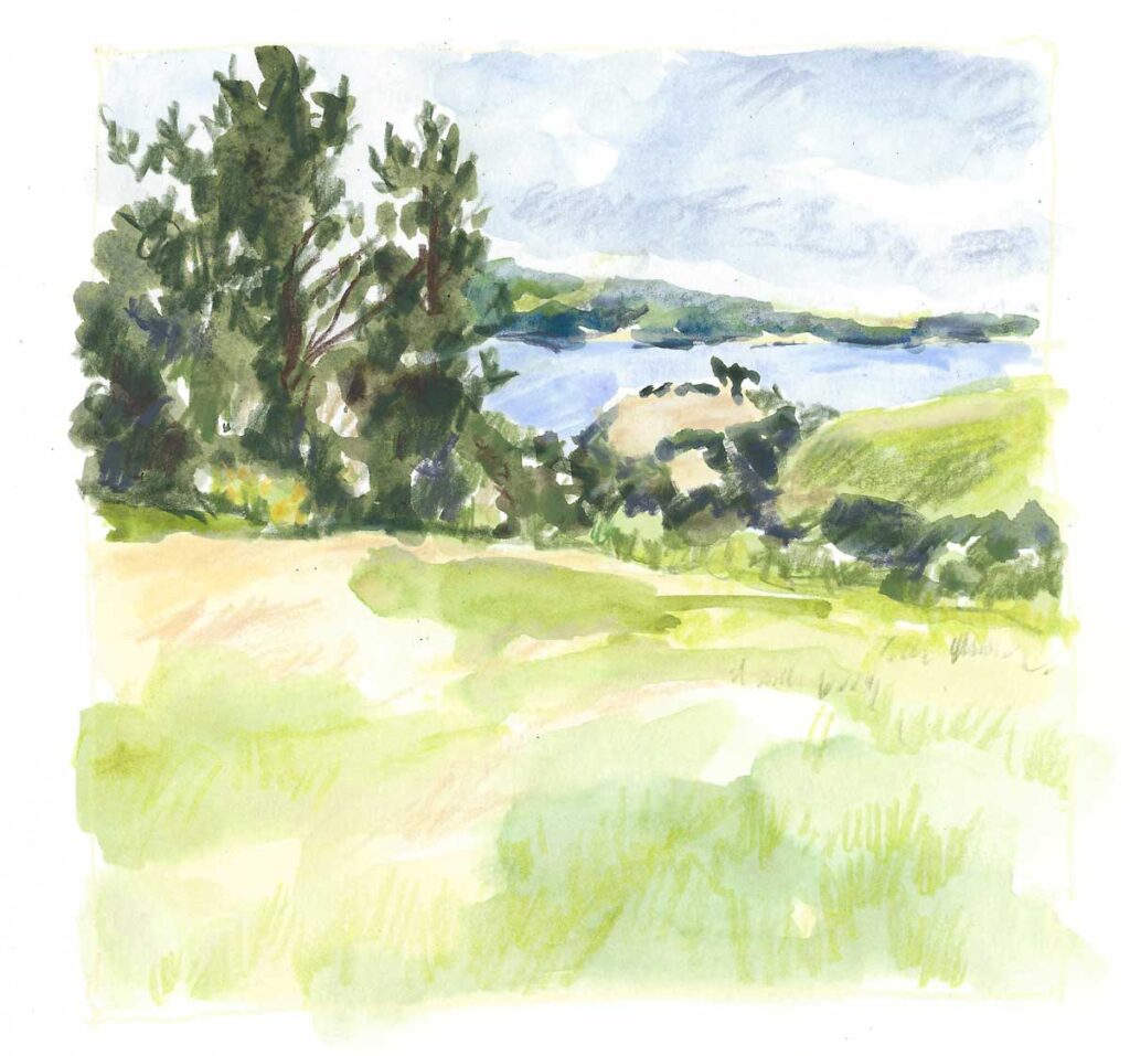
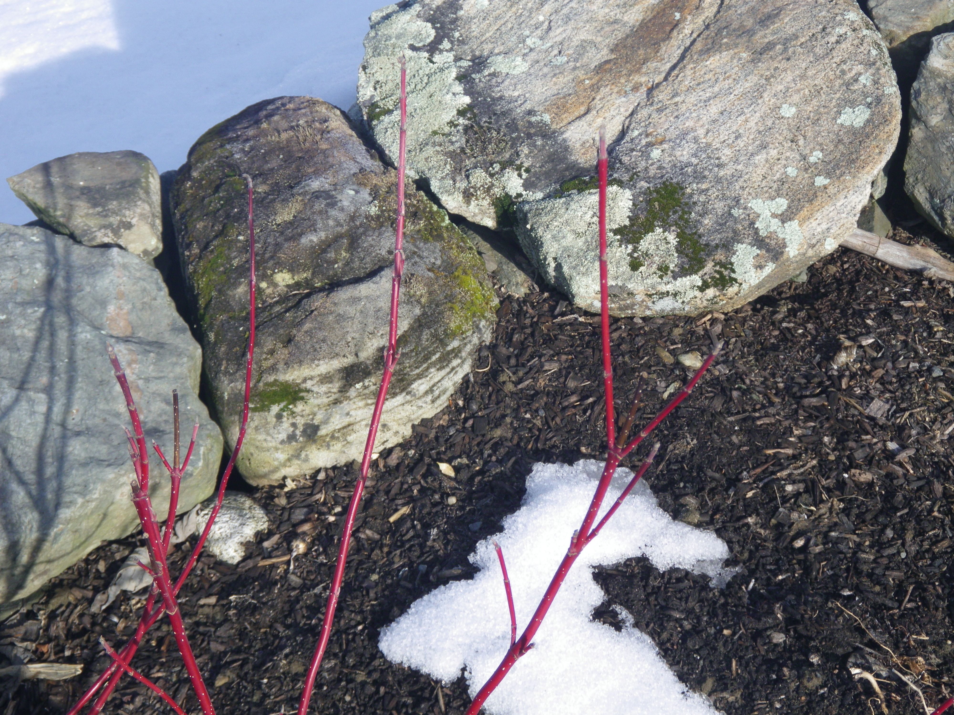
Tower Hill ©2024 Elizabeth Fram, Watercolor & Colored pencil on paper, 6 x 6 inches. Beautiful spot for a wedding, don’t you think?
Meanwhile, there is nothing more gratifying than realizing a loved one “gets” you by reaching out to engage the thoughts and quandaries that swirl around in your head, but which you may not have quite known how to articulate yourself. In sharing this essay, it’s clear my son is paying attention, and that is the greatest of compliments/gifts.
With that in mind, I’d like to dedicate this post to him and his bride as they embark on their bright future, with deep appreciation for the many, many contributions he, and now they, have made to enrich my journey, both in the studio and outside of it.
Here’s to you SBF & OGW…and from the bottom of my heart – thank you.