
While color will often draw a person across a room to a work of art, composition is the key that then locks the viewer in place.
A whole new world cracked open during my first college art history survey course when the “science” of arrangement and placement, in almost mathematical terms, was revealed to me for the first time. Suddenly I began to understand why some pieces of art just seem to feel right, and others niggle like a tiny pebble in your shoe.
After last week’s post, please understand that my head is still floating around in 15th century Italy.
Triangles developed as a compositional technique during the Renaissance, partially due to the shape’s inherent relationship to perspective and its implication of depth as artists began to understand how to depict ‘real’ space. Additionally, the shape was used as a reference to the Holy Trinity and as a symbolic mechanism — a point-up triangle representing ascension toward the spiritual world. It was a revelation for me during that long-ago class, to view slide after slide outlining examples of its use throughout art history: Da Vinci’s Mona Lisa, Liberty Leading the People by Delacroix, The Chess Players by Thomas Eakins, and The Iwo Jima Memorial sculpted by Felix de Weldon are just a few examples.
At the Uffizi, because most people were flocked around Primavera and The Birth of Venus in the Botticelli room, I had plenty of elbow room and time to closely study Botticelli’s unfinished Adoration of the Magi, from 1500. If you squint you will see the not-so-subtle use of a triangle, superimposed over an “X”, which forms the mainstay of the piece’s composition. Once one becomes aware of it, it is really quite fascinating to see how Botticelli deliberately guides our eyes directly toward the Christ Child, amid and despite the relatively frenetic crowd of people and animals.

Adoration of the Magi Sandro Botticelli, 1500, Tempera on panel, 173 x 107.5 cm, Uffizi Gallery, Florence, Italy
On a more contemporary note, inspired by the podcast Unspooled, (recommended earlier this summer), we re-watched Citizen Kane this past weekend. Since podcast hosts Amy Nicholson and Paul Sheer frequently referenced Roger Ebert’s expertise in their discussion of the movie, I watched a second time with Ebert’s voice-over commentary. The background details about the actors and the film’s production were moderately interesting, but what really grabbed my attention was the extent to which composition was a factor as Orson Welles and cinematographer Gregg Toland labored to flesh out Kane’s story on a visual level. Countless scenes were composed, and camera shots framed, such that the characters were placed into the classic device of a triangle, forcing sight lines between them and often a key object, while simultaneously influencing what we as viewers saw, albeit often subconsciously.
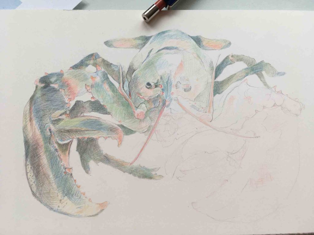
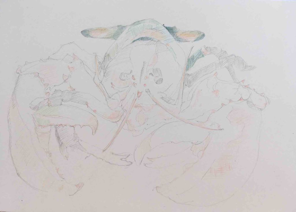
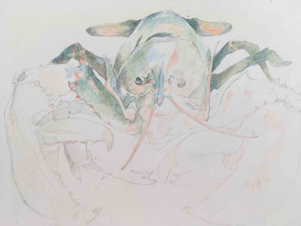
So, looking at this week’s lobster drawing, I realize that at first glance it doesn’t form a true triangle, yet the shape is strongly suggested in this head-on view with the tail at the apex. I have to admit I didn’t plan it that way, but chose this view because it “just felt right” (see first paragraph). It’s a configuration that lends a sense of stability and weight to the drawing even though the image is floating in space, and I have to wonder how much influence all the art I saw in Florence, and perhaps even Citizen Kane, had on it’s making.
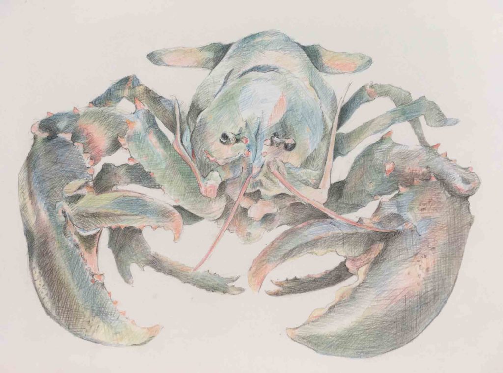
Lobster ©2018 Elizabeth Fram, Graphite and Verithin Pencils, 6 x 9 inches
❖
For all you art/gardeners, take a look at James Golden’s beautiful View From Federal Twist. And if you have the time, treat yourself to this lovely NY Times article about Golden and his garden, in which he describes “…the main purpose of this garden is aesthetic, ornamental, even emotional”. It’s a wonderful end-of-day read.