Up until the last couple of days, winter has been tenaciously hanging on. We’re all itching to move on but, knowing how mercurial Vermont’s transition to spring can be, the studio is the one place where I can effectively make change happen.
With that in mind, here’s a peek at something new…
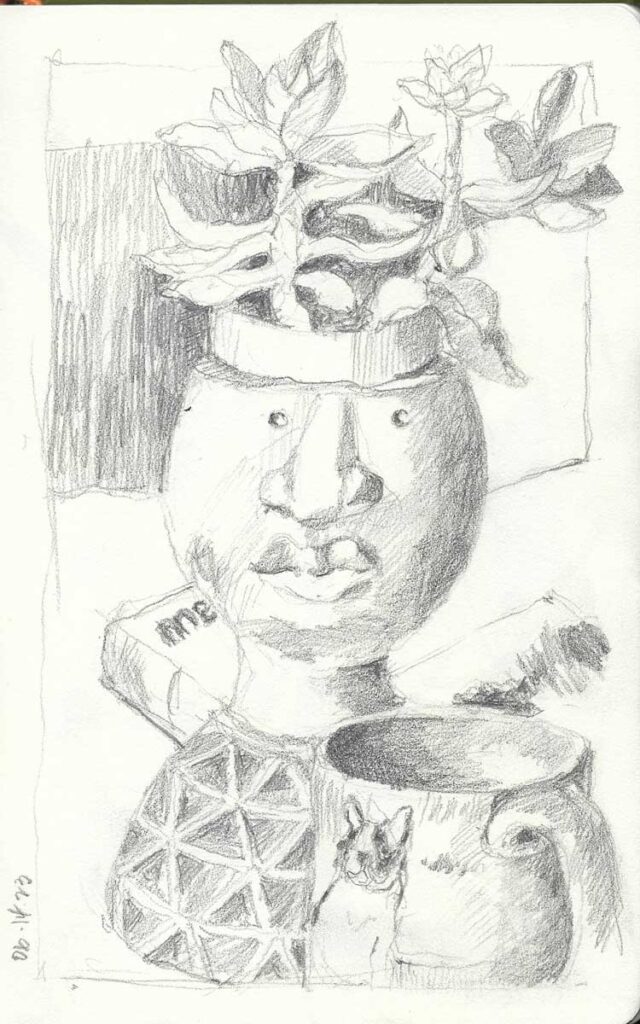
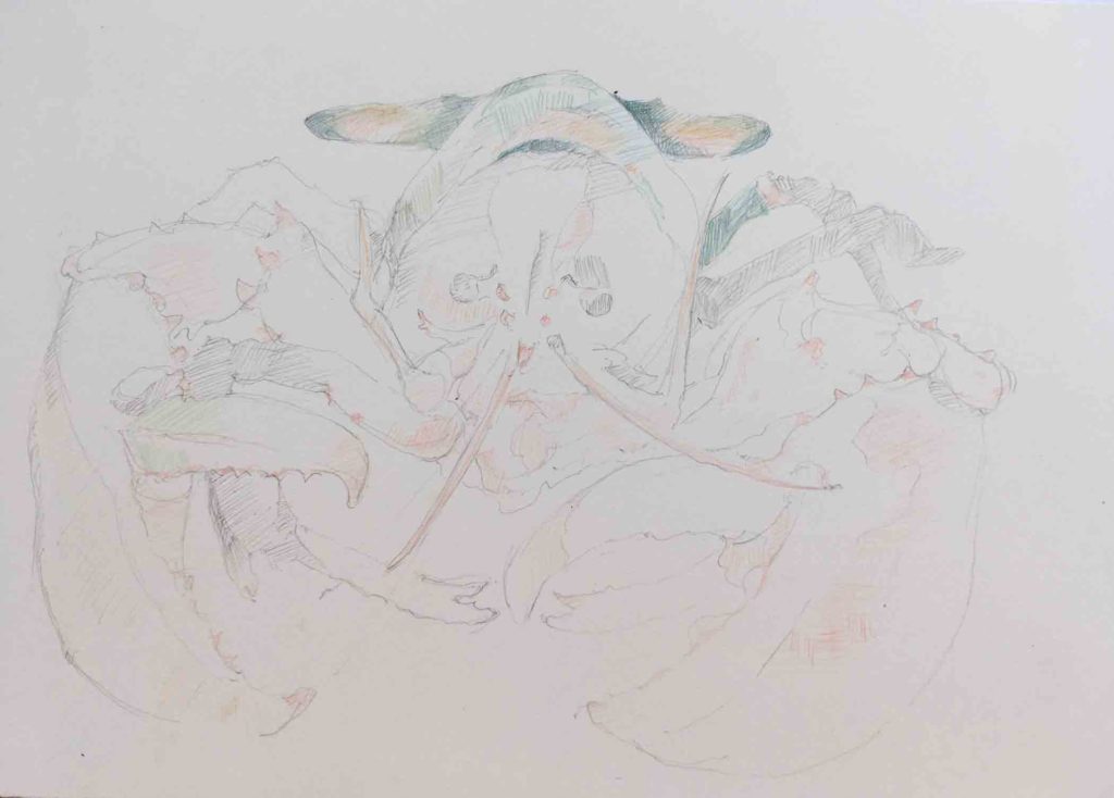
I have been thinking quite a bit about the sewn side of my paintings and how I might leverage passages of stitching to explore pattern and texture more extensively.
Orientation is key; rotating an image 90° or 180° shakes off automatic interpretations, allowing me to lean into abstraction. I’m still thinking about how to tackle the stitching on this one.
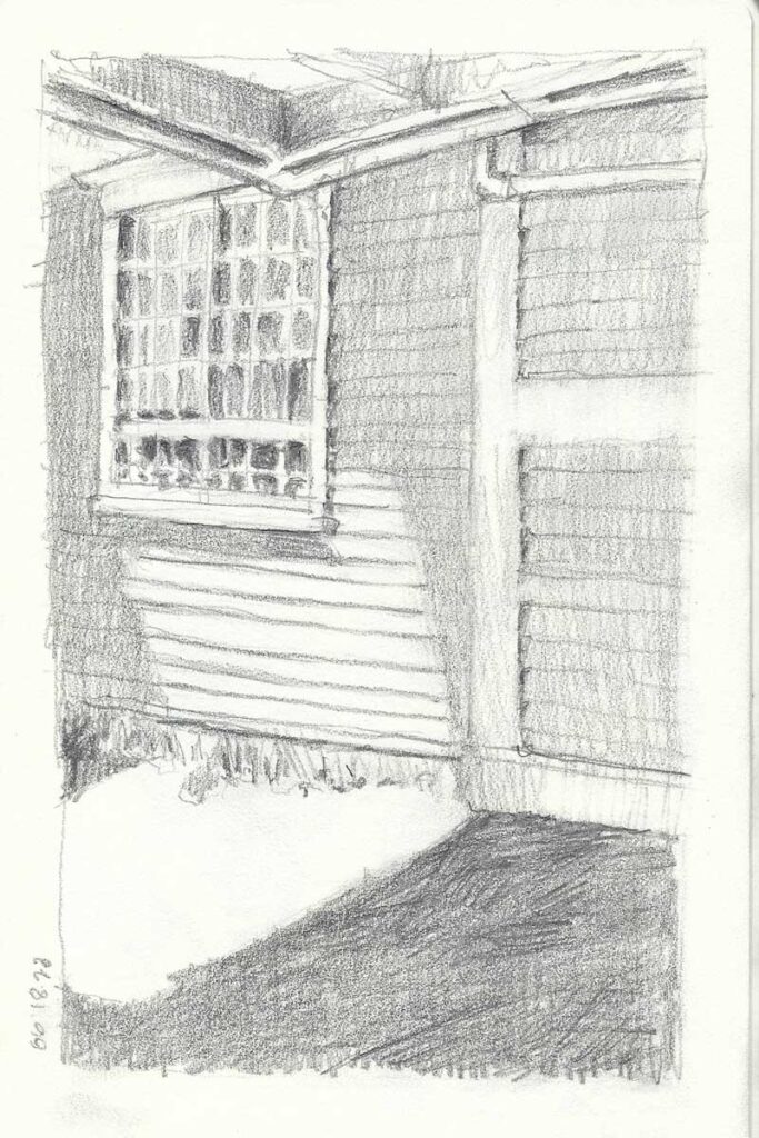
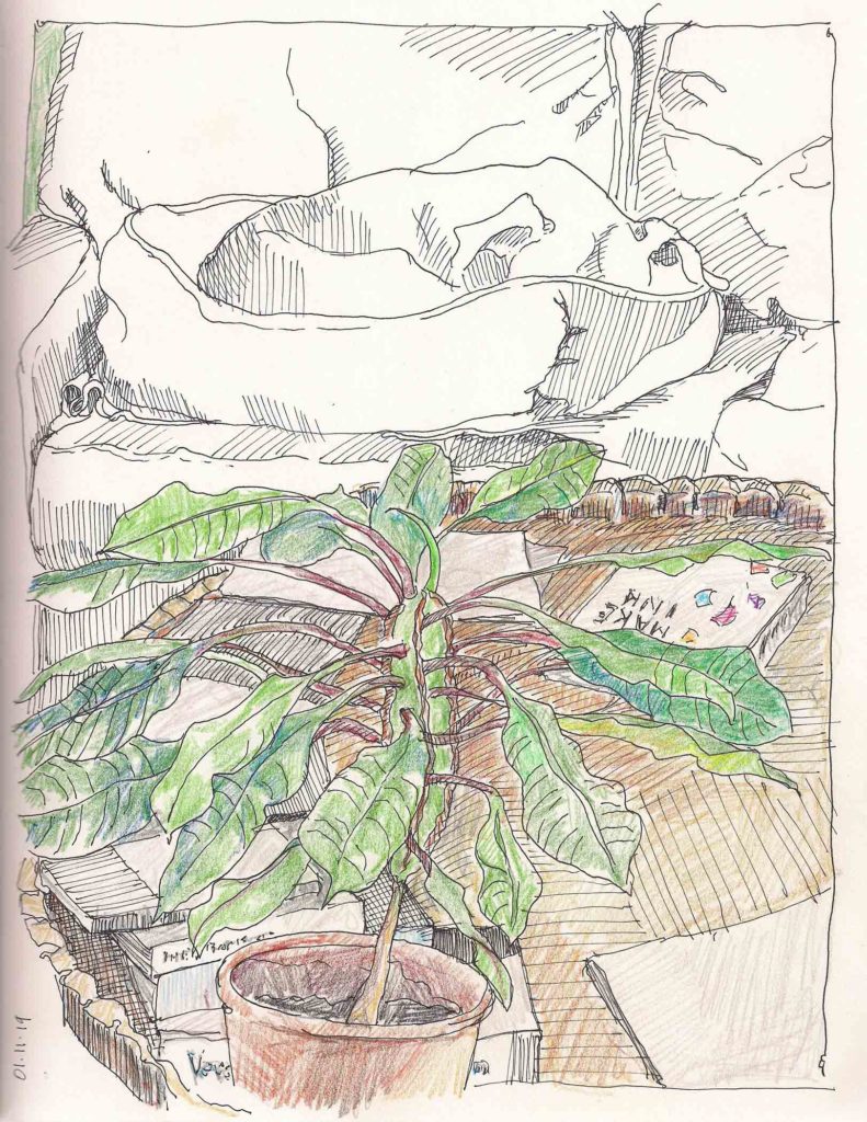
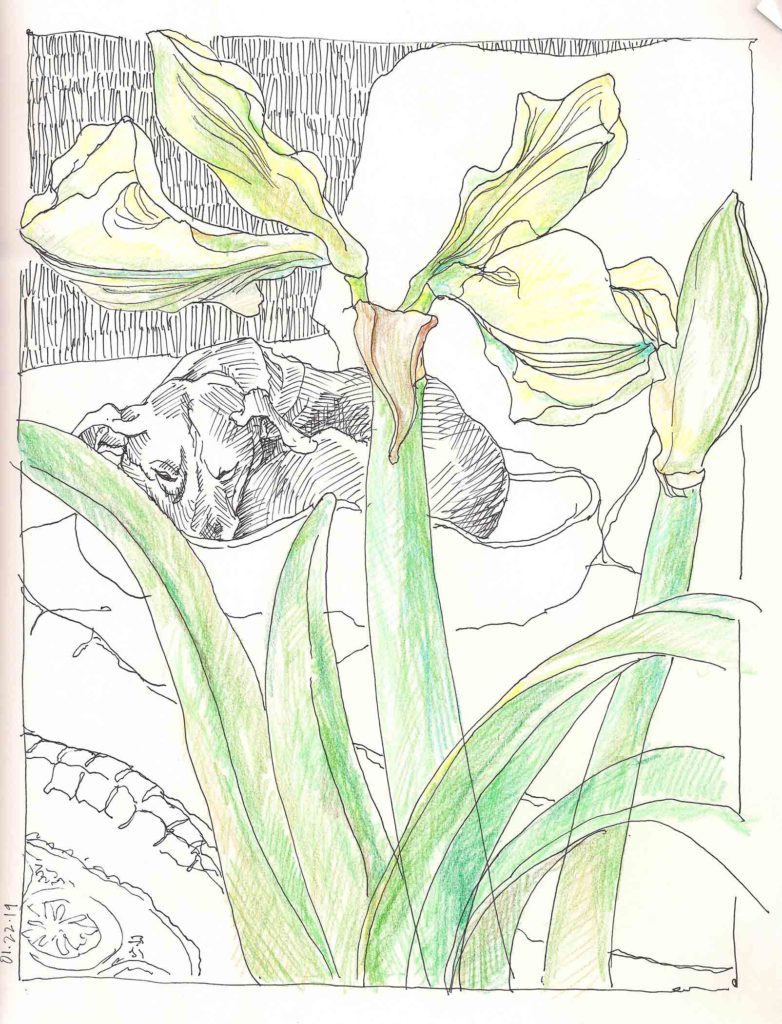
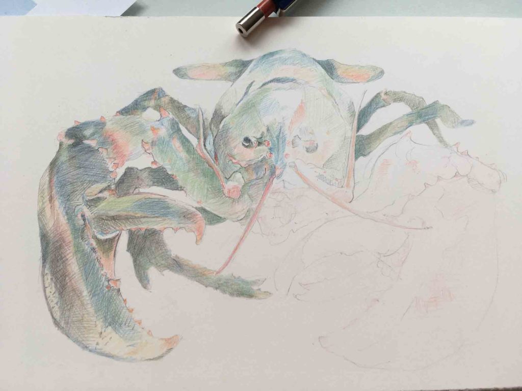
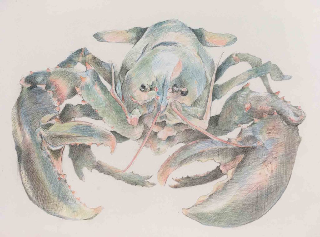
I’ve been cropping sections of older ink sketches, reinterpreting them by creating new compositions in watercolor that flirt with abstraction. By situating the painted elements so that they hug the edges of the frame, I’m simultaneously leaving wide swaths of space that are open for stitching.
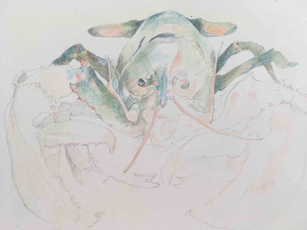
This image is more easily identifiable, but again, rotation helps me to home in on an interaction of shapes vs a specific object.
On the one hand this creates tension between the painted and unpainted areas, while on the other hand it offers me an empty field that is ready-made to push the potential of stitching as it relates to the image as a whole.
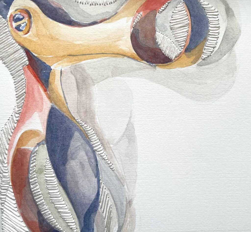
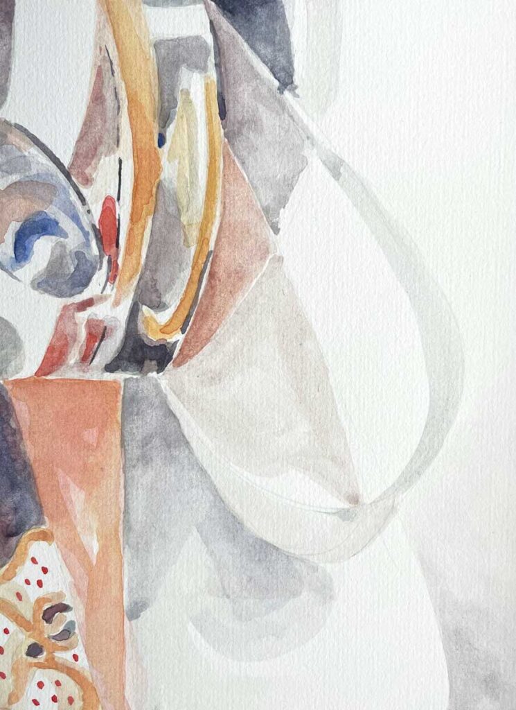
©Elizabeth Fram I raced on the stitching so I could include this piece in today’s post, giving you a taste of what I’m working toward. But you never know how things will evolve until you’re already up to your elbows. What I didn’t expect was that leaving a large area completely free of any sort of imagery/stitching would be just right. That, and cropping the image to a square makes this piece feel complete. If one thing’s for certain, it’s that the work is just as much in the driver’s seat as I am.
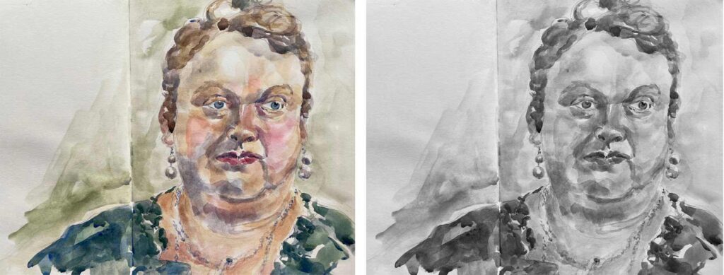
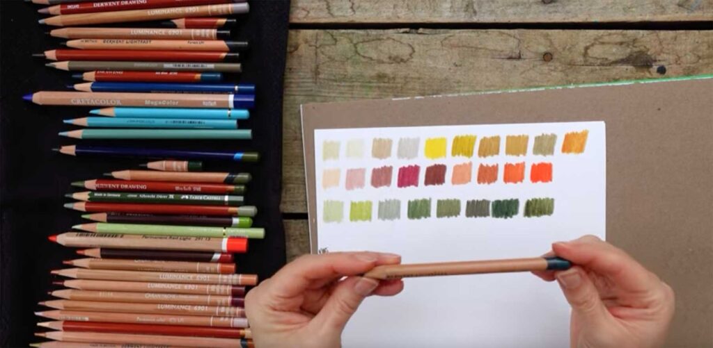
Considered from another angle, I’m giving myself an opportunity to juggle between positive and negative space. Remember the old optical illusion: is it a vase or 2 profiles? That’s what I’m thinking about while at the same time limiting my palette so I can concentrate more fully on finding a balance between the two.
✷
Meanwhile, as I wait out our on-again / off-again snowy days I’ve been experiencing a bit of a bonanza in terms of art-related film. There’s nothing quite like art for reminding us that, despite world affairs, creativity ties us together across cultural and geographic lines.
If you aren’t already familiar with The Red Dress project, this short film will bring you up to speed. Kirstie Macleod, originator of the project, travels to Mexico to connect with two of the many embroidery artists who contributed to the finished dress.
✷
Led Zeppelin drums up plenty of teenage memories for me, but I never fully understood or appreciated their sheer genius until seeing Becoming Led Zeppelin in the theater last week. OMG.
✷
Finally, I happened upon this last film by pure chance. You can stream it either on Kanopy or Amazon Prime. If you have any interest at all in Japanese Ukiyo-e prints, artistic collaboration, the melding of an ancient art with pop culture, or even the fine craftsmanship of Japanese tools — you will also love The Art of the Game: Ukiyo-e Heroes.
✷
Come take a look…
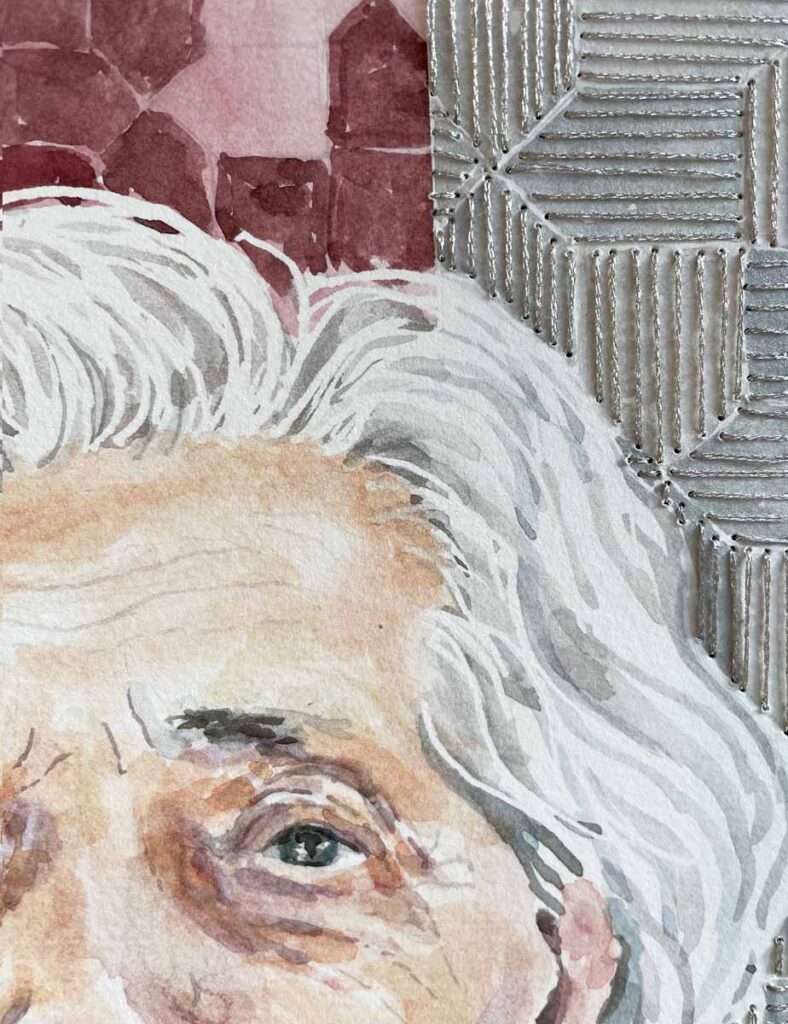
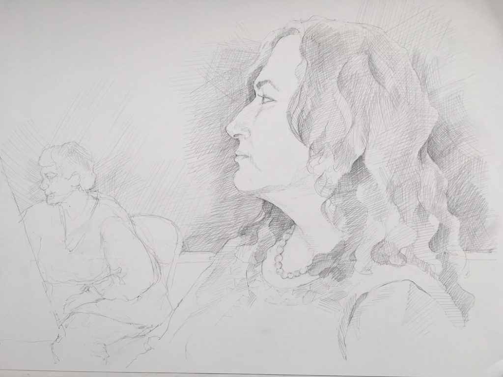
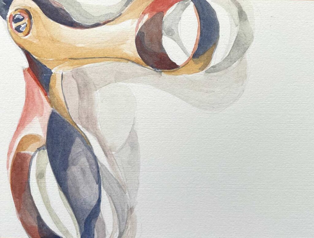
Strands of Wisdom (I’ve Seen a Lot, Not All of It Good)), detail ©2024 Elizabeth Fram, Watercolor and stitching on paper, 8.5 x 8.5 inches.
Studio Place Arts, a jewel of community and creative connection, just opened its latest group show this week. Silver Lining celebrates 25 years of SPA with a show based on the color Silver. The show runs from March 12th – April 19th.
I have two stitched portraits in the show.