We’ve reached the mid-point!
Welcome to Week 3 of my Summer Stories Archival Sale!
The five pieces described below are 20% off in my web shop , now through 11:59pm July 31st. Find them under the category “Etudes”.
Use the coupon code Etudes20 at checkout.
But first, a quick check-in: I hope you are enjoying the stories I have been sharing this summer. Have you found anything surprising, relatable, confounding?
What I’ve discovered is that taking the time to look back helps me to see more clearly where I am going. And that is very rewarding.
Thanks for coming along for the ride.
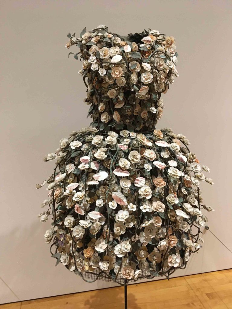
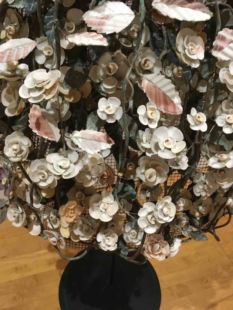
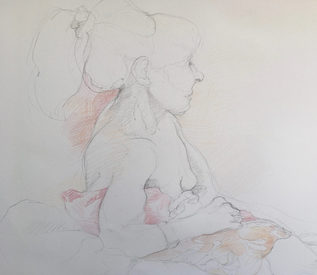
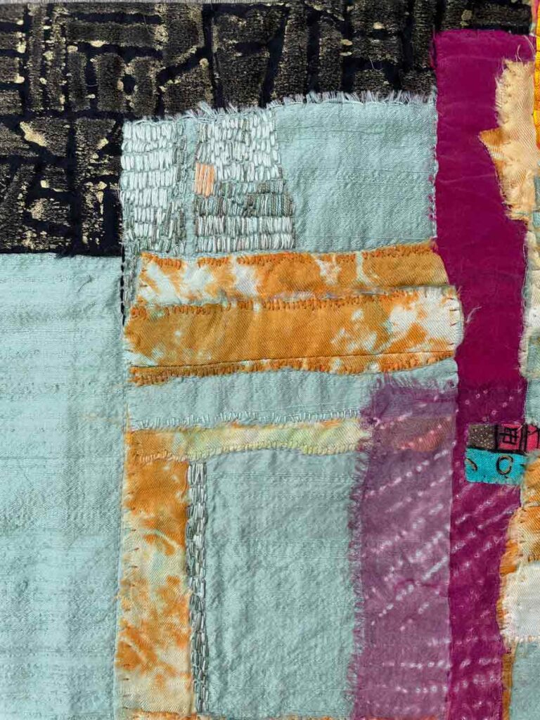
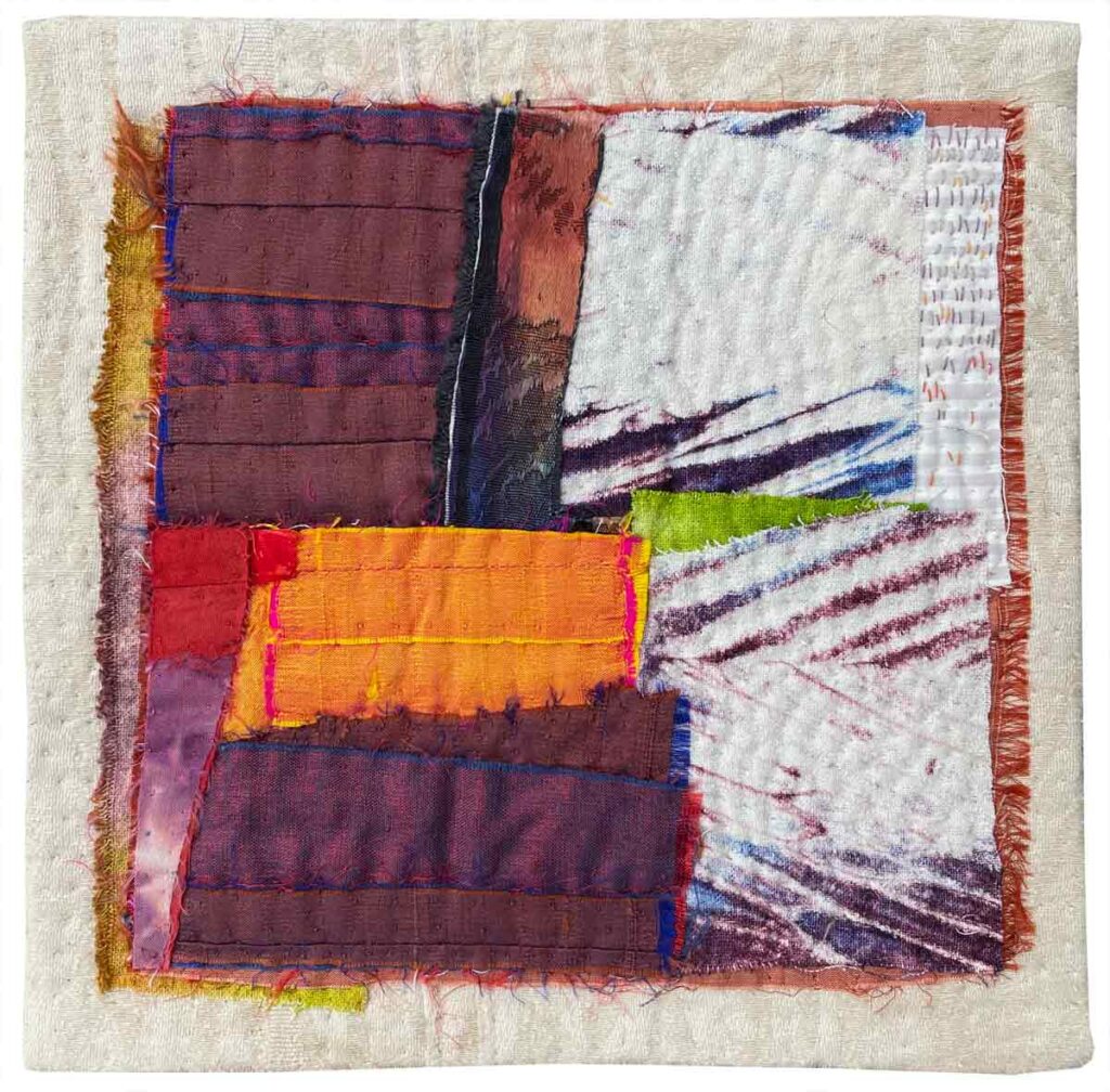
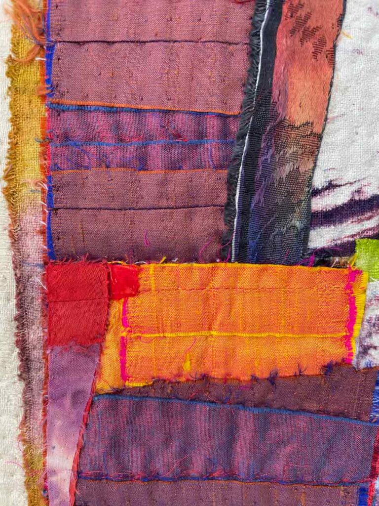
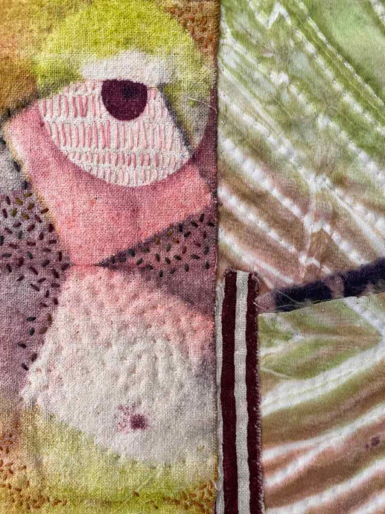
Stand, detail ©2011 Elizabeth Fram
I’ve called this latest section of my sale “Etudes” because each of these small pieces was just that – a study. While the dictionary’s definition of “etude” refers to a musical composition, the creative intention remains the same regardless of medium or discipline: “a piece designed as an exercise to improve the technique or demonstrate the skill of the player”.
With the basic building blocks of fabric, dye, thread and a needle, possibilities are only limited by one’s imagination. I’ve come to appreciate that fully exploring assorted processes in order to push the nuances of their potential is as integral to my practice as the concepts I am hoping to illustrate.
After moving to Vermont we built a house, customizing it to our personal quirks, desires and environmental goals. Topmost for me was that it include a roomy studio with a sink. That humble sink has given me the freedom to stretch beyond the copied “prints” on fabric I had been making previously, and to begin to explore surface design through many variations of Shibori dye techniques.
The small pieces you see here were created with the intent of finding new ways to incorporate the results of resist-dye explorations with a variety of sewn construction techniques, hand-stitched quilting and embroidery. They represent a mere scratching-of-the-surface of investigating and celebrating the rich artistic possibilities of textiles.
For years, a large part of my self-imposed directive has been to push the distinct qualities inherent to cloth and thread, honoring and highlighting them within my work for their unique visual and textural characteristics, rather than attempting to mimic processes and imagery that can be much more easily accomplished with paint or other media.
I love how these small works speak not just to a moment within my personal artistic development, but also to how, despite their small size, they reference the abundant potential of seemingly modest materials.
Book Form ©2011 Elizabeth Fram, Silk & cotton fabrics, Dye, Discharge, Paint, hand appliqué, Hand and machine quilted, Hand embroidered, 15″H x 21″ W, SALE Price: $440. If you’ve followed this blog for any amount of time you will know that reading is a huge part of my daily practice. This piece honors that love by using marks created with dye, paint and stitches, plus areas of pleated assembly, to mimic lines of text on a page beneath an open book.
Book Form, detail © 2011 Elizabeth Fram The pattern on the black and gold fabric in the upper left corner was created by etching a design with a dull pencil into a styrofoam tray from a package of grocery store chicken. The resulting “plate” was rolled with textile paint and then used to create a mono-print on cotton.
Book Form, detail © 2011 Elizabeth Fram Black fabric, adorned with lines of masking tape and then sprayed with a diluted bleach solution created a lovely pattern of irregular lines once the tape was removed. Overlaying it with a sheer fabric allows that pattern to peek through, increasing a sense of depth. Lines of embroidered stitching follow the rhythm of the discharged pattern, also inferring a sense of text but with variations that imply handwritten rather than printed words.
❖ ❖ ❖
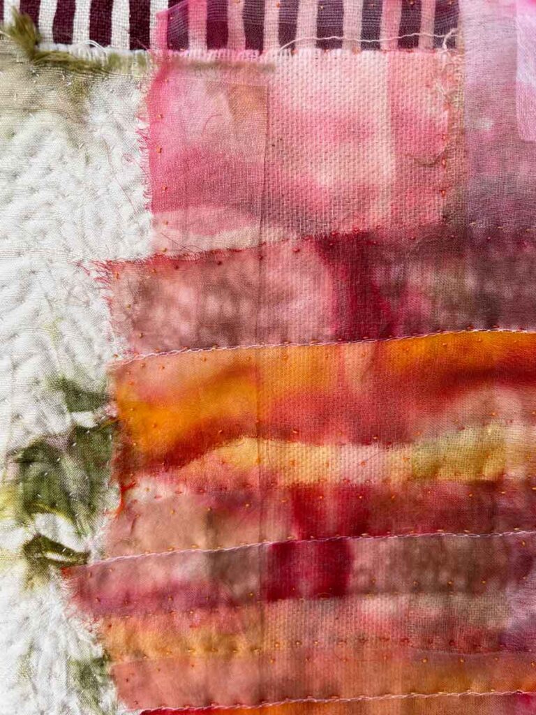
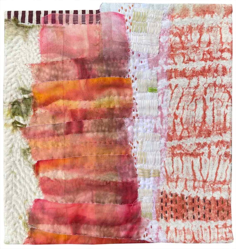
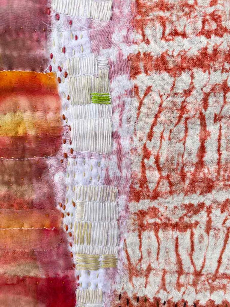
Stack ©2011 Elizabeth Fram, Silk & cotton fabrics, Wrapped-resist dye, Machine stitched, Hand quilted, Hand embroidered, 9″H x 9.5″W, SALE Price: $200. The following 4 pieces are part of what I have informally called my “motion series”. They all imply some form of movement or stance. When I made them, I had just completed an online class in Shibori dyeing that taught me the basics of a variety of ways to create pattern on cloth via stitched, wrapped and clamped resists.
Stack, detail ©2011 Elizabeth Fram Combining samples of this newly dyed cloth with fabric from my stash brought me the same satisfaction as piecing together a puzzle. I particularly like the way the pleated sheer fabric on the left – which I had dyed separately – worked in tandem with the striated red and white arashi-dyed silk.
❖ ❖ ❖
Strut ©2011 Elizabeth Fram, Silk & cotton, Wrapped-resist dye, Hand appliqué, Hand quilted, Hand embroidered, 8.5″H x 8.5″W, SALE Price: $160 This piece is small but has a strong voice. Such is the power of color. For years, before I began trying my hand at surface design, I collected dupioni silks wherever I could find them, treasuring them for their saturated colors and iridescence. The confidence conveyed by these assertive hues is why I named this piece “Strut”.
Strut, detail ©2011 Elizabeth Fram
Strut, detail ©2011 Elizabeth Fram When I first began making art with cloth, I ran through every fabric department I came across, collecting anything with unusual characteristics and potential. The damask-like rectangle that morphs from orange to violet, in the upper right of this detail photo, was a length of synthetic that I believe was intended as a dress fabric. It was so unusual, but incredibly versatile. Somehow it seemed to “fit” in almost everything I made, until all I had left were tiny slivers to insert here and there. Not only did I use it for the colors on its right side, but it’s reversible back side was silver with the black pattern, and I used it as the underbelly of a mackerel in one of my earliest pieces. Follow this link and scroll to the bottom of the post to see that fish.
❖ ❖ ❖
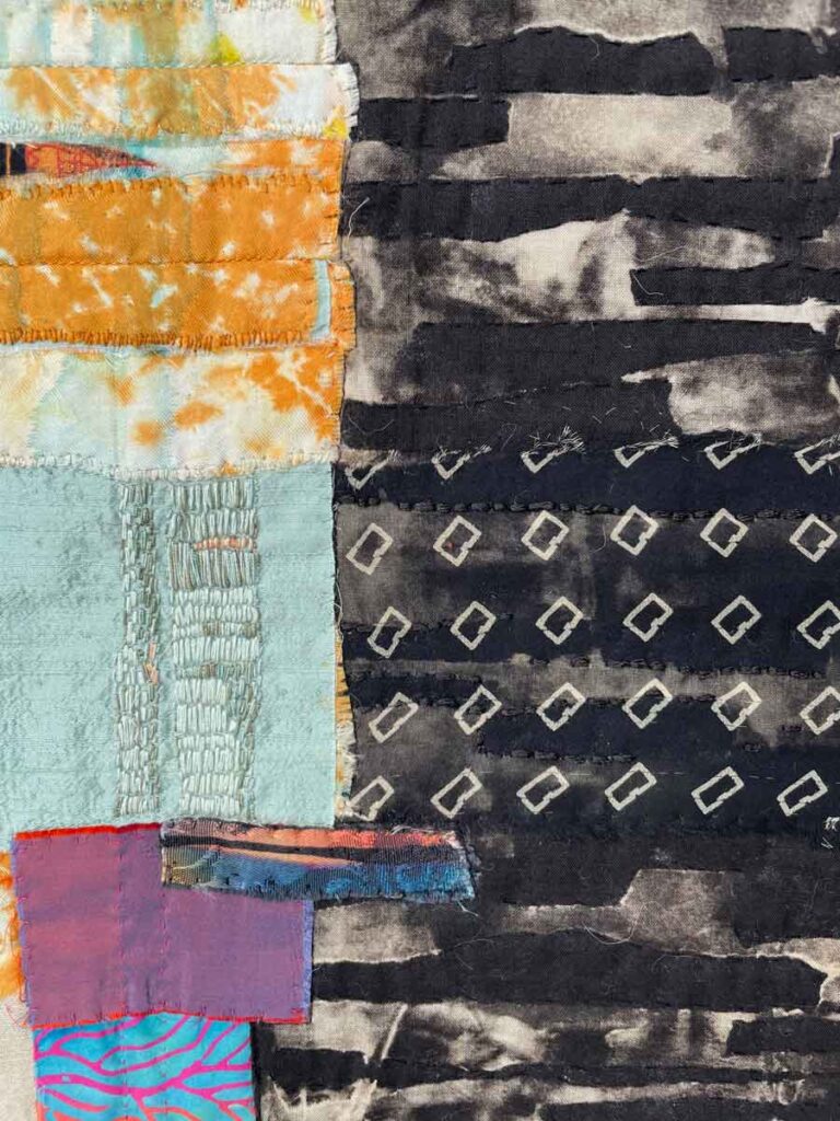
Tumble ©2011 Elizabeth Fram, Silk & cotton, Clamped and wrapped-resist dye, Discharge, Hand appliqué, Hand quilted, Hand embroidered, 9.5″H x 9″W, SALE Price: $200 Clamped-resist is a dye technique where you take two objects of the same shape and clamp them together on either side of the outside of a folded fabric bundle, sort of like two slices of sandwich bread. The results are a shadow image of their shape that appears on the cloth once the objects are removed and the dyed fabric is unfolded. A hardware store is a great place to find objects to use in this process, such as the oversized aluminum washers I used to create this donut shape.
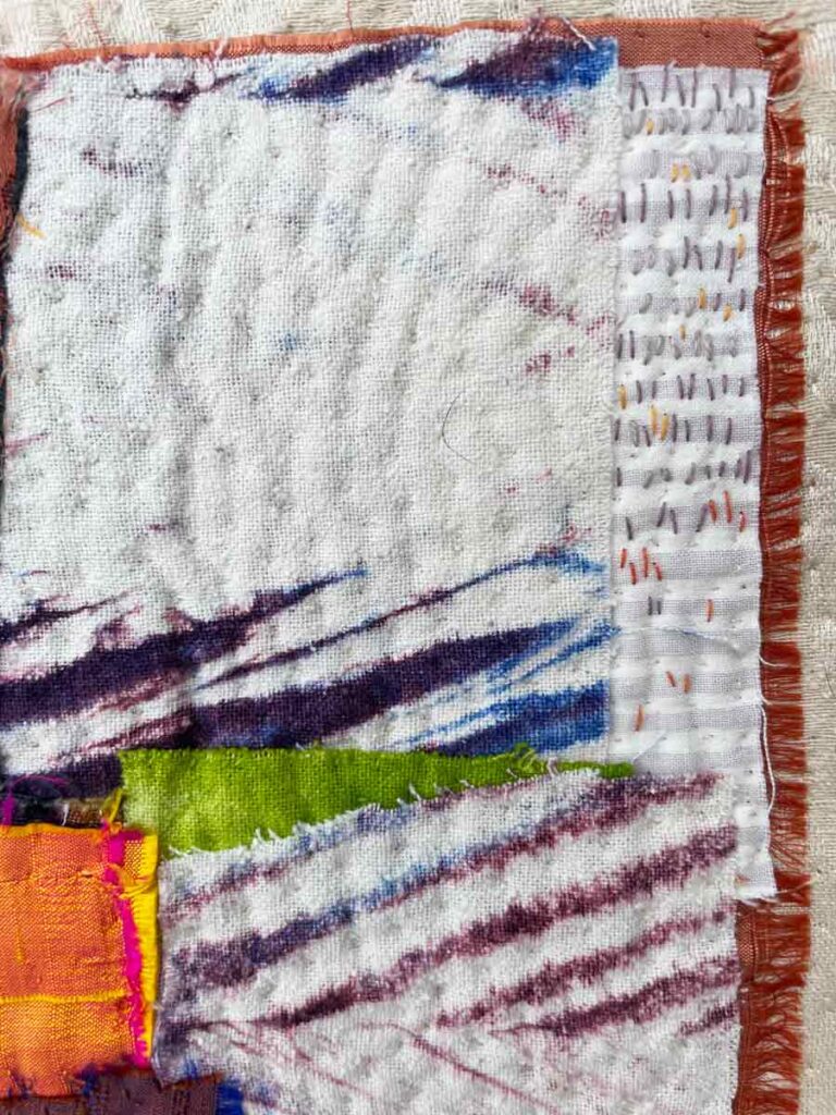
Tumble, detail ©2011 Elizabeth Fram Stripes, marks, color & texture. These detail photos show the distance from which I see each piece as I am working on it. Can you begin to understand why I get so swept up in detail?
❖ ❖ ❖
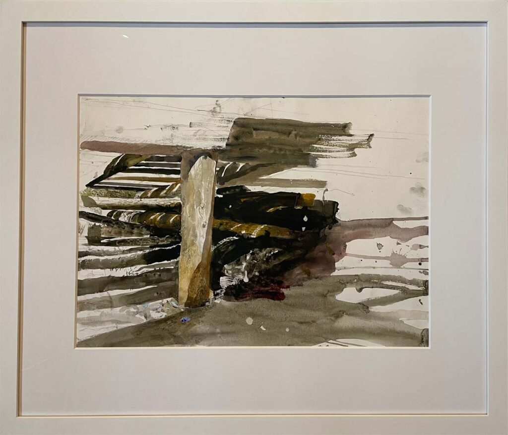
Stand ©2011 Elizabeth Fram, Silk & cotton, Stitched-resist dye, Hand appliqué, Hand quilted, Hand embroidered, 9.9″H x 9″W, SALE Price: $200 The challenge of bringing diverse elements together so that they look as though they were always meant to be a whole unit is a good part of what I loved about making the pieces in this series. I was looking for ways to create a conversation between all the ingredients so that, like a complex sauce, one can appreciate the individual components while savoring their intermingled results.
Stand, detail ©2011 Elizabeth Fram All the pieces in this post were made in 2011 and by now I’m sure you’ve noticed that in all but one I was using the device of rows of stitches, stacked on top of each other. Part of the beauty of going back through older work in detail is you notice things with fresh eyes. I think I have more to say with this particular way of stitching, so don’t be surprised if you see it in new work.
❖ ❖ ❖
And now, because I can’t resist…
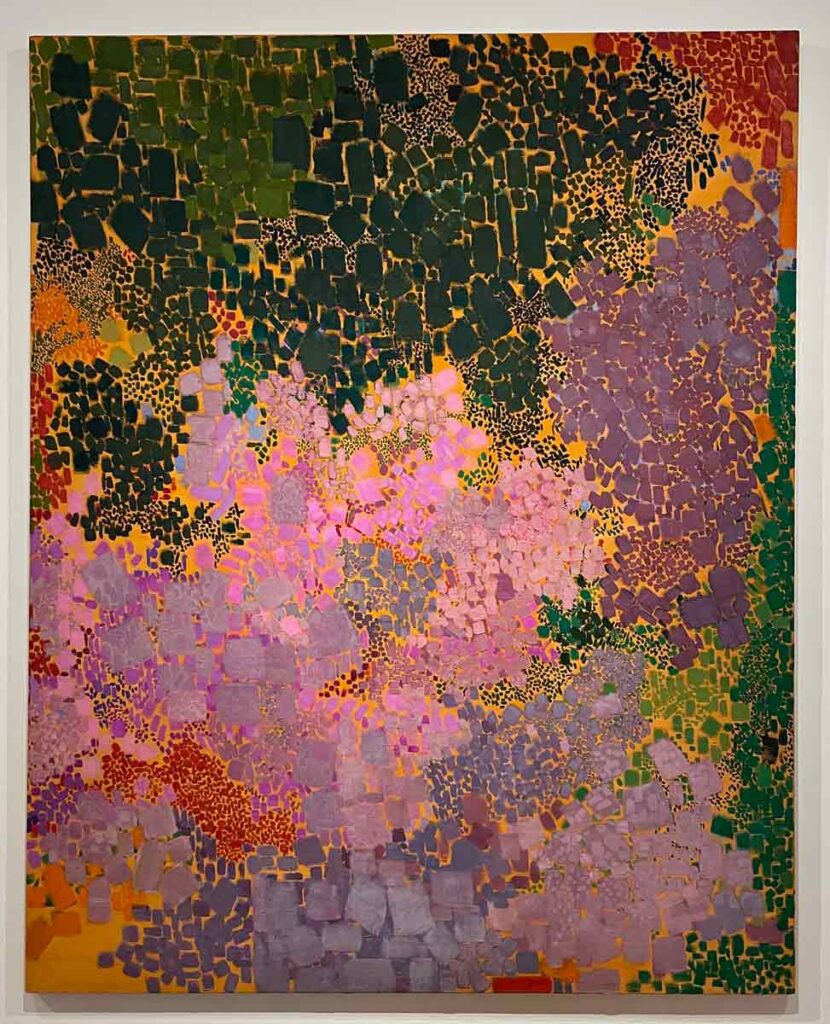
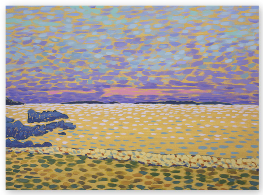
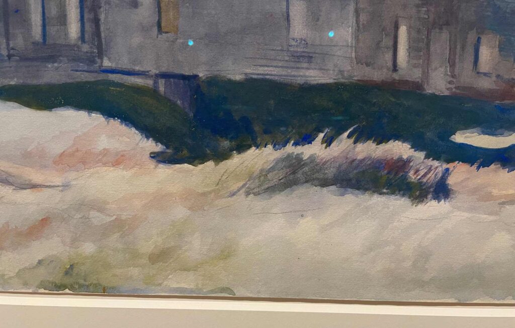
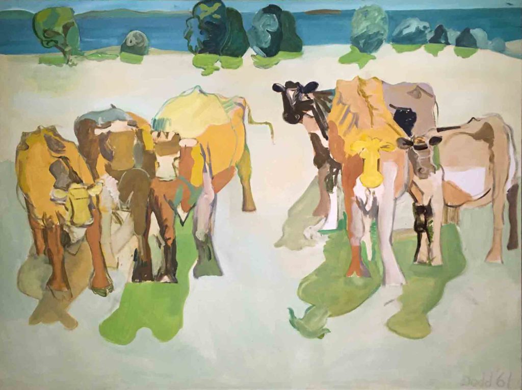
Untitled, circa 1959-1962, Lynne Drexler, Farnsworth Museum of Art
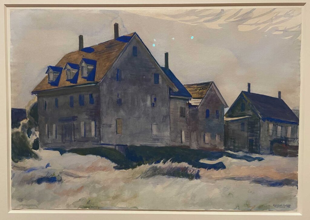
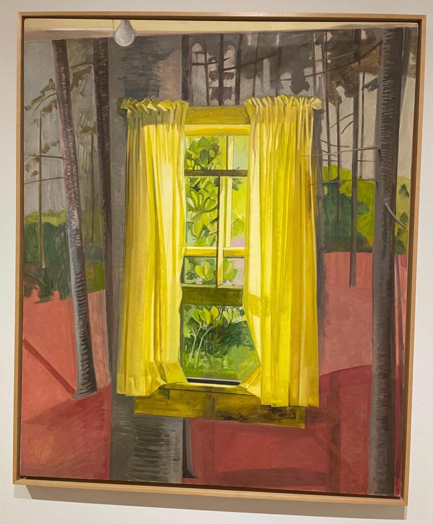
We are back from a week in Maine and of course made our annual pilgrimage to the Farnsworth Museum. Perhaps because I’m looking back on the old, non-representational work in my sale, this year I was most taken with exhibits of abstract work by Lynne Drexler and – surprise! – Andrew Wyeth. I’m not going to write much about either here since you have already waded through the above. But I encourage you to check out the links and to read about both shows – they are beautiful and fascinating.
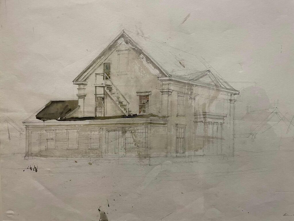
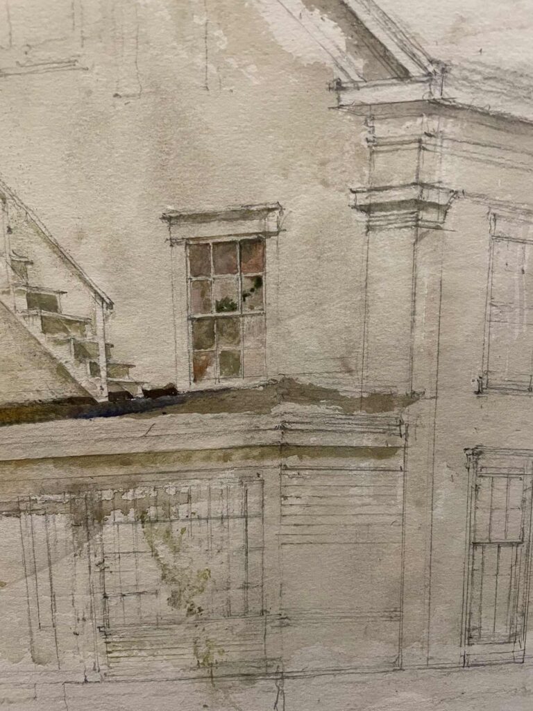
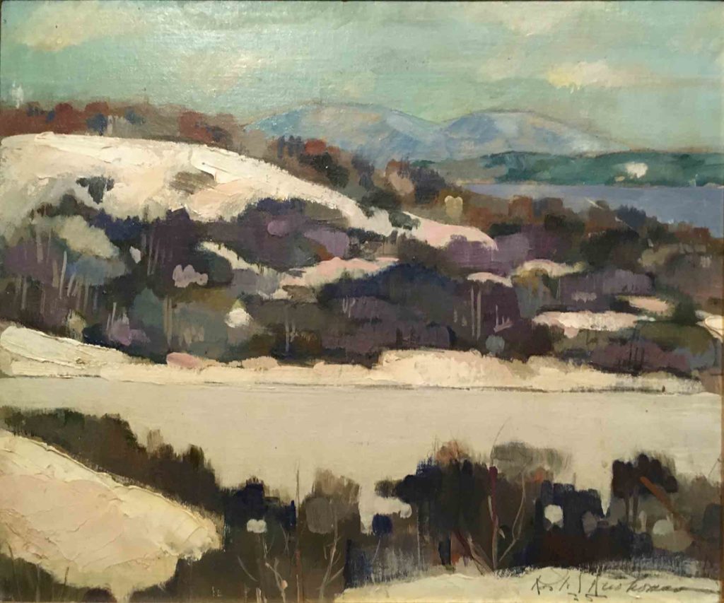
Untitled, 1991, Andrew Wyeth, Watercolor on Paper, Collection of the Wyeth Foundation for American Art While Drexler’s work is (stunningly) all about the color, I was quite moved by this exhibit of never-before-shown abstract works of Wyeth’s, which spanned six decades. His ability to capture a beautiful abstraction with vitality and immediacy blew me away. All the more so because we think of him as the quintessential realist. He is quoted as saying “My struggle is to preserve that abstract flash like something you caught out of the corner of your eye” , and very surprisingly, apparently referred to himself on numerous occasions as an abstract artist.
Don’t forget to use the coupon code Etudes20 for your 20% discount in my web shop. These five pieces will remain on sale through 11:59pm July 31st. Enjoy free shipping within the continental US.; these pieces are ready to hang.
The next sale will begin with my August 8th blog post in two weeks.
Keep an eye on my web shop, as the next five pieces will be available to preview soon after this sale ends. You can find them under the category “Transitions”.