
One of the perks of living in a rural state is the beauty of the open land one passes on the way to pretty much everywhere.
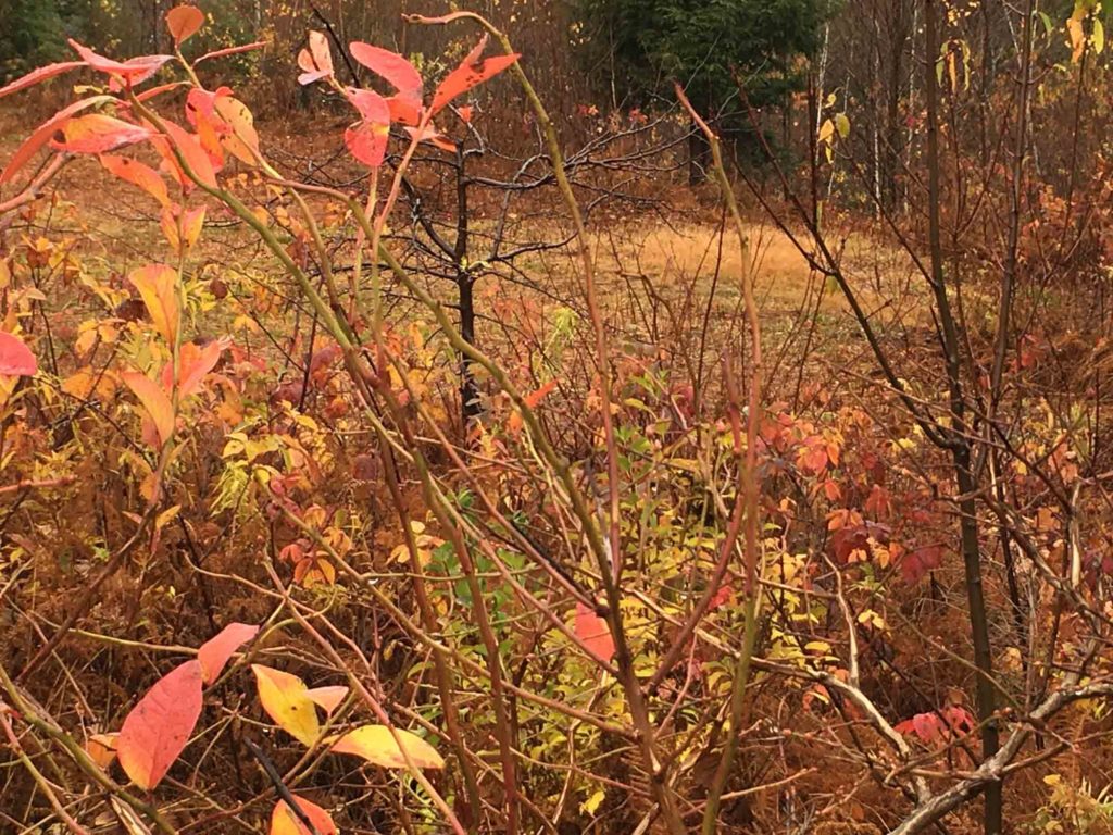
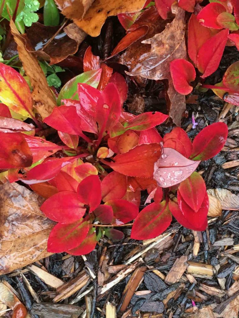
Blueberry leaves in the fall are glorious – as these few stragglers attest
Each season lends its voice to the ever-changing flora, with color combinations that are sometimes prominent, sometimes subtle, but always there to enjoy. The sight of a well-known field as it reliably cycles through the year’s seasons is a both a source of comfort and of inspiration.
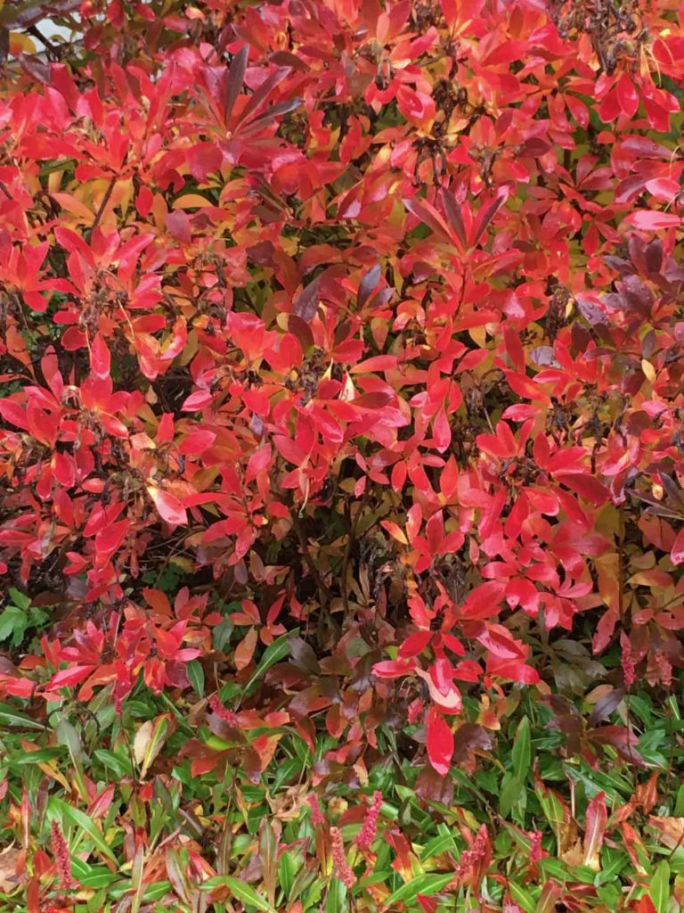
The azaleas also outdid themselves this year
Driving the back roads through the Northeast Kingdom to the Canadian border last week was a chance to enjoy the final gasp of what has been a gorgeous Vermont fall. Of particular note were the deep russet and rust hues interlaced between the ochres and dark umbers of the grasses and foliage in the marshes and bogs we passed, their impact heightened by the gloomily overcast skies. As various plants decline toward winter their colors differentiate, allowing their individual shapes to show in a way that isn’t visible amidst the lush blend of summer’s myriad shades of green.
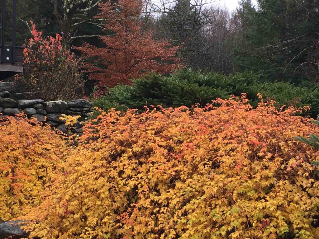
This shrub is a voracious creeper that requires constant and merciless pruning. But all is forgiven when it puts on this stunning ombre display.
There wasn’t time to stop to take photos, but after getting home, I circled our yard to record the last legs of our own foliage. And good thing I did; strong winds and rain over the following 24 hours swept down the last of the leaves. For one final afternoon though, the striking color took my breath away.
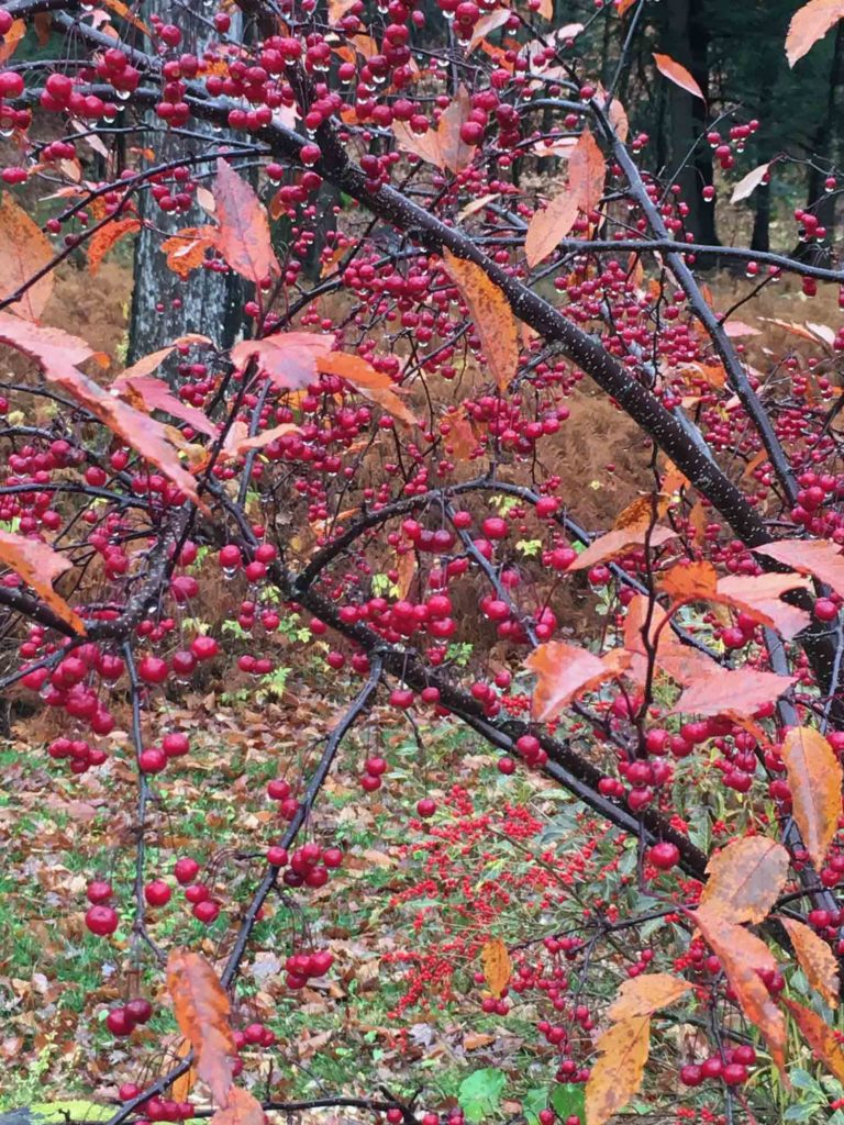
The sight of crabapples and winterberry ease the transition when leaves drop
Not being a landscape artist, it’s hard to gauge how these impressions will surface in my work, but I know that somehow they will. It’s part of the wonderful, ongoing homework of making art. Paying attention to the colors that surround us, gleaning what we can in order to reinterpret them in a meaningful and personal way, is one of the many privileges of what we do and a major component of what attracts me to the work of others. The paintings below, seen recently at The Farnsworth Museum in Rockland, Maine, are a perfect example.
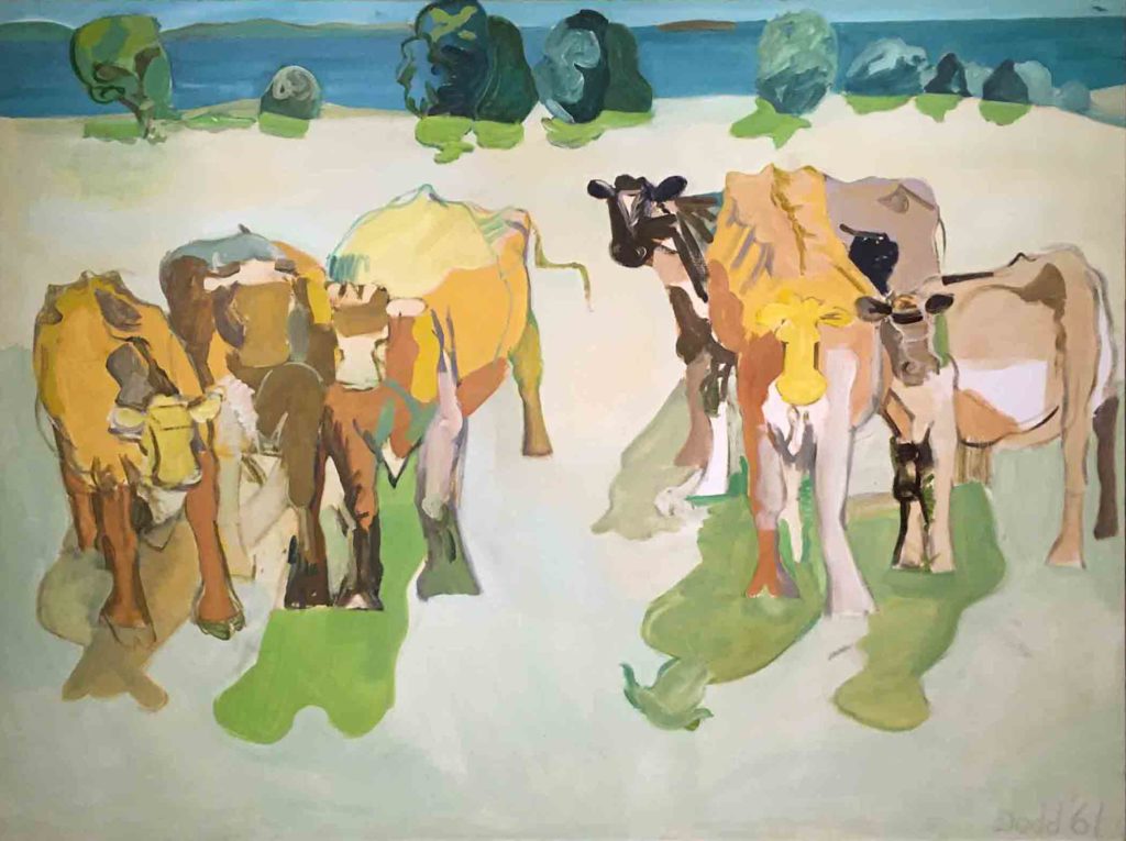
Six Cows At Lincolnville, Lois Dodd, 1961, Oil on canvas
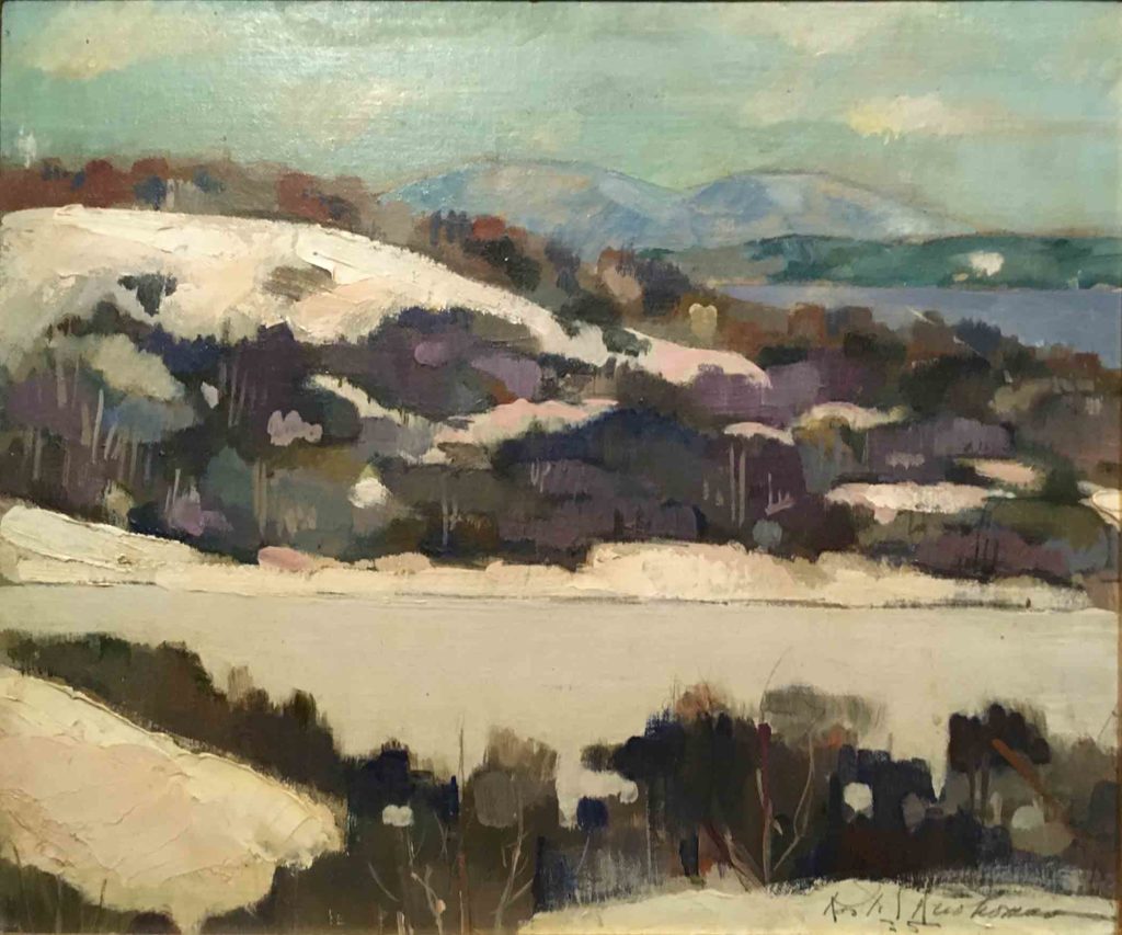
Untitled (View from the Ruohomaa homestead on Dodge’s Mountain), Kosti Ruohomaa, 1935, Oil on panel.
To frame this idea from another perspective, consider color not necessarily as subject, but from the angle of its impact on us as a backdrop. Research abounds on how wall color affects mood and behavior in prisons, schools, and hospitals; it is certainly true of our outward surroundings as well. Museums and galleries play on this theory too — the variety of colors that grace their walls add immeasurably, although perhaps subconsciously, to the way one sees and experiences the art on display. Is that not also true of our outdoor environment and its effect on us? What better reason to celebrate a field sporting its last hurrah of color on a grey and drizzly morning than for witnessing its inherent beauty and the way the sight of it flavors the rest of our day as we move forward.
❖
I found a couple of interesting articles about the thought that goes on behind the scenes in choosing wall colors to enhance an exhibition, thereby heightening the viewers’ experience. In one, individual curators talk about what inspires their choices, and in the other, how color designers/colorists often create new colors to best highlight the work on exhibit.
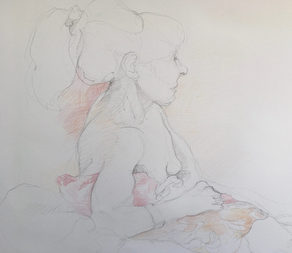
©2019 Elizabeth Fram, 18×24 inches, Graphite and colored pencil on paper Perhaps resurfacing more quickly than I would have thought — reds and golds in a quick study from life drawing earlier this week.
And for those interested in getting even further in the weeds on this subject, enjoy this fascinating article from the Metropolitan Museum on “Color and Light in the Museum Environment”.
❖
One final note and announcement:
At the end of this month, I am going to be making a bit of a change with this blog in order to reclaim some much-needed time for other areas of my practice. It won’t be disappearing entirely by any stretch, but it will begin to transform. I’ll let you know more at the end of November. In the meantime, I am ever so grateful for your ongoing interest and support, and I hope you will stay with me and keep reading as Eye of the Needle moves forward to its next chapter.
Love the photos, you know how I gravitate to grasses, branches and the wildness in the out of doors.
You would have loved those marshes and bogs, but know you have plenty to enjoy up your way too so you haven’t missed out.
Your writing glows as much as the colors in this post. It’s friendly and concise yet lushly descriptive. Thank you.
Thank you Lynn – your encouragement is much appreciated!