Tag Archives: Embroidery

Leap of Faith

Mind Palace 1

I might have called this finished.


Mind Palace 2

But instead, I held my breath and lifted as much paint as I could outside a house shape that I had superimposed over the subject’s central features.


Mind Palace 3

It was my intention that by embroidering outside the house shape, the painted and stitched areas would stand apart from each other, yet still work together.


Mind Palace 4

The embroidery blurs details, such that texture becomes the overarching descriptor. It’s a quality I quite like – especially when paired with the untouched watercolor.


Mind Palace Finished

Mind Palace    ©2023 Elizabeth Fram, Watercolor, graphite and embroidery on paper, 5″H x 5″W

Despite the variation, the finished product still reads as a whole and I’m very pleased with the added dimension the stitching contributes. That’s not to say there aren’t a number of kinks still to work out. Taking this shot in artificial light emphasized the house shape to a degree that isn’t as easy to see in natural light. But that’s a puzzle for the next time around.
Regardless, the leap of faith was worth it.

It’s a new world out there – but check out the following and chalk one up for the little guy: artists fight back against AI.


Small Plates

To me, the half the fun of tapas – or a pre-Covid cocktail party with lots of different appetizers – is the variety of small plates one can sample. Most weeks, my time in the studio mirrors that approach – a little bit of this and a little bit of that filling up the hours. In that spirit, here are a few so-called “tastes” of what’s been swimming in my head these past couple of weeks.

First, my big news is that the Fall Issue of the Surface Design Journal is now out. Every autumn SDA publishes an International Exhibition in Print. This year’s show, “From Confrontation to Catharsis,” feels both relatable and personal. The diverse scope of work exhibited addresses many of the overwhelming challenges of 2020. As I read each artist’s statement, the word that often comes to mind is “fragile”. So much of the work is a commentary on fragility: of our systems, our planet, our connections, our history, and even our human-ness.

SDA Journal Page

However, in viewing the show, one can’t help but also be reminded that there is empowerment and strength in expression, and as such there is an underlying sense of hope that resides with these works.
I am gratified and honored that “Until the Bitterness Passes”, one of my shibori houses from last year, was selected to be included.

It’s Inktober!
While I haven’t followed every prompt set out this year, I have enjoyed interpreting of a handful of them. Here are just a few.

Crystal

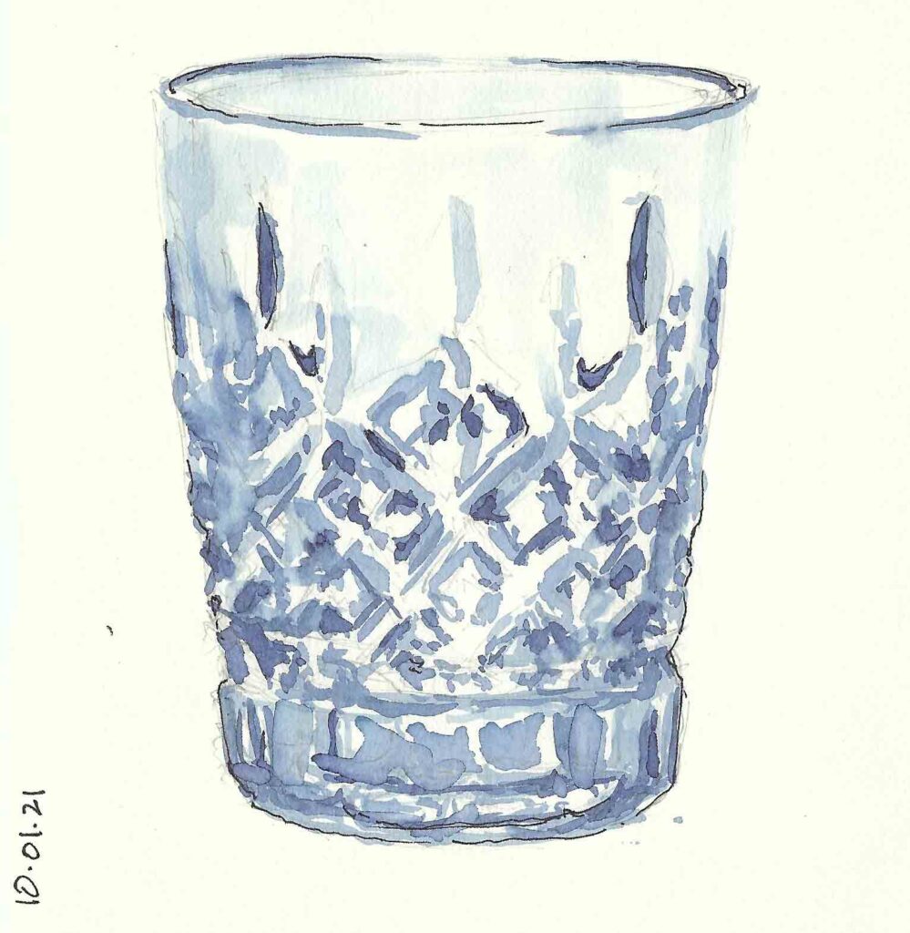
Crystal    ©2021 Elizabeth Fram, Ink and graphite on paper, 5.5 x 5.5 inches

Another perk of the project is it’s great for filling up those last few straggling pages in one’s sketchbooks.

Suit

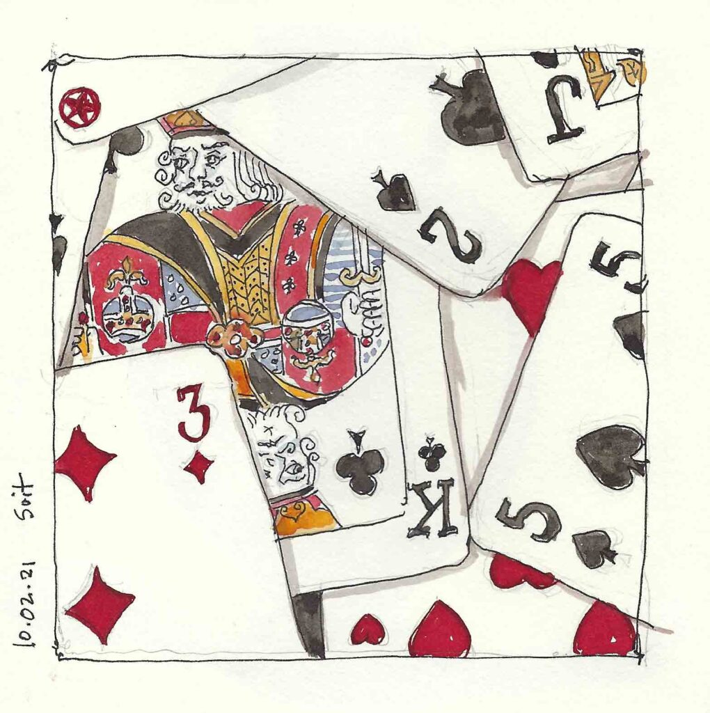
Suit    ©2021 Elizabeth Fram, Ink, watercolor and graphite on paper, 5.5 x 5.5 inches

I have 4 different colors of ink on hand and Inktober has been an opportunity to experiment with them — supplementing with a tiny bit of watercolor when a different color is needed.

Stuck

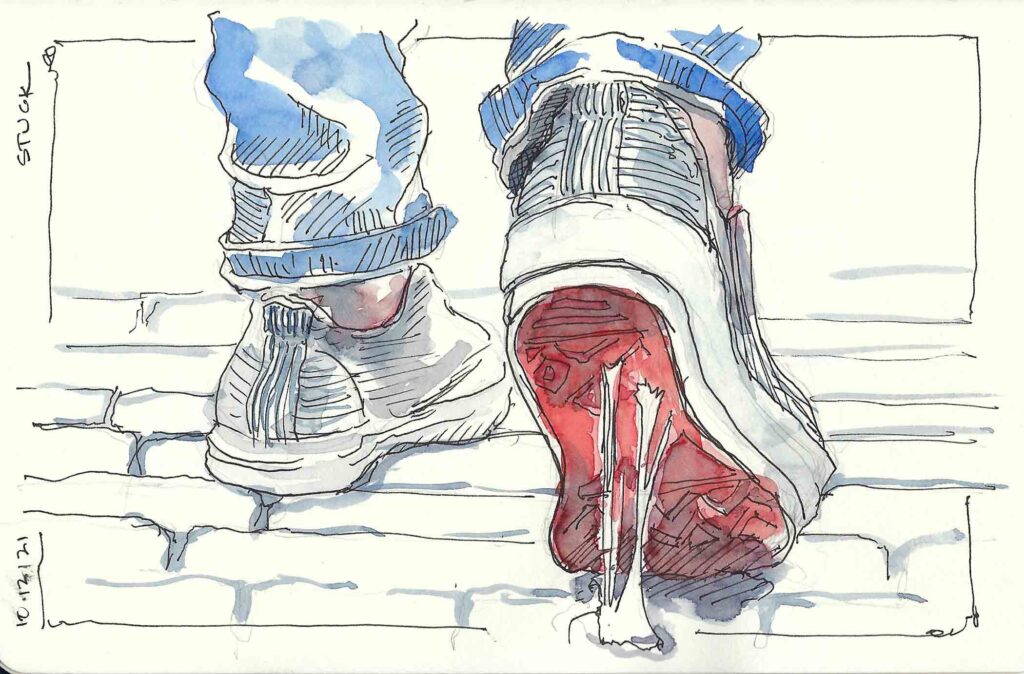
Stuck    ©2021 Elizabeth Fram, Ink and graphite on paper, 5 x 8 inches

It also gave me an excuse to go ahead and purchase my new favorite under-$10 art supply (does one really need an excuse to buy art supplies?): a porcelain petal palette. It’s a great tool for mixing numerous values of ink all at once.

Porcelain Petal Palette

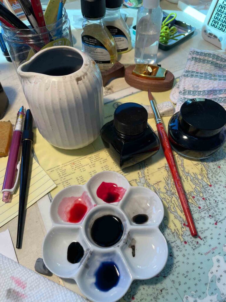
Oh, and speaking of cheap supplies, check out my new water jug! It’s a creamer that I found and snapped up this summer for just this purpose – also less than $10. The spout is brilliant for wiping the extra water off one’s brush before dipping it back into the ink. Now I wish that I’d also gotten the creamer from the black set since I usually have two water containers going at once, one for dirty and one for (relatively) clean water.

Mussel Shell detail

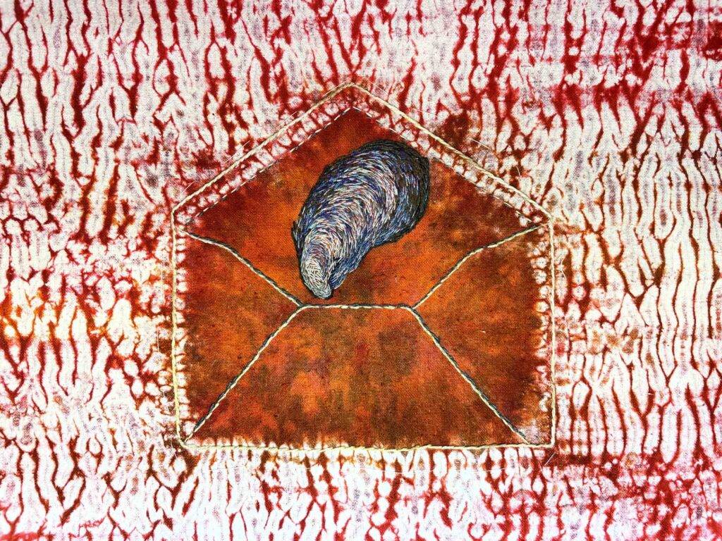
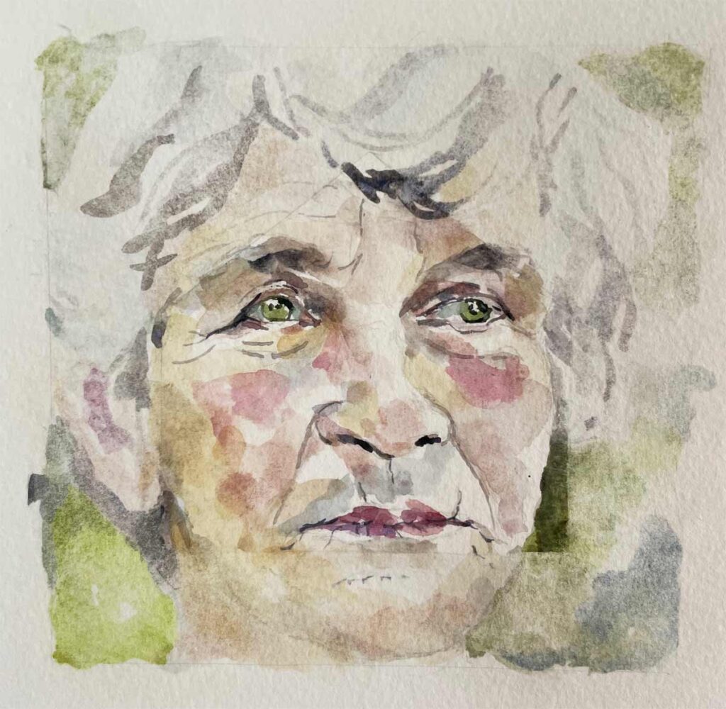
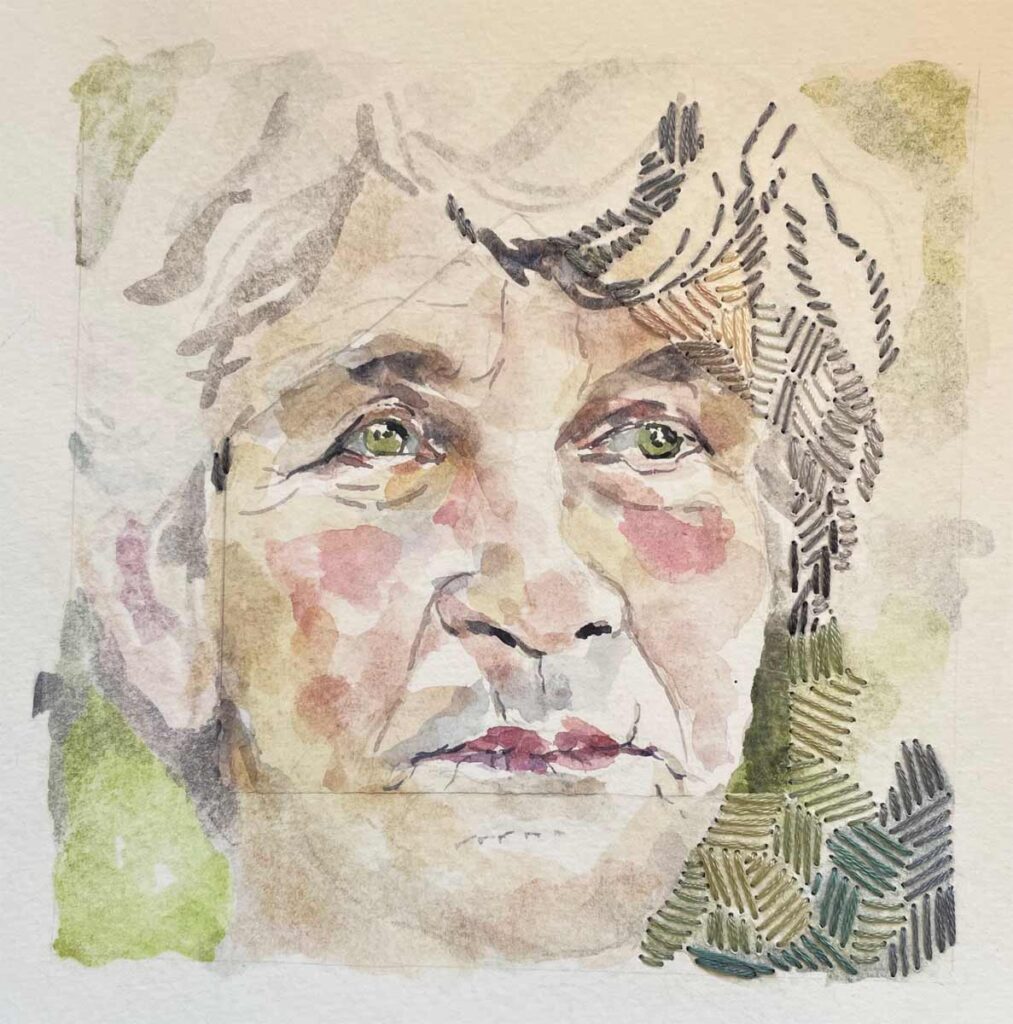
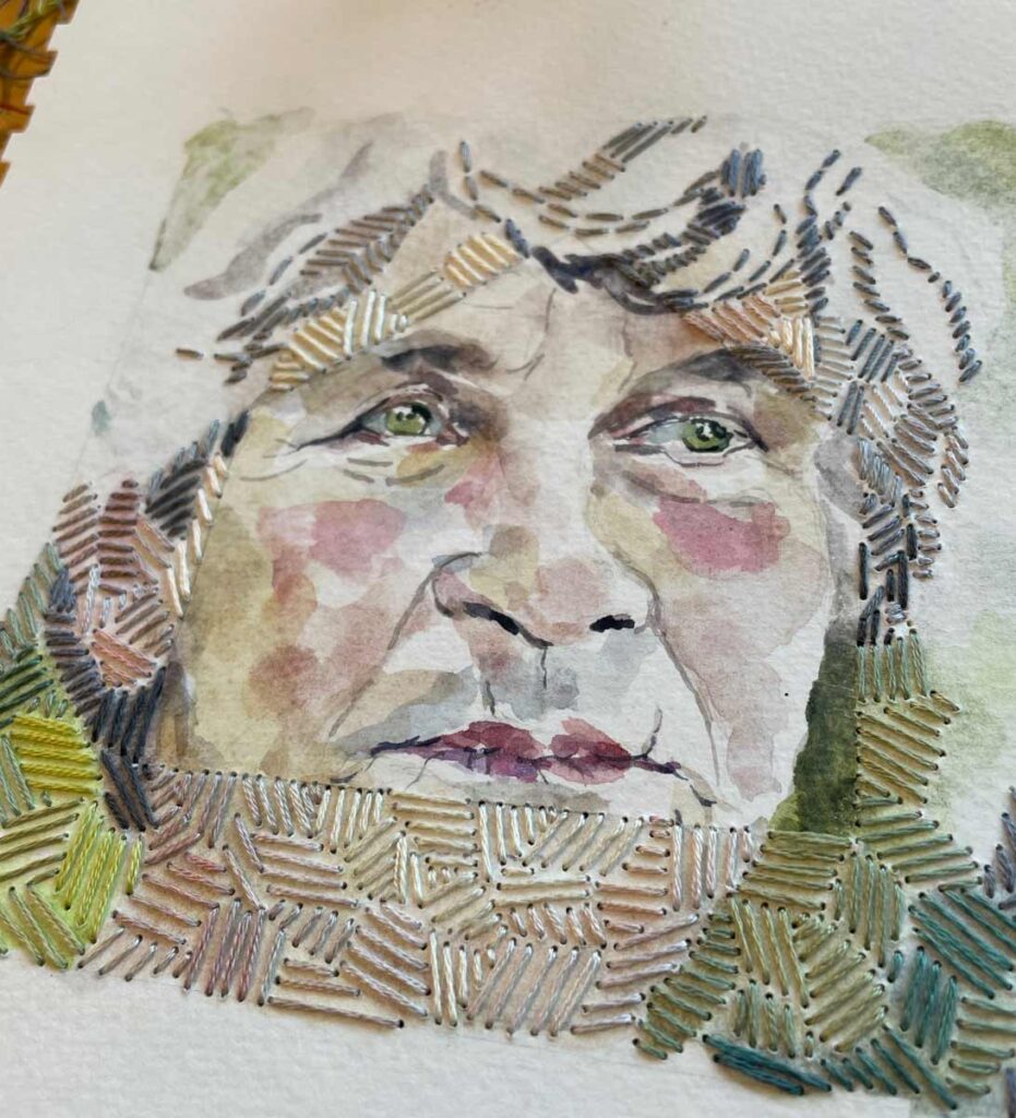
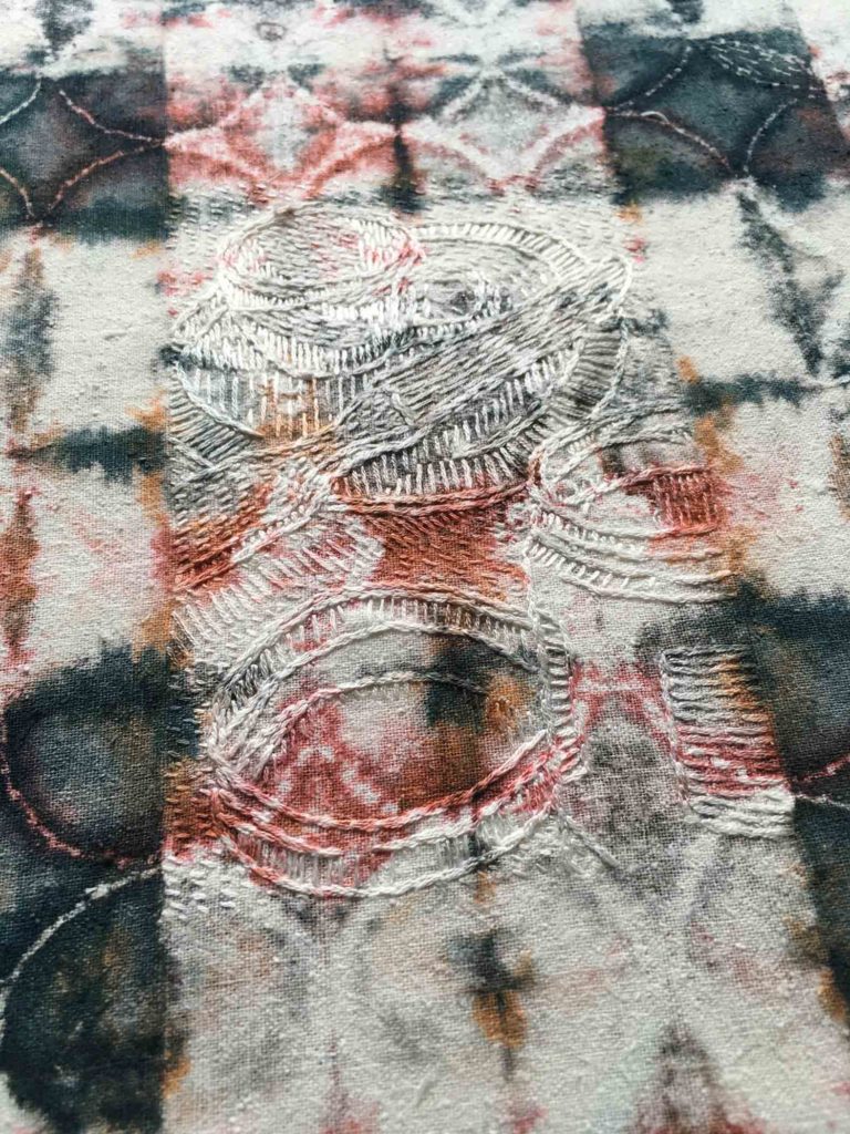
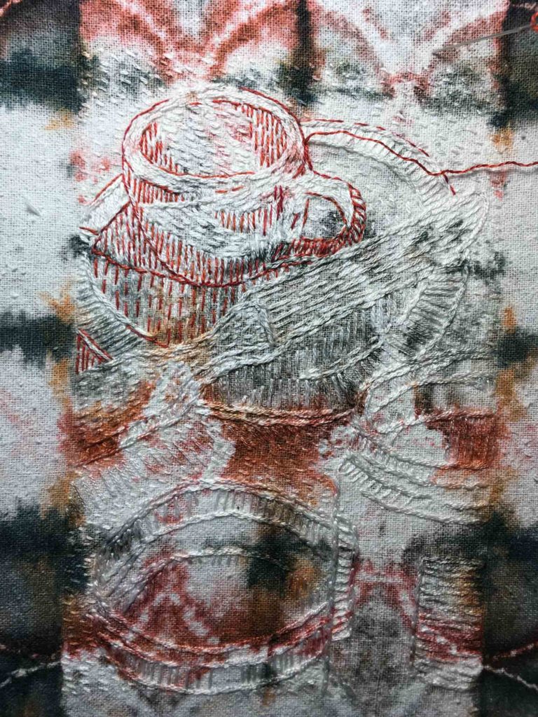
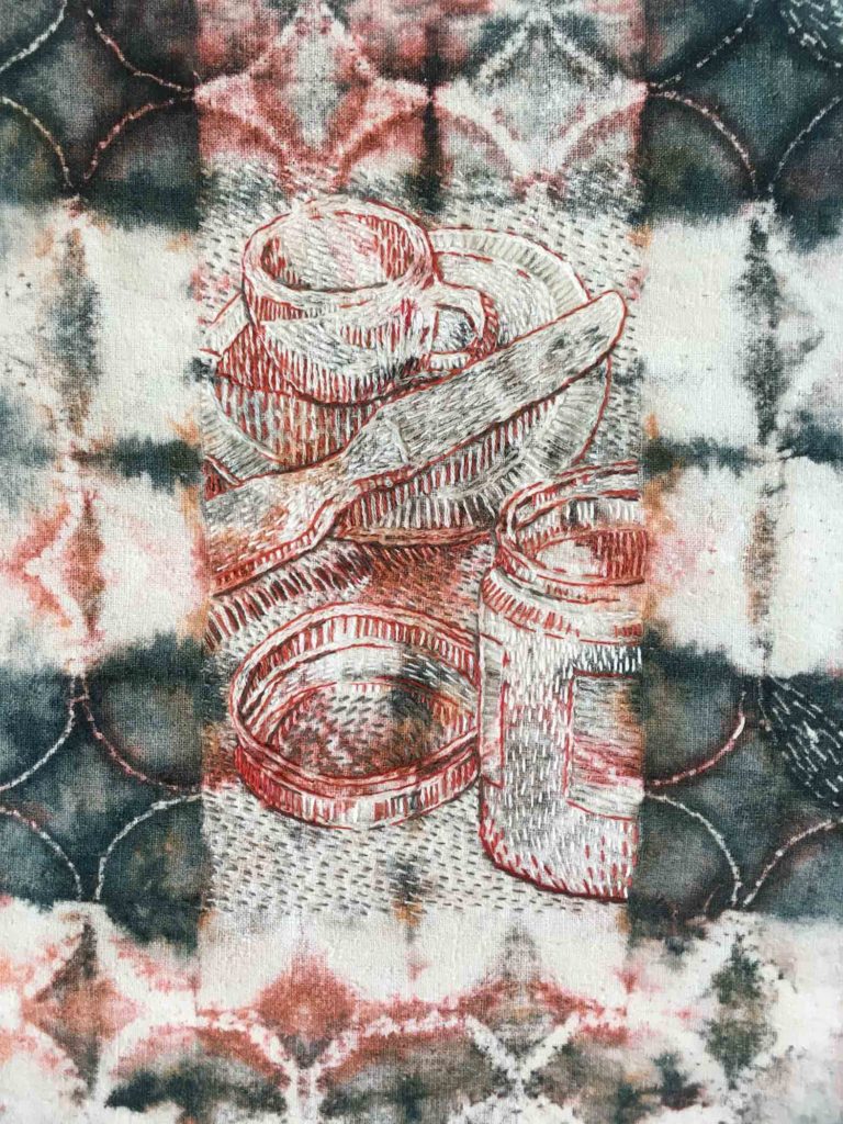
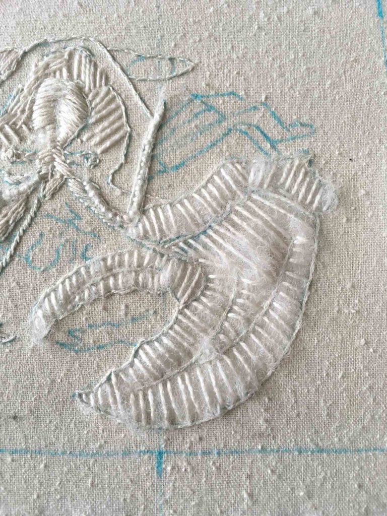
detail ©2021 Elizabeth Fram, Stitched-resist dye and embroidery on silk.       I still have to come up with a title for this.

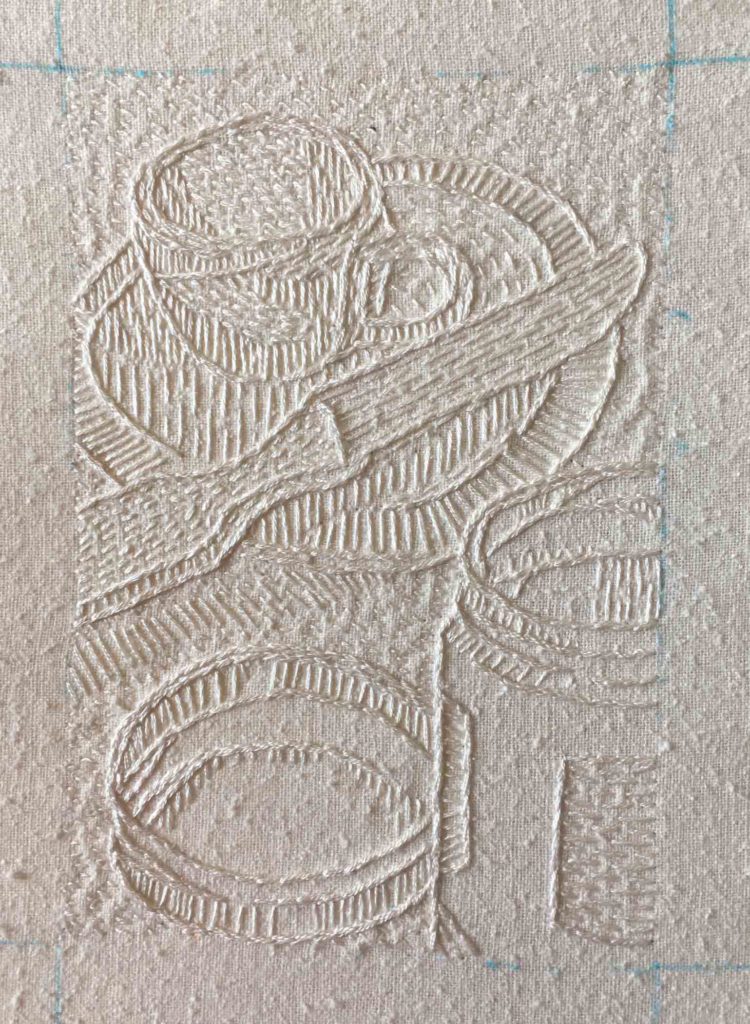
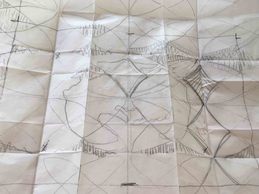
Meanwhile, I’ve been puzzling my way through the shibori/embroidered “letter from home” I showed you last time. Surprisingly, the mussel shell was a snap to realize, but figuring out what to do with the envelope has been an unexpected challenge (lots of stitches sewn and then picked out). Next post I’ll write more about my discoveries and process along the way, but in the meantime I have some experimenting to do in order to figure out how to approach the dyed pattern in relation to the central shape – as well as what overall finished size/shape to use.

Mussel Shell

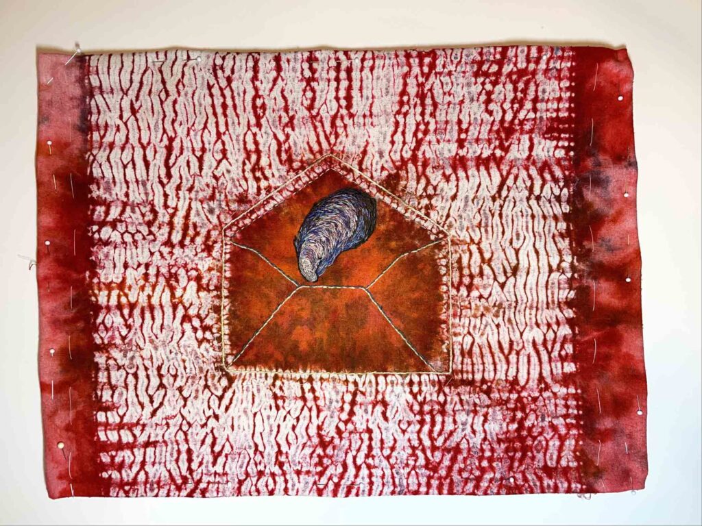
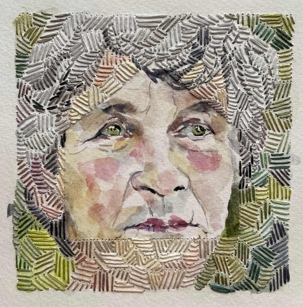
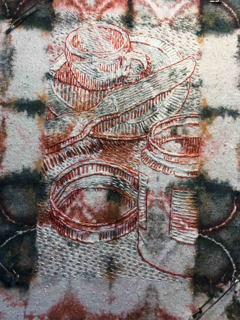
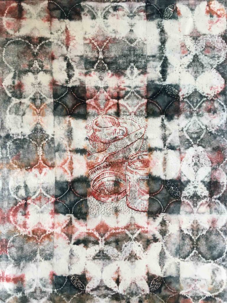
©2021 Elizabeth Fram,  Stitched-resist dye and embroidery on silk, approx. 12 x 16 inches   I think I’m going frame this one like this. Allowing the area without pattern to show provides a much needed sense of balance to the piece as a whole.

Framing will be part of that consideration. Unlike in this piece, which I dove into without finished dimensions in mind, I need to plan ahead so I don’t back myself into a corner.

I get a lot out of James Cleary’s 3-2-1 Newsletter; it’s a short and sweet shot in the arm each Thursday. The list below was particularly resonate. Maybe for you too?

How to Build a Career in 7 Steps:
1. Do great work
2. Share it publicly
3. Cold email people 2 steps ahead of you
4. Talk about your work and trade ideas
5. Host events and meet in-person
6. Become friends
7. Rise together

I get just as much of a lift from the beauty of my garden in fall as I do in spring and summer. While the colors are a bit more nuanced, they’re just as striking. Did you happen to read the NYTimes article “Take a Walk in the Garden Before It’s Too Late“?

With that in mind, my Instagram recommendation this time is @pottersarms, whose images of flowers, often in various states of decay, are quite lovely and somehow momentous.

©Sandy @pottersarms

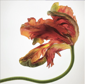
© Sandy @pottersarms

And finally, to bring you full circle, the next time you’re in Asheville, NC consider a meal at Cúrate – a tapas bar that will satisfy any yen for delicious variety.

Enjoying the Ride

Last  July I started experimenting with a new approach to my dyed and stitched pieces.
Flipping the coin from the way I’d been working, I started embroidering the imagery with white silk thread first, and then dyed the cloth afterward using a new stitched-resist method that I had begun experimenting with at the Vermont Studio Center in April.

Espresso and Peanut Butter 1

Espresso and Peanut Butter  ©2018 Elizabeth Fram,  In process, Stage 1

My hope was that the silk thread would absorb the color and pattern of the dye process, leaving the image to some degree camouflaged while still maintaining its visual strength. I wanted the viewer to be drawn in by the pattern and to discover the imagery upon closer inspection.  Unfortunately, the results were decidedly unsatisfactory because the image became almost completely lost. It shows more clearly below because the angle of the photo catches the light to its advantage.
To jog your memory, check back to my post “Committing to a Process of Search” to read about my initial stab at this new process.

Espresso and Peanut Butter 2

Espresso and Peanut Butter     ©2018 Elizabeth Fram,  In process, Stage 2

After working my way through the more recent lobster piece (my second attempt at this idea), I returned to the original this week with new thoughts on ways to salvage it from its ghost-like appearance.

Espresso and Peanut Butter 3

Espresso and Peanut Butter     ©2018 Elizabeth Fram,  In process, Stage 3

While there are elements of the process I’d like to tweak, I am definitely making progress toward my initial objective. And more importantly, as I work back and forth between the stitches and the pattern they sit upon, I’m really enjoying the ride.  For lack of a better way of describing it, there’s a satisfying rhythm to considering both image and surface, puzzling out a way to bounce between the two so that they can simultaneously work together and independently, with neither being overwhelmed by the other.

Espresso and Peanut Butter 4

Espresso and Peanut Butter     ©2018 Elizabeth Fram,  In process, Stage 4

Meanwhile, serendipity happened in the form of Neil Gaiman’s 2012 University of the Arts commencement address “Make Good Art”.
The thing about a good graduation speech is that it’s just as inspiring to everyone else in the audience as it is to the graduates…maybe even more so because being older provides the benefit of life experience as a measuring stick. Gaiman’s advice resonates loudly and clearly in its encouragement to make mistakes and to keep trying.

Espresso and Peanut Butter Detail

Espresso and Peanut Butter, detail     ©2018 Elizabeth Fram, Stitched-resist and Embroidery on Silk

If you too are attempting to gain some traction in your current work, give it a listen and see if it doesn’t give you a boost.

Espresso and Peanut Butter, full

Espresso and Peanut Butter     ©2018 Elizabeth Fram, 20 x 16 inches unframed, Stitched-resist and Embroidery on Silk

Leap of Faith

Do you remember this piece from several weeks ago? I am taking what I learned from it and trying again with the goal of figuring out how to portray something “hidden in plain sight” — a stitched image that is camouflaged within shibori patterning while remaining visible.

Pattern draft

Another challenge is deciding what the shibori pattern will be so that it works together with the shape of the image, not against it.

This time I’m using my lobster drawing from a couple of weeks ago as a jumping-off point. I sewed the stitches as densely as I could, trusting their solidity would make it possible for the image to hold its own in relation to the visual strength of the dyed pattern that is yet to come.

Stitched lobster

The rectangular stitched area is 6 x 9 inches. The background stitches were added to set the image apart from the rest of the cloth, hopefully helping the lobster to stand out once the shibori pattern is in place.

In reading Young Yang Chung’s Painting with a Needle, I’ve learned that Asian embroiderers commonly placed various kinds of padding underneath areas to be embroidered in order to achieve a three-dimensional effect. Perhaps creating a relief-like form will give this lobster the oomph it needs to mingle and co-exist with the dyed pattern, each with its own voice, but neither overpowering the other.

Padding

I used both batting and heavy silk thread to pad the lobster, some areas more heavily than others. I think it adds something of a sculptural effect. The process is very reminiscent of trapunto.

The middle image in this post shows the completed embroidery. The next step will be a huge leap of faith as I move forward with the dye process. I hope what I have to show you next week will be a happy outcome, or at least a step in the right direction. For now I am cautiously optimistic.

Stephen King’s On Writing: A Memoir of the Craft and Anne Lamott’s Bird by Bird: Some Instructions on Writing and Life both hold a place on my “favorites shelf”. I return to them from time to time for inspiration, encouragement, and solace. Writers may write about writing, but for the most part the wisdom they share can be directly translated to any form of creative work. It’s just that they’re, well, writers, so they have a knack for making the information both inspirational and accessible.

I will be pushing the above two books closer together to make room for Ann Patchett’s The Getaway Car: A Practical Memoir About Writing and Life, which I read this past week. It has earned its spot next to the others. At 45 pages, it’s short, to the point, and so very worth your time if you’re interested in such things.