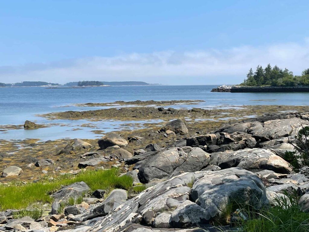
There’s nothing quite like a wedding to put a shine on the world. We’re just back from Philadelphia where family togetherness, perfect weather and a healthy dose of art made for a very special long weekend.

First stop: Blick.
In my world, a trip to Blick is a major highlight during any city visit. With my very patient husband and daughter in tow, I made a beeline there to stock up. There’s no match for wandering the aisles and fingering the goods in person, and it was nice to have a few new things to try out in the hotel room between planned activities.
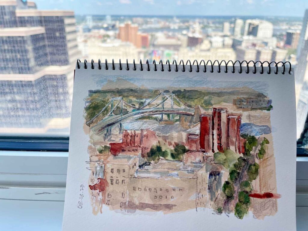
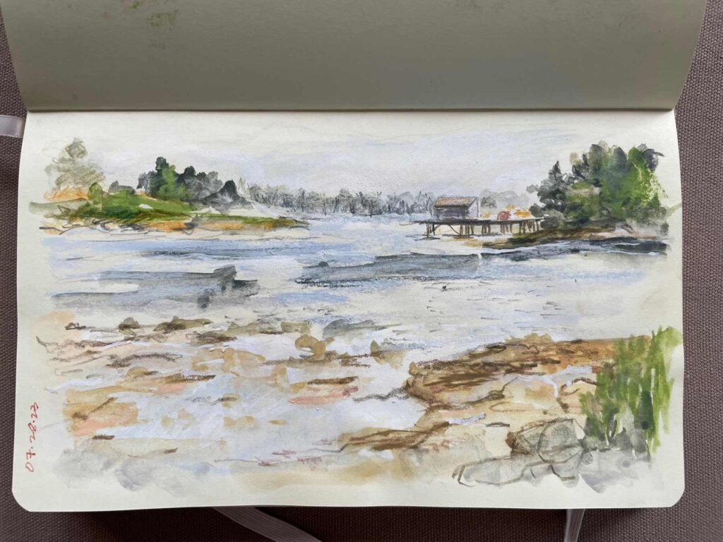
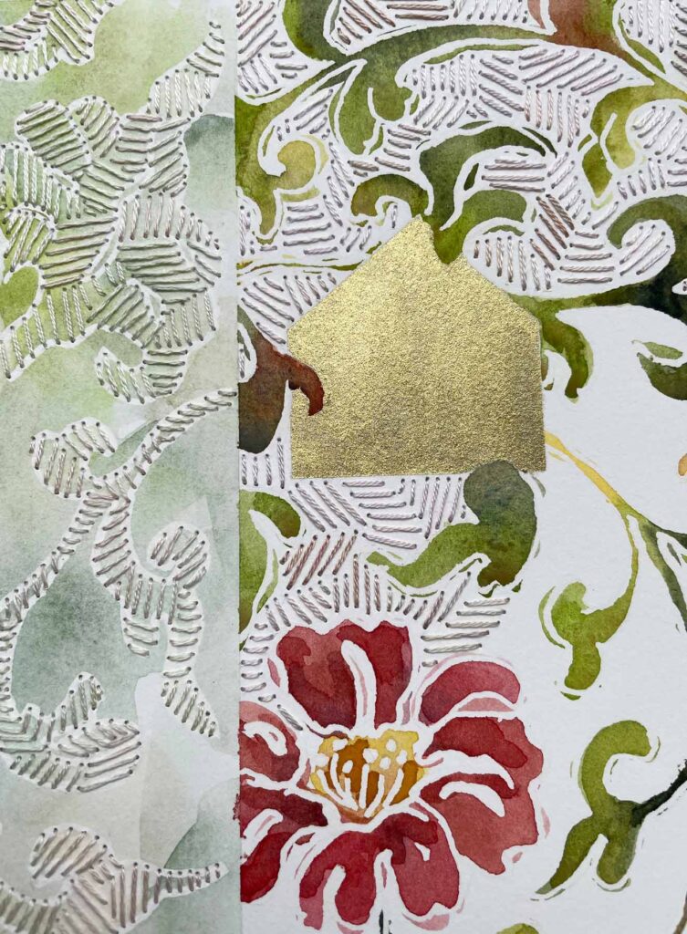
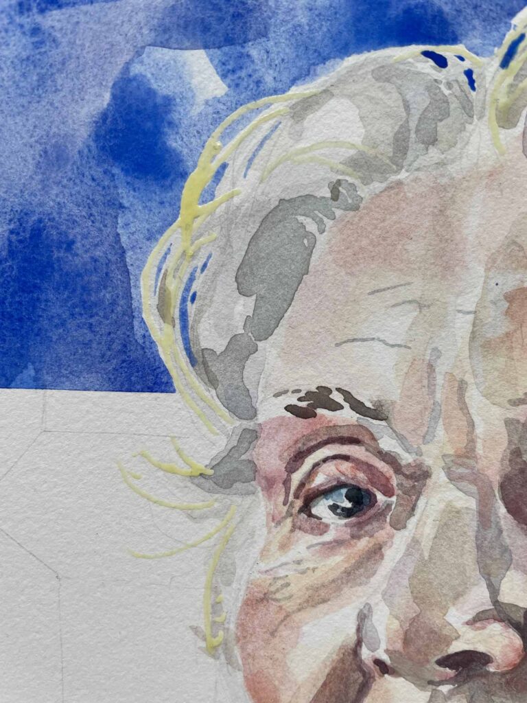
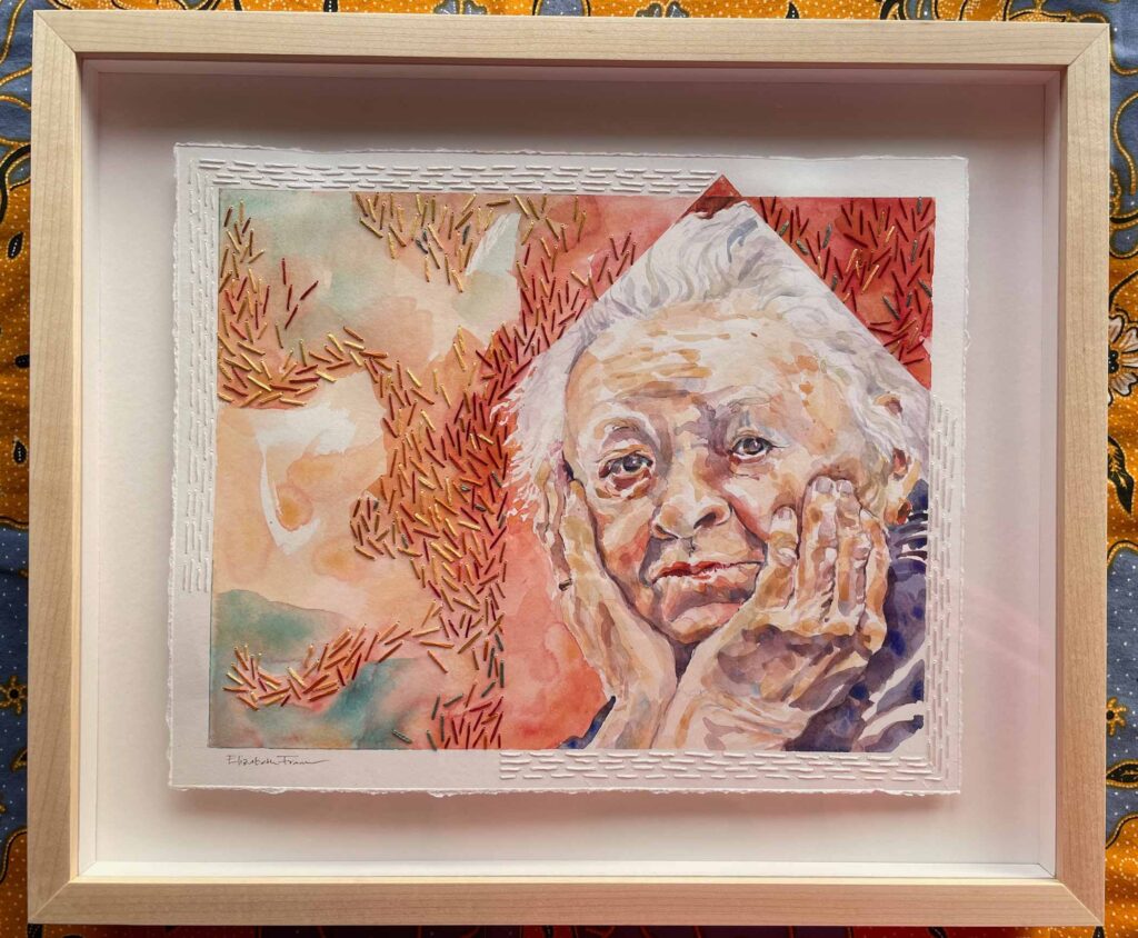
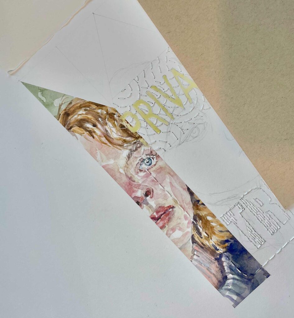
Hotel View ©2023 Elizabeth Fram, Watercolor, acrylic marker, colored pencil, 5 x 6.5 in.
Nevermind the Phillies, Eagles, 76ers, & Flyers, IMHO one of Philly’s best claims to fame is that it’s home to one of the largest public art collections in the country. When we lived in Bucks County, 30 miles north of the city, life was too busy with raising kids to dive into the Philadelphia art scene as deeply as we might have – but what a pleasure to have a chance to enjoy it now.
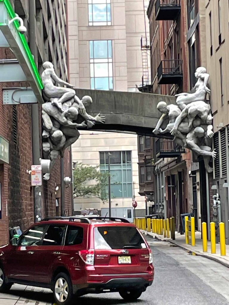
Contrafuerte ©Miguel Antonio Horn Read more about this sculpture, seen in the Cuthbert Street alley as we left Reading Terminal Market.
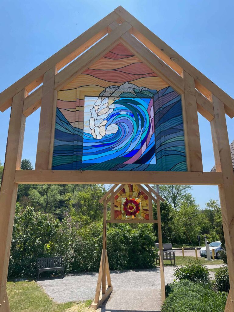
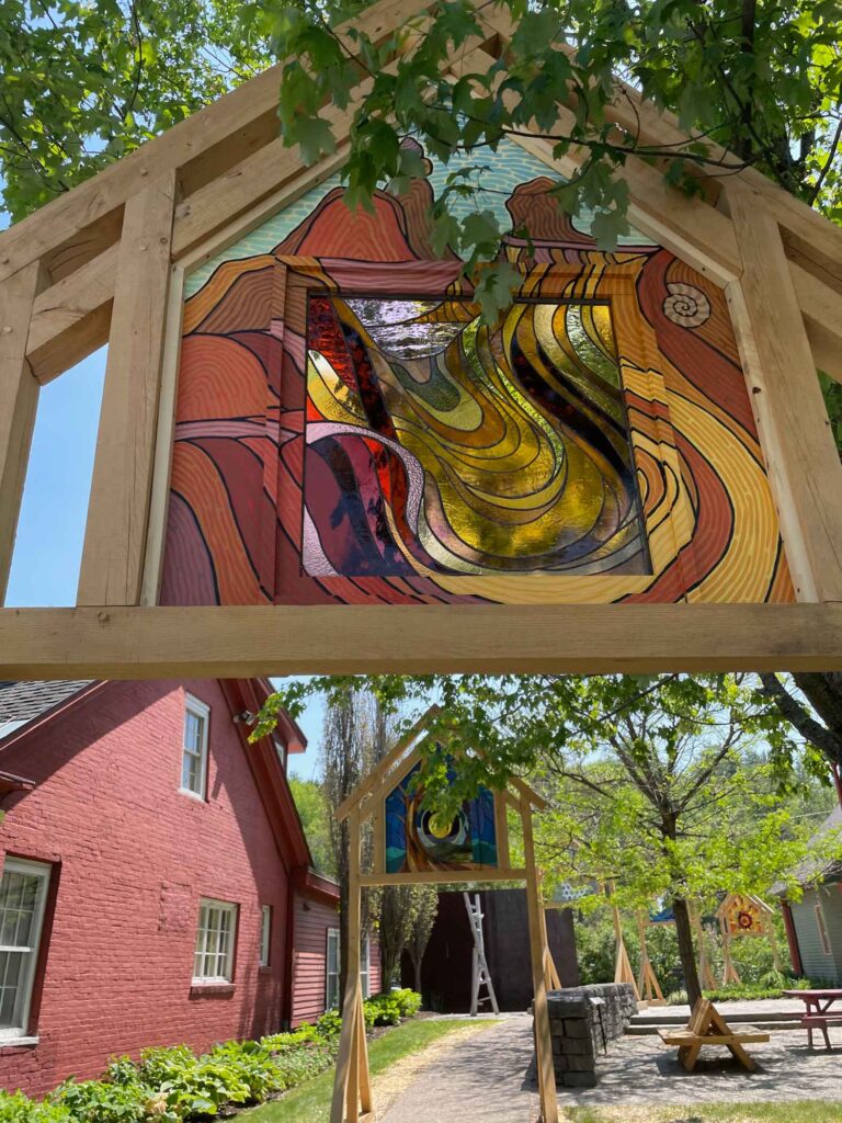
The city’s 63 year old Percent for Art Ordinance mandates that any new City construction or major renovation project must include site-specific public art worth one percent of the total budget. So if you don’t have time to visit one of Philadelphia’s numerous stellar museums on your next trip, rest assured you’ll get an eyeful merely walking or driving from place to place.
Gratefully, this visit there was also time to check out a couple of museums.
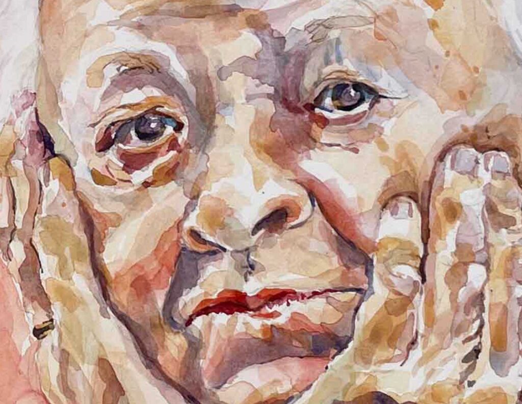
The Philadelphia Museum of Art is currently showing The Artist’s Mother: Whistler & Philadelphia, a fortuitous discovery considering my current direction.
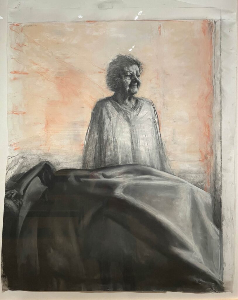
Artist’s Mother I ©1994 Sidney Goodman, Charcoal and pastel on cream wove paper
In addition to Whistler’s cornerstone painting, “Arrangement in Grey and Black No. 1” (don’t miss this fun NPR piece about it), it was a treat to see other masters’ approach to portraying elder women. The emotional element between artist and sitter adds a bonus layer to each work.
If you’ve never seen Whistler’s painting in person, you should. She has the loveliest rosy cheeks and, much like the Mona Lisa, appears so much warmer than any reproduction seems able to convey.
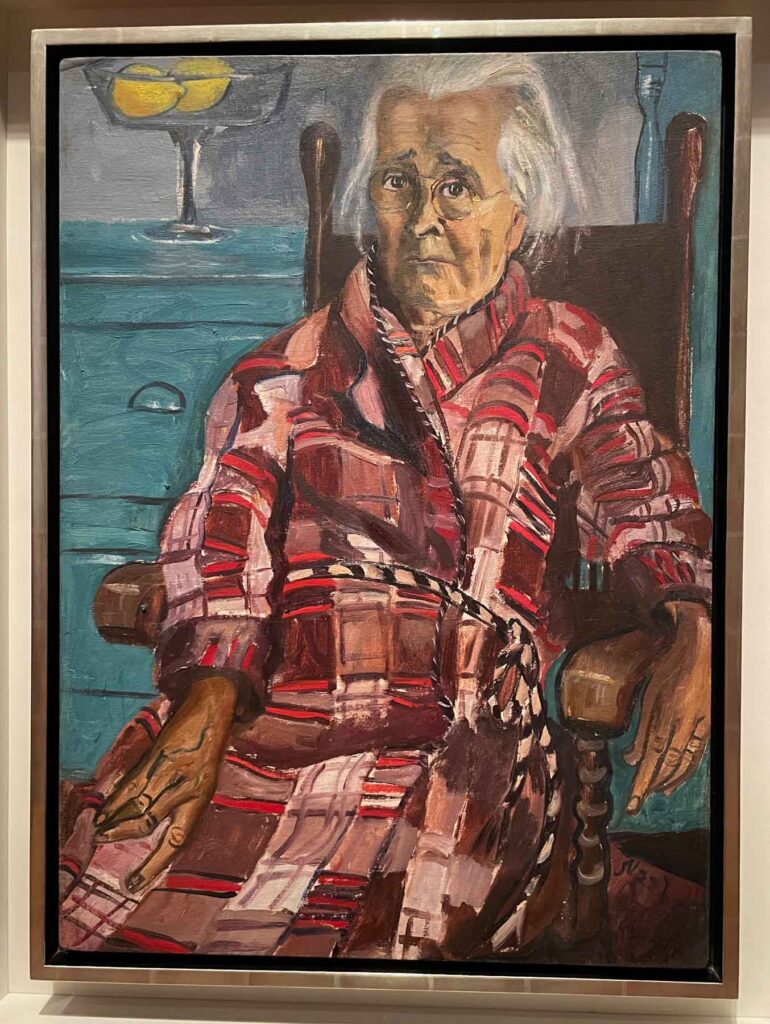
Last Sickness ©1953 Alice Neel, Oil on canvas
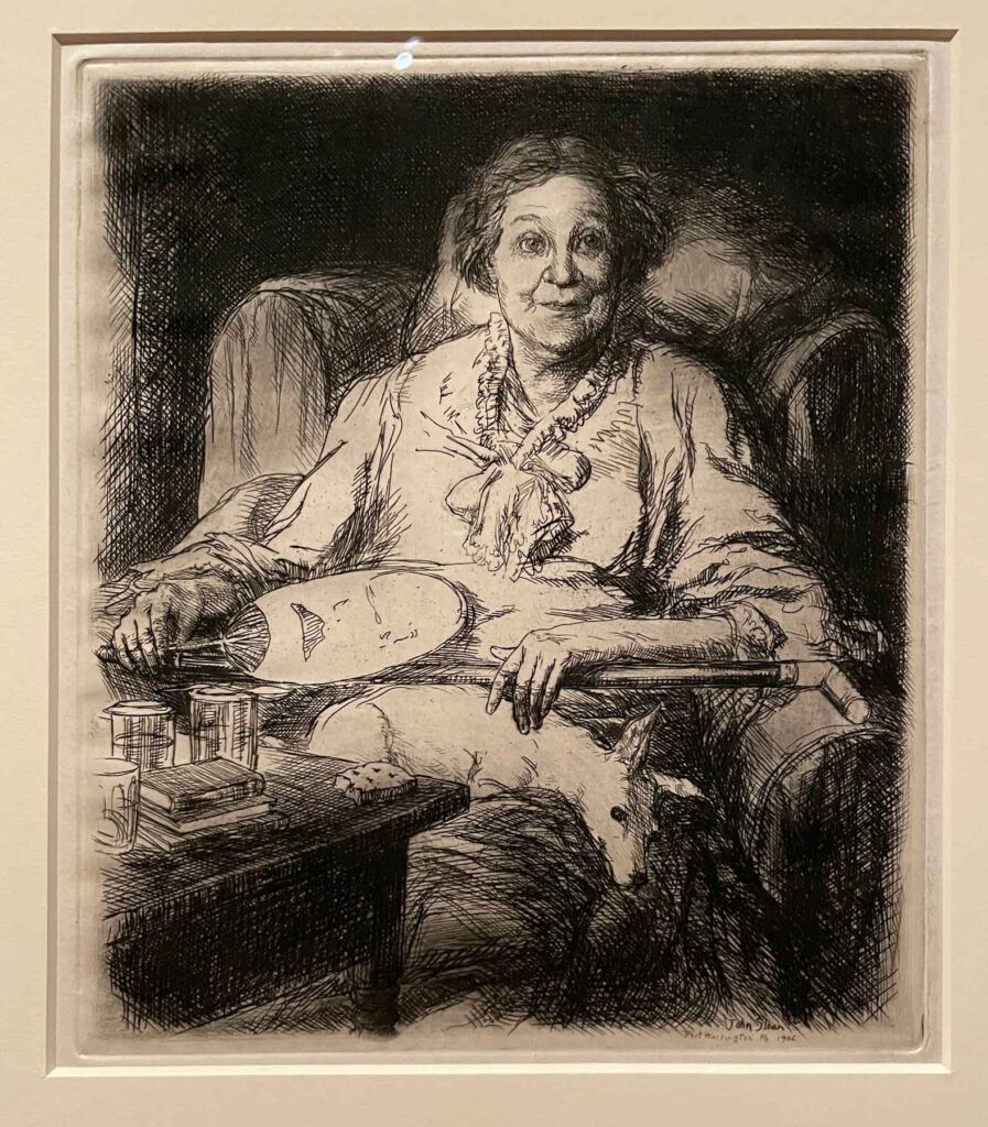
Mother ©1906 John Sloan, Etching
And to cap it all off, my sister-in-law arranged for a fantastic docent-led tour for interested wedding guests at The Barnes Foundation the day of the big event. Founder Albert C. Barnes was a bit of an odd duck, as is evidenced by the way he insisted his collection be displayed into perpetuity. But there is no denying that the collection is spectacular, and it’s interesting to take into consideration his aims and perspective as you wander through the galleries. There were plenty of stunning portraits to absorb among the many other treasures.
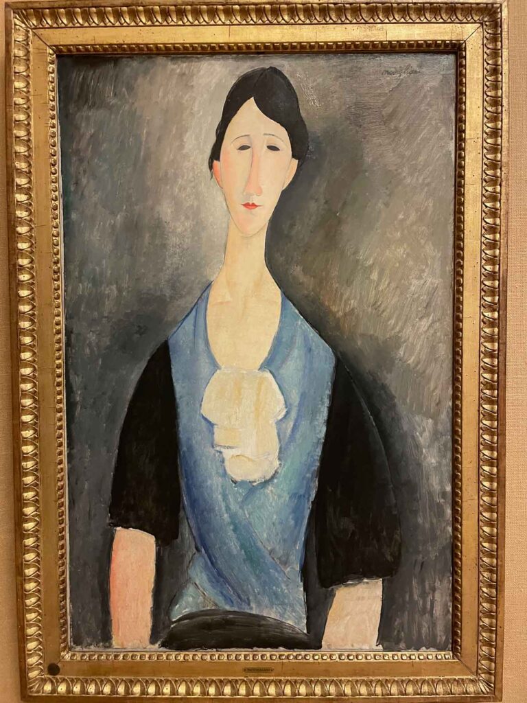
Young Woman in Blue ©1919 Amedeo Modigliani, Oil on canvas
And on a slightly different note, I was grateful for the chance to revisit this small watercolor by Charles Demuth – a painting that has remained a favorite in memory from my last visit to The Foundation over a decade ago.
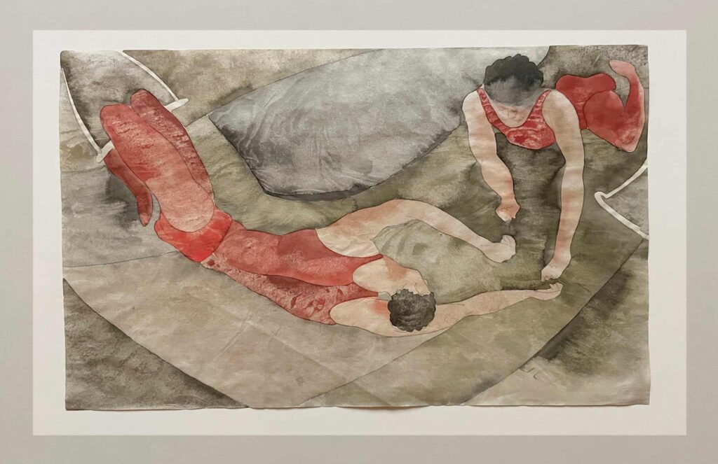
Two Trapeze Performers in Red ©1917 Charles Demuth, Watercolor and graphite on thin wove paper
And now, home again and back to work putting those new supplies to use!
✷
So many wonderful things to read – it’s hard to keep up.
Two of my latest favorites on Substack speak to two things that take up a lot of real estate in my mind and schedule most days: art and recipes. If you’re of like mind, take a look at Amy Allen’s Palate & Palette: Stories about people who make great art and food and Vicki Smith’s Easel to Table: Turning food into still life first and dinner second