Tag Archives: Chandler Gallery

Re-Balancing

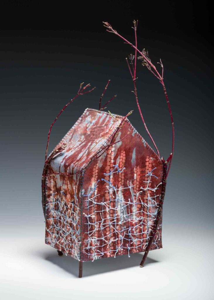
One of the things I most enjoy, and am very grateful for in my day-to-day, is that my well of projects never runs dry. Still, balance is necessary to keep things in sync and moving forward smoothly. January was packed with administrative chores and various commitments, both art-related and otherwise, which took me away from studio work more days than I would have preferred — and I’m feeling the pinch.

JR with Tombows

Let’s hear it for sketchbooks – a space to work through ideas, experiment with materials (as with the Tombow brush pens used above), and to find sanity when computer chores feel overwhelming.

However, for the month of February I’m shifting weight, so to speak, and will spend less time on outreach and more hours just making work. That includes here at Eye of the Needle too. Rather than writing and rewriting as usual, I’ll just share a few recommendations below that I’m sure you’ll enjoy, and then will turn away from the computer in favor of my needles and brushes.

Trichromancy Poster

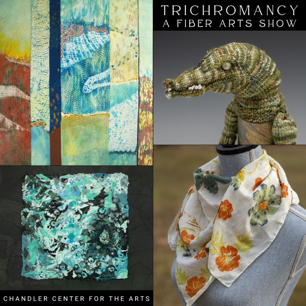
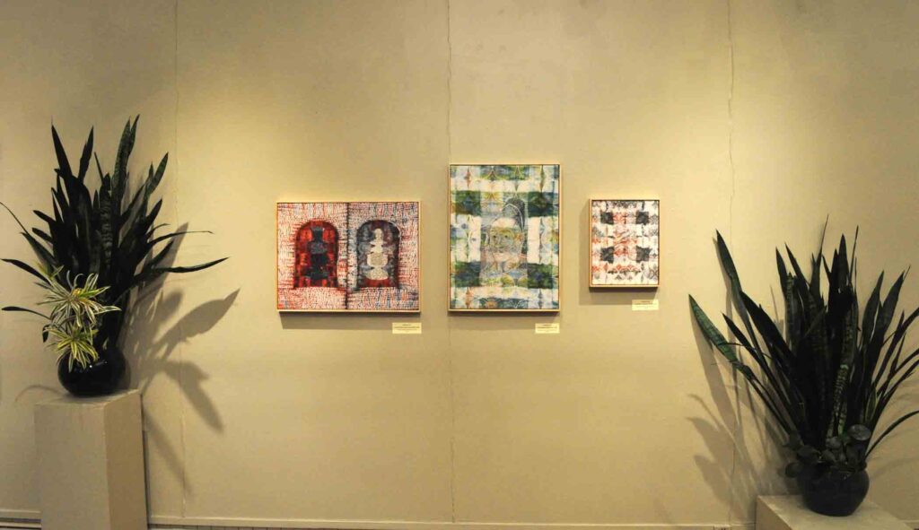
Last Saturday the group show Trichromancy: Color Divination opened at the Chandler Gallery in Randolph, VT. I have three pieces on view, including “Poseidon’s Garden”, shown in the upper left of this announcement,  The event was well attended and spirits were high. I was having such a good time with friends, meeting new people and running into folks I haven’t seen for a long while that I never even thought to bring out my phone to take pictures of the work on display. Bad form for a blogger, but a lovely indication of the convivial evening, and perhaps an impetus for you to go see the show for yourself.

I really enjoyed this interview with Sandi Hester on Maria Stoljar’s “Talking With Painters” podcast.

Hester, whom I’ve recommended before, is a hoot. She always shares generously about her practice and, in this particular case, talks about approaching it with joy, authenticity and especially without taking herself too seriously. Wise words for all of us. Consider giving it a watch — there’s something in there for just about anyone.

Finally, good art writing is hard to find. Quite often it’s a slog through erudite art-speak that encourages napping rather than digging deeper to learn more.
Not so with Dian Parker! Parker is a Vermont artist who has written extensively about color and contributes to a wide assortment of art publications. Her reviews and essays about individual artists are succinct and enlightening, always encouraging a desire to look further. Check out her review of Celia Paul ; I can almost guarantee you’ll be Googling to find out more as soon as you finish.

Nnenna Okore Sketch

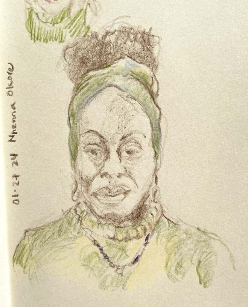
I sketched SDA conference presenter Nnenna Okore  while she spoke about her use of bioplastics in her efforts to bring awareness to sustainable practices in art. There is a theory, which I believe whole-heartedly is true,  that one hears better while drawing.

That’s it for this week. And here’s to finding that sweet spot of balance in all our practices!


“Cape Elizabeth Supper”

When I was growing up, my mother used to save leftovers, no matter how small, and freeze them for later. Eventually there would come a night when she would pull them all out, reheat and serve with a green salad. It was another way she avoided waste and, perhaps more importantly, got a night off from cooking. She jokingly called the culinary mélange “Cape Elizabeth Supper,” in honor of our public high school fundraising potlucks.
In that spirit, I’ve been saving up an assortment of links and announcements to share with you all at once. Think of it as a mid-summer break for both of us.

First the announcements:

Hidden Messages by Roz

A view of “Hidden Messages”     Photo: Rosalind Daniels

Many ‘calls for entry’ rely on themes. I generally tend to skip over them since that’s not how I prefer to approach my work and meeting their parameters is often a stretch. However, the premise of Hidden Messages: Old and New at the Chandler Center for the Arts’ Gallery in Randolph, VT was a different story, offering a platform that resonates strongly with both the intention behind several of my pieces – the idea of something “hidden in plain sight” – and the process I used to create them.

Espresso and Peanut Butter

Espresso & Peanut Butter   ©2018 Elizabeth Fram, Stitched-resist dye and embroidery on silk, 14 x 11 inches. This work is something of an ode to the hidden and often unsung beauty of the quotidian, a fact of life that I have come to more fully appreciate through my regular drawing practice.   Photo: Paul Rogers

In coordination with the Surface Design Association, this exhibition features the work of 15 Vermont textile artists who break the boundaries of traditional fiber processes and techniques,  infusing their work with underlying layers of meaning. You can view a sampling of the show online but I also hope you’ll consider going to see it in person. It’s a disappointment that I won’t be able to attend the opening reception due to an eagerly anticipated family commitment, but if you go, many of the artists will be there, keen to speak with you about their pieces and the ideas behind them.

The Secrets She Keeps

The Secrets She Keeps   ©2020 Elizabeth Fram, Stitched-resist dye and embroidery on silk, 24 x 18 inches  In this reimagined portrait of Barbara van Vlaederberch after a painting by Hans Memling, both the subject and the process used to create it address the idea of unrecognized identity. The sad fact of being visible, yet invisible is something that intrigues me. Unfortunately, it has been a reality for women throughout history. I could find very little information about van Vlaederberch, only that she was married to a prominent citizen of Bruges and had given birth to 18(!) children. You can’t convince me she didn’t have a story to tell.    Photo: Paul Rogers

The three works I have on view allude to the idea of “hidden” in different ways conceptually, two of them emphasizing the theme through a multi-step process that involves “losing” a white-on-white stitched drawing within a field of stitched-resist dye and pattern, and then bringing the image back to the surface via a second layer of embroidery using threads in colors that contrast with the dyed background.

House Divided

House Divided (Mitch and Nancy) ©2021 Elizabeth Fram, Stitched-resist dye and embroidery on silk, 18 x 24 inches. This piece relies on visual metaphor to communicate my point, while navigating between the superficially obvious and hidden layers of meaning through imagery that is symbolic of a deeper idea.    Photo: Paul Rogers

Here are the show details:
Hidden Messages: Old and New
July 10 – September 5, 2021
Chandler Gallery at the Chandler Center for the Arts
71 N Main St.  Randolph, VT 05060
Opening reception: Saturday July 17th, from 4-7pm
Gallery Hours: Saturdays 12-5,  Tues-Fri 11-4 when Chandler Offices are open (look for the Open  flag or call 802.728.9878 and press 2),  and during Chandler events.

And please note, as part of Hidden Messages, an exhibit of traditional and contemporary quilts are concurrently on display at the White River Craft Center, also in Randolph.

Until the Bitterness Passes

Until the Bitterness Passes   ©2020 Elizabeth Fram, Stitched-resist dye on silk with stitching/knotting and foraged branches, 16.5″H x 7.5″W x 8″D    Photo: Paul Rogers

I recently learned that my piece Until the Bitterness Passes was selected to appear in “From Confrontation to Catharsis”, the 2021 SDA International Exhibition in Print. The full exhibition will be featured in the Fall 2021 issue of the Surface Design Journal.

The Violet Process

©Elizabeth Fram, Embroidery and applique on cotton, 8 x 8 inches.

Last week I finished my contribution for The Violet Protest, which you may remember was a call, created by Ann Morton, for 8″ square works of equal parts red and blue to encourage thought about bringing our differing political factions together rather than continuing to separate them more widely. My square will appear in stack G-3 in the ongoing exhibition at the Phoenix Art Museum through September 5. If you will be in Phoenix at some point this summer, I encourage you to go to the museum to view the project before the squares are sent to members of Congress at the end of the year. Or, if that’s not possible, you can get a feel for the scope of the undertaking at @thevioletprotest on Instagram. (My Instagram recommendation for the week).

And now for the promised links: