
Important lesson from this week: color is flexible, but value needs to remain constant.
©2019 Elizabeth Fram
Problem:
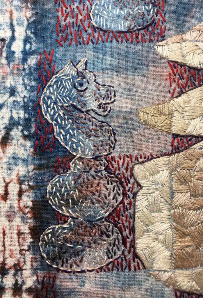
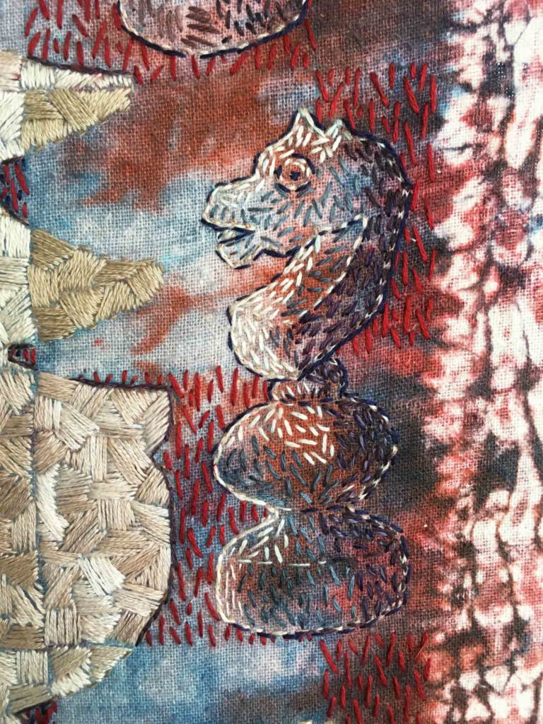
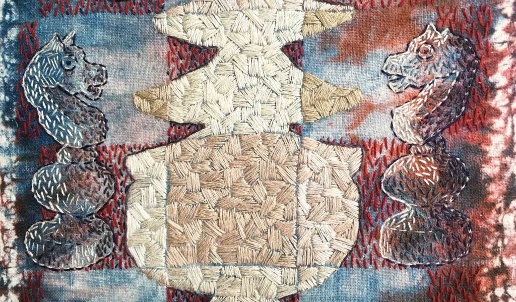
How to convey two objects that are the same color, ostensibly sitting under the same light source, but depicted on backgrounds that are entirely different from each other in both color and saturation.
The best answer seems to lie in value. Look closely at the similarities and differences of these two knights to see what I mean. The highlight color is constant, but the shadow colors are not: shades of mauve and purple in the knight facing right, slate blue and navy in the knight facing left. Yet the overall impression of both is the same.
©2019 Elizabeth Fram
My January 2016 post, Benefiting from the Basics, points out how trimming back to thinking only in terms of value (while painting a monochromatic watercolor sketch) revealed an unexpected and beneficial parallel with my textile work, one that I continue to think about and use today.
©2019 Elizabeth Fram
As Carol Marine says in Chapter 4 of her book Daily Painting, “If you have the values down, the world will be your oyster”.
❖
Ok, I admit it, this is more than just a link to an archived post. Old habits die hard, but it’s a start. The good news is that I saved hours this week, all of which have been devoted to stitching (and making discoveries about value).
Reminds me of Albers color theory class in college
Exactly! Except it makes so much more sense when putting it into actual practice, rather than playing with color-aid paper.