
Color is like gravity: an inescapable and powerful force that pulls you in and won’t let go. When deftly handled it’s hypnotic. Working with it is an oh-so-sweet challenge that requires lots of time and practice.
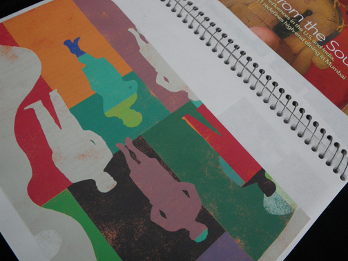
In an effort to learn more, I keep index cards with scraps of different fabrics glued to them and sketchbooks filled with reference material. Both highlight unexpected color combinations that I find particularly beautiful or intriguing. I return to these sources over and over — for ideas or even as a sort of visual vacation when I need a break.
In my latest work I’ve been combining processes that are inherently different, but which complement each other and lay the groundwork for chromatic lessons.
The first step is to dye raw silk after painstakingly covering it with running stitches and then gathering them so that the dye can only access certain parts of the whole. Some areas, such as the figures below, are left unstitched, so the different colors of dye are allowed to fill those sections freely. Overall, this creates a textural pattern that serves as a base. Next, textile paint is applied relatively quickly; broad strokes of pigment that bleed into the fabric and mix impulsively.
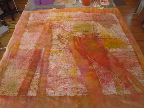
Evening Duet, in process – wet textile paint ©2013 Elizabeth Fram
Then those base layers of color are covered with stitches of many different hues, playing off the coloration of the dye and paint. The density of the stitching provides a way to learn through the push and pull between the colors as they react to each other. Each stitch/mark is similar to the dots from a pointillist’s brush, providing a means of examining the nuances of how one hue affects the next, with the result that I’m able to expand my understanding of color theory while exploring its intellectual and emotional power.
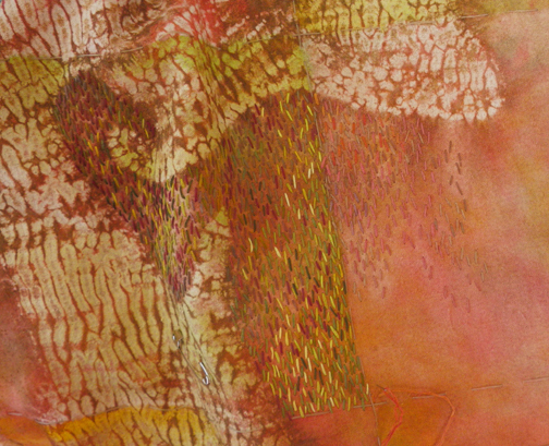
Evening Duet, in process – stitching ©2013 Elizabeth Fram
The slow and methodical pace of the process gives me an opportunity to resolutely consider each mark and I often go back to pull out stitches/colors that don’t seem to have been placed correctly. There is definitely an intuitive element which kicks in that has evolved with practice. It comes from watching closely as the work develops and from seeing how the colors affect not just each other, but the artwork as a whole.
Color is a school with no mandatory prerequisites that’s open to all of us. As you move through your day, keep your eyes peeled for what grabs you; the combinations that make you pause. The beauty of the process is you can write your own curriculum.
If you’re interested in adding to your syllabus, here are a few suggestions. There’s some really good meat to their texts, but it’s also fun to just flip through the pictures.
Color in Contemporary Painting; Integrating Practice and Theory by Charles LeClair Painting What You Want to See by Charles Reid Glorious Color by Kaffe Fassett
Susan Sargent’s The Comfort of Color