Tag Archives: Susan Hertel

Dog Daze

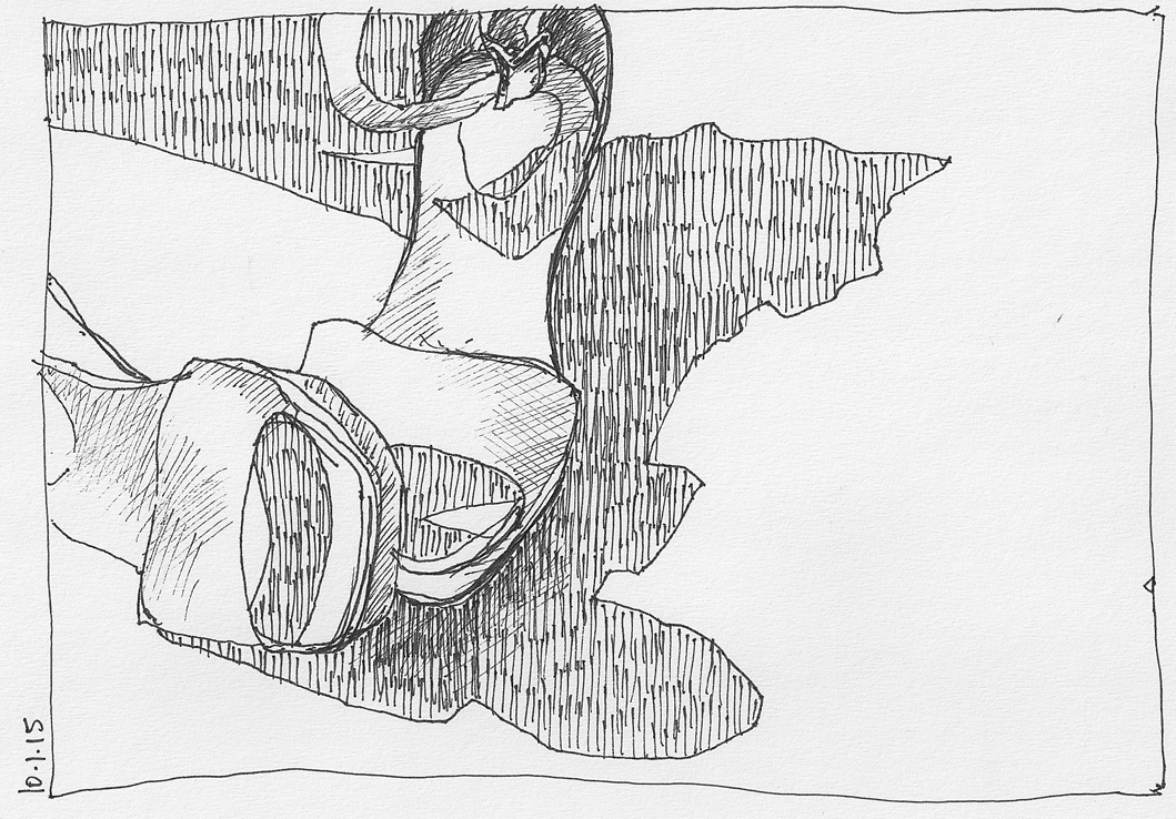
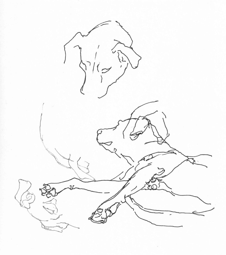
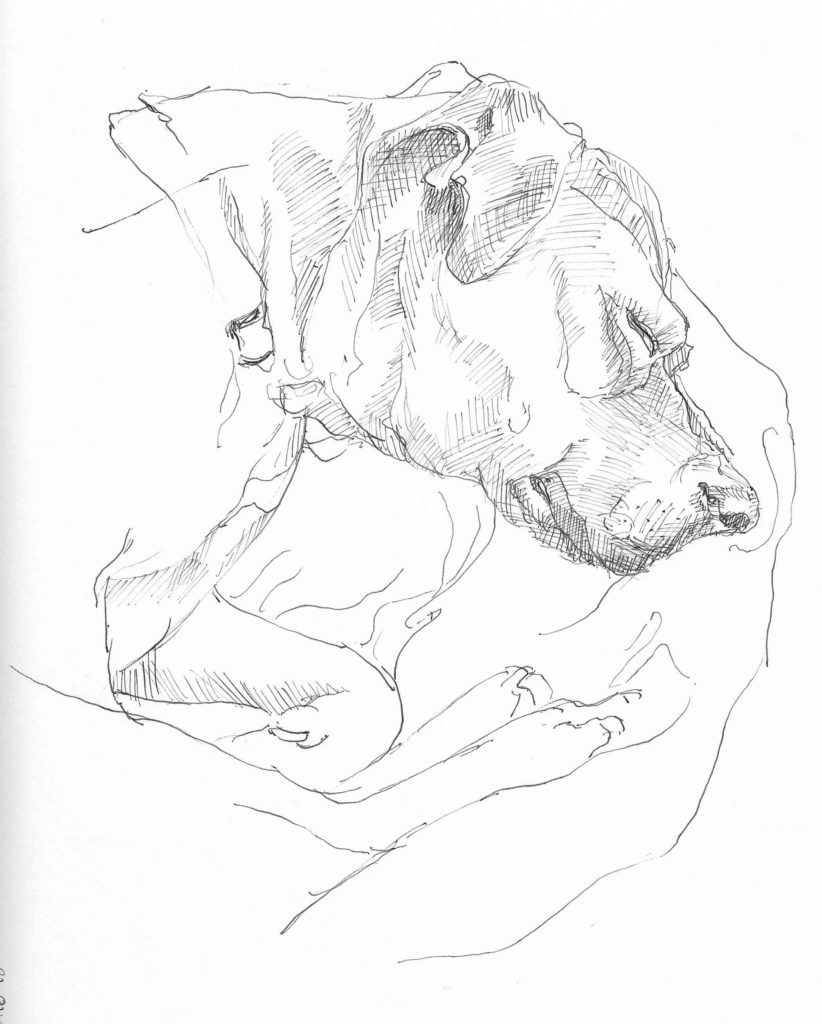
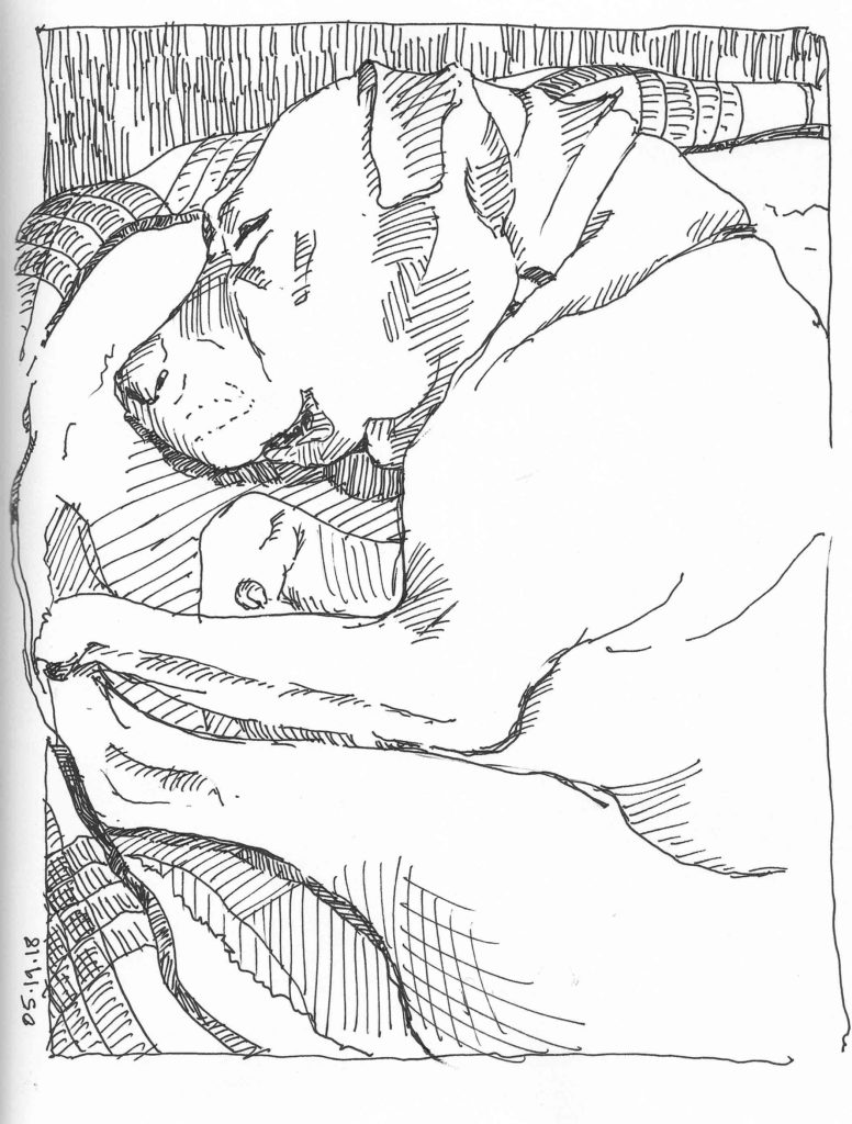
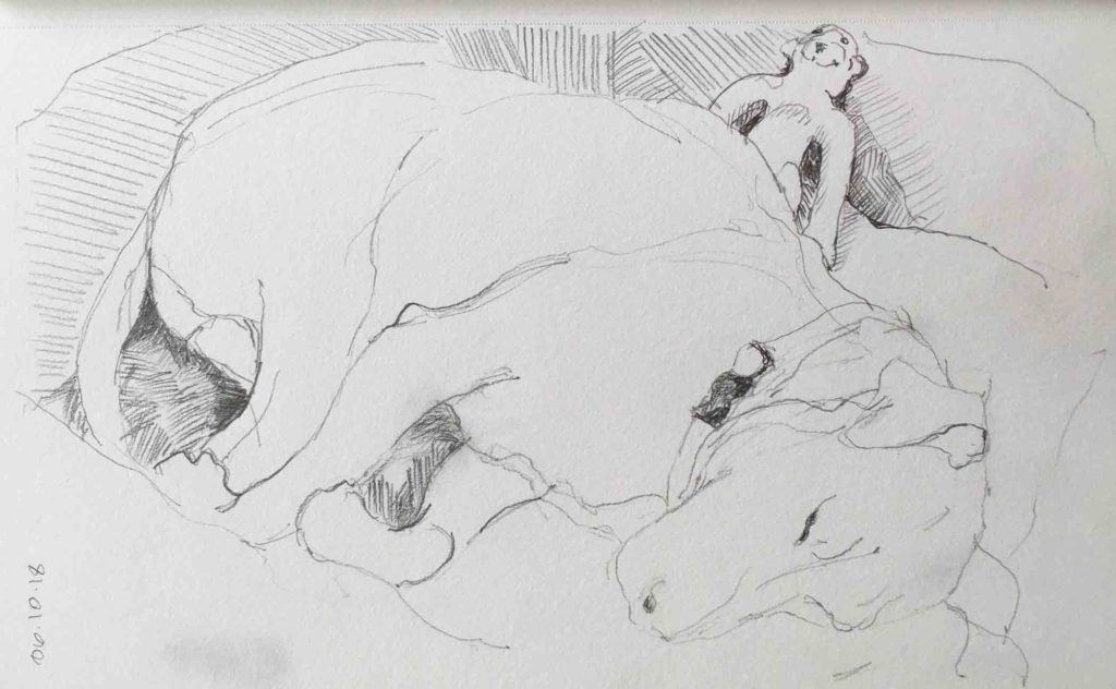
Looking back over posts from the past couple of months, I see it’s been a while since Quinn has made an appearance here. Despite the regularity of my weekly life drawing sessions, she’s still my most faithful and readily available model. It is the rare week that I don’t try to capture her in at least one or two sketches.

Multiple tries

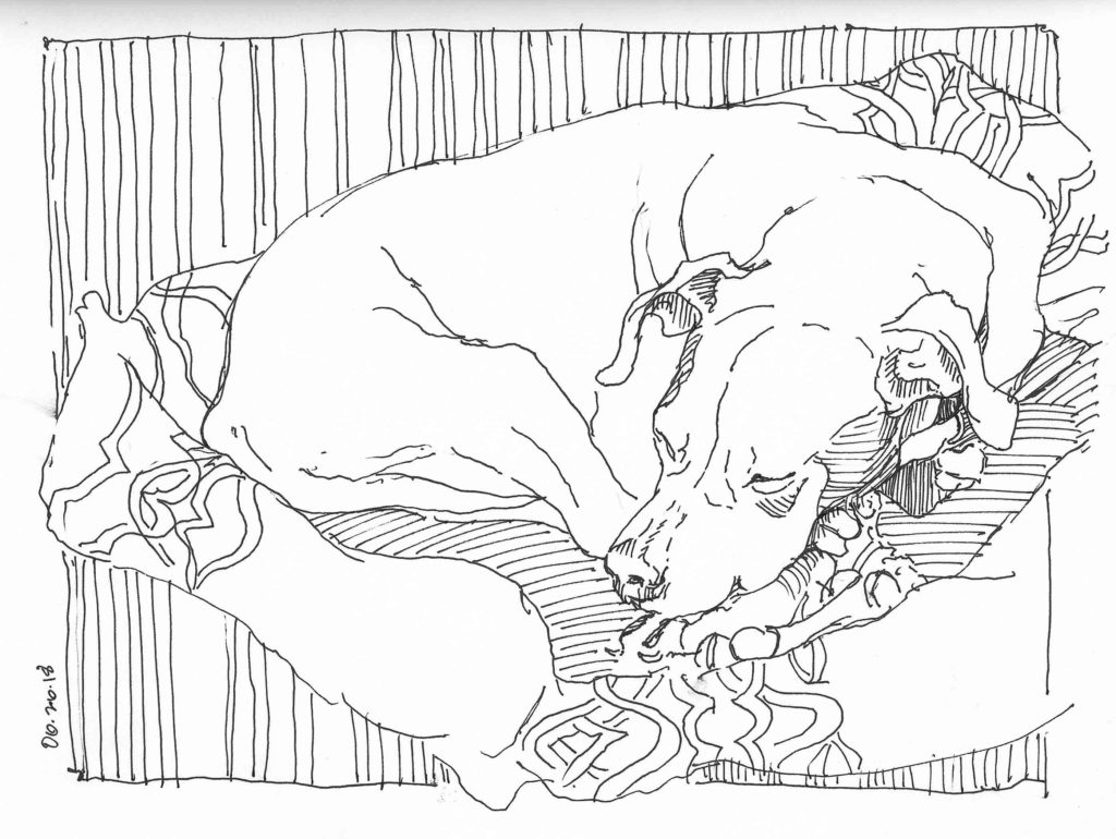
© Elizabeth Fram, 11 x 8.5 inches, Pen & ink on paper.                                                   Some days she’s particularly restless, which means numerous false starts before turning the page to start again.

Try Again

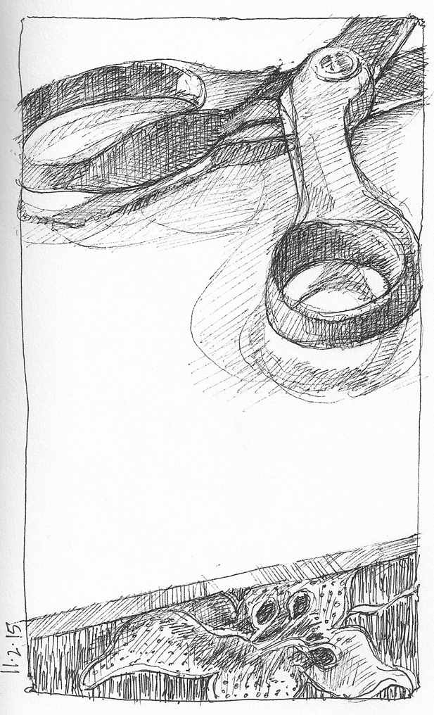
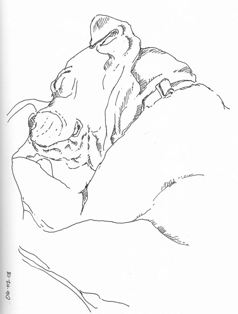
©Elizabeth Fram, 11 x 8.5 inches, Pen & ink on paper.                                                Other days she’s the cooperative one but I’m the problem, in need of many searching tries to get the lines where they should be.

Left facing

©Elizabeth Fram, 11 x 8.5 inches, Pen & ink on paper

Green Man

©Elizabeth Fram, 5 x 8 inches, Graphite on paper

Minimal

© Elizabeth Fram, 11 x 8.5 inches, Pen & ink on paper

Pattern Pooch

©Elizabeth Fram, 8.5 x 11 inches, Pen & ink on paper

Unsurprisingly, I tend to be drawn to work that includes a creature of some sort. If you are also a member of that camp, take a look at the art resources for animal lovers listed below.

  • Susan Hertel (1930-1993), an artist I had never heard of before coming across a retrospective catalogue of her paintings while vacationing in New Mexico years ago. I was immediately smitten with her compositions, her rich use of pattern, and her portrayal of her animals (horses, dogs & cats), an element integral to both her work and her life.
  • Lark Book’s 500 Animals in Clay is a delightful compendium of beautifully, and often humorously, crafted representations of the animal kingdom.
  • Mr. Finch, of Mr. Finch Textile Art, fabricates stunning pieces that are a combination of the magic of fairytales with a touch of Darwin.
  • BONUS: David Hockney’s paintings of his beloved dachshunds.

Dancing on the Edge

“Good composition is like a suspension bridge; each line adds strength and takes none away… Making lines run into each other is not composition. There must be motive for the connection. Get the art of controlling the observer – that is composition.”
— Robert Henri

I have been pulling back to basics this fall by concentrating on composition in my sketches. The more I experiment, the more I learn, and I’ve become intrigued by the idea of composing an image where the subject hugs the perimeter of the frame. In doing this, I am discovering that a tension occurs between the concentration of elements at the edges and any expanse of relatively unoccupied space (or large area that relies on an overall pattern).  A heightened sense of abstraction seems to occur as a result, adding another layer to consider — which is a by-product I quite like.

I spent some time hunting for examples of this in the work of several of my favorite artists. Here are a few pieces that caught my attention.


Still Life with Letter

Richard Diebenkorn     Still Life with Letter, 1961     Oil on Canvas

Equestrienne

Henri de Toulouse-Lautrec     Equestrienne (At the Cirque Fernando), 1887-88     Oil on Canvas                   I spent a fair amount of time studying this piece at the Art Institute of Chicago last week. If they had offered, I would have gladly brought it home.

Susan Hertel         http://www.susanhertel.com                                                      Susan Hertel, 1930-1993, was a New Mexico artist whose art “embodies what is marvelous in the mundane experiences of life”, a sentiment that resonates strongly with me. She had a menagerie of animals who were frequently the subject of her paintings. In my dog-less state these days, I find particular comfort in her work.

Alone with the Tinkling of Bells

Dorothy Caldwell     Alone with the Tinkling of Bells, 1991     Wax resist and discharged cotton with stitching, applique, gold leaf

Wayne Thiebaud, Delicatessen Counter, 1963:

Wayne Thiebaud     Delicatessen Counter, 1963

I’m sure the reason I’ve found this way of organizing a picture so exciting is due to several things: my natural inclination toward asymmetry, an affinity for Japanese art — where this strategy is common, and the fact that I subscribe to the theory that a piece of art should be acknowledged as a 2-D interpretation, not an attempt to reproduce reality.

I’m including below a couple of examples of my own exploration of this idea.

Sandals

Sandals     ©2015 Elizabeth Fram

Scissors

Scissors     ©2015 Elizabeth Fram

An additional reward is that by incorporating the edges, subject matter that goes beyond the picture plane leaves the viewer with an opportunity to imagine “more”, rather than being presented with a neat package that has nothing further to say. I love the idea of building in another level of significance to a drawing by editing-out rather than adding-on.

How important is composition in the art that grabs your attention? Because I am so interested in design,  it has significant power for me. Do you find that to be true as well — or is it the subject of a piece that first sways you?

See this post for the simple tool I use to hone in on this discipline.