Tag Archives: Kaffe Fassett

For Love of Color

A couple of weeks ago I gave in to impulse.
My shelves are sagging under the weigh of the many books I’ve collected throughout the years, so I’m consciously trying NOT to indulge in oversized art books anymore, opting instead for Kindle editions.
But everyone falls off the wagon from time to time.

Kaffe Fassett In The Studio


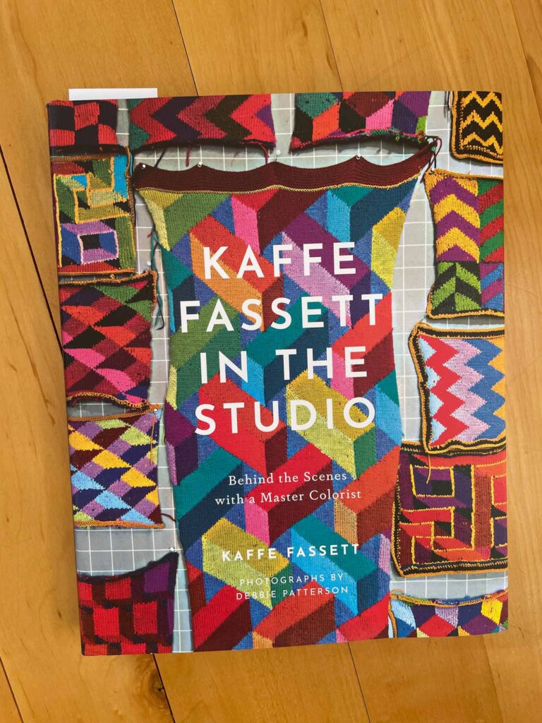
Kaffe Fassett In the Studio: Behind the Scenes with a Master Colorist is worth every inch of shelf space it will someday occupy — although I think it will be a while before I let it out of immediate reach. It proved a really fun read in the moment and will be an inspirational resource for the future.

Magenta

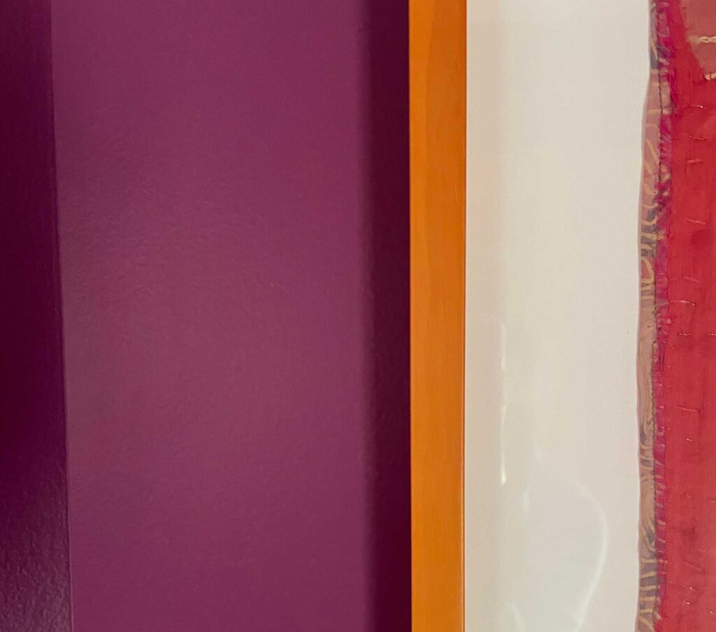
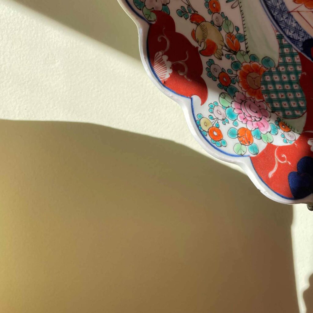
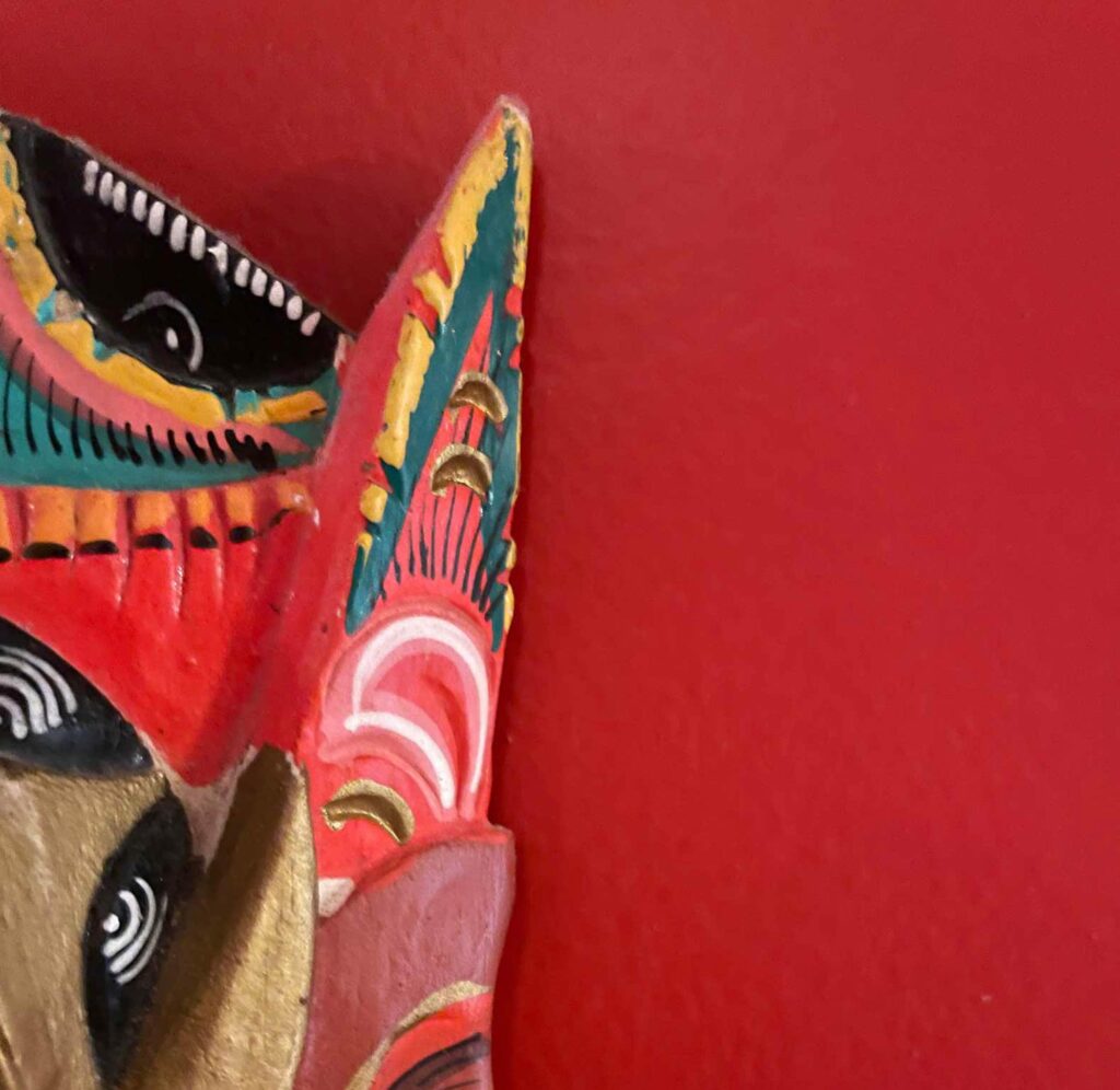
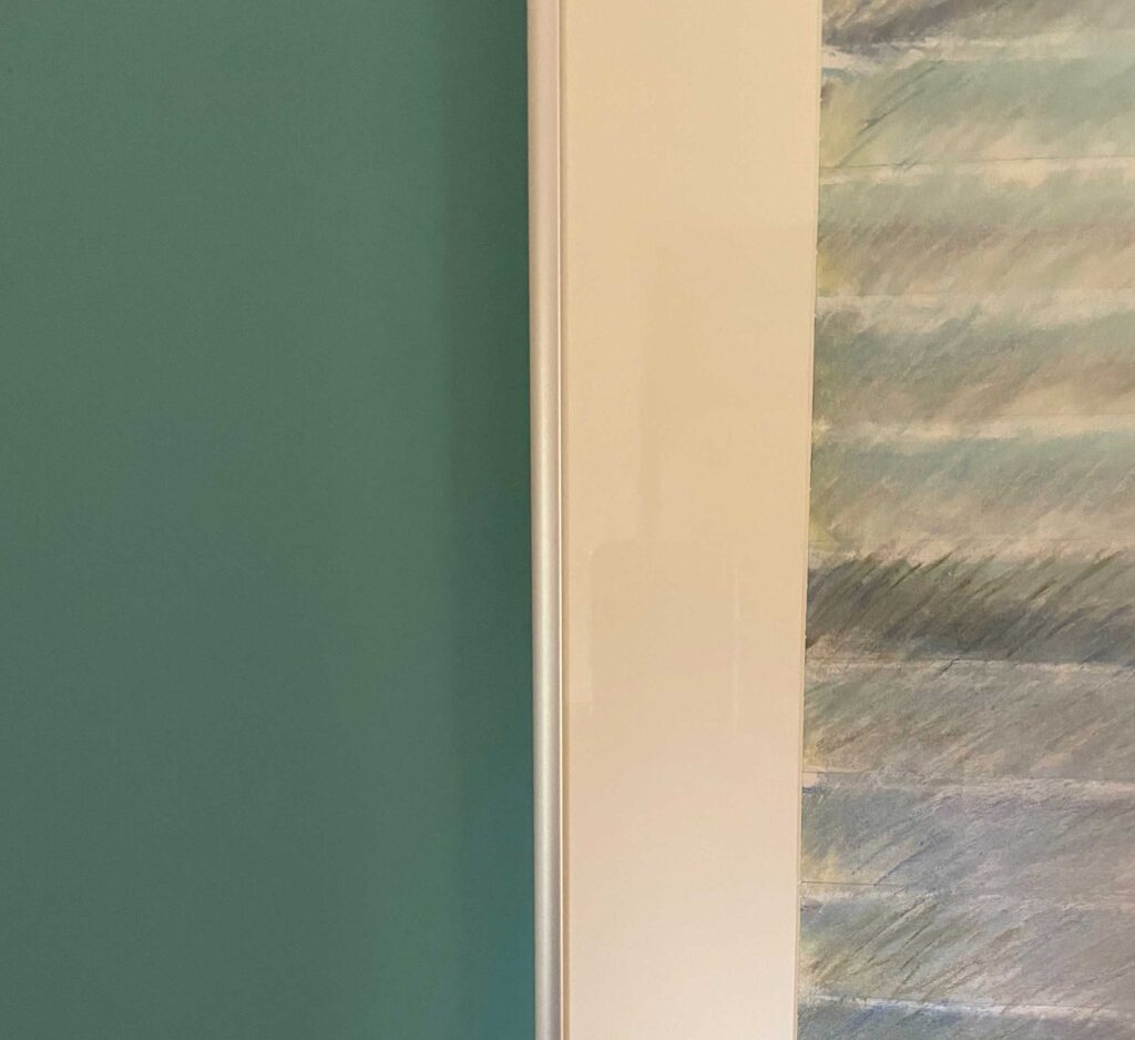
This and below: a selection of the wall colors I love living with

Textile artist, painter, mosaicist, designer and collector of all things eclectic, Fassett ushers the reader through his intermingled home and studio (who doesn’t love a good peek into another artist’s working space?) writing extensively about the evolution of his long art career. With the flip of each page, one gets a further glimpse into the many aspects of Fassett’s prolific creativity, all of which seem to turn on an axis of color. The experience has the effect of making one feel a bit like Alice journeying into Wonderland.

Fern Green


A dozen years ago, while we were still in the design phase of building our Vermont home, I gained a lot of inspiration and courage from Susan Sargent’s book The Comfort of Color. I’m pretty sure I freaked our painters out when I handed them a spreadsheet outlining the panoply of colors I wanted applied throughout our new house. Let’s just say I put a bit of a wrinkle into the ease of blindly using one version or another of white from room to room.

Red


Most artists I know surround themselves with strong colors and eclectic collections. On a more universally known level, think of Monet’s Giverny or Frida Kahlo’s Casa Azul. The trip through Fassett’s home/studio is no different although, compared to many, arguably on steroids. And what’s not to love about that?

Seaglass


If you’re lucky, the colors outside your home are just as vibrant as those that surround you inside.
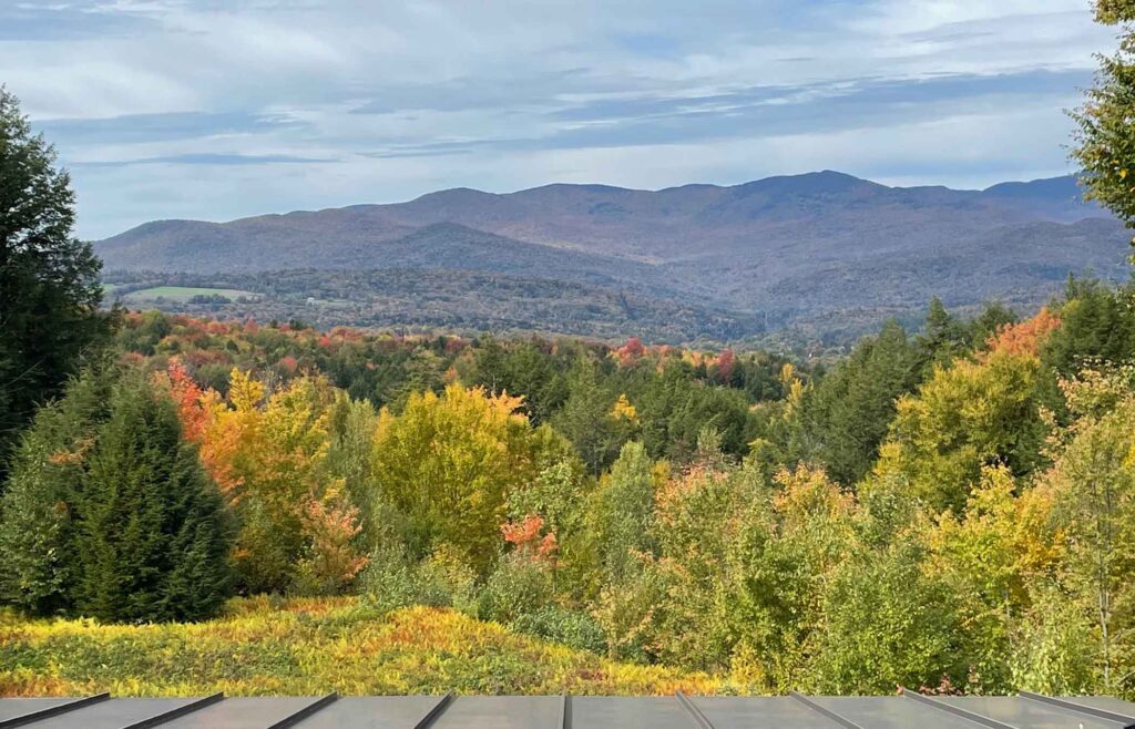
Autumn from studio window

View from my studio

It’s hard to beat nature’s colors as autumn takes hold here in Vermont.

Swan Song

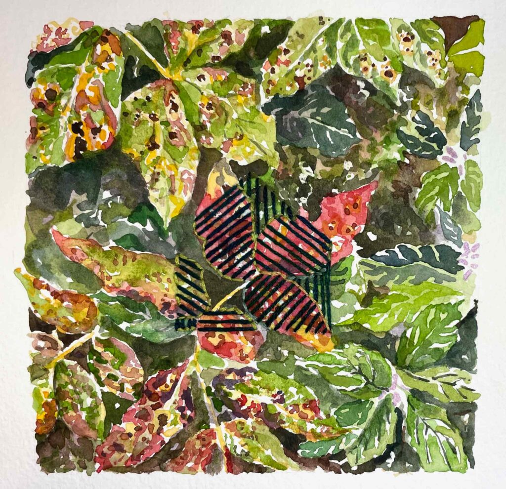
Swan Song   ©2022 Elizabeth Fram, Watercolor, pencil and embroidery on paper, 5 x 5 inches.

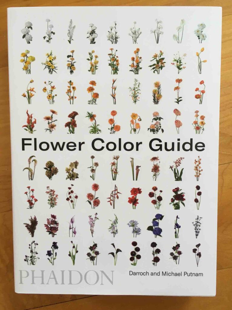
For a deeper dive into the rainbow, don’t miss Dian Parker’s sparkling essays on individual colors. Start with your favorite and then savor each one – you will be fascinated reading about their history, chemistry and their significance in art and everyday life.


Four Ways To Add Color To Stick Season

I think it’s safe to say that the last gasp of summer is now behind us. That fact, paired with the latest COVID restrictions on social interactions here in Vermont, point to more time for reading and digging into creative outlets, online and otherwise.

November Trees

It’s a time when we can all use a bit more color in our day-to-day, so I thought I’d share a few of the things that have brightened my outlook:

  • I’ve been enjoying the American Craft Council’s weekly post “The Queue”. It’s a series of interviews with 2020 ACC Awards honorees, often including a short video of the artist. The ACC is a wonderful resource; I encourage you to spend some time exploring the Stories section of their website. The satirical sculptures of recently featured Bob Trotman caught my eye several years ago, so I was happy to become reacquainted with his work on a deeper level via “The Queue”. With a background in philosophy, not art, Trotman was originally most interested in studying the idea of the individual. But as he developed an art career, his concerns turned toward examining the machinations of society. As a result, his artistic commentary is largely aimed toward money and power in America.
    Considering the unprecedented behavior we have been witnessing from our out-going president and his enablers, Trotman’s powerful voice is more resonate than ever.
  • Another resource that delicately walks the line between delightful and educational is Vermont painter Susan Abbott’s Painting Notes Blog. Always enriching without being didactic, Susan shares her extensive knowledge of art history from both a visual and personal angle. She shines a contemporary light upon the artists and works that have gone before us, and who have laid a path for us to follow. If you’re interested in book suggestions from Susan, look for her generous response to my question at the very end of the comments section of this post.
  • Beginning with the lock-down last spring, several major textile organizations joined forces to offer weekly “Textile Talks” — video presentations and panel discussions that surround a huge variety of subjects related to textile art.
    All can be accessed via YouTube.
    The recent “creative discussion” between color icon Kaffe Fassett and his niece Erin Lee Gafill covers their personal history as well as the habit they’ve developed of painting side-by-side. They’ve recently released a book of these parallel works called Color Duets. Anyone who knows and admires Fassett’s work and his long, illustrious career will enjoy the conversation. Particularly inspiring is the way Fassett straddles different media while maintaining the consistent thread (sorry for the pun) of color.
  • And finally, if you too are a student of color, you know it’s hard to beat a garden – flower or vegetable – for the lessons it can teach. Our beds may be all buttoned up for the winter, but even as the snow flies we can dream about next year’s glory…while learning a thing or two along the way. Two resources that will be scratching the color itch for me this winter are Darroch and Michael Putnam’s Flower Color Guide and the Floret Flowers website.  There are plenty of lessons to be gleaned from each, but perhaps more importantly during these crazy, stressful days, they both offer pure, visual delight.

Flower Color Guide

With Thanksgiving just around the corner, I can’t let the occasion pass without saying how grateful I am that you choose to join me here every other week, sharing your ideas and comments along the way. Please accept the suggestions above as a token of my gratitude. Be well and wear your mask. We’re all in this together.

Linda

Linda    ©2020 Elizabeth Fram, Ink, graphite, and colored pencil on paper, 11 x 8.8 inches. It’s always fun to see what each person chooses to include in the selfie they send me, because it’s a further window into who they are. Linda made the paper batik behind her and I think it’s an apt reflection of her bright spirit. All 13 pieces in my COVID-19 Selfie series can be seen together on my website.