Tag Archives: Dorothy Caldwell

Color + Light = Place

There’s nothing quite like travel for a reminder of how much light and color affect a sense of place. In fact, I don’t think it’s too bold to say that, for those of us interested in such things, the elements of light and color define place.

Kailua Beach

Kailua Beach

Matisse knew that fact, as did Winslow Homer and Gaugin. On the more contemporary side, look to Dorothy Caldwell, Eric Aho or the interior designer Justina Blakeney* for color that portrays the essence of specific locales.

Berkeley

Berkeley

Our visits with family in Berkeley and Hawaii were nothing less than a full-on immersion in chromatic glory – especially for this northern New Englander. It was the kind of visual shake-up that makes me sit up straight and pay close attention.
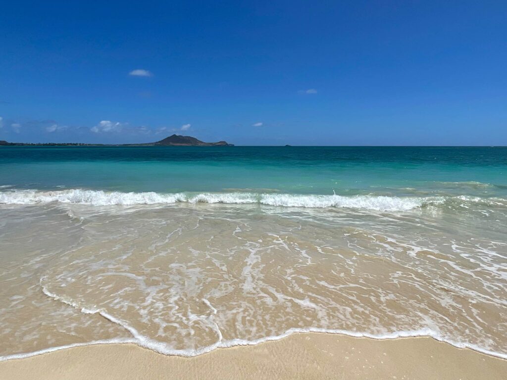
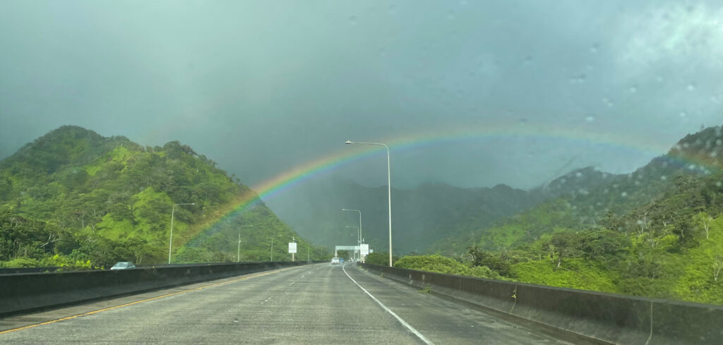
Hawaii

Hawaii

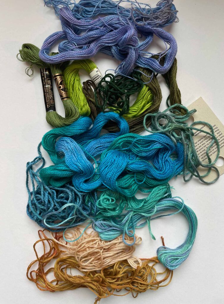
That isn’t to say things haven’t been waking up here in Vermont over the past weeks. We arrived home to find our garden bursting with the colors of Zone 4: phlox, azaleas, lilacs, iris, rhododendrons and lupins…and let’s not forget the lush Green Mountains.
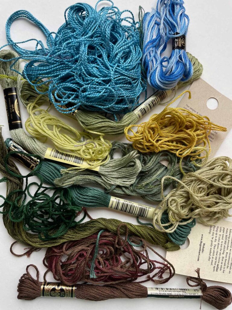
Vermont

Vermont

I’m not well-versed in the science of light wavelengths and how they are affected by their relationship to the sun or the surrounding environment, but at least I can say that their variations make my travels – and coming home – all the richer.

*Thanks for the introduction, Sandy!

For a similar experience – especially while travel is still iffy with COVID – consider tuning in to the Strong Sense of Place podcast. Each episode explores one destination by discussing in detail, without spoilers, five books that will take you there on the page. Hosts Melissa & David ferret out books that really convey the feeling of a particular place — color and light limited only by your imagination.

Sun Hat

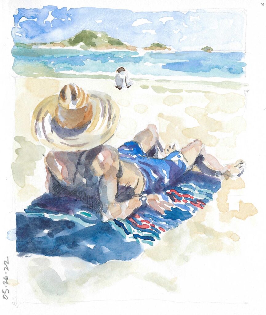
Straw Hat   ©2022 Elizabeth Fram, Watercolor and graphite on paper, 7.25 x 6 inches

Look to Art’s Formalities

Tuesday I loaded 25 pieces into a van and sent them on their way — all carefully wrapped, labeled, and ready to hang in the upcoming exhibit The Dialects of Line, Color, and Texture at the Highland Center for the Arts in Greensboro.

I am honored to have my work in company with pieces by Frank Woods and Elizabeth Billings, and I am very gratified to be part of a show that reaches beyond a specific medium or subject matter, instead highlighting how, despite the obvious contrasts, we all three gravitate to similar underlying formal structures to express our ideas.

I find this particularly pleasing since the formality of line, color, texture, shape, and composition is a major driving force behind both my drawings and my textile pieces. Perhaps, subconsciously, this explains why I was immediately attracted to both Frank’s and Elizabeth’s art when we moved to Vermont almost ten years ago.

I hope you’ll be able to join us for the opening on Saturday, or will be able to get up to Greensboro at some point during the show’s run (through May 26th). For those who can’t make it, I’ll do my best to have pictures to share with you next week.

Poster for The Dialects of Line, Color, and Texture

This week textileartist.org posted an interview with Janet Bolton, another of my artistic heroes, whose work grabbed me very early during my own fledgling textile explorations. Attracted to her consideration of edges and the way she divides space, (again the formalities of art holding strong sway), I purchased two of Bolton’s books in the mid-90s: Patchwork Folk Art and In a Patchwork Garden. Hindsight reveals a predictable pattern of preference for these qualities, which resurfaced in my later inclination toward the work of Dorothy Caldwell, Toulouse-Lautrec, and Richard Diebenkorn, among others, and continues to attract me to artists today.
The dye, as they say, was cast.