
While browsing in a Bar Harbor bookstore in August, I came across the book Local Color: Seeing Place Through Watercolor by designer Mimi Robinson.

The theory behind the book is that the colors of a place leave a lasting impression of that locale, especially somewhere we haven’t been before. She elaborates by demonstrating how she creates watercolor grids as a means of journaling about the places she’s visited in order to retain a sense of that location.
That idea has stuck with me since.
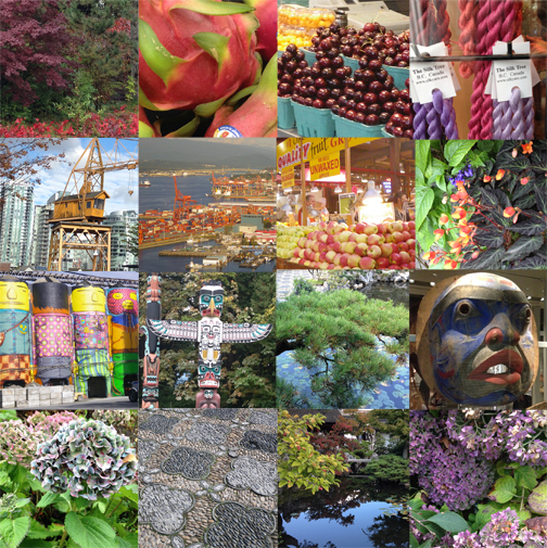
Vancouver, BC September 2015
While we wandered around Vancouver last week, I was paying attention to the colors that were representative of what we were experiencing, and making a point to think about it in my sketching as well as in what we photographed.
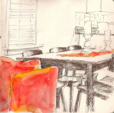
What most interested me here was the tangle of chair and table legs, but the room had an orange chair and table runner that created a striking contrast.
While I think it’s fair to say that most of us are attracted to and influenced by color, it’s a worthwhile exercise to be mindfully aware of it as a way of defining a location. I encourage you to give it a try.
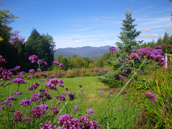
Autumn colors beginning to pick up steam
And finally, I would be remiss if I didn’t give a nod to my adopted state of Vermont in any discussion of local color. There is such a strong sense of color identity here, especially at this time of year.
Bonus: In my research before we left for Canada, I found and planned a visit to Maiwa Supply. It is a wonderland of books and materials. Happily you can also check it out by visiting and shopping online!
I “found” this book at the Met in NYC.. bought 2, one for my artist daughter and one for me. I didn’t think I’d use the technique but find I frequently do.. did a bouquet of zinnias the other day with satisfying results. As a person learning color mixing, it’s also been really helpful. 🙂
Isn’t that cool! Love hearing how it’s helping you. I didn’t buy the book, (trying to be better at trimming down my bookshelves) but really liked the ideas she presented.
I bought the book at the John Singer Sargent exhibit at the Met. Sometimes simply cannot resist buying a book.. to study and then give away mostly these days. But distilling the view down to the main colors.. not every single color, just predominant & the ones that pop out at me.. I really enjoy that exercise. I have learned over the years about which paints to take to which locations.. for example I have a note in travel journals to be sure & take grey to London! CA (where our daughter lives) has this salmony, pinky, terra cotta ish color that I’ve never been able to copy.. and so on.
Happy Fall.. (speaking of colors!!) 🙂
I’d love to compare palette notes some time!
Excellent post. Thank you.
I recall visiting the People’s Republic of China back in 1979. What struck me was the absolute lack of color in public spaces. There were many grey Stalinist buildings punctuated by large red banners featuring various slogans by Chairman Mao and Deng Xiaoping. The grey background made the red banners stand out that much more.
Hi Lenny. You’re reminding me of when I visited China in 1984 — we were in some small town, it was a grey day, and as you remember, all the buildings were very grey and drab. The shops were all 3-sided & open to the passageway we were walking through. One shop keeper was selling brightly colored yarn – which stood out so cheerily against everything else. Of the hundreds of slides I took, that is the one I remember best.