
What is it about grouping colors together that is so enticing? Have you ever left a paint store with only the color chips you came in for? Neither have I.
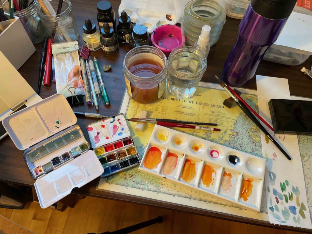
This is a pretty cramped area to work in so I am planning to expand into another part of my studio. While I didn’t buy any new paints (see below), I did order a new porcelain palette. This old one that I’ve previously used with textile paints is versatile, yet I wanted something with a larger flat area for mixing. After a bit of research, I ended up ordering a rectangular porcelain sushi plate rather than a formal palette. Not only will it fit my work area better, but it doesn’t have paint wells, which were the often-mentioned caveat in review after review of various palettes.
A big part of my attraction to watercolor is the transparent layering of hues, as well as the flow and interaction between them. Pair that appeal with a love for the colors and forms of plants and you have a near perfect recipe for endless exploration.
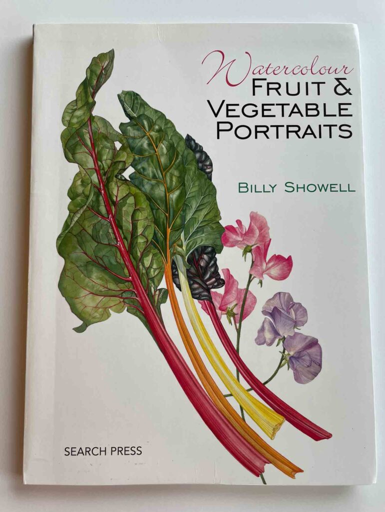
Over the years I’ve collected a number of books of painted flora, the vast majority in watercolor. This week I’ve been re-reading Billy Showell’s 2009 book Watercolour Fruit & Vegetable Portraits. Her botanical studies are strikingly accurate while retaining a sense of informality. It’s a given that anyone who writes such a book will spend the first chapter or so going over their chosen materials. Often I’m inclined to skim those sections and move on, but Showell goes a lot deeper than most in discussing her palette, particularly regarding primaries. It’s important information.
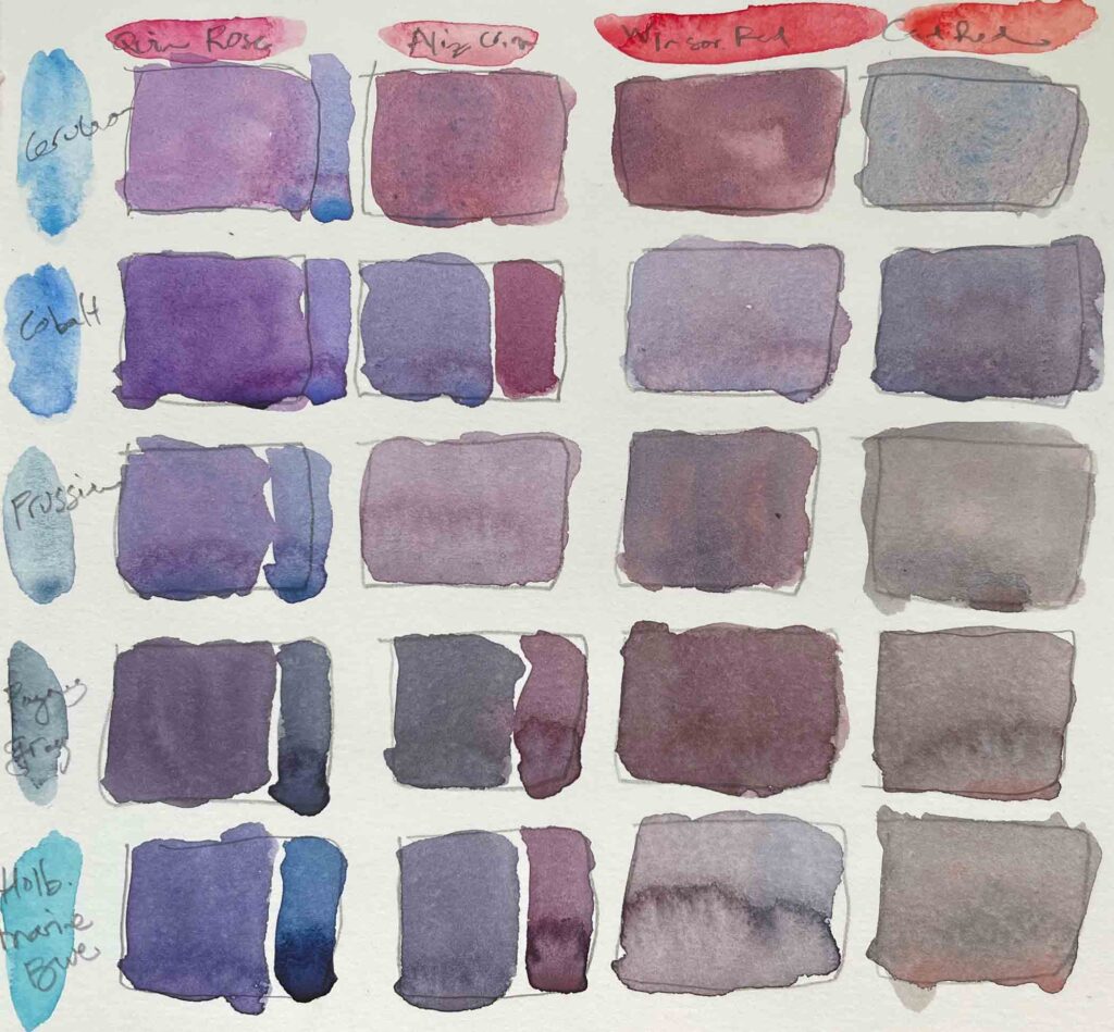
I wish I’d thought to do this earlier, but I realized with a bit more of one color or another I could add a sidebar to a swatch to give an indication of it’s range, leaning warm or cool.
For instance, she mentions that there doesn’t seem to be a single paint that is a true primary, so she will mix a cool and a warm version of a color (e.g. Cadmium yellow pale and Cadmium lemon) in order to get as close as possible to a near perfect primary. As you can imagine, this is key info for mixing greens, the mainstay of plant portrayal.
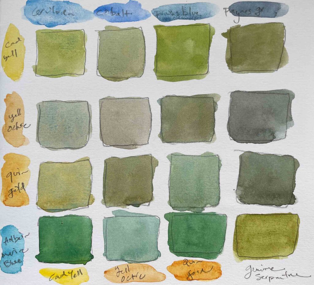
I was impressed with the range of greens I could get and with the added depth in them as the two colors of a given mixture settled somewhat separately as they dried. Genuine Serpentine, in the lower right corner, is the only green straight from the tube.
Before adding any of the colors she recommends to those I already have, I figured I’d see how my current palette stacks up. Not bad, as it turns out. In fact, the range of secondaries I can get from the various primaries I have on hand is pretty impressive. And that doesn’t begin to take into account the full range of color that is possible from any mixture of two colors, depending on how you adjust the percentage of each.
It also turns out that making these little swatches is incredibly relaxing in it’s own right. Give it a try.
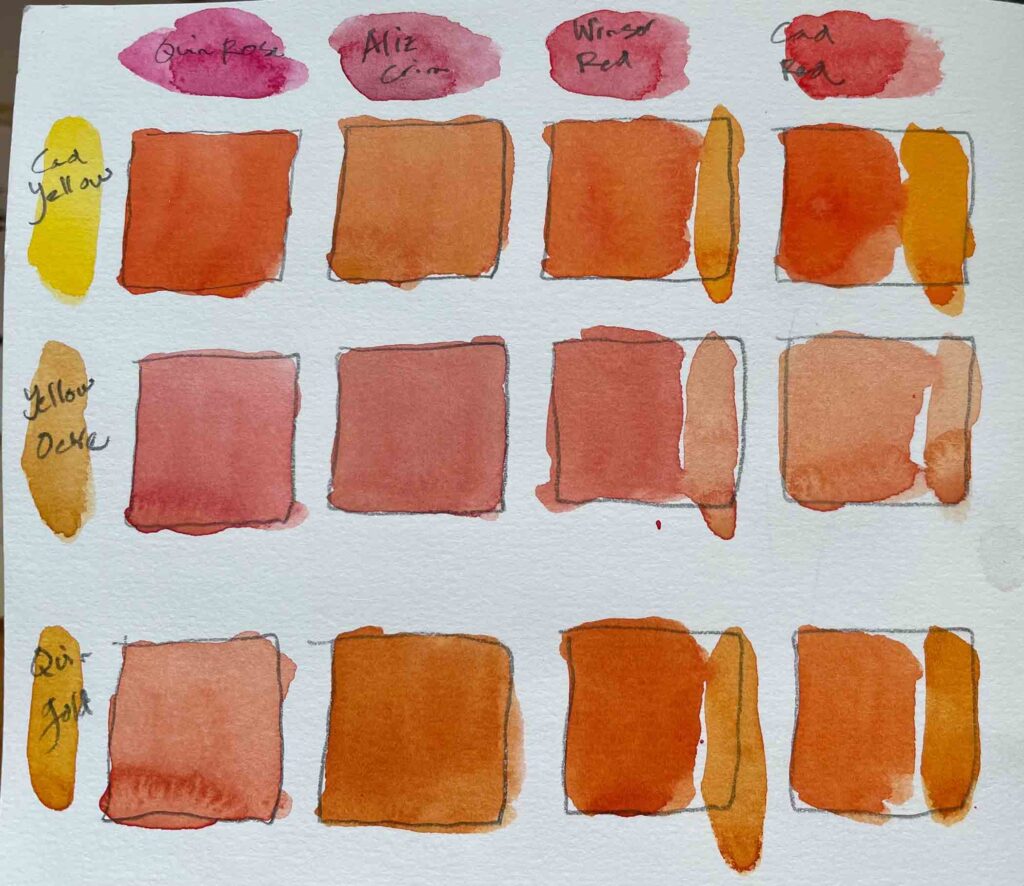
The oranges, on the other hand, weren’t quite as varied.
Another watercolorist I’ve long admired and look to for guidance is Charles Reid. His work, unlike Showell’s, is loose and spontaneous, such that it truly celebrates the unique qualities of the medium. He is also a master of the lost and found edge, but that is another discussion.
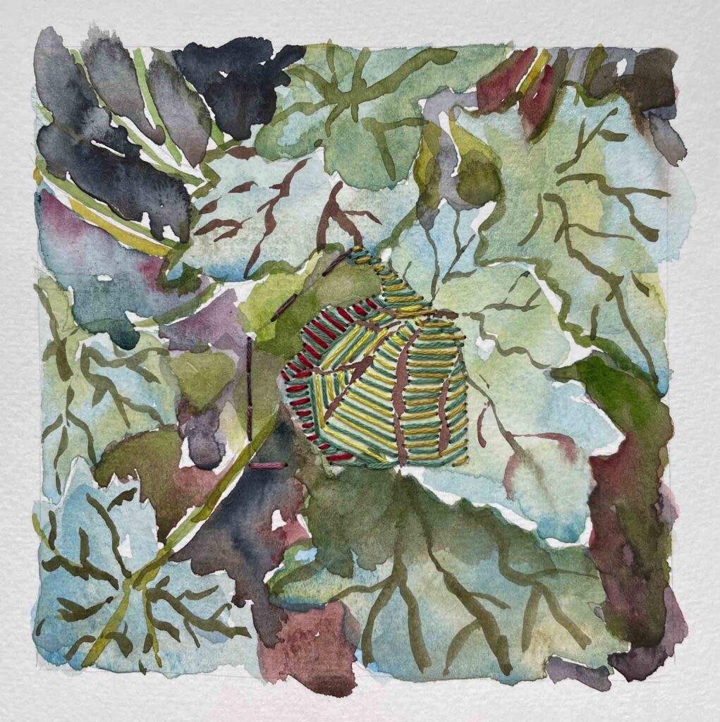
Heuchera ©2021 Elizabeth Fram, Watercolor and stitching on paper, 5 x 5 inches
As I work on my stitched garden paintings this summer, I hope to find a happy medium somewhere between Showell’s skill for description and Reid’s expressiveness. Figuring out how to incorporate each stitched house form, while capitalizing on both those aspects, creates an unexpected bridge between the two.
And while I’m practicing, I will be happily lost in color.
✷
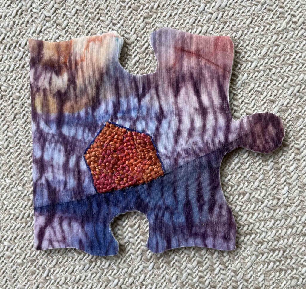
©2021 Elizabeth Fram, Stitched-resist dye and needle weaving on silk, approx. 3 x 3 inches
I finished the puzzle piece mentioned last post and sent it off to the We Are All Connected Art Project. While scrolling through to see the latest pieces added, it was a happy shock to discover that Ai Weiwei had also contributed. My guess is that’s the first and last time I will have any overlap with him, but I’ll take it!
✷
Watch for more details about this upcoming exhibit in my next post, 2 weeks from now.
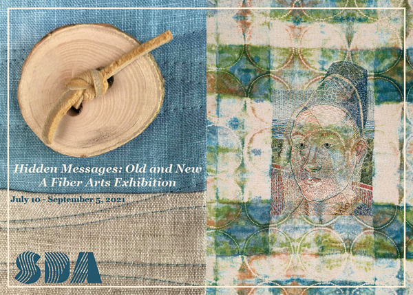
Hidden Messages: Old and New at the Chandler Gallery in Randolph, VT • July 10 – September 5, 2021
✷
Three artists who often share their lovely dye and watercolor swatch work on Instagram are Mirjam Gielen @mirjamtextiles, Rachel Kahn @vermontknitter and Paul Wang @paulwang_sg