Time and exposure have taught me that the biggest gap in my art education relates to international art and artists beyond the expected European and Asian classics. A couple of years ago I was amazed when visiting the AGO Museum in Toronto at how many iconic Canadian artists I’d never heard of. That’s just not right. Therefore, one of the real joys of travel has become the opportunity to learn more about some of the major artists within the country I’m visiting.
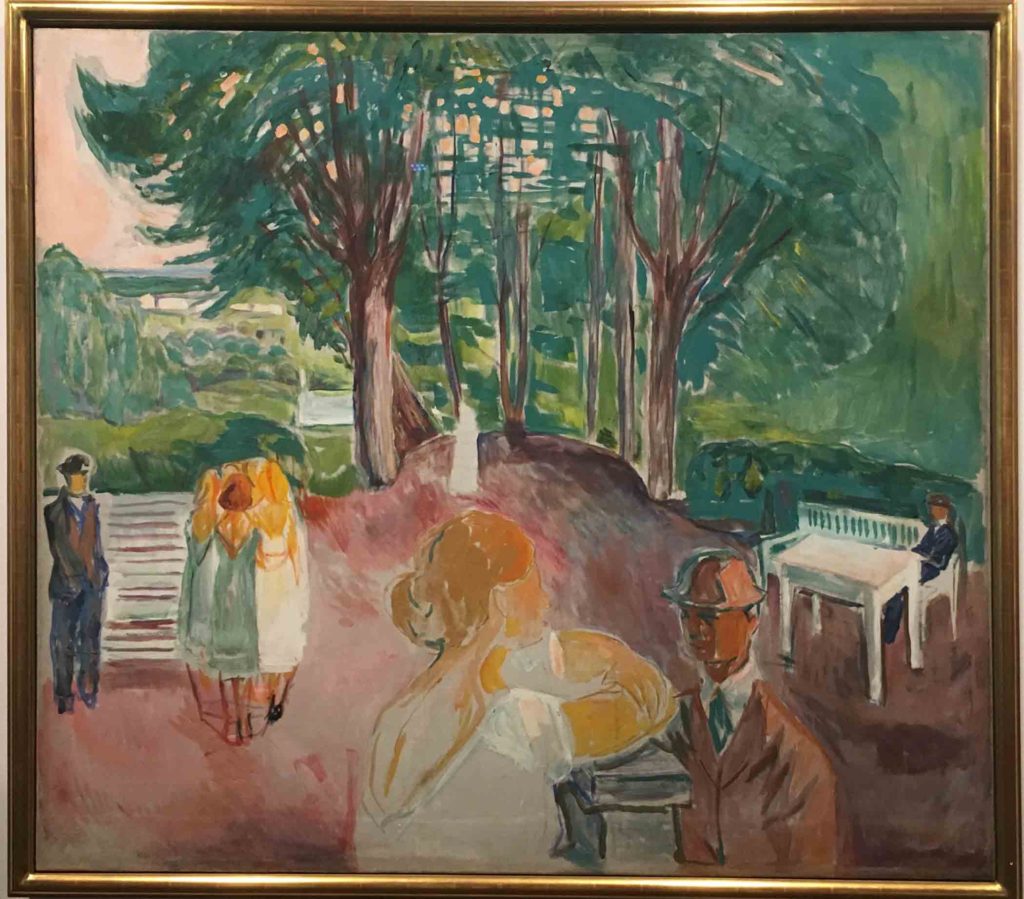
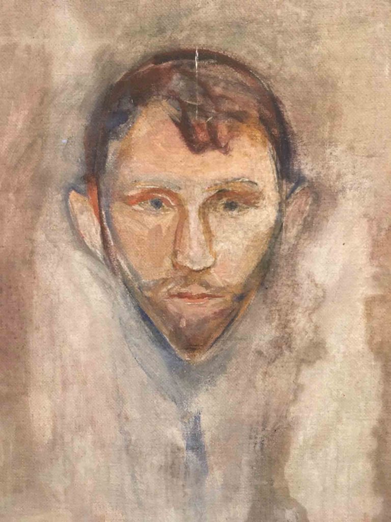
Edvard Munch, Flirting in the Park, 1942, Oil on Canvas How many other paintings by Munch can you call to mind besides The Scream? Most of what we read about Munch concerns his obsession with psychological themes, but after seeing so many of his paintings, my lasting impression of his work is that he was an admirable colorist.
As promised, this week I’m going to take you off the streets of Norway and into the Munch and Kode Museums of Oslo and Bergen for a more formal view of Norwegian art. My picks tend to reflect the various concepts that were floating in the back of my mind at the time, due in large part to my questions and concerns regarding the piece I hadn’t quite finished before leaving for vacation.
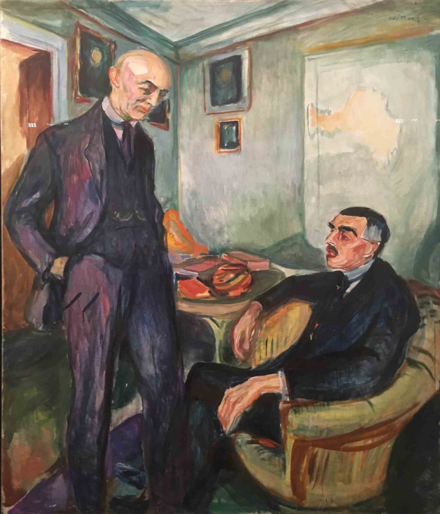
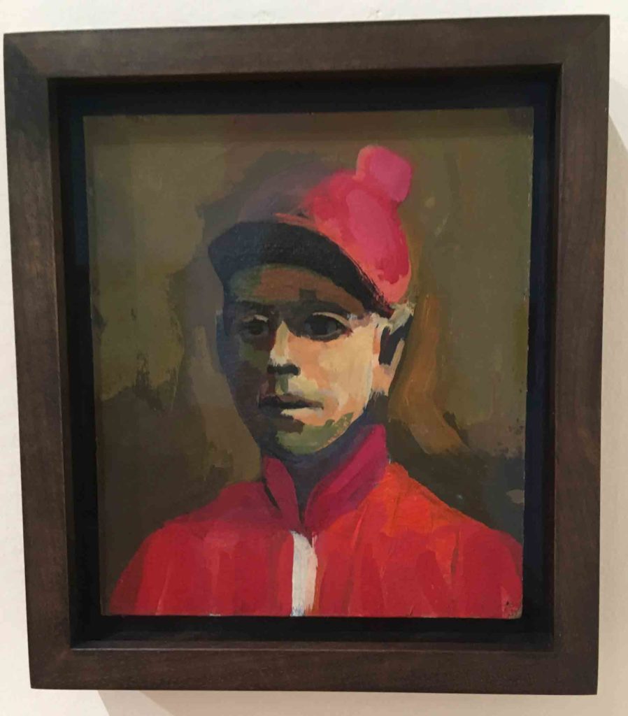
Edvard Munch, Lucien Dedichen and Jappe Nilssen, 1925, Oil on canvas Talk about making color sing! The magenta underlayer of Dedichen’s blue suit, paired with the bright orange book cover and other objects on the table, in combination with the strong turquoise that defines the walls and corners of the room, elevate this painting of the physician Dedichen and writer/art critic Nilssen to an exhilarating degree.
There is plenty of ground to cover, so put your feet up and I will do my best to pull together the images that follow with the threads of what struck me as important about them. It will come as no surprise that portraits and use of color were utmost in my mind as I made my way through the various galleries of both museums. To a large degree, that was because of this piece I have been working on all spring.
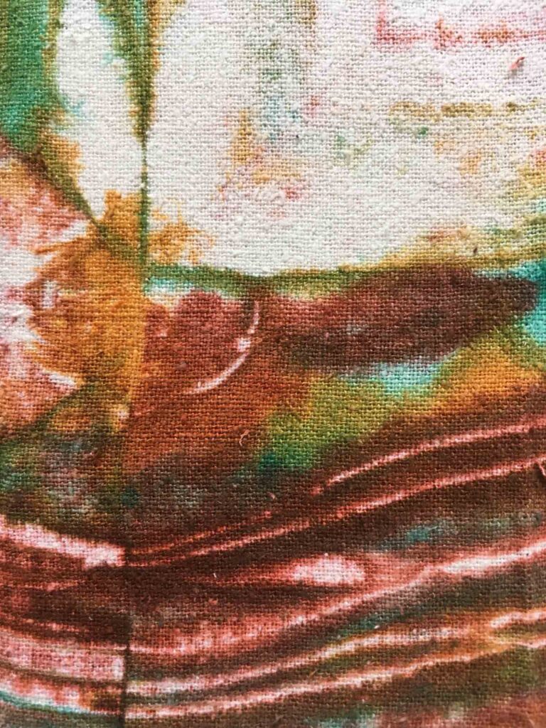
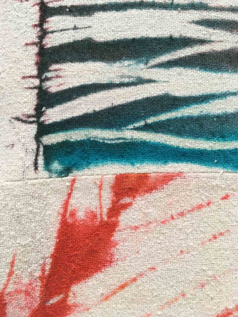
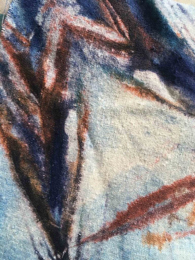
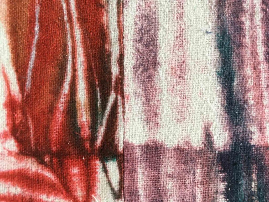
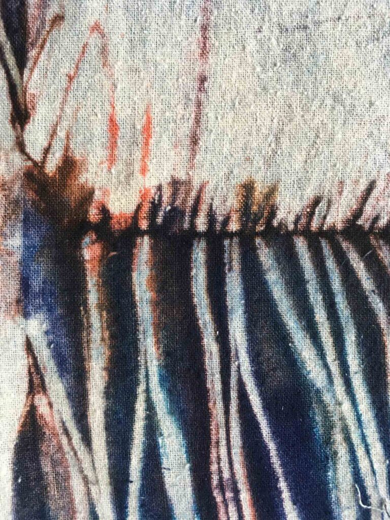
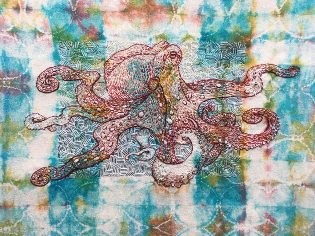
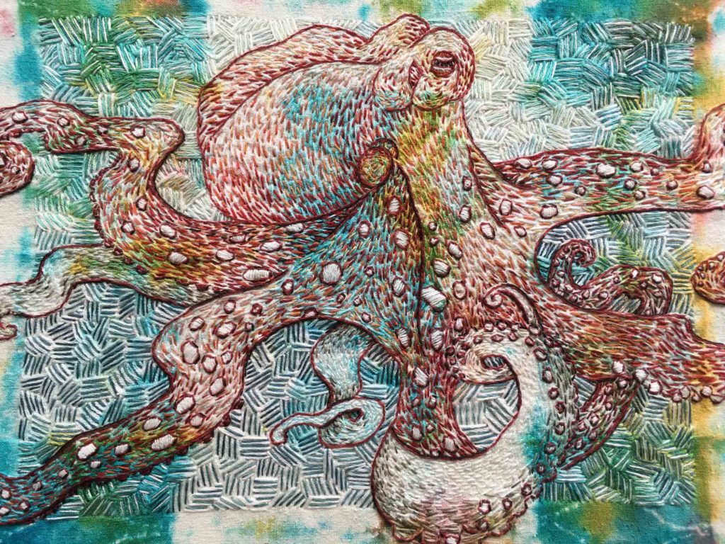
The Woolgatherer ©2019 Elizabeth Fram, 16 x 16 inches, Stitched-resist dye and embroidery on silk
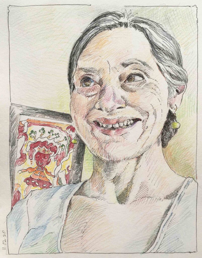
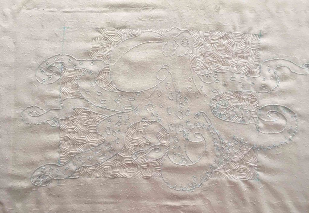
First, although I haven’t written about it since the end of April (for a reminder click here), I have been chipping away continually at this portrait. My final challenge was figuring out how to set the relatively dark figure apart from its very dark background without obscuring the delicate luminescence of the unevenly dyed silk. My goal is usually to straddle a line between the image portrayed and the surface textures of which it is comprised. By stitching judiciously, while simultaneously exploring color in unexpected ways, I think I’ve come as close as I could hope in meeting that objective.
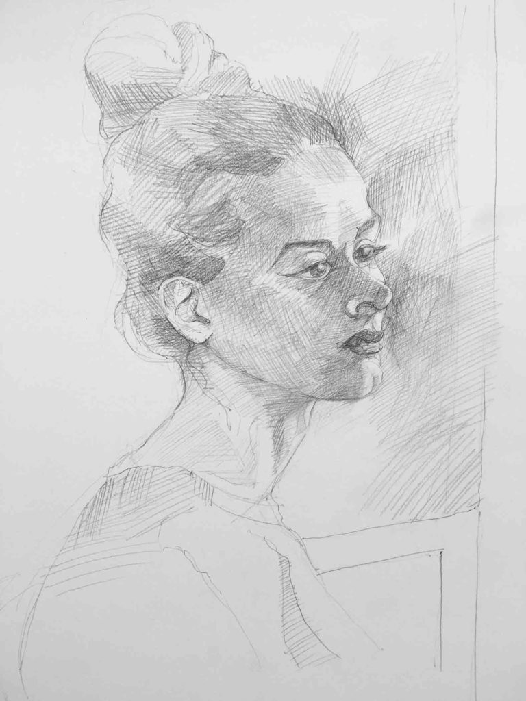
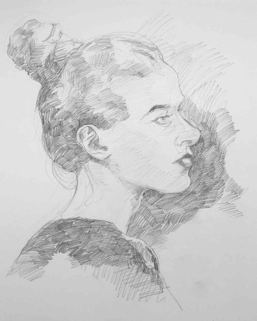
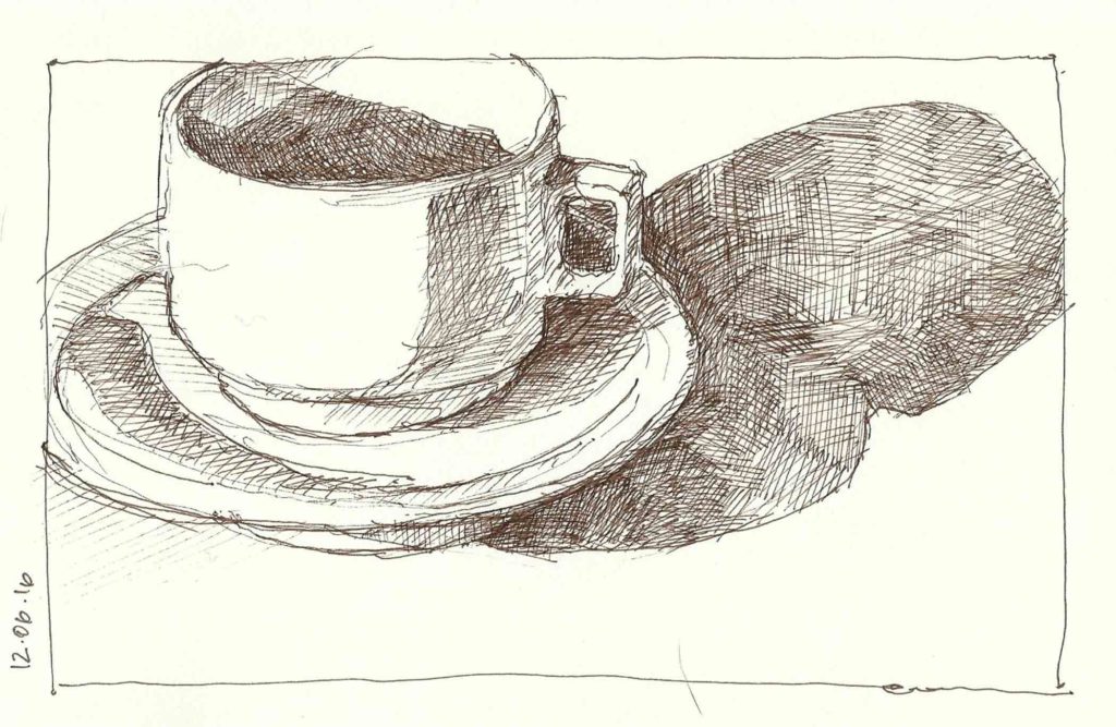
For those of you who have asked, here is the life drawing that inspired it.
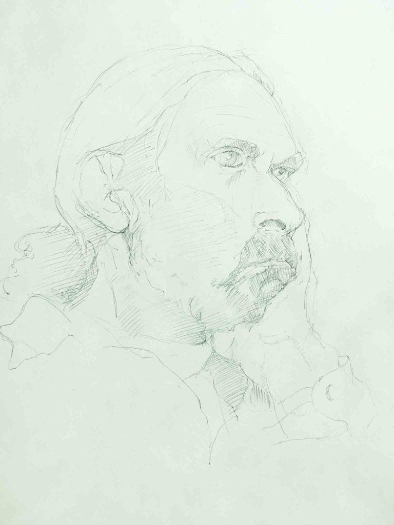
©2018 Elizabeth Fram, 24 x 18 inches, Graphite on paper
I usually try to include more than just head and shoulders in my life drawings by squeezing in as much of the figure as possible, as well as bits of the surrounding area. I think this makes for more interesting compositions. Yet there are certainly instances where those rules can be broken.
Edvard Munch, Stanislaw Przybyszewski, 1894, Casein and distemper on canvas. This floating head portrait of the Polish novelist was one of the first pieces I saw in the Munch Museum. Aside from being intrigued by the ‘Wizard of Oz’ nature of the portrait, I couldn’t help but make a connection between the thin glazes of atmospheric paint and similar effects that are possible via variation in dye saturation on silk.
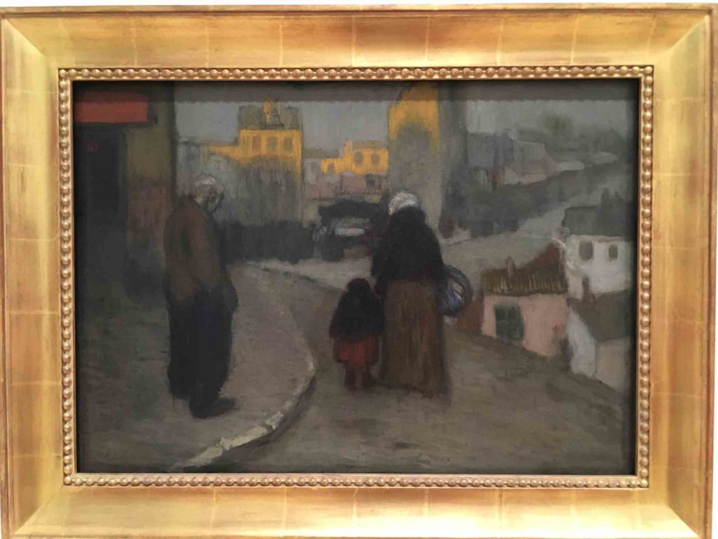
Although it’s usually the back story of the subject that draws me into a formal portrait, these pieces from the Kode Museum in Bergen were intriguing for their stylistic attributes.
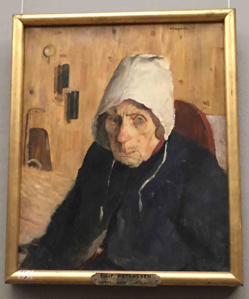
Eilif Peterssen, Old Woman, 1888, Oil on Canvas What lies behind those icy blue eyes? There is so much personality radiating from this woman, accentuated by the somewhat mystifying background of restrained color. The tones of her skin seem so real. I was quite attracted to the contemporary feel of this more than 130 year old painting.
It’s unfortunate that these striking side-by-side portraits (above and below) were each titled “Old Woman” Seriously, couldn’t each artist have been a little more imaginative?
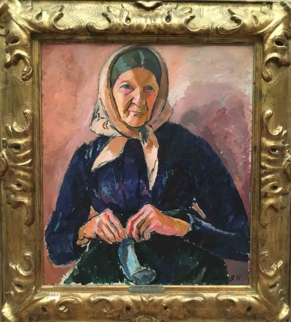
Jean Heiberg, Old Woman, 1909, Oil on canvas In a country famous for its knitwear, I was thrilled to come across this painting highlighting a pastime that must have long been ubiquitous, certainly in the early 1900s.
While the contrast and depth of color in this portrait is striking in its own right, it was the composition which caught my eye, bringing to mind my own penchant for asymmetrical placement of objects with shadows that have as much to say as the main figure.
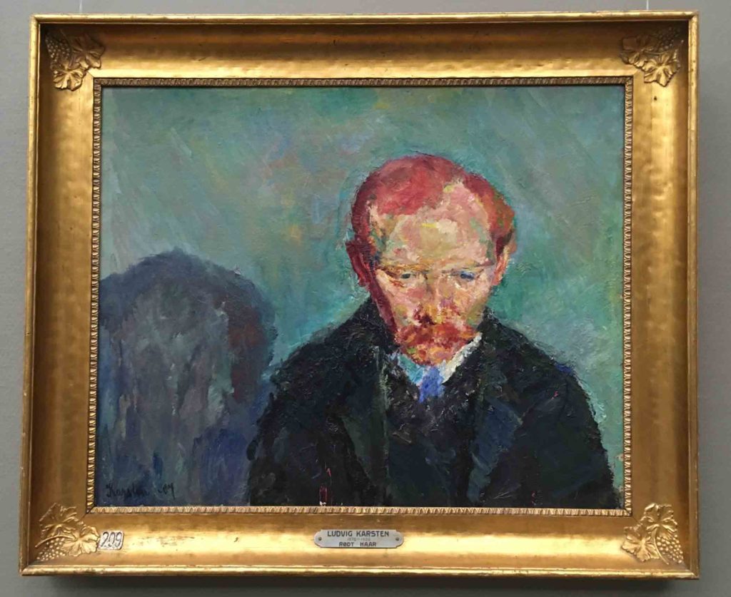
Ludvig Karsten, Red Hair, 1907, Oil on Canvas
Cup & Shadow, ©2016 Elizabeth Fram, 5.25 x 8.25 inches, Ink on paper
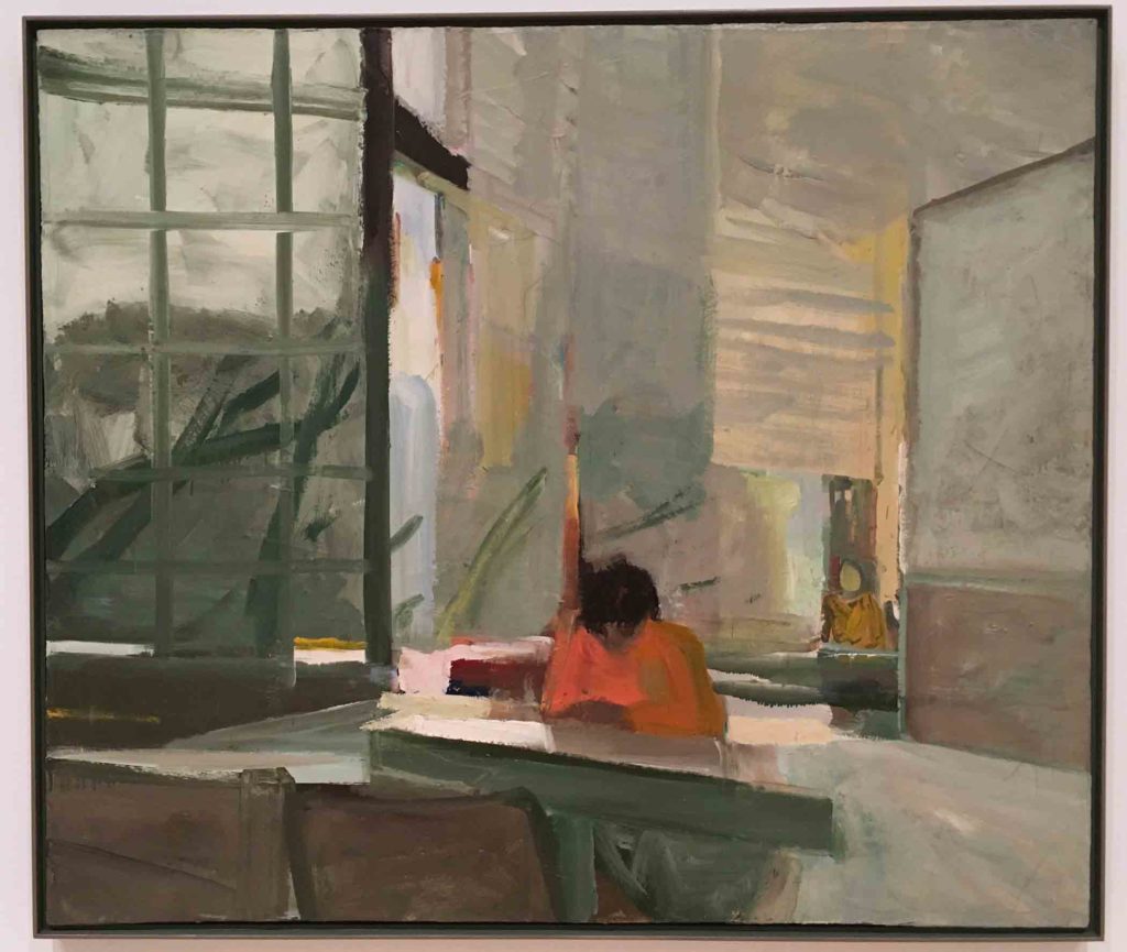
Many of Munch’s works are thinly painted, often with the canvas showing through. It was a quality for which he was often criticized. But I was drawn to that aspect in a number of his pieces because it left such a clear path toward following his process, and it encouraged me in my decision to not fully fill in The Woolgatherer with stitches. The piece below is an excellent example. An initial view might lead one to think it is unfinished, but his signature in the upper right corner suggests otherwise.
Edvard Munch, Mrs. Schwarz, 1906, Oil on Canvas
Munch’s thoughtful use of color, even in this sketchy image of Mrs Schwarz, is a wonderful study in brevity. Henrik Lund’s portrait below, while more visually verbose, also provides much to consider in its use of marks and color.
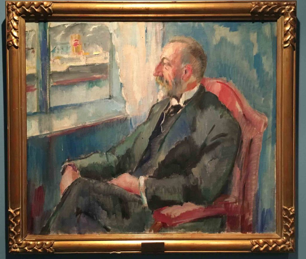
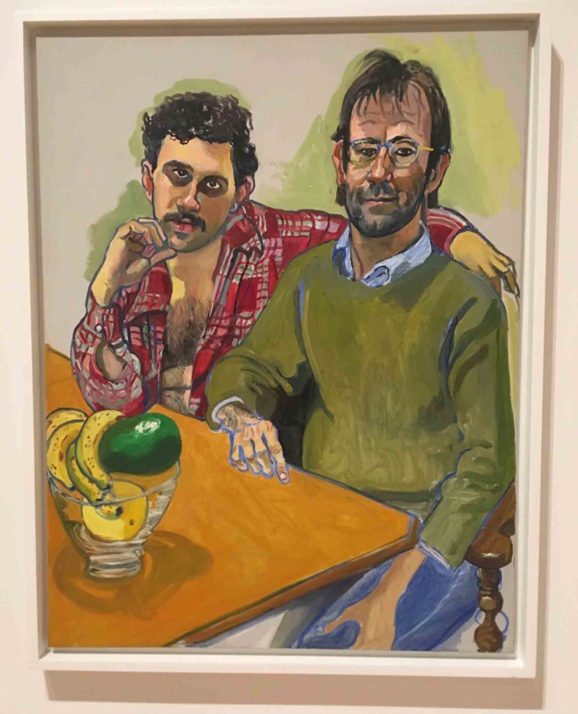
Henrik Lund, Prime Minister Christian Michelsen, 1916 The use of color in this piece struck me: the green right sleeve contrasted with the blue lapel, and the various hues used to add depth and definition to elements throughout – the walls, chair, curtain, window sill and sash. It made me feel I’m not too far off track in my color explorations in The Woolgatherer, and serves as encouragement to keep experimenting.
If you are still with me, thank you.
I hope you too have been pleasantly surprised and inspired by this brief peek into these Norwegian masters’ work, admittedly from my pointed perspective.
Finally, my museum report wouldn’t be complete without a quick dive into one of the temporary exhibits that, quite frankly, was the main draw (for me) to Bergen’s Kode Museum. The dance between the classic and the contemporary made for a very satisfactory visit.
❖
The work of textile artist Kari Dyrdal and ceramicists Torbjørn Kvasbø and Marit Tingleff is nothing short of monumental in their exhibit “Forces”. To hear them each discuss their practices and processes, please watch these three brief subtitled videos, which convey their ideas much better than I could hope to do. I will leave you with a selection of my favorites from their work. Enjoy!
Kari Dyrdal – Pattern, repetition, color and material are all essential to Dyrdal’s computer generated tapestries. She is considered a forerunner in the field of digital textiles.
“I allow patterns to lead me like a compass, both the structures that are apparent and those that are not so easy to spot.”
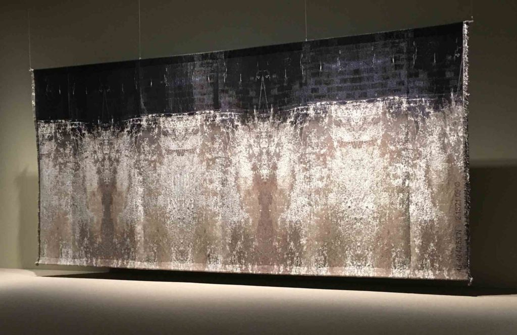
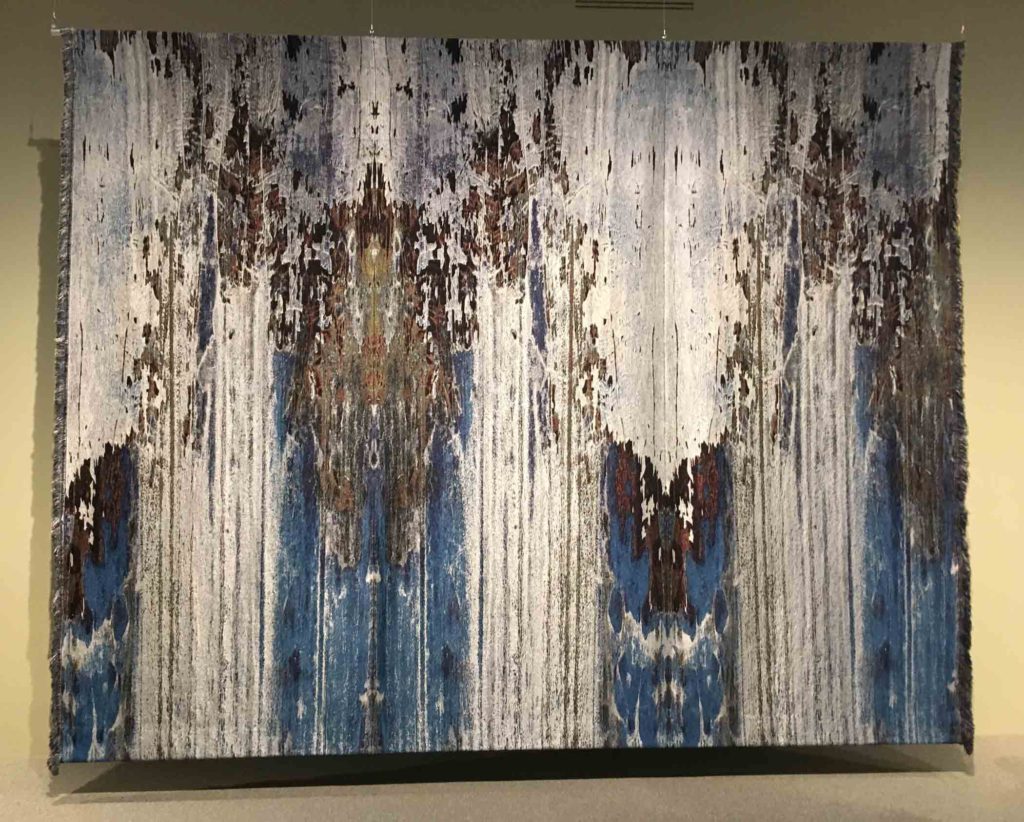
Kari Dyrdal, Wall Sèvrres III, 2017, Mixed fiber, digital weave
Dyrdal purposely had this piece hung away from the wall so that visitors could observe the construction of the numerous panels from behind. This image gives a sense of the tremendous scale of the piece.
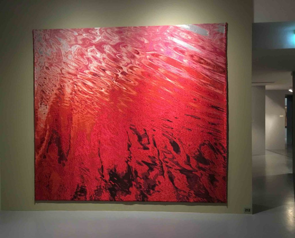
Kari Dyrdal, Red Sea, 2015, Mixed fiber, digital weave
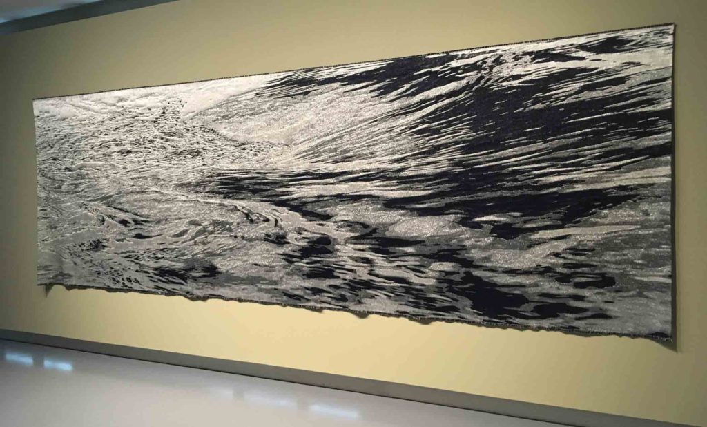
Kari Dyrdal, White Waters, 2015, Mixed fiber, digital weave
Kari Dyrdal, Wall Sèvres II, 2018, Mixed fiber, digital weave
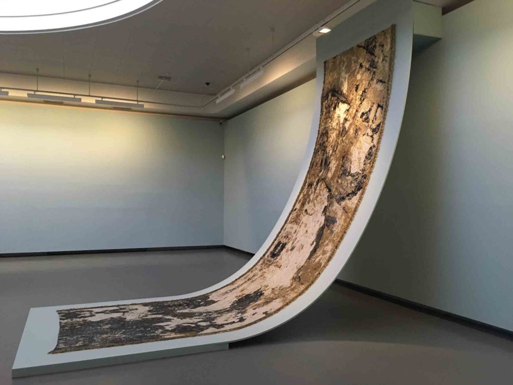
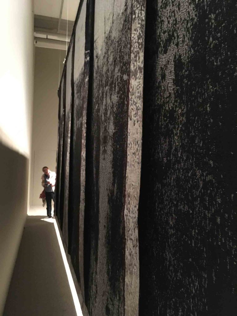
Kari Dyrdal, Wall Stone, 2015, Mixed fiber, digital weave I was really intrigued with this means of displaying this piece. Of course one needs plenty of space, but what a fantastic way to give the work its due.
Torbjørn Kvasbø – Kvasbø writes of his work:
“Disturbing and ambiguous, immediate and overwhelming, beautiful and repulsive. All of this combined to form a readable whole (…) in perfect balance: like a killer punch to the solar plexus.”
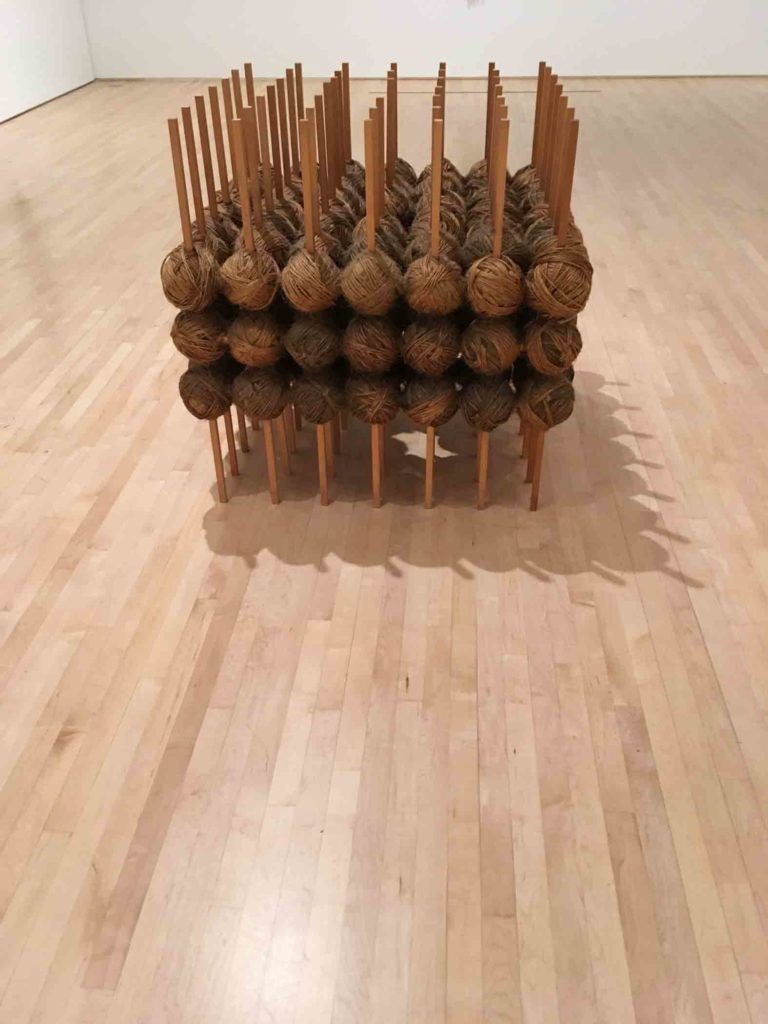
I was struck by the way this piece seemed to be woven together – a suitable foil for Dyrdal’s tapestries.
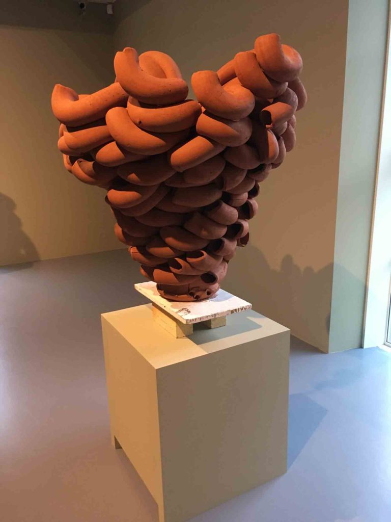
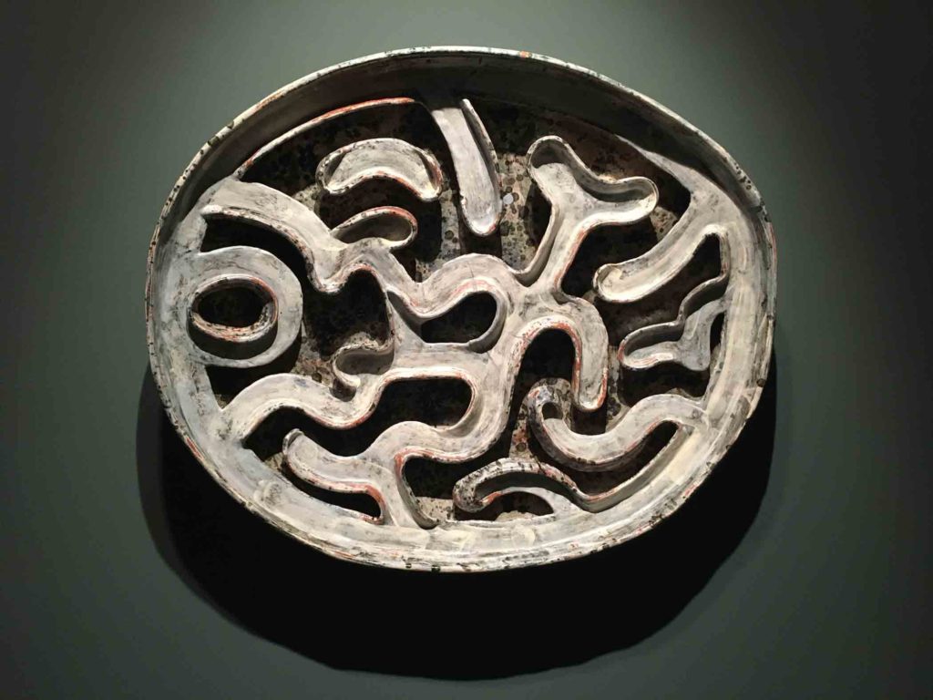
Torbjørn Kvasbø, Stack Terracotta, 2014, Teracotta clay, unglazed, electric kiln
Marit Tingleff – This part of Tingleff’s statement is particularly strong and thought-provoking:
“I live in an age where I’m not really needed. My pots don’t fulfill any utility function other than that they can tell stories about other times and other utility functions. They have acquired the utility that art possesses, i.e. they can open people’s minds and trigger wonder, joy and indignation.
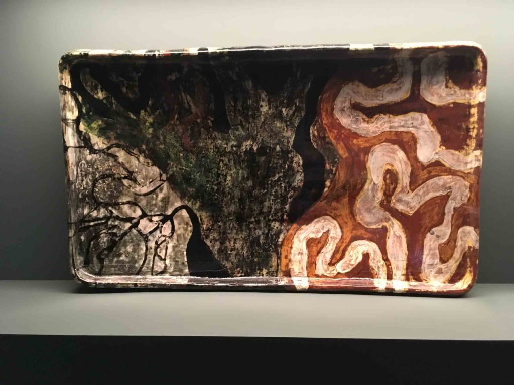
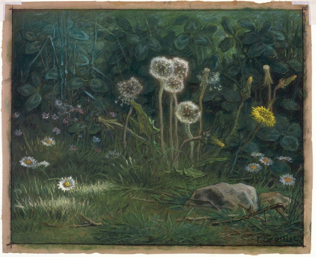
Marit Tingleff, Deep Green, 2006, Earthenware clay, slips, transparent glaze. I wish there had been measurements on this and the following pieces, or some way to give you a sense of scale. They are enormous – probably 4 to 5 feet wide and 3 feet high.
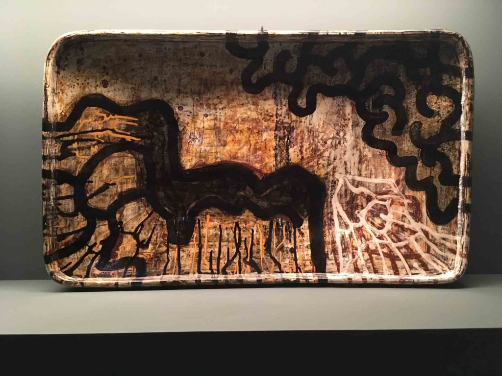
Marit Tingleff, Black and Orange Dish, 2006, Earthenware clay, slips, transparent glaze
Marit Tingleff, Wall Object with Blue Flower Ornament, 2005, Earthenware clay, slips, transparent glaze
So tell me what you think. What aspect of all this work resonates most with you?