Category Archives: Portraits

A High Bar

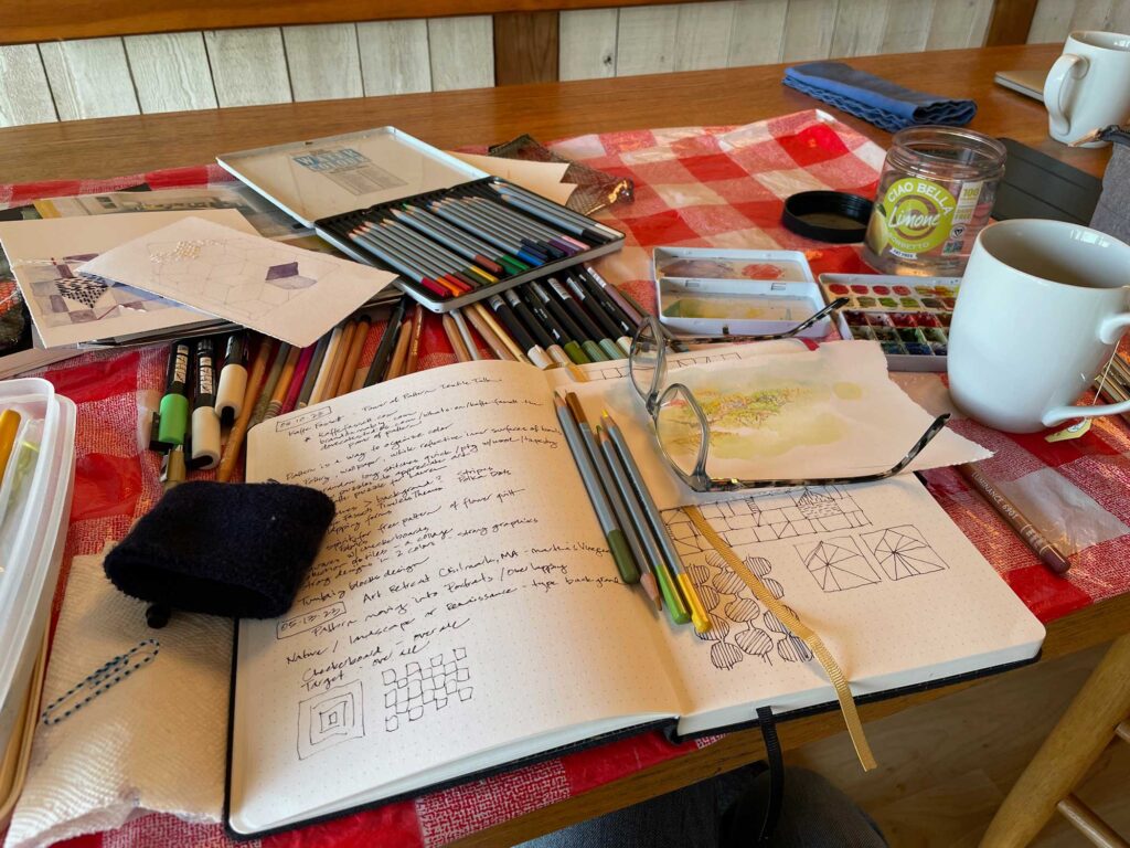
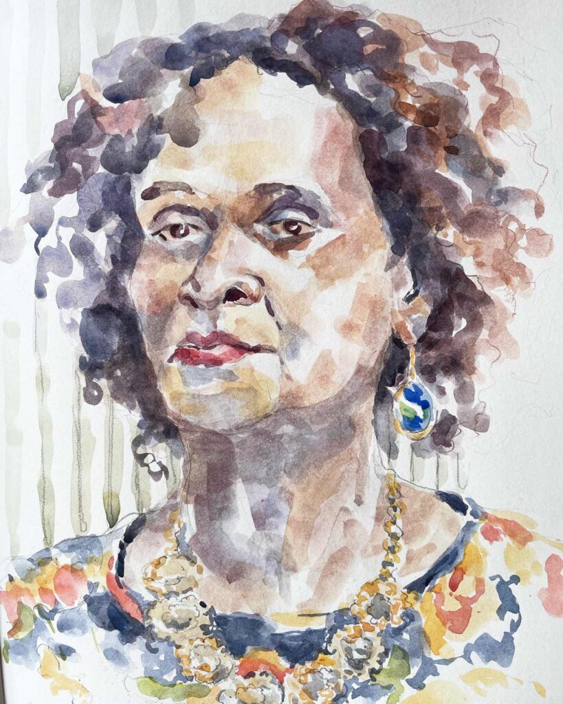
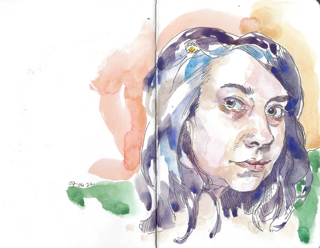
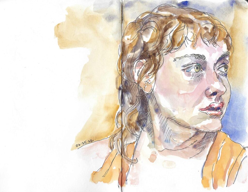
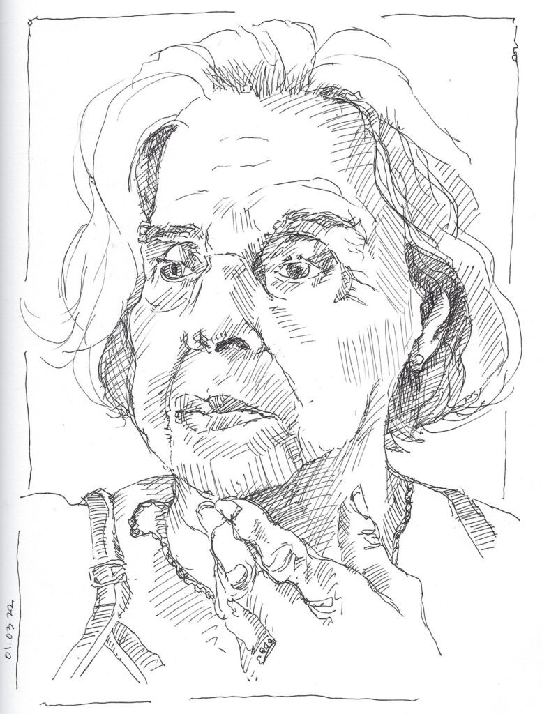
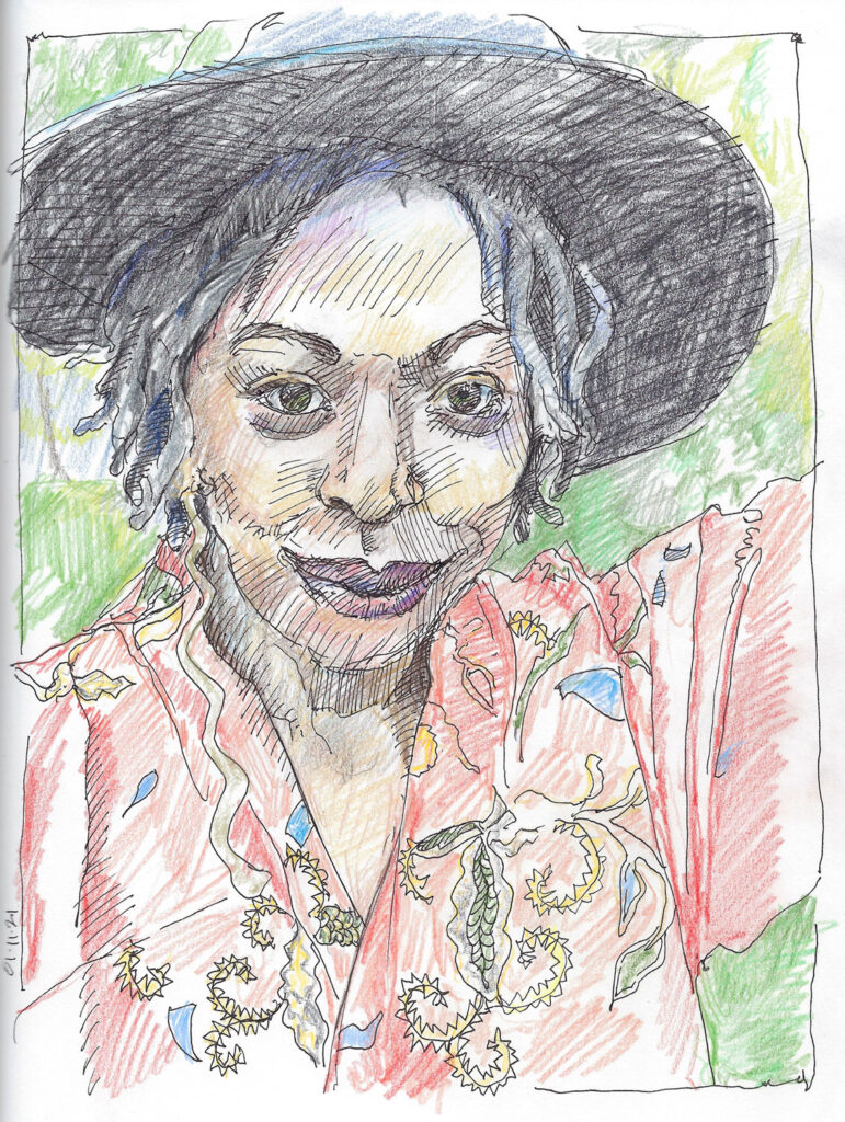
When was the last time you saw a portrait that truly made you think…an image that asked more of you than simply observing another human’s likeness? This idea has been much on my mind as I work on my current series of post-Roe women. A portrait can and should be so much more than just a pretty (or not) face.

Painted Thread

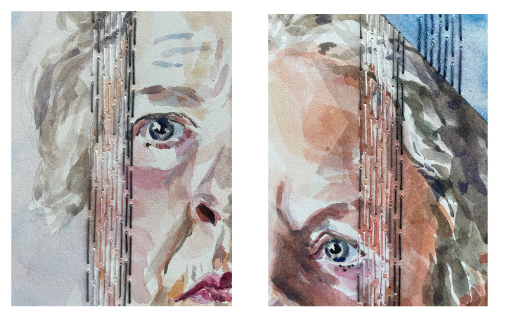
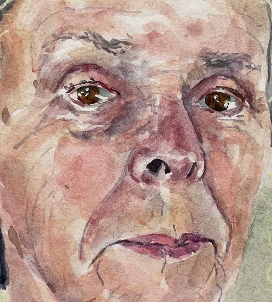
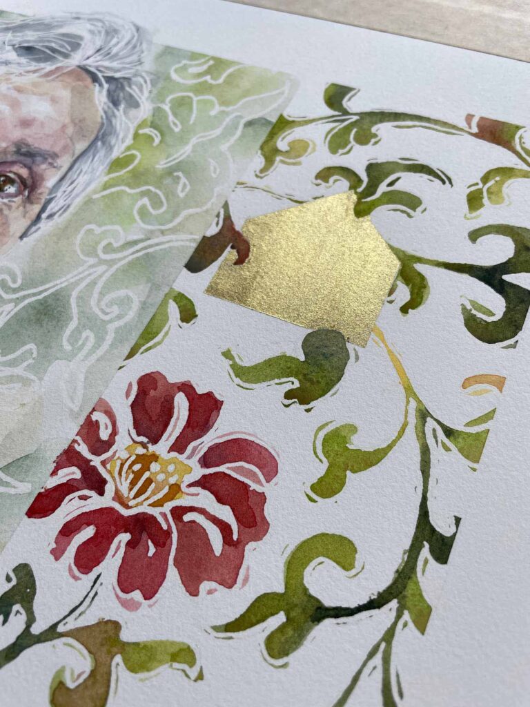
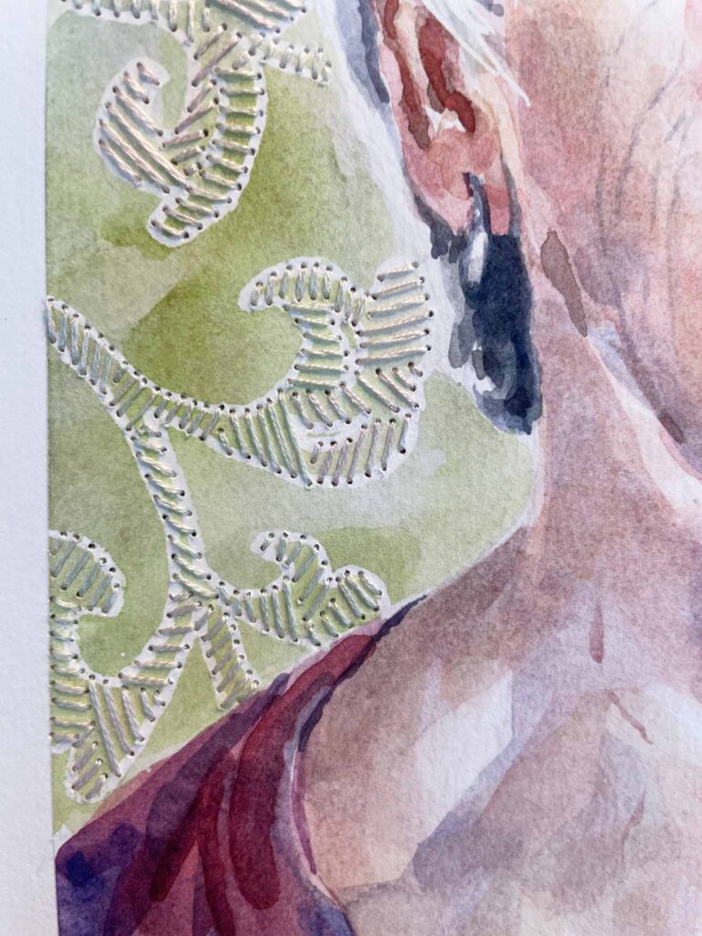
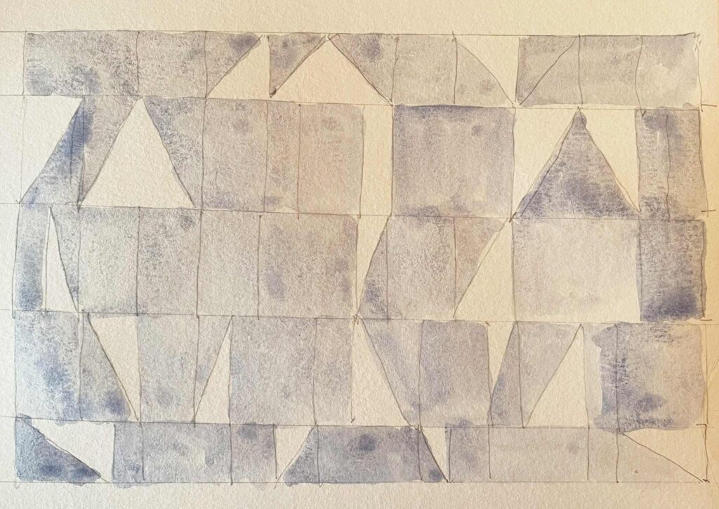
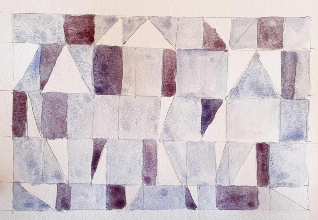
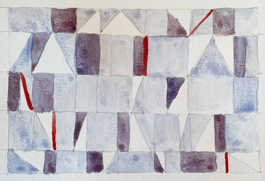
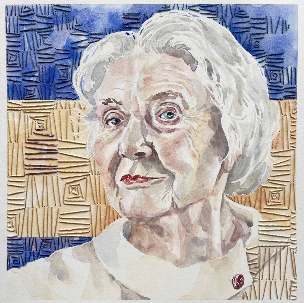
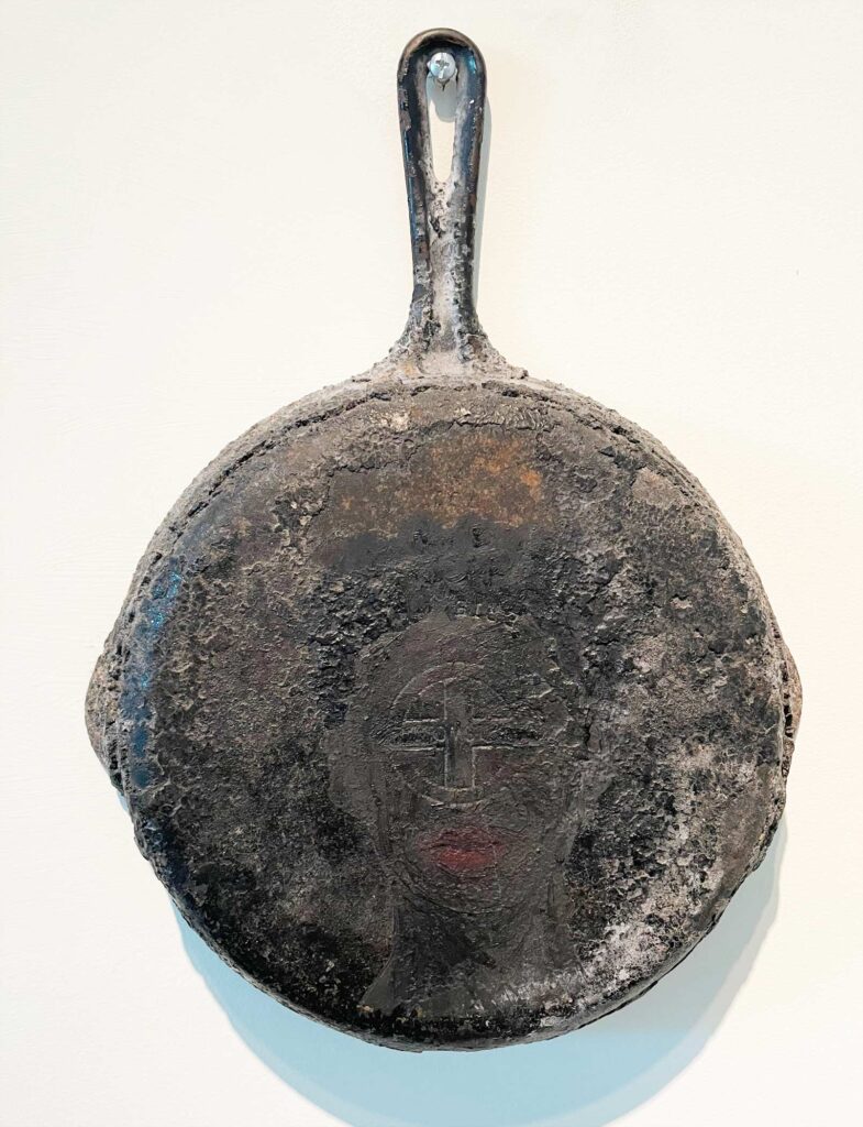
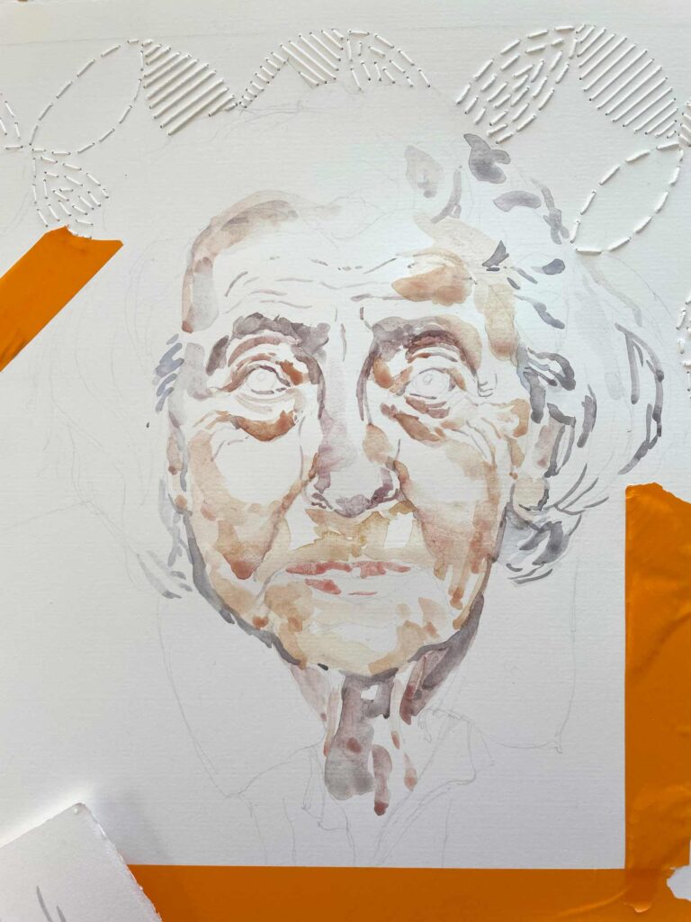
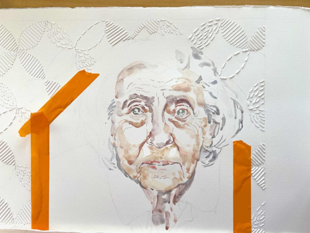
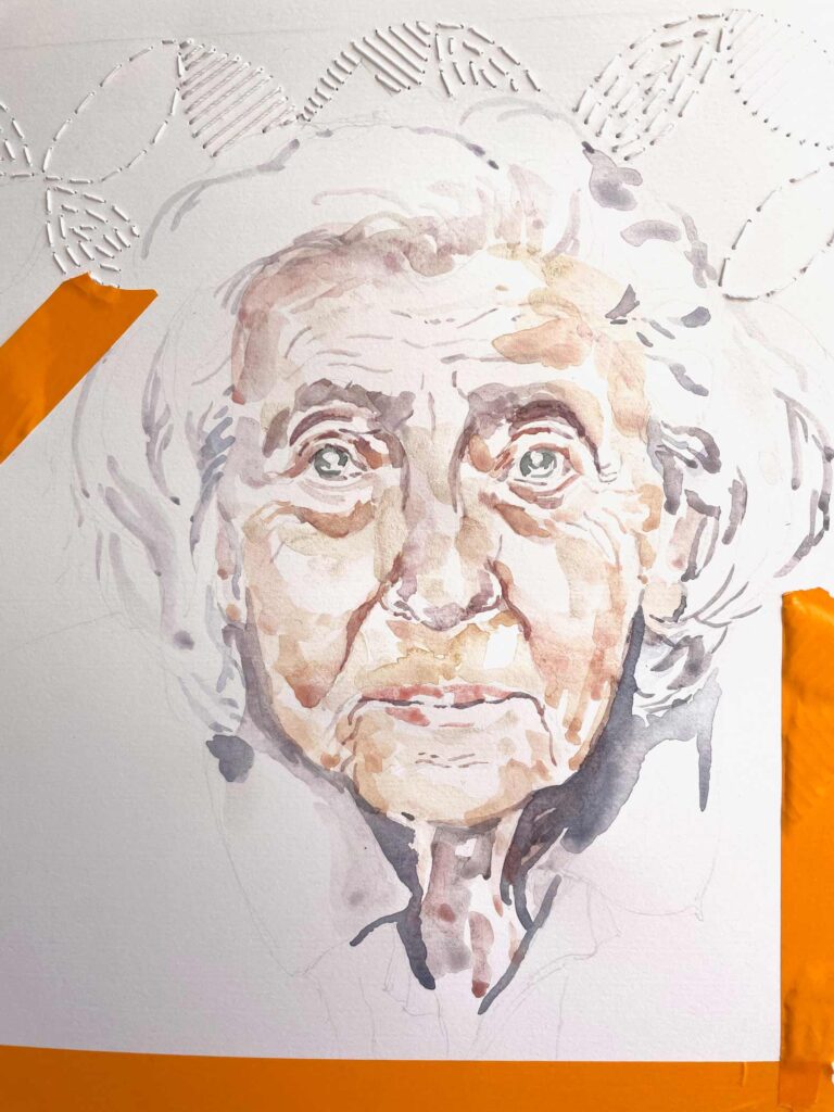
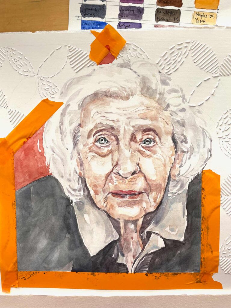
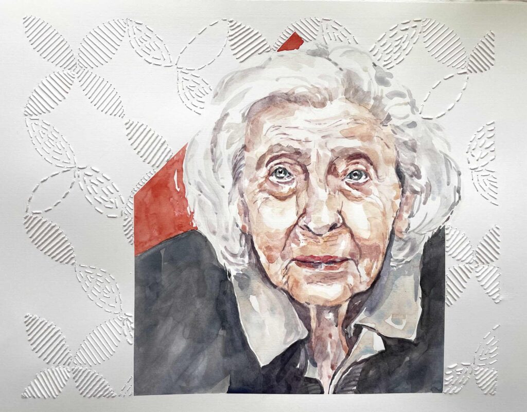
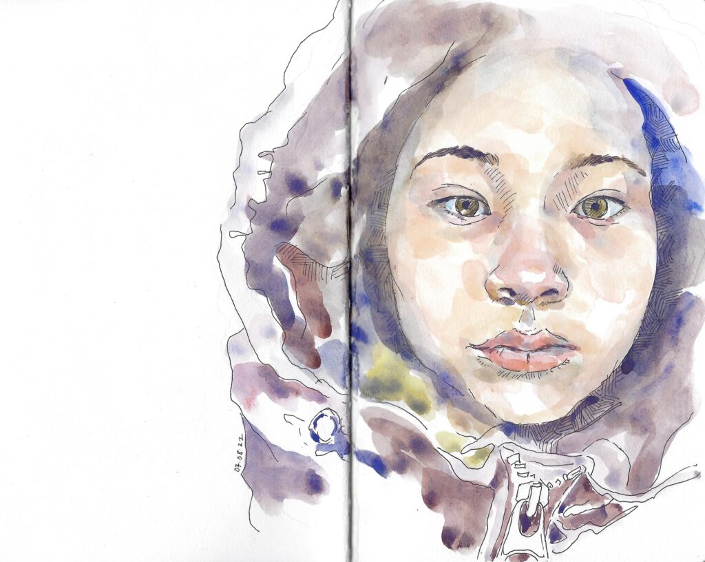
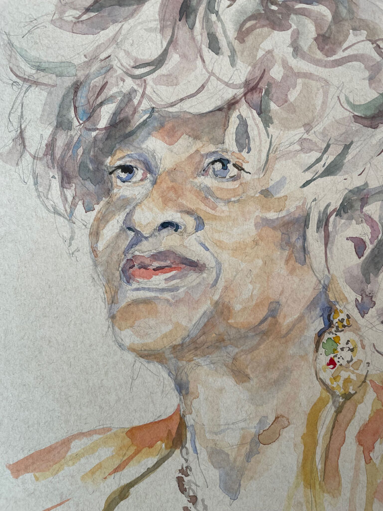
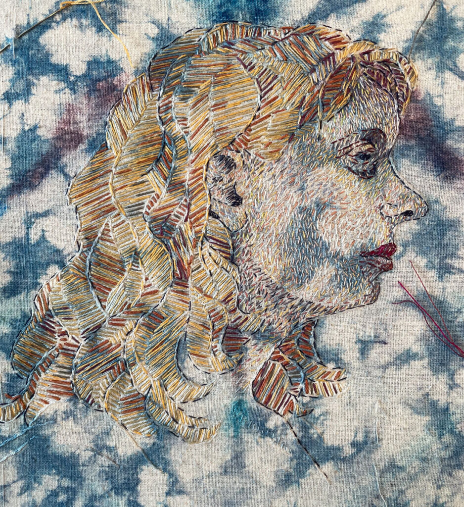
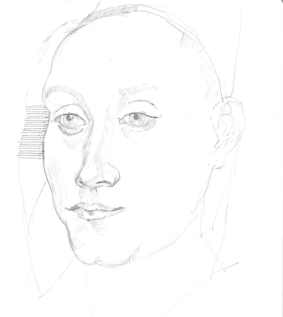
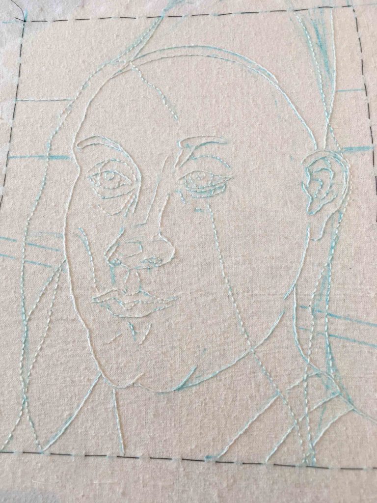
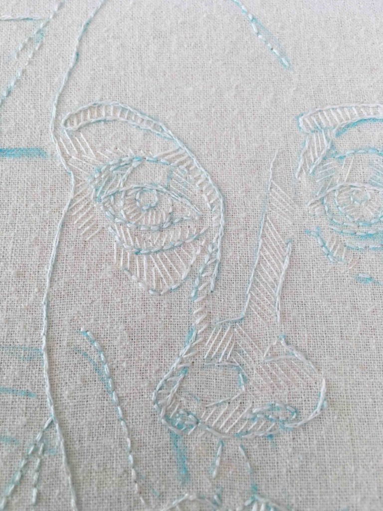
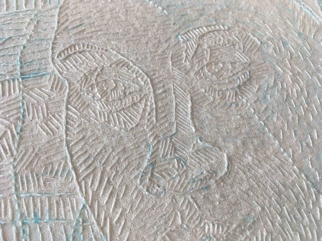
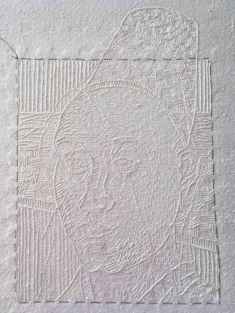
These close-ups show that I added stitching both before and after painting the image in this latest piece. Taking a leaf from previous work, I first used white cotton thread on the unpainted paper, knowing it would absorb pigment and allow for the texture of the stitches to melt into the image. Additional stitching after the paint had dried allowed for further definition of the “bars”. My goal is to show that post-Roe restrictions cut deeper than just a physical cage; taking away one’s autonomy is actually absorbed into the psyche of an individual.

In an unexpected instance of kismet, I was recently able to delve a bit deeper into this question by experiencing the work of a contemporary master of the genre, one who engages far beyond solely portraying an accurate visage.

Stitching

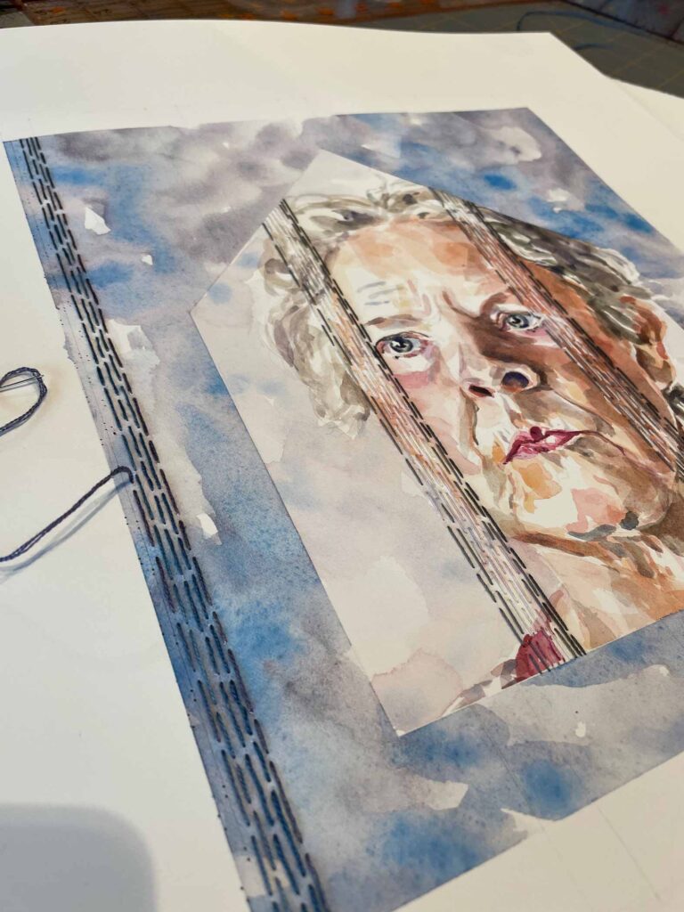
Additional stitching is done with variegated silk thread after the painting is finished

I first became aware of Kehinde Wiley’s work with his celebrated 2018 portrait of Barack Obama. It was a thrill to have seen that painting in Chicago last year when the Obama Portraits began their official tour. My excitement was partly due to the cultural significance of the work, but also to my admiration for its subject. It’s indisputable that Wiley’s artistic facility is remarkable.

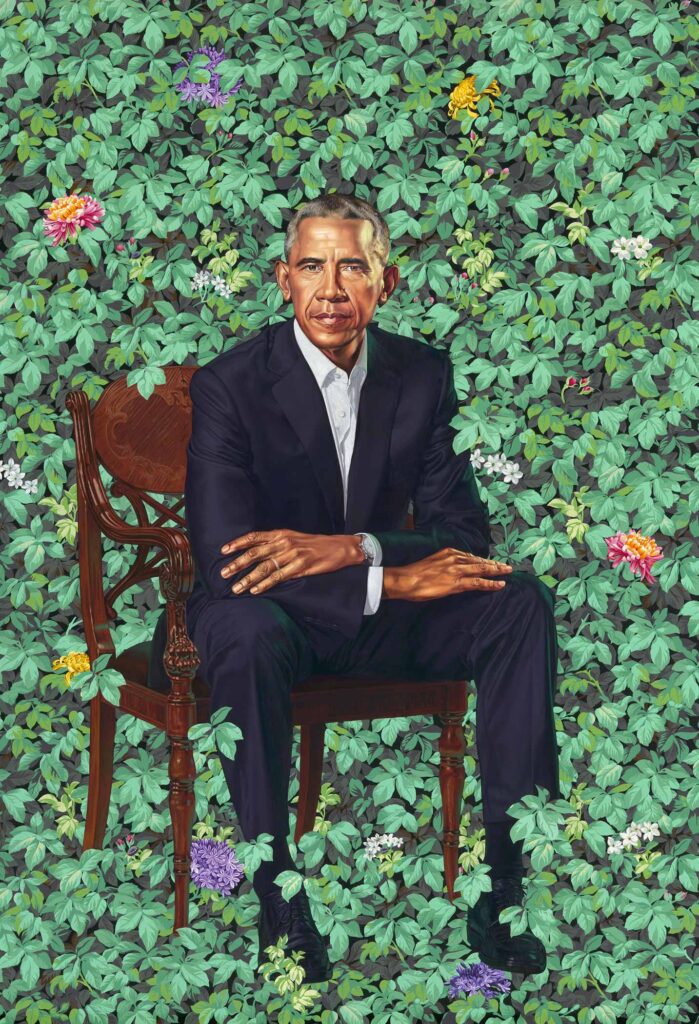
Barack Obama   ©2018 Kehinde Wiley, Oil on canvas, National Portrait Gallery, Smithsonian Institution

A couple of weekends ago, at The Huntington Library, Art Museum and Botanical Gardens of San Marino, CA, I was privileged to see another Wiley portrait in a context that reflects the mission behind much of his work: “disturb(ing) and interrupt(ing) tropes of portrait painting (by) blurring the boundaries between traditional and contemporary modes of representation…”. *

Kehinde Wiley A Portrait of a Young Gentleman

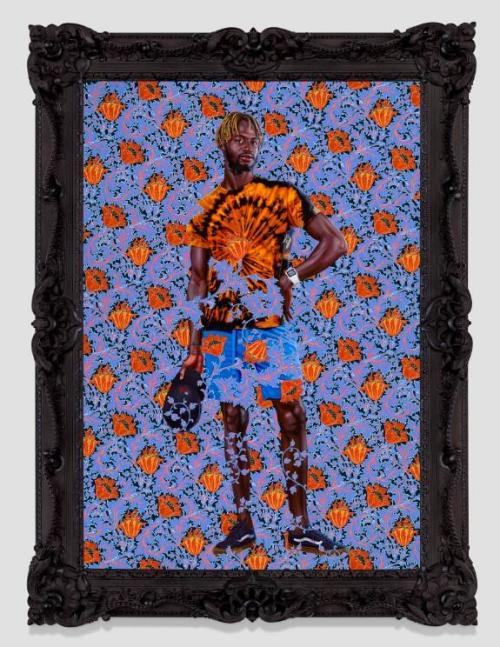
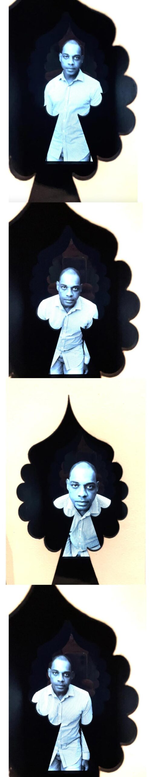
A Portrait of a Young Gentleman   ©2021 Kehinde Wiley, oil on linen, 70 1/2 x 49 1/8 inches, collection of The Huntington Library, Art Museum and Botanical Gardens. From the label text: Kehinde Wiley’s “A Portrait of a Young Gentleman” glows. The sitter wears a tie-dye shirt and Vans sneakers, and he was likely scouted and street cast near the artist’s studio in Dakar, the coastal capital of Senegal. This beachy, cool young gentleman echoes his counterpart: Thomas Gainsborough’s “The Blue Boy”, painted some 250 years earlier, in The Huntington’s collection. …Wiley makes us see that self-fashioning, pomp, and posturing are qualities not only of eighteenth-century English society, but also of contemporary street fashion and global black culture. While Gainsborough’s figure stands in a landscape setting, Wiley’s model is ensconced in a field of psychedelic flowers, which both surround and obscure him. The floral background is based on a William Morris wallpaper pattern, similar to those in The Huntington’s collections.

Growing up in nearby Los Angeles, Wiley often visited the Thornton Portrait Gallery at the Huntington as a young person, becoming enamored of the style of the British grand manner portraits displayed there. But he was acutely aware that the people in those paintings didn’t look like him. In the gallery text, the Huntington notes that Wiley’s current work seeks to rectify the omission of Black and Brown subjects by appropriating and remixing classical stylistic elements in a way that is both a love letter to art history and a critique of it.

Gainsborough The Blue Boy

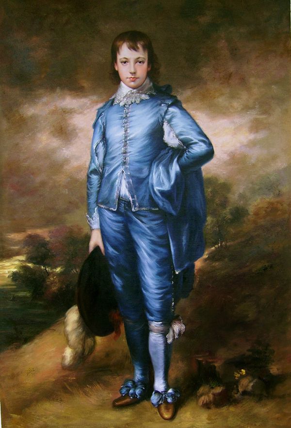
The Blue Boy 1770 Thomas Gainsborough, Oil on canvas, 70 5/8 x 48 3/4 in., Collection of The Huntington Library, Art Museum and Botanical Gardens

To commemorate the 100th anniversary of the 1921 purchase of Thomas Gainsborough’s “The Blue Boy”, Wiley was commissioned by the Huntington to create “A Portrait of a Young Gentleman”. The two paintings are the same size, set into identical frames (one gilt and the other painted black) with the subjects sharing a similar stance. “A Portrait of a Young Gentleman” literally faces-off against “The Blue Boy” in ‘High Noon-esque’ fashion. The two larger-than-life portraits bookend opposite ends of an enormous gallery that is filled with classic eighteenth century portraits, all of which speak to the conventions of glorification, history, wealth and prestige that Wiley’s contemporary depictions of urban young men call attention to and reference in a reflection on the complex issues of power.

Caged Again

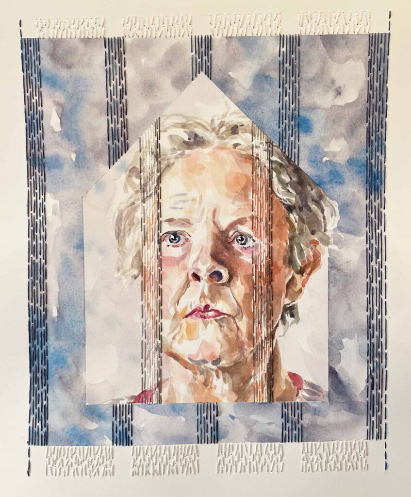
Caged Again   ©2022 Elizabeth Fram, Watercolor, graphite and embroidery on paper, 12 x 9.5 in. This piece speaks to both the internal and external restraints that the draconian overturn of Roe places on women within this country, regardless of age.

The juxtaposition is thought-provoking, uncomfortable and ever-so-important.
Such is the power of art…and a high bar to aim for.

Huntington Botanical Gardens

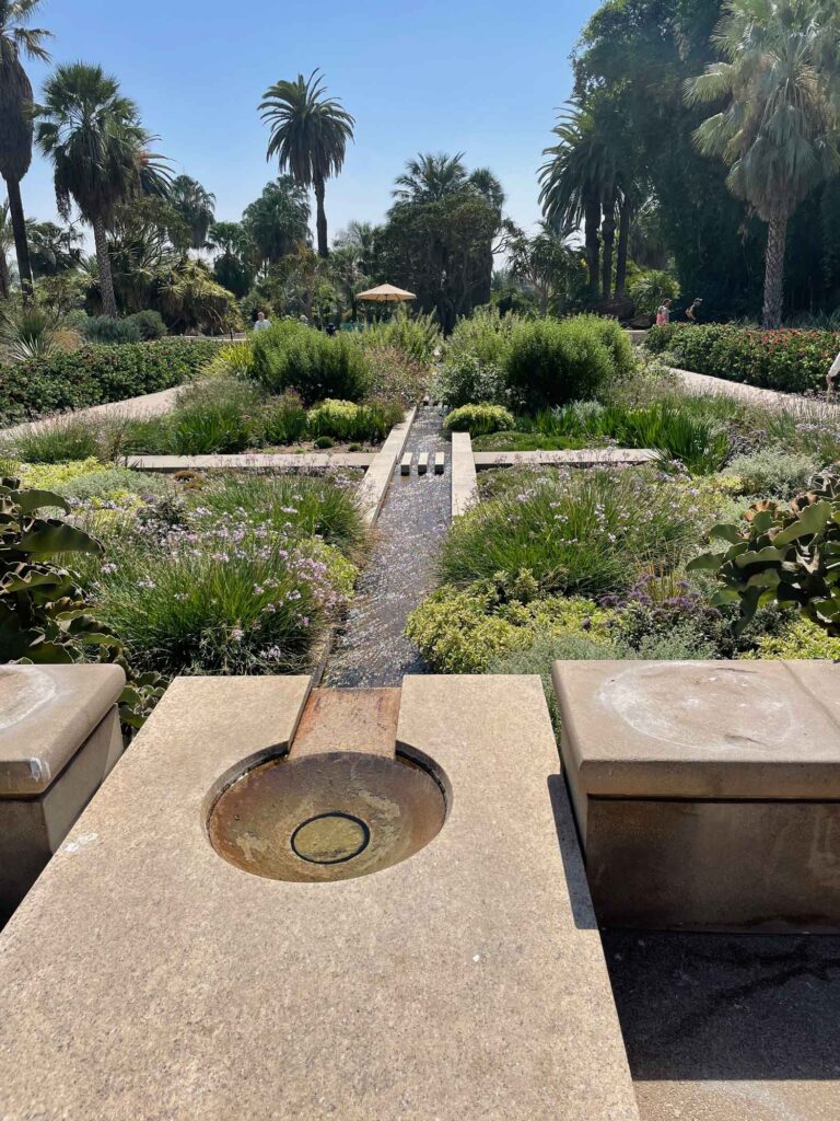
The central axis of the Huntington Botanical Gardens barely scratches the surface of the extensive delights that await. Mixing geometric forms within the lush organic shapes of flora is one of my favorite horticultural devices.

On a more general note, between the art museum, the extensive themed gardens and the library collections, there is much to learn and absorb at the Huntington; a half day was nowhere near enough time to spend there. The next time you head to Los Angeles, consider a side-trip to San Marino. My fingers are crossed I’m able to return one day.

*Excerpted from Wiley’s website

As I write, I have been somewhat distracted by the movement of trees outside the window above my desk. They are electric with color, releasing their leaves to dart and swoop on the wind like pods of playful dolphins. I know for many this is a melancholy time of year, with winter soon to follow. But for me, it’s like the woods have put on their cheeriest party dress and are celebrating the last hurrah of a summer well-spent. Thinking somewhat along the same lines, check out the raucously exuberant draughtsmanship of Esteban del Valle – a party on the page!

Swept Away

Very occasionally I run into an image that, in the best analogy I can think of, burrows beneath my skin and won’t let go.

Last week, while researching something completely unrelated online, I somehow happened upon this amazing photograph and was absolutely swept away. I feel something indefinably visceral and ancient each time I look at it. But beyond that, most simply put, it brings me joy.

Eyes as Big as Plates # Agnes II (Norway 2011) © Caroline Hjorth & Riitta Ikonen

Eyes as Big as Plates # Agnes II (Norway 2011) © Karoline Hjorth & Riitta Ikonen

This is just one piece within an expansive collaboration named “Eyes as Big as Plates” between Karoline Hjorth (NO) and Riitta Ikonen (FI). Considering my own current portrait project, the age of the subjects was no doubt the initial attraction. But the more I study the images, each subject’s integration within elements of nature somehow feels like a true and long-held secret finally revealed.

I’ve lifted an excerpt from Hjorth’s statement directly from her website, hoping that it will inspire you to visit one of the above links to see more of these amazing photographs.

“We need to learn to see not just with Western eyes but with Islamic eyes and Inuit eyes, not just with human eyes but with golden-cheeked warbler eyes, coho salmon eyes, and polar bear eyes, and not even just with eyes at all but with the wild, barely articulate being of clouds and seas and rocks and trees and stars.”  ROY SCRANTON

Eyes as Big as Plates is the ongoing collaborative project between Karoline Hjorth (NO) and Riitta Ikonen (FI). Starting out as a play on characters from Nordic folklore, Eyes as Big as Plates has evolved into a continual search for modern human’s belonging to nature. The series is produced in collaboration with retired farmers, fishermen, zoologists, plumbers, opera singers, housewives, artists, academics and ninety year old parachutists. Since 2011 the artist duo has portrayed seniors in Norway, Finland, France, US, UK, Iceland, the Faroe Islands, Sweden, Japan, Greenland, Czech Republic and South Korea. Each image in the series presents a solitary figure in a landscape, dressed in elements from surroundings that indicate neither time nor place. Here nature acts as both content and context: characters literally inhabit the landscape wearing sculptures they create in collaboration with the artists.

Meanwhile, I finally feel comfortable enough to leave my sketchbook and have moved into the next phase of my elder women portraits. I have still have a way to go with the stitching portion, but here’s where I am to date.

WIP: House on Fire

WIP: House on Fire ©2022 Elizabeth Fram, Watercolor and stitch on paper, 8-7/8 x 11 inches

Chipping Away at The List

My husband was recently bemoaning his seemingly endless project list.
It got me to thinking that, while superficially I too would love to check everything off my long string of to-do’s, in all honesty I don’t believe it’s a finish line either one of us really wants to cross, mainly because…then what? Seen from a certain perspective, always having something in the queue may be the secret that propels us forward.

Daisy Barrette

Daisy Barrette   ©2022 Elizabeth Fram, Ink and watercolor on paper, 8.5 x 11 inches

I think the practice of making art is similar. If we’re doing it right, every day is a stretch leading to another stretch, and then another, and so on. It may seem like we want to get “there”, but do we really? Does “there” even exist? If every time I sat down to make something it just flowed out with ease, my guess is I’d get bored. Keep in mind that achieving a level of facility isn’t the same thing. For me at least, the challenges I set for myself and the resulting growth are perhaps more than half the point of doing the work in the first place. One could always use another 10,000 hours.

As I’ve been adding portraits to my sketchbook this month, I keep chipping away at assorted goals. My current “there” is to simplify, to make a conscious effort to rein myself in despite my love for detail and my desire to pack in lots of visual information. The big question is how does one do that while depicting a human’s individuality and alluding to what lies beneath the surface?

Along the way I’m discovering my own vocabulary, but I continue to look for pointers from other artists who seem to have figured out this mystery of distilling an image down to its essence. Joe Ciardiello sets a great example. His portraits capture a likeness and plenty of additional information with a relatively spare, but oh-so-expressive line. Often he fleshes the image out with just enough color to bring it further life, and/or offsetting that warmth with rich passages of black ink. Without fuss, his drawings seem to convey the soul of his subject. I’d love to be able to do that.

Joe Ciardiello, Jimmy Smith

© Joe Ciardiello, Jimmy Smith

If we still lived in the mid-Atlantic, I would have enjoyed going to see Ciardiello’s recent exhibit “A Fistful of Drawings” at ArtYard in Frenchtown, NJ. However, I was able to listen to him talk about the show with Gil Roth on The Virtual Memories Show podcast. It was fascinating to hear him describe his thought processes and the technicalities of his approach, nevermind how heartening it was to recognize similarities between our working methods. He too begins each portrait with a subject’s eye, finding it key to a successful start. We share a preference for drawing older models: he says the lines of their faces reflect a deeper story — I just find the topography of an older face more interesting in general. And perhaps most reassuring of all, he freely admits to continuing to make many mistakes.
What could be more inspiring than that?

Hooded

Hood   ©2022 Elizabeth Fram, Ink and watercolor, 8.5 x 11 inches


Consolation Though Art

It’s been a rough week.
And while this is not the place to outline my opinions regarding the crushing Supreme Court decision on Roe, it would be disingenuous for me to blithely write this post as though nothing had happened.

John Green

I give this book 5 stars

It often seems that when something sets me reeling, I’ll come across an idea or a sentence in whatever I happen to be currently reading – even if completely unrelated – which points me back to at least a small sense of balance. This has proven true even when regaining my full bearings seems impossible. John Green’s 2021 book The Anthropocene Reviewed has been such an anchor this week.

Yellow Tank

Yellow Tanktop    ©2022 Elizabeth Fram, Ink and watercolor on paper, 8.5 x 11 inches.                                                 My thoughts this week have been with the women of this country who will no longer have access to the care that should be their right.

In a series of essays that review a variety of diverse themes on a five-star scale, Green invokes our shared humanity via this quasi memoir that covers such eclectic subjects as “Scratch ‘n’ Sniff Stickers”, “Air Conditioning” and “Diet Dr Pepper”. In times of distress it’s helpful to be reminded that one can find unexpected significance and empathy in the ordinary. Perhaps most appropriate to where I’m going with this post is Green’s essay entitled “Hiroyuki Doi’s Circle Drawings”. It speaks to the consolation of making art.

Addressing Doi’s obsessive abstract drawings, composed of thousands of circles and begun in response to the death of his brother, Green relates that Doi retreated to the act of drawing and the comfort of repetitive mark-making to find relief from his grief.

Pink Hoodie

Pink Hoodie    ©2022 Elizabeth Fram, Ink and watercolor on paper, 8.5 x 11 inches

Creative work often brings one into a “flow state”, inducing a sense of being or, as Green comments, “a present tense that actually feels present”. He writes about this phenomenon in relation not just to Doi’s drawings, but also to the 150,000 hand-written signatures he supplied to his publisher to be bound into copies of one of his books (including my library copy above). He quotes Doi as saying, “I feel calm when I’m drawing”.

I have also found this to be true, and will add that it’s proving a viable means for confronting the shocking reality of American women in the 21st century being stripped of their reproductive rights and autonomy.

Orange Shirt

Orange Shirt ©2022 Elizabeth Fram, Ink and watercolor on paper, 8.5 x 11 inches

While the painted drawings I’ve worked on this past week haven’t softened last Friday’s blow, they have offered a space of gentle reprieve. My work is the closest thing I’ve found to a respite from my anger and despair. Ironically, the flow state that accompanies creative work appears to be a direct route to the end goal of so many meditation apps that reside on our phones. I guess I prefer to find my solace through a needle and thread or via an ink pen and a box of paints.

Know someone who needs help?   Here’s a list of resources.
~ with thanks to @owasowfoundphotos via @gollyokate

Face Value

Not to be too overly dramatic, but I long ago reached the point during this pandemic where any in-person human interaction has become the highlight of my week. Over these past couple of years I’ve come to appreciate my trips to the post office, the library and the grocery store in ways I never would have thought possible.

Dignity

Dignity  ©2022 Elizabeth Fram, Ink on paper, 11 x 8.5 inches  My hardcover Daler-Rowney Classic sketchbook takes ink and pencil equally well. The 8.5 x 11 size is big enough to stretch out upon without feeling unwieldy. It’s a trusty workhorse.

So I’m not exaggerating when I say it was absolutely wonderful this past Saturday to attend the Artist Social at Studio Place Arts for the Face It exhibition. Plenty of (masked) people turned out and it was so fun, not only to chat with folks I haven’t seen other than on Zoom since last summer, but to even meet a few people for the first time as well. The lift I got from it has lasted all week.
On top of that, the previous Monday I attended my first life drawing session since March of 2020. Things are definitely looking up!

Pink Hair

Pink Hair  ©2022 Elizabeth Fram, Graphite and colored pencil on paper, 11 x 8.5 inches

In chatting with the executive director of SPA when I dropped off my work for the show, she mentioned how she felt the time had definitely come for an exhibit of portraits. She went on to say that she’d chosen the subject selfishly because she knew that working in the midst of them would be both comforting and normalizing.

Considering

Considering  ©2022 Elizabeth Fram, Ink on paper, 11 x 8.5 inches

It was a brilliant idea and, frankly, her reasoning is largely why I continue to draw, paint and stitch faces. Even though I often don’t know my subject, I still get a sense of human connection from studying and trying to execute something as personal and unique as facial features. Taking the time to really see someone else is something we’ve all missed, and I hope we won’t take the ability to do so for granted once the masks finally come off.

Orange Kimono

Orange Kimono  ©2022 Elizabeth Fram, Ink and colored pencil on paper, 11 x 8.5 inches     HA! – I just noticed I hadn’t fully made the adjustment to 2022 when I dated this sketch.

Face It closes on March 5th. Check out the Seven Days review to whet your appetite for a visit before the show ends.

Man With Cap

Man With Cap  ©2022 Elizabeth Fram, Graphite on paper, 11 x 8.5 inches

Joni

Joni  ©2022 Elizabeth Fram, Ink on paper, 11 x 8.5 inches

Speaking of connection – are you familiar with the word “pareidolia”?
It’s the formal term for the tendency to perceive shapes or an image out of randomness, such as seeing something in a cloud formation.

Lisette

Lisette  ©2022 Elizabeth Fram, Watercolor and graphite on paper, 12 x 9 inches       I started experimenting with Strathmore Toned Mixed Media paper  last year. It’s been a whole different learning curve to begin with a background that is medium-toned, rather than stark white. It comes in 3 colors – this is the tan. With a vellum surface that is akin to hot-press, it allows for erasures without damage. It is heavy enough that it doesn’t need to be stretched and doesn’t buckle from layers of washes – at least with the amount of water I use. It’s acid free and 30% post-consumer fiber; again, a good workhorse and convenient for traveling out of the studio. It’s what I brought with me to life drawing last week.

This brief article refers to it specifically as seeing faces in everyday objects, tagging the occurrence as an instinctual evolutionary hold-over geared toward protecting us from danger. I don’t know about that; I’ve always thought the images I tend to notice had more to do with my imagination compensating for boring moments.

Queen

Queen  ©2022 Elizabeth Fram, Graphite on paper, 11 x 8.5 inches

But lately I seem to conjure more faces (as opposed to other images), which I attribute to all the portrait work I’ve been doing, figuring that I’ve become more finely attuned to the physical characteristics of the human face. Evolutionary phenomenon or not, it makes life a bit more interesting, don’t you think?

Work in Progress

Work in Progress  ©2022 Elizabeth Fram, Stitched-resist dye and embroidery on silk      Slowly but surely this piece is coming along. This week has been all about working with the hair. It needs more color, so I still have a way to go – plus, I haven’t even started with her shoulders. I’m having a bit of a love-hate affair with the background pattern & color. In the long run I think it will elevate the piece, but it has surely made the process more challenging.

What’s Your Story, Morning Glory?

Barbara Van Vlaenderberch had eighteen children. Sadly, that’s pretty much all I know about her.

Hans Memling Barbara Van Vlaederberch

Hans Memling, Portrait of Barbara Van Vlaederberch, c.1482

She was married to Willem Moreel, a man who had been born into a prominent Bruges family and who became a public figure of great wealth and standing in that city, holding numerous powerful positions throughout the second half of the 15th century.
But what is her story?

After Hans Memling

After Hans Memling, ©Elizabeth Fram, Graphite on paper, 11.7 x 8.25 inches

When we were at the Musées Royal des Beaux-Arts in Brussels last fall, Barbara’s portrait caught my eye. It was painted in 1482 by Hans Memling, a prominent painter of the affluent, and hence, one of Bruges’ wealthiest citizens himself.

In progress 1

In progress.     The first steps involve mapping out the image with a water-erasable pen, then outlining with a variety of stitches to suggest depth and translucence.

Zooming in on her facial features, while ignoring her medieval dress and hennin, I see an undeniably contemporary air about her. Unlike many formal devotional portraits, it’s not hard at all to imagine her as a living, breathing individual who will soon get up from her prayer and move away.

In Progress 2

In Progress.     Using both Memling’s portrait (enlarged on my iPad) and my own drawing, stitches mimicking hatch marks lend form and definition to individual features. Exploring with stitch allows me to flex my artistic license and to reach beyond to something that is more than a mere copy.

Copying a masterwork is an opportunity to study it in minute detail, to glean valuable technical lessons and, obviously, to reflect upon its subject. Stitching Barbara Van Vlaenderberch has given me plenty of time to wonder about the life and thoughts of a woman who had the fortitude and physical endurance to carry and give birth to eighteen (!) children. Despite her great wealth, what could it possibly be like to raise a virtual tribe? (It seems those eighteen progeny lived, as evidenced in Memling’s 1484 Moreel Triptych – a work which marks the birth of the family portrait. I can’t help but speculate on how many others didn’t survive). What was her life really like? Was her serene appearance merely a devotional ruse by a painter who knew how to please a wealthy client? Or is it truly a measure of her personality? Perhaps she was just too tired to look anything but calm.

In Progress 3

In Progress.     I’ve learned to space stitches out so that there is room for another layer of stitching to be added after the piece has been dyed. This picture highlights how pattern and texture, two components that are so key to textile work, carry with them a unique sense of visual excitement.

We all hide parts of ourselves from public view.
Now that the initial white-on-white embroidery is finished, over-dyeing the image with a stitched-resist pattern and then drawing it back out with another layer of embroidery will give me an avenue for exploring the notion of what is real and what is a mask.
The bonus, for me, is having a brief chance to recognize Barbara Van Vlaenderberch, a woman we will never know, as an individual.

In Progress 4

In Progress.     The initial layer of stitching is complete. It may be hard to see here, but one detail to note: I used only one strand of thread vs two in an effort to suggest her veil and its translucence. We’ll see if that carries through and what else I may need to do to make that clear after the piece has been dyed.

Stay tuned to my instagram to follow as this piece progresses over the next two weeks.

Feeling cooped up because travel is curtailed by Coronavirus? Strong Sense of Place podcast and website will send you on adventures far and wide, with absolutely no risk of infection.