Tag Archives: Henri Matisse

Color + Light = Place

There’s nothing quite like travel for a reminder of how much light and color affect a sense of place. In fact, I don’t think it’s too bold to say that, for those of us interested in such things, the elements of light and color define place.

Kailua Beach

Kailua Beach

Matisse knew that fact, as did Winslow Homer and Gaugin. On the more contemporary side, look to Dorothy Caldwell, Eric Aho or the interior designer Justina Blakeney* for color that portrays the essence of specific locales.

Berkeley

Berkeley

Our visits with family in Berkeley and Hawaii were nothing less than a full-on immersion in chromatic glory – especially for this northern New Englander. It was the kind of visual shake-up that makes me sit up straight and pay close attention.

Hawaii

Hawaii

That isn’t to say things haven’t been waking up here in Vermont over the past weeks. We arrived home to find our garden bursting with the colors of Zone 4: phlox, azaleas, lilacs, iris, rhododendrons and lupins…and let’s not forget the lush Green Mountains.

Vermont

Vermont

I’m not well-versed in the science of light wavelengths and how they are affected by their relationship to the sun or the surrounding environment, but at least I can say that their variations make my travels – and coming home – all the richer.

*Thanks for the introduction, Sandy!

For a similar experience – especially while travel is still iffy with COVID – consider tuning in to the Strong Sense of Place podcast. Each episode explores one destination by discussing in detail, without spoilers, five books that will take you there on the page. Hosts Melissa & David ferret out books that really convey the feeling of a particular place — color and light limited only by your imagination.

Sun Hat

Straw Hat   ©2022 Elizabeth Fram, Watercolor and graphite on paper, 7.25 x 6 inches

Down The Rabbit Hole

In looking for new subjects to draw, I’ve been seeking out photos of my artistic heroes. With very little effort, one can find some pretty remarkable images online.

David Hockney

Hockney ©2021 Elizabeth Fram, Ink on paper, 5.5 x 5.5 in.

Admittedly, searching in this way can become a bit of a rabbit hole if you aren’t careful. It’s easy to get caught up in unanticipated articles and links. Yet perusing these old photos also offers a tiny peek into the person behind the giant — a touchstone more intimate than critical essays and curatorial art-speak can offer.

Georgia O'Keeffe

O’Keeffe ©2021 Elizabeth Fram, Ink on paper, 5.5 x 5.5 in.

As far as practicing my drawing is concerned, the fact that the majority of these resources are black and white plays to my advantage. Their lack of color gives me the opportunity to stretch by adding and working with various hues as I see fit, pushing the limits of what I know so far.

Henri Matisse

Matisse ©2021 Elizabeth Fram, Ink on paper, 5.5 x 5.5 in.

I’m coming to recognize that, even when using a photographic reference, drawing facial features is an exercise in empathy. Unlike a still life, there is a human being behind the shapes and forms one is diligently trying to capture. Alice Neel stated that she was painting her subjects’ souls in addition to their bodies. While I’m still working on more rudimentary levels of portrayal, I do find myself thinking about the person I am drawing, wondering how a conversation might unfold and what I might learn if I were lucky enough to have any of these heroes actually sitting in front of me.

Alice Neel

Neel ©2021 Elizabeth Fram, Ink and colored pencil on paper, 5.5 x 5.5 in.

YouTube, it turns out, can be a pretty decent substitute by providing the opportunity to hear artists (at least those from the 20th & 21st centuries) speak for themselves. I thoroughly enjoyed this 1978 video of Neel. She reminds me of my grandmother in many ways — partly because they were born around the same time and Neel’s look with the hat and chunky necklace is very reminiscent of the elder ladies in my family as I was growing up. But beyond that, also like my grandmother, Neel’s confidence and down to earth tell-it-like-it-was attitude captured in this interview is endearingly human.

I have great admiration for reportage illustrators and have written about them before. For court illustrator Jane Rosenberg, the Derek Chauvin trial in times of COVID presented a far steeper set of challenges than I am experiencing in just trying to keep up a regular practice. It was interesting to see the results of her labors and to read about her experience in this New York Times article. The New York Post published a much deeper article about her career last September, as she remembered “40 years of legendary bad guys”.

Instagram of the Week

Lara Blanchard is a multi-disciplinary French artist who makes embroidered etchings and textile-based sculptures. That description doesn’t begin to do her work justice. It is both fantastic and fantastical; be sure to check out her Instagram feed @laraorsolupa.

The Strength in a Single Voice

Vibrant color is hibernating at this time of year.
As I’ve discussed before, there is much to see and appreciate in the subtle tones that surround us during the winter months, but stick with me for a slightly different story.

Frostbitten

Andrew Wyeth, Frostbitten, 1962, Watercolor on paper

While driving south on Route 89 the other day, I was casually appreciating the muted beauty of the roadside fields and hills when a tiny rectangle of brilliant fluorescent orange caught my eye.  It was nothing but a small and temporary construction sign on Rte. 2 that runs alongside the highway, not exactly an item of any particular interest or visual appeal. But the strength of that spot of color in the midst of a world of neutrals was startling.

Andrew Wyeth, Flood Plain, 1986, Tempera on panel, 24.5 x 48 in.

I have been trying to think of works of art that push the concept of presenting judicious limitation of color while containing such a spark, and it has been something of a challenge to find many examples.

The German

Andrew Wyeth, The German, 1975, Watercolor, 21 x 29 in.

Andrew Wyeth is the one artist who kept coming to mind. He was a master of the concept, as the paintings above illustrate.

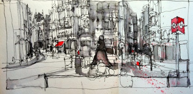
One of the artists I follow on Instagram, architect and urban sketcher Simone Ridyard, is the best contemporary example I can think of who uses this device very effectively. While the general neutrality of her drawings make her spots of color leap off the page, each element balances the other by providing the perfect foil for appreciating the black lines of her sketches.

What other artists am I forgetting who also push this idea?

Simone Ridyard

©Simone Ridyard      drawing with non waterproof ink 2, from urbansketchers.org

Color is so intoxicating that the desire to saturate and enrich a work with it can be overwhelming. (Matisse, you speak to our hearts!) But it’s also worth thinking of color along the the lines of this analogy: a full-throated chorus of many voices can make spirits soar, but the lone voice that breaks through silence has the power to lift us to equal heights.