Tag Archives: Dye

Small Things Adding Up To Big Things

There isn’t much in my process that quite matches the excitement of undoing the resist stitching or wrapping that was painstakingly put in place before a dye bath. Wonderful surprises are always revealed.

Dye1

Sure, there are things one can do to nudge the process along; with time one learns about the various ways colors will mix and how multiple layers will absorb (or not absorb) the dye. But there are also rich rewards in the tiny unexpected passages that appear through pure kismet.

Dye 3

As with any venture, outcomes always vary in success. But without fail, there is at least one area of wonder to be found in each piece, even if only a couple of square inches within a whole yard of fabric.

Dye6

Working on my little houses, especially the ones without embroidery, has given me an opportunity to appreciate and highlight some of the more beautiful passages of pattern and color that might get overlooked in a bigger field. Spotlighting those sections within the small parameters of a wall or a roof is somewhat akin to opening the curtains in a dark room, allowing light and color from outside to burst through the window frame into the space, emphasizing individual elements that might not be noticed if you were sitting outdoors with the full scope of your vision in front of you.

Dye2

Along this vein of paying attention to small areas for their particular visual interest (sorry for the semi-awkward segue here), in addition to the fact of bigger matters surrounding the post office, I am worried about what I think of as one of the best (and smallest) elements the USPS has to offer: the postage stamp. Aside from being a way to dress up the mail by adding a little art to the pedestrian, stamps are one of the most public and cost effective ways that we honor our artists in this country.

Dye4

My father taught me to appreciate stamps years ago, so I am always on the lookout for something beyond the generic American flag to elevate my personal snail-mail. Most recipients probably never notice, but my choice is the final bit of care that finishes any hand-written note.

Asawa Stamps

What a pleasure it was to walk into my local PO branch last week and to buy a 20-stamp sheet of 10 different miniature images of the lyrical work of Ruth Asawa.

Since our son moved to the Bay Area in 2015, I’ve crossed paths with numerous Asawa works. Perhaps the most memorable being a permanent installation of 15 of her pieces in the Education Tower of The de Young Museum in Golden Gate Park.

De Young Installation

Asawa installation in the Nancy B. and Jake L. Hamon Education Tower of The de Young Museum, San Francisco   Photo credit: ruthasawa.com

There has been a lot written about Asawa concurrent with the issuing of these stamps. This recent article by Thessaly La Force in the NY Times is quite comprehensive. Asawa is yet another female artist who created consistently throughout her long life, forging ahead despite little recognition, and in tandem with the consuming business of raising a family of six children, becoming an educator, and being an activist. Imprisoned as a teenager in Japanese internment camps, she endured prejudice and racism but never saw herself as a victim. She just kept moving forward. Her recognition as an American Master is long overdue.

Asawa Detail

Ruth Asawa, detail

Below are several Asawa quotes that are particularly resonant for me. They hold a lot of wisdom. Hopefully you will find something in them that rings true for you as well.

It’s important to learn how to use your small bits of time. All those begin to count up. It’s not the long amounts of time you have that are important. You should learn how to use your snatches of time when they are given to you.

Sculpture is like farming. If you just keep at it, you can get quite a lot done.

I am able to take a wire line and go into the air and define the air without stealing from anyone. A line can enclose and define space while letting the air remain air.

An artist is not special. An artist is an ordinary person who can take ordinary things and make them special.

This weekend marks the 28th South End Art Hop in Burlington, with curated exhibitions to follow for the next 1-3 months. As with so many happenings right now, this year’s Art Hop will primarily be a digital event with as many in-person portions as possible. Visit the link above to learn more and for the full program guide and schedule.

I have two pieces in the affiliated 2020 SEABA Art Hop Juried Show:

Relative Distance (front)

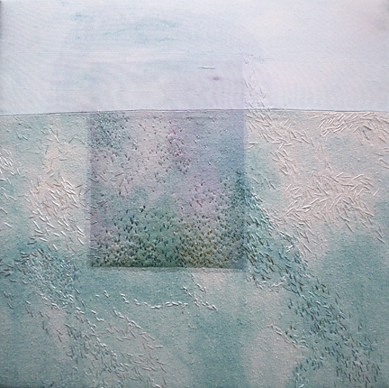
“Relative Distance” ©2020 Elizabeth Fram

and


Cultivating An Oasis

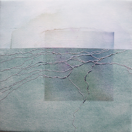
“Cultivating An Oasis” ©2020 Elizabeth Fram

You can see them and preview the show now. Please return to vote for the People’s Choice Award, which will go live on that link Friday 09/11 at noon through Sunday 09/13 at 7pm.

Out of the Deep

White on White Octopus

The base stitching is finished. From this distance, it’s hard to make out the image in the midst all the pattern, but if you zoom in you will see it.

Every new piece brings its own discoveries. When it was time to dye this one, I decided to work with high key colors rather than the deeper tones one might associate with an octopus’ habitat. The next days will be spent figuring out how to merge the two (background and figure) so that neither overpowers the other, or gets lost.

Stitched-resist Dye

Folded, with resist stitching in place, the dyed piece looks darker when it is still wet.

Embroidery

This is the exciting part: seeing how the dye and pattern are absorbed into the embroidery.

These photos are a log of this past week’s progress. I can’t stress enough how many decisions take place as I go along. There are constant questions and challenges to each choice (is the outline too dark? How can I keep the stitched rectangle background obvious without overdoing it? How much of the shibori pattern can, or should, remain within the figure of the octopus?)

Red Outline

I am planning to use red tones to define this guy, but it will also have to include some of these other colors so as to play on the camouflage effect.

Ready for color

Now that the piece has been completely outlined, the real fun of blending and playing with color can begin.

Every hurdle presents a puzzle and the potential for new revelations to add to my “toolkit”.  The fact that the road ahead is uneven is a big part of what brings joy to this work.

Who, besides yourself, are you trying to please with your work? Once again, Danny Gregory lights the way in his recent blog post How Not to Give A Damn.

Shibori x3

Working in tandem with my 3 jalapeño sketches last week, I stitched my way through the waiting period between watercolor washes.

stitched-resist

Stitched-resist

When I was a college student, I spent a Winter Term in Seattle working with and learning from watercolorist Karen Guzak. At that time her studio was in her home and she counseled the value of such an arrangement in allowing one to multi-task — a term I’m not sure we were using yet in the late 70’s. At 20, I couldn’t relate to being able to throw in a load of laundry while a different kind of wash dried, but her words stayed with me and have served me well. Always having a home studio is what has allowed me to work continuously around the privilege of being home with two kids.

shibori 2

Stitching drawn up and dyed

Just as I mentioned last week, there is much to be learned through repetition and variation, and that fact is perhaps most salient when pieces are made in close succession.

shibori 3

I usually set up at least 3 different colors of dye to use at once. These pieces gently progressed through variations of those colors so that they are each in the same family while remaining different. Thread choice will eventually highlight those distinctions.

On a Different Note________________________________________________________________________________________

What I’m reading now: A Piece of the World by Christina Baker Kline — “a fictional memoir of the woman in the famed Wyeth painting Christina’s World” – Erik Larson.
So far, so good – there is much that resonates considering its Maine setting.

Moving Right Along

The “ice pieces” are finished and stretched; I’m still deciding about framing.

Ice1Sharp

Crystallized     12″ x 12″    ©2015 Elizabeth Fram

It somehow seems fitting to get these two sewn up for good (pun intended) in tandem with the disappearance of the last patches of snow and ice that I see on my daily walks with Lola in our woods. I’m more than ready to leave the restraint of February behind, and to dive into the color of Spring and the coming months.

Ice 2Sharp

Floe     12″ x 12″    ©2015 Elizabeth Fram

But looking out my studio window, you can see we’ve still got a way to go. In fact, it’s been very soggy & gray this week, so it seemed like the perfect time to make an exercise out of my craving for color.

Grey Day2

It can be quite a challenge (or perhaps foolhardy) to forge ahead without much forethought, and you can see that I am doing just that — with a vengeance.  I mixed a dye-bath of Goldenrod and Pumpkin, with the finished result coming pretty close to Naples Yellow, Cadmium Yellow Deep and Cadmium Orange.

Color copy

That was the easy part. So much yellow…where do I go from here?  I have to figure out a way to balance color and the various means of applying it (paint, thread, & more dye) to offset and harmonize with this rather bold beginning. Oh, and also to pull it all together within a cohesive image/composition.

Color Mixing Handbook

I have some ideas, but the first step is to consult this wonderful little book, The Colour Mixing Handbook which I have come to consider one of my most trusty guides. It suggests in its introduction that you use it “as a handy reference when you want to know how to mix a specific colour, or as a catalogue of inspiration when seeking ideas to try in your work”.

I’ll be doing just that.

PS: I’ll also be keeping two of my favorite quotes in mind:

“Don’t wait for inspiration. It comes while one is working.”    – Henri Matisse

“Inspiration is for amateurs–the rest of us just show up and get to work.”    – Chuck Close

Expect the Unexpected: Revisiting Process, Part 1

This piece, Ulysses’ Wave, is about change — and more specifically, coming to terms with the aging and the loss of a parent. It seemed a worthy candidate for sharing a look into my process, which is largely intuitive and does not involve much preparation other than a vague idea of where I am headed.

Ulysses' Wave1

Ulysses’ Wave  19″ x 38″  ©2014 Elizabeth Fram

Almost daily my dog and I walk the same path in the woods, and as a result I’m sensitive to the subtle differences I see from day to day. My observations have prompted me to think about the slow changes that occur as one season merges into the next, which in turn led me to consider the idea of such a progression in wider terms.

Even though one is fully aware change is coming, there can suddenly be a moment when the realization strikes home that the exchange has already occurred — almost like the silent flip of a switch. The most apt metaphor I can come up with is an invisible line that one day you are a bit surprised to find you have already crossed. In a nutshell, that’s the concept behind Ulysses’ Wave.

In my work, I’ve been developing a process for a couple of years now that brings together my interest in color, texture, and the organization and arrangement of shapes within an image. I aim to capitalize on the qualities that make working with textiles unique through the shifting of one’s focus between the surface of the work and the image portrayed. Along the way, I’m learning to become comfortable with the fact that no part of the process is entirely predictable; the final piece will evolve as it does, which is the result of lots of starts and stops along the way.

In beginning Ulysses’ Wave, I first dyed strips of raw silk in a gradual progression from a bright, clear green to a subdued, faded neutral.

Color copy

Each segment was then stitched so that once the threads were pulled tight and the strips put in a second dye bath – each progressively more muted –  the resulting shibori pattern created connections and continuity between the strips, but maintained distinct characteristics.

Stitching copy

With the dyeing completed and the segments laid out in order, I realized a counterpoint was needed to offset the uninterrupted rhythm of the piece so far. I painted and inserted a strip of dupioni silk to provide some breathing room.

Insert

But as the process of embroidery began in earnest, something didn’t seem quite right…

Too Wide copyThe painted section was too wide and disruptive

Too Thin copyAnd here it seemed too thin

Just Right copyFinally…a width that feels correct.

The next part of the process is one that I really enjoy — auditioning thread for color and placement. One of the great things about thread is that you can get your hands right into the color (it reminds me a bit of playing in my mother’s jewelry box when I was little).

Auditions copy

Then comes the largely intuitive job of using stitch to play off the pattern, color and shapes created by the dye.

Detail Stitching copy

At this point the embroidery, for the most part, seemed complete. I had spent weeks on the challenge of harnessing visual movement so that it flowed around and through the piece, rather than traveling to one side and dropping off the edge.  But unfortunately, it’s not uncommon to get this far and to discover after pinning the work to my design wall that I can’t get past a niggling feeling that part of it isn’t working. Thus begins something of a waiting game – one of holding back and taking time to consider, anticipating an eventual solution which will set me on the right path.

Waiting copy

So this is where I’m going to leave you until next time — considering, as I did, how to bring this piece to a place where it could convey a sense of the transformation that comes with change, while maintaining, as we all must, some form of continuity.

Enjoy your week…